WIP: Goths
Printed From: Pixel Joint
Category: Pixel Art
Forum Name: WIP (Work In Progress)
Forum Discription: Get crits and comments on your pixel WIPs and other art too!
URL: https://pixeljoint.com/forum/forum_posts.asp?TID=5960
Printed Date: 11 September 2025 at 8:12pm
Topic: WIP: Goths
Posted By: absinthelord
Subject: WIP: Goths
Date Posted: 30 January 2008 at 4:59pm
|
I saw someone had done a very cool sprite sheet of Charlie's Angels sprites... It was inspiring, so I've decided to start collecting goths to practice my small detail sprites... I'm new to this type of sprite design.   |
Replies:
Posted By: Thunderthighs
Date Posted: 30 January 2008 at 5:06pm
| Nice Job The girls face is a litte weird though. |
Posted By: Blu
Date Posted: 30 January 2008 at 5:43pm
|
The skin looks a lot more complex than the clothes (and than it really is, probably because it covers such a small space...). I'd recommend shading the clothes some more. ------------- Gremlins rule the world; you just don't know it yet. |
Posted By: absinthelord
Date Posted: 30 January 2008 at 7:36pm
|
I agree... I've added a little bit of highlighting as well. EDIT: I've added another goth to this collection. I want that coat that he is wearing to be made out of a very shiny "pleather" plastic material. Any suggestions on how to shade/highlight something so dark (I want it nearly black)?  |
Posted By: Blu
Date Posted: 31 January 2008 at 6:07pm
|
Looks good. ^^ I think...probably add a texture of some kind. But I'm not sure. :/
The girl looks a lot better. :D The guy still bugs me, though. ------------- Gremlins rule the world; you just don't know it yet. |
Posted By: Kee
Date Posted: 01 February 2008 at 10:22am
| the dude to the far right looks like the guy from the matrix :P |
Posted By: Inventrix
Date Posted: 01 February 2008 at 11:04am
Well the two biggest tips I would have for shading black are 1) use dramatic shadows in pure black, and 2) don't be afraid of really dark greys. I did an edit thing with more black shadows and a darker midtone.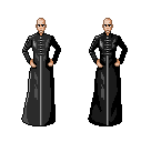 |
Posted By: Kee
Date Posted: 01 February 2008 at 11:36am
| Good edit Kira! |
Posted By: littlesapphire
Date Posted: 01 February 2008 at 11:45am
| I agree. It's much more dramatic with black instead of the grey. |
Posted By: Blu
Date Posted: 01 February 2008 at 5:09pm
|
*thirds quietly*
Is that a zipper? More specifically, a metal zipper? I'd highlight it a bit if it is. ------------- Gremlins rule the world; you just don't know it yet. |
Posted By: absinthelord
Date Posted: 01 February 2008 at 5:16pm
Thanks Kira! Good advice. I think this might work.... Now to add another!  |
Posted By: Metaru
Date Posted: 01 February 2008 at 6:26pm
|
not that was too drastic, as it appears to be some sort of latex dress with white stains. remember that those clotes follows the anatomy below it, and the idea of those hightlighs(because I would add highlights on a surface that already is black enough to use dark shades) is to help define those features and add volume. as you did in the first sprite's pants and seconds's boots. ------------- I ate leel's babies |