Wasp
Printed From: Pixel Joint
Category: Pixel Art
Forum Name: WIP (Work In Progress)
Forum Discription: Get crits and comments on your pixel WIPs and other art too!
URL: https://pixeljoint.com/forum/forum_posts.asp?TID=614
Printed Date: 12 September 2025 at 10:22am
Topic: Wasp
Posted By: Goldprobe
Subject: Wasp
Date Posted: 27 July 2005 at 3:24am
For age's now, i've been looking at the work you guys have created, and
tried to pick up on your technique's and how you do your stuff. Im
really not good at pixeling at all, so....yeah :P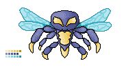 I could'nt do the wings :( I was'nt sure how i would do them, so hopefully i could get help on that, and hopefully with the whole thing. I used MS Paint to do this, and i added those little square's with all the colours i used. Im still not sure what those are for, but i added them just incase. If someone could explain that aswell for me :P Thanks. |
Replies:
Posted By: Monstara
Date Posted: 27 July 2005 at 3:29am
|
The little squares are your pallete. You can see with how many colours you worked, and you could later use them as reference. On to the piece: insects are one of THE hardest things to draw. I admire your pick, but be warned. The wings really look kind of wrong. first of all, they look heavy to me. choose a lighter color. also, the wings are supposed to originate from more or less the same point. now their origins are too far away from eachother. You could also add those streaks the wings have - like veins or smth. Apart from that I like the cartoony style. |
Posted By: Goldprobe
Date Posted: 27 July 2005 at 3:57am
|
Here's is an update from what you told me to change. Oh and thanks for the help :) Next time in going to look in google if im doing something that actually exists. lol the one above changed aswell :P |
Posted By: Xero
Date Posted: 27 July 2005 at 4:37am
| Personally i think it needs more contrast for more depth. |
Posted By: Goldprobe
Date Posted: 27 July 2005 at 4:59am
| Sorry, but what is contrast? And also, i am supposed to make this into a animated enemy for a game that's already online. So it wont be 1 static image. |
Posted By: Monstara
Date Posted: 27 July 2005 at 5:06am
|
Contrast is the difference between the darkest and lightest colours. By adding contrast you generally increase the perceived depth of the image. Yes, I would advise you to gather as many reference images as possible when you do something like that. Google is a good place which many of us use. And yes, better not overwrite your images so we can see the progress (not that I haven't done that a few times) |
Posted By: Goldprobe
Date Posted: 27 July 2005 at 7:18am
 Ive made a back, im about to attempt to improve the contract. This is the first forum that has actually helped me :P |
Posted By: EyeCraft
Date Posted: 27 July 2005 at 6:15pm
|
Um, this latest image you've posted looks like a thumbnails rather than
the actual image. It's zoomed out. Could you show us the actual pixels,
because its much harder to critique and give advice otherwise. Your low
contrast is leading to the higher amounts of shades you are using for
each colour. Like, you are using 5 indigo-ish blues for the main body
colour of the wasp, you could probably get away with using 3, just with
more of a different in brightness/darkness between them. Same could be said with the wings, probably 3 or 4 would be enough, rather than 6. And yet again for the yellow. Try removing colours that are very close to other colours, one at a time, if the difference is managable, leave the colour out. Keep removing colours until you have the bare essential colours left that you simply cant remove without ruining the picture. Also, The legs on wasps from memory aren't divided like that, it looks like 2 of them are closer together and the other is left out further down the body all by itself  . I would evenly space the legs. . I would evenly space the legs.The black outlines you are using is what is called for the large amounts of anti-aliasing you are doing, which again is using a lot of colours. Try outlining in a colour, like you did for the wings. That's my advice. Keep going, it's great to see your effort.  |