The Man in the Tree
Printed From: Pixel Joint
Category: Pixel Art
Forum Name: WIP (Work In Progress)
Forum Discription: Get crits and comments on your pixel WIPs and other art too!
URL: https://pixeljoint.com/forum/forum_posts.asp?TID=6340
Printed Date: 10 September 2025 at 10:35pm
Topic: The Man in the Tree
Posted By: *MR21*
Subject: The Man in the Tree
Date Posted: 11 April 2008 at 12:59pm
 The Man in the Tree. Been working on this on and off for a few days now, but I'm at a standstill as to what I should do. C+C, you know the drill. |
Replies:
Posted By: Pixel_Outlaw
Date Posted: 11 April 2008 at 1:10pm
|
I really like your colors in this work. You might consider making the light reflection more to wards the center of the stump. I'm not suggestion direct center but as it is it currently looks a bit flat. You may also consider the pars where the trees meet the foliage. Consider making some knobs and leaves of plants block bits of the tree trunk. Most of the time trees will branch reasonably low to the ground you might try adding some branches to your tree trunks. Personally I would like to see a broken branch or two coming off the tree man and maybe some ivy or moss on him. As it stands now he looks like a bit of a textured cylinder. Nature is full of complexity when creating life. A tree may be somewhat like a cylinder at first glance but all of those cells reproducing and crowding each other makes some very complex knobs and such. Try to give some live around your tree man and think about how complex textures in nature are. The background brush looks a bit like a large single plant. You may consider breaking it up a bit into separate plants then sort of blurring them together as you get further back into the scene. ------------- http://www.shmup-dev.com/forum/"> 
|
Posted By: schrumpfkopf
Date Posted: 11 April 2008 at 2:04pm
|
the treetrunk is to straight - i miss a lot of shadows (under the nose for example) more weird shaped roots etc |
Posted By: M.E.
Date Posted: 11 April 2008 at 10:55pm
|
Hi MR21, Previous posts had lots of valuable information. Personally I would like to have some foilage above the head to make it sort of like the tree is wearing a hat.... But still keep the style you have on the bushes, which is really working! And maybe .. push the tree a little bit off-center. It could be that if you work on the comments given before that the 'straight in the middle'-ness is gone. Looking forward to progress! Best regards from M.E. ------------- http://www.kunststukken.nl - KunstStukken.nl M.E. Art |
Posted By: *MR21*
Date Posted: 13 April 2008 at 4:53pm
 Update. :P
|
Posted By: Setzer
Date Posted: 13 April 2008 at 9:33pm
i meant to do an edit on just the bushes to show them 'layered' but i got a little carried away, 2px brushes are fun. hopefully this gives you some ideas if you didn't have them already. also the bark looks really scaly ------------- http://sj-gfx.com"> 
|
Posted By: *MR21*
Date Posted: 14 April 2008 at 5:32pm
|
Awesome edit! Here's what I did looking at it, except I didn't add the berries or whatever because I want it to be more of a dark scene, not flowery if you get me. 
But I'm really happy you showed me how to do the trees in the back, Setzer, as I had been trying that and failed a few times. :P
|
Posted By: 0xDB
Date Posted: 15 April 2008 at 12:14pm
|
Looking great so far. I think the tree should show its bumps on the sides too(currently its a straight line down on the left side). ------------- http://www.dennisbusch.de/index.php - 0xDB | https://twitter.com/dennisbusch_de - twitter |
Posted By: Saboteur
Date Posted: 16 April 2008 at 7:08pm
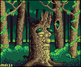 As promised, an explanation of what I`ve changed from your latest to my edit. Colours and Contrast: To start, how I always start EVEN IF the colours look pretty okay, I shift the hues further. Take that yellowish highlight on his face and make it a bit warmer. Take the reds, make èm redder. Shadows a lil bit darker. Taking another look, I think I made your greens bad. They were muuch better before I touched em. The rest of it, though, I think the changes I made help the piece out more than they hurt it. Structural and rendering issues: This was the next step, as it is easily the biggest issue I`ve got with this piece, so far. Your tree has an AWESOME Face (You`ll notice I didn`t touch it at all :O) but the rest of the tree is... meh. It looks kind of flat. ...which is fixed by changing the shading and adding some bounced light (everything that catches light reflects it, so you`ll get the secondary lighting if there are other objects kicking around that can bounce light) Next up was the roots. They all come toward the viewer, and they all are... more or less there for the sake of being there. Tree roots tend to go randomly in all directions and usually give a sense of balance to the tree. I changed your roots up a bit to try and give it that sense of balance. What I did could certainly be improved upon, but that`s for you to figure out. Thirdly, his head didn`t make any sense. At first glance, I thought it was supporting a canopy (of leaves), but a closer look revealed that you want it to look kinda broken off. What I tried to do to fix this was to make the break-off more believable. Take a look at some pictures of trees, or remember if youve chopped down trees yourself. Trees don`t break off on a level plane unless they`ve been hacked through with a chainsaw. I tried to make some axe-cuts and a kind of ripped-off point, but what I`ve done can DEFINITELY be improved upon. And changed completely. I think that`s enough, for now :D Good luck, I look forward to updates! ------------- "I was minding my own business and walking across a pebbled path, and a Duck started giving me the business." |
Posted By: Pixel_Outlaw
Date Posted: 16 April 2008 at 11:08pm
|
This is coming along nicely. ------------- http://www.shmup-dev.com/forum/">
|