Whoa no wai d00d!
Printed From: Pixel Joint
Category: Pixel Art
Forum Name: WIP (Work In Progress)
Forum Discription: Get crits and comments on your pixel WIPs and other art too!
URL: https://pixeljoint.com/forum/forum_posts.asp?TID=6608
Printed Date: 12 June 2026 at 10:13am
Topic: Whoa no wai d00d!
Posted By: RichardisRaving
Subject: Whoa no wai d00d!
Date Posted: 03 June 2008 at 4:32pm
|
Hello everyone!  |

Replies:
Posted By: Shougi
Date Posted: 03 June 2008 at 5:01pm
| The Serratus muscles beneath his pecs look really odd, also it seems like he has no ribs at all, his abdomen just flows into his Pectoral muscles. I do like the style of your drawing though, I would work on trying to make the forms more unified as it is right now it appears like his skin is torn off and just his muscles are showing. |
Posted By: RichardisRaving
Date Posted: 03 June 2008 at 5:57pm
Thanks for the feedback! I did some edit, added some more leg and what-not. I hope I understood correctly...
 |
Posted By: Indigo
Date Posted: 03 June 2008 at 7:02pm
|
the following was also posted at Pixelation... its clear to me that you may understand a bit about various muscle groups - but you've failed to study how they flow together. here is an image I whipped up to help demonstrate what would take much too long with words... 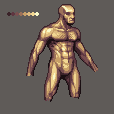 Anatomy: I wont say much here other than study my edit, but more importantly - study from photo-reference. I don't claim to be perfect at anatomy, but you cannot go wrong with photos. Palette: firstly, I adjusted your palette to be a bit more even across the ramp. Your last shade made no sense in how it jumped to a ridiculously high saturation. some colors were too close together, and others were too far apart Composition: You need to grasp a sense of depth and forms. utilize your palette to show these things. Currently you're barely making use of it at all - barely even touching your darks only for the outlining of things. Try not to think of lines, but rather shapes.... and how the light would react to these shapes. Also, try flipping your canvas horizontally occasionally while you work. This will help resolve a lot of symmetry issues you're currently having. -Dan ------------- |
Posted By: RichardisRaving
Date Posted: 03 June 2008 at 10:04pm
|
Thank you for the great advice indigo(in both forums)
Using the improved palette and a reference for the chest and abdominals
ref: ( http://www.videocodelab.com/Myspace-Codes-Posters/myspace-codes-posters-31.jpg - http://www.videocodelab.com/Myspace-Codes-Posters/myspace-codes-posters-31.jpg )
This is part of the improved sprite.
 |
Posted By: Metaru
Date Posted: 03 June 2008 at 10:25pm
 please refrain from working over other people's edits. such thing mean no improvement for you, as these are made for you to be studied -not copied- ------------- I ate leel's babies |
Posted By: RichardisRaving
Date Posted: 03 June 2008 at 10:34pm
|
Oh, sorry.
To clarify I didn't simply edit his edit. Just making sure no one thought that...
I'm glad I didn't finish that :P
|
Posted By: Indigo
Date Posted: 03 June 2008 at 10:48pm
|
call me crazy, I dont see where he supposedly worked off my edit. anything that lines up probably does so because *I* worked off his original piece. yup... you can definitely tell that he didn't just paint over mine. good job, RichardIsRaving ------------- |
Posted By: RichardisRaving
Date Posted: 03 June 2008 at 11:11pm
|
Thanks again! I didn't want people to think of me as a theif or anything so I started from scratch...This is what I have now (so far) 
|
Posted By: cure
Date Posted: 04 June 2008 at 12:10am
|
I think it'd be best to sketch out the basic forms first, get the whole body down, have all your volumes worked out, then go in and detail. Indigo: The asinine "good job man" wasn't necessary, you can make your point without being condescending. Unless I've misinterpreted the intended recipient of the remark, and you were in fact complimenting the progress, in which case, carry on. ------------- |
Posted By: Indigo
Date Posted: 04 June 2008 at 2:45am
|
it was a genuine remark directed at the creator of the artwork, cure. No need to cause a scene ;) edited the post to make that more clear. ------------- |
Posted By: cure
Date Posted: 04 June 2008 at 11:46am
|
Cool. I was confused as to why good ol' Dandigo would cop an attitude for not reason. Thanks for clearing it up, sorry for the misinterpretation.
------------- |
Posted By: RichardisRaving
Date Posted: 04 June 2008 at 2:52pm
I'm almost done...I think. Anyway, I think something is wrong with the legs.
 EDIT:
 |