Guy with sword...AND SPUD NUDITY.
Printed From: Pixel Joint
Category: Pixel Art
Forum Name: WIP (Work In Progress)
Forum Discription: Get crits and comments on your pixel WIPs and other art too!
URL: https://pixeljoint.com/forum/forum_posts.asp?TID=678
Printed Date: 12 September 2025 at 11:52pm
Topic: Guy with sword...AND SPUD NUDITY.
Posted By: Godslayer
Subject: Guy with sword...AND SPUD NUDITY.
Date Posted: 06 August 2005 at 7:33pm
|
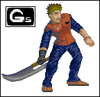
<grumbles> So, um, I'm sort of apprehensive about this, seeing as everyone here is so hardcore awesome, and I'm, sorta, not, knawaddamean? Anyways, rip this apart I guess, I want mostly to know about my shading, that being the biggest thing on my pixel to-do list. http://imageshack.us"> A 25 year old dude in the year 2010, member of the local medieval warfare recreation dudes (MWRD, to you peasants ;D) hefting a nice wee-er, huge sword.
Hokaye. This is pixelart^.That is a nice pixel you might say. Round?- I mean, uh, blow me away with C+C please! ------------- Oi. |
 http://imageshack.us -
 Replies:
Posted By: ryan-gfx
Date Posted: 06 August 2005 at 7:41pm
|
I like it. But I dont like the red outline. It kinda ruins it, and it's too trendy.
------------- |
Posted By: Godslayer
Date Posted: 06 August 2005 at 7:45pm
|
Changed it o__0; ------------- Oi. |
Posted By: EyeCraft
Date Posted: 07 August 2005 at 8:15am
|
Great stuff! Really good in fact. I really like how youve used some
colours, like the shadow on the left of the torso, thats great. Hmm what could I suggest for this, his ungloved hand is a little hard to make out, perhaps it needs just a little of a darker tone in there to give some definition. And the only other thing I could say is how you have your colours distributed, its mainly on the legs. Just watch for clashes between bright tones and shadow tones, you might need to get a tiny be of AA in there to smoothen. I would daresay such a liberal use of your highlight tone on the entirity of the legs is sort of killing the shading. Try to imagine the texturing, the wrinkles to be precise, not being there on the legs, as far as I see it there would be no real lighting on the legs, if you get me. Basically Im just saying youve got shadow tones in zones of highlight and highlight tones outside zones of highlight and its working against the overall shading of the character. THERE! I think I got out what I trying to say   |
Posted By: Godslayer
Date Posted: 07 August 2005 at 9:39am
|
So. Uh, the highlights are too harsh, is that what your saying?
Also, thank you for the compliment, my palletes are a source of difficulty, I'm glad someone likes a bit of it. ------------- Oi. |

Posted By: Lawrence
Date Posted: 07 August 2005 at 10:07am
|
Yeah, the blue marerial it too shiny, it almost looks plastic. Also, I
think there are a lot of unecessary creases/folds there, it looks like
he has never used an iron, lol. If you look at your own jeans, you
should notice that the folds are usually only around the knees, groin,
and feet, and even then, they are usually quite subtle. I like how you've used that shade of teal for the shadow on the left. |
Posted By: Godslayer
Date Posted: 07 August 2005 at 10:10am
|
The pants arent jeans, they aren't even cloth, just to say. They're like those lightweight, satiny smooth sports pants. I wanted to make it adidas, but I couldnt fit the stripes.
I would never shade jeans like that. ------------- Oi. |


Posted By: So-lou
Date Posted: 07 August 2005 at 8:53pm
|
Originally posted by Godslayer
This is pixelart^.That is a nice pixel you might say. Round?- I mean, uh, blow me away with C+C please!
HA! I get it! End of the world. :D "And Australia is like....double you tee eff mate? But they'll be dead soon....f**king kangaroos...." ------------- -So-lou |
Posted By: Godslayer
Date Posted: 07 August 2005 at 9:00pm
|
"But I am le tired..." "...Well, take a nap." "THEN FIRE ZE CIGARET--MISSILES!"
Very funny. Anyways, I got some feedback from Lief on pixelpolis, and I'm doing some editing.
------------- Oi. |
Posted By: Godslayer
Date Posted: 07 August 2005 at 9:31pm
|
Sorry for double post, but I thought you guys would like to see an edit:
And an entirely new guy for you peeps to look at: The Taterman of Spudia, Ebeneezer.
------------- Oi. |

Posted By: EyeCraft
Date Posted: 07 August 2005 at 11:10pm
|
Ahh I think the hand is much better. I know what kind of material you
mean now, but I dont think there would be wrinkles on the top of his
left leg, it would sort of just drape down. The spud dude is great, some fine fine palette work. |
Posted By: Godslayer
Date Posted: 08 August 2005 at 4:43am
|
His left or our left? That spud is does have some cool colors, doesnt he? ------------- Oi. |
Posted By: EyeCraft
Date Posted: 08 August 2005 at 4:51am
| Hmmm both legs now that I think about it... |
Posted By: Godslayer
Date Posted: 08 August 2005 at 5:00am
|
I don't all together agree with that, thank you for the crit though. It's just that he's idle and bending his legs, so the pants have been ruffled a bit and theres as of yet no reason to unruffle. Yea? But if you really insist, I'll try an edit. ------------- Oi. |
Posted By: randomblink
Date Posted: 07 September 2005 at 8:13am
|
Taterman rocks... The other guy is pretty cool too... ------------- www.randomblink.com I am me... no! Really! |