WIP My first stuffs
Printed From: Pixel Joint
Category: Pixel Art
Forum Name: WIP (Work In Progress)
Forum Discription: Get crits and comments on your pixel WIPs and other art too!
URL: https://pixeljoint.com/forum/forum_posts.asp?TID=679
Printed Date: 12 September 2025 at 11:52pm
Topic: WIP My first stuffs
Posted By: psychokitten
Subject: WIP My first stuffs
Date Posted: 06 August 2005 at 10:46pm
|
ok, so I'm fairly new to real pixel art. I've been editing other peoples sprites sometimes for fun, but I just got recruited to do this guys game and i thought i should get some skills
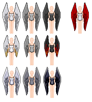
a base that may or may not be used in the game. itll be an MMORPG, which is why there are different ones... if that makes sense.
A thing I thought I'd do for fun. The version on the left is more finished, but i might ditch that head later coz I don't like it much. |
Replies:
Posted By: Zoomrix
Date Posted: 07 August 2005 at 12:00am
|
Originally posted by psychokitten
Please comment and be harsh. You asked for it. Ok, I would assume you would be a doll pixel artist, because from what I see it looks like it. The first thing that I noticed was how low contrast you have on almost all the wings of the sprite version. I think you need to add more shading to them too, to add more detail and show that it's made of feathers... not plastic. Oh shoot, Sorry I would write a little bit more, but I'm running out of ideas and barely have time. But I would love to see some progress and updates ------------- http://zoomrix.com - My Portfolio |

Posted By: EyeCraft
Date Posted: 07 August 2005 at 7:52am
|
Hello psychokitten. I enjoy your name. The figures have not enough contrast, definately, theres almost no shadow on them at all. The black outlines of the wings mismatch with the light coloured outline of the figures. Also the costumes on the bodies are pillow shaded, pick a specific light source and shade off that and things will look a lot better quickly  . . The second pic is very nice outline indeed, keep it going |
Posted By: psychokitten
Date Posted: 14 August 2005 at 5:18am
|
Hi guys, sorry for late reply, my computer got all f***ed up.
and here's the updated version of the angels, with slightly better shading. I would rather not do any more on these, since they will probably not be used in the game anyways.
And finally my first isometric stuff ever
|
 . They were alot harder then I expected, and I still hate them. Any suggestions?
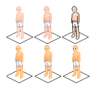
Posted By: EyeCraft
Date Posted: 14 August 2005 at 6:06am
You've got to watch out for consistency on perspective with iso. Iso
has the same angle on everything. The feet on the figures are on a
different angle to the shoulders and the waiste. Compare: |
Posted By: Rifts
Date Posted: 14 August 2005 at 9:26am
|
some good work for your 1st stuffs :P but like eye said u have 2 check
the angles. also in that colouring of the blue cat person, the sadeing is ok but u have mixed up the light source on the left leg, as on the rest of the body the shadow is on his left, on the left leg the shadows on the right 
|
Posted By: Zoomrix
Date Posted: 14 August 2005 at 10:45am
|
Originally posted by psychokitten
I would rather not do any more on these, since they will probably not be used in the game anyways. Awww, that's a shame. ------------- http://zoomrix.com - My Portfolio |
 I really think that these wingy girls have a lot of potential waiting to burst out.
Posted By: kankki
Date Posted: 14 August 2005 at 10:50am
Woooooooooooow! I  your 1337 R0XX0R images your 1337 R0XX0R images------------- Well, duuuh, I can eat spam if I have to! 
|
Posted By: psychokitten
Date Posted: 16 August 2005 at 12:20am
| doublepost |
Posted By: psychokitten
Date Posted: 16 August 2005 at 12:22am
Thanks again for comments everyone  Eyecraft, you're completely right about the perspective thing. I made a
new version with a better face and the shoulder is sorta fixed.
Eyecraft, you're completely right about the perspective thing. I made a
new version with a better face and the shoulder is sorta fixed.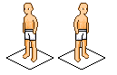 The guy I'm making the game with has stopped answering my emails though, so I'm not sure if there's much point in me making more game sprites. And I guess since you put it like that Zoomrix I'd better keep playing with that angel girl >.< |
Posted By: Zoomrix
Date Posted: 16 August 2005 at 12:49pm
|
Yay! You have improved on the isometric guy, but on the left version his right (our left) shoulder looks slanted, I think it could be more up as EyeCraft demonstrated with the red markers. Good job. ------------- http://zoomrix.com - My Portfolio |

Posted By: psychokitten
Date Posted: 22 August 2005 at 3:15am
They're exactly the same guy flipped around. It's funny how the whole shape seems to change when you do that. I'm trying to make it look like it's accurate when you flip it both ways 
|
Posted By: Wannahlakujuu
Date Posted: 22 August 2005 at 7:17am
| Wasn't this post from a long time ago? If not sorry, but I thought this was a topic kick |
Posted By: psychokitten
Date Posted: 22 August 2005 at 7:24pm
It wasn't that long ago, maybe 2 weeks  but im still working on this stuff so id rather not make a new post. but im still working on this stuff so id rather not make a new post.
|
Posted By: Wannahlakujuu
Date Posted: 22 August 2005 at 7:26pm
|
Oh, ok then, sorry |

Posted By: randomblink
Date Posted: 07 September 2005 at 7:47am
|
GAH! The guy you were working with on the game stopped responding to your emails? GAH! Vapourware... I hate it... ------------- www.randomblink.com I am me... no! Really! |