Green Ball Monster
Printed From: Pixel Joint
Category: Pixel Art
Forum Name: WIP (Work In Progress)
Forum Discription: Get crits and comments on your pixel WIPs and other art too!
URL: https://pixeljoint.com/forum/forum_posts.asp?TID=6907
Printed Date: 09 September 2025 at 7:55am
Topic: Green Ball Monster
Posted By: fucbillgates
Subject: Green Ball Monster
Date Posted: 07 August 2008 at 12:20am
|
It's a weird green ball thing trying to be camouflaged as a part of a tree. i drew when i was at work. Check it out 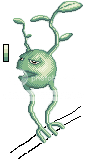 What should i do to improve it?? EDIT: 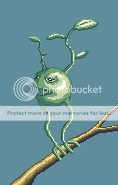 no aa but after i make the background i will add some. |
Replies:
Posted By: dro man jerr
Date Posted: 07 August 2008 at 1:04am
|
add a branch and a bg and fix the les |
Posted By: Blu
Date Posted: 09 August 2008 at 2:57pm
|
It looks pillow-shaded on the main bit/body. :/
------------- Gremlins rule the world; you just don't know it yet. |
Posted By: cure
Date Posted: 09 August 2008 at 4:20pm
|
Define your lightsource, you have several at the moment. The dithering adds unnecessary texture, ditch it.
------------- |
Posted By: Krobelus
Date Posted: 14 August 2008 at 2:17am
|
Hi guys Phoebe, I'm new here.. I'm really into art, I'm a student in IAFT. I really enjoy Photography. I am really a fan of guys who draw so well. ^_^ I'm in my second term now in http://www.filmschool.ph - IAFT. I hope I could finish soon. wish me luck guys! :) ------------- aw |
Posted By: fucbillgates
Date Posted: 14 August 2008 at 10:20am
|
OK!!!!!!! I went and changed colors and also colored the branch. What should i do for the background?? And should i add leaves on the branch?? |
Posted By: cure
Date Posted: 14 August 2008 at 1:04pm
|
Easy there chief, you don't need to go addin' all sorts of new colors for AA that you don't need, you just need to utilize the palette a bit better. You're using a few too many colors as is, tbh. There are two greens in there that are way too close in value to justify using both. The inconsistent outline is also a bit bothersome, here's a partial edit I made on the fly, it should illustrate a few points that I don't feel like explaining: 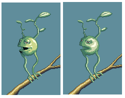 mine yours ------------- |
Posted By: Aurial
Date Posted: 14 August 2008 at 1:19pm
|
Dunno man... it seems weird, even the edits. Look at it... light source of monster body cames from right-front, but stick and monster leaves's lightsource comes from up... That is just strange ._. I guess even monsters proyects shadows... this shadow is not reflected on the stick. The design is cool, but it has a lot of basic mistakes. ------------- |
Posted By: cure
Date Posted: 15 August 2008 at 12:20pm
|
I didn't edit the leaves or the stick, just the monster's body. But that is a good point, make sure to have a consistent light source and believable shadows in the final product.
------------- |