WIP Game Graphics
Printed From: Pixel Joint
Category: Pixel Art
Forum Name: WIP (Work In Progress)
Forum Discription: Get crits and comments on your pixel WIPs and other art too!
URL: https://pixeljoint.com/forum/forum_posts.asp?TID=705
Printed Date: 12 September 2025 at 11:52pm
Topic: WIP Game Graphics
Posted By: NinjaHamster
Subject: WIP Game Graphics
Date Posted: 11 August 2005 at 1:11pm
|
Soo... I decided to make a platform-shootergame, and started to do
the most important thing (or at least funniest) first: graphics. There's the main character: Idle:  Crouching with sniper rifle (yeah, the rifle is goinq over the canvas, but it doesn't matter now):  EDIT: A "little" edit to the test screen... 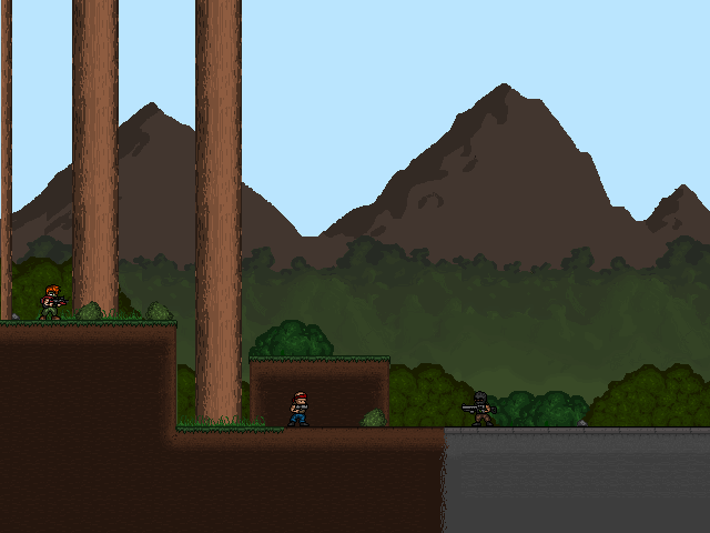 The mountains on the background are unfinished (as you can see...)... And the ground tiles are also unfinished... I have done a new walking animation, will post it today... ------------- Armed n' dangerous... |
Replies:
Posted By: Xion Night
Date Posted: 11 August 2005 at 1:29pm
|
Not bad, not bad at all... But that walk... His feet are freaking me out. It's more like a spiraly rotation than a "one foot in front of the other" kinda thing. Make the closer foot/leg a bit brighter or the further one a bit darker. Not only that, but I had to look really hard before I realised he wasn't shuffling. Those things aside, the actual mockup isn't too shabby. I like it. ...[end transmission] ------------- Kizzah! http://www.thepixelagency.com"> 
|
Posted By: Vidd
Date Posted: 11 August 2005 at 1:51pm
|
The first animation is fine. The second is hard to judge because without the arm movement it looks very stiff. How come he turns away from the screen, back to the neutral position but not towards it. The last animation seems a bit jerky but it could be due to the speed. Overall they're nice (a little dark imo though) but the mock-up looks very bland. I like the LCD numbers but the green grid's a bit boring. The blending of terrain is really rough, if you're not going to devote a colour to it why not dither it correctly? The ground looks terrible when it's on that scale, there's a huge block of flat colour; the first bit looks very nice and well blended but after that it's just that one colour. |
Posted By: Wannahlakujuu
Date Posted: 11 August 2005 at 5:09pm
| wow, like xion said, it looks like his legs are twisting around. everything else looks great, just work on the walking animation |
Posted By: Commodore
Date Posted: 12 August 2005 at 1:49am
| The interface design is bad IMO. |
Posted By: 1ucas
Date Posted: 12 August 2005 at 2:48am
|
Oooww my eyes. Why the character and the ground are so dark and the sky and background are blindingly light?
God, no. Change these colors or make it night: 
The secret is never use extremes. ------------- http://toxicdump.org/labs/frameviewer/viewer.php - Online Animated GIF Frame Viewer |
Posted By: NinjaHamster
Date Posted: 12 August 2005 at 7:02am
|
Thx, ppl... I'm pretty crappy in animating walkin, I know it. The
background in the test is just a temporary, I'm not goin' to use it in
the game. And the ground tile is WIP, I'm goin' to edit it. The last "animation" isn't an animation at all, it just shows the positions, that's why it's so slow... But huge thanks from the crits! It helps me to do better graphs for my game... :) Btw, sorry for my bad english, as you can see, I'm from Finland... ------------- Armed n' dangerous... |
Posted By: NinjaHamster
Date Posted: 18 August 2005 at 3:26am
|
I have updated the test screen... It's in the first post... Those bushes are really the first ones I have ever done... ------------- Armed n' dangerous... |
Posted By: randomblink
Date Posted: 07 September 2005 at 7:54am
|
Not bad... Good luck on this one... ------------- www.randomblink.com I am me... no! Really! |