(WIP) Little Red Riding hood
Printed From: Pixel Joint
Category: Pixel Art
Forum Name: WIP (Work In Progress)
Forum Discription: Get crits and comments on your pixel WIPs and other art too!
URL: https://pixeljoint.com/forum/forum_posts.asp?TID=7109
Printed Date: 11 September 2025 at 2:20am
Topic: (WIP) Little Red Riding hood
Posted By: Kren
Subject: (WIP) Little Red Riding hood
Date Posted: 16 September 2008 at 4:00pm
Well after a long time without posting anything here I decided to enter the pixeljoint weekly challenge with this: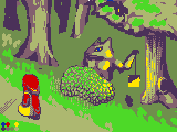 I am having some problems, but I know you can help me :D, I will be following any advice, please tell me what you think of the piece so far and how I can improve it. :d |
Replies:
Posted By: dro man jerr
Date Posted: 16 September 2008 at 7:26pm
|
good wip i like where you are going with the trees but they need more contrast |
Posted By: Kren
Date Posted: 17 September 2008 at 5:36pm
Update: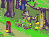 BTW dro man jerr what pat exactly needs more contrast? the leaves or the trunk? |
Posted By: dro man jerr
Date Posted: 17 September 2008 at 5:57pm
|
the trunks are good so far the leaves need another color and more comtrast |
Posted By: cure
Date Posted: 17 September 2008 at 6:54pm
|
I have not idea what contrast issue dro is referring to. The light purple doesn't work as a shadow on lil' miss hood. Right now the bush looks like a scaly rock, very hard and rigid. The road looks like it may be at too steep of an angle as well. ------------- |
Posted By: Kren
Date Posted: 17 September 2008 at 8:07pm
|
Originally posted by ThereIsNoCure I have not idea what contrast issue dro is referring to. The light purple doesn't work as a shadow on lil' miss hood. Right now the bush looks like a scaly rock, very hard and rigid. The road looks like it may be at too steep of an angle as well. wow, I msut agree with that, I don't know how to change the bush though :/ maybe making the leaves bigger and adding them in a more random way and leaving some space between a group of 3 or 4 leaves, hmm I just don't understand the steep angle, my english sucks D: Edit: After an hour of work I remade the bush: 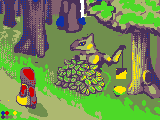 |
Posted By: Solitude
Date Posted: 17 September 2008 at 11:14pm
|
I'm a bit of a newbie Kren. Well I've been here for a while but I tend not to create any pixel art. So I'm trying to say is don't take my advise too seriously. I like what you've done so far. It's exceptionally difficult with the colors that you have to work with for the challenge. The biggest problem I see with the pic is the angle. The trees seem to be at a different angle to the road and to little red riding hood. Also it looks like little red riding hood is getting light from her right, but the shadow on the ground is at her back and her purse are getting light from the left. I'm still a newbie so I might be completely wrong of course. ;) Good work, keep it up. |
Posted By: Kren
Date Posted: 18 September 2008 at 8:35pm
Update: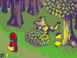 Indeed you are right Solitude, I still need to change the angle of the road and the little red riding hood,thanks for pointing that out :D, now I need to remake her, hmm even if you are noob your c+c helped me alot, now I know what I should change, I hope you like this new update.. I hate having just 3 days to finish this D:! I am leaving the little red riding hood and the wolf as one of the last part, since I want to get the environment completed first.. but I am having some hard time knowing what to add to the grass and dirt.. and more with the hard colours and dithering. |
Posted By: Solitude
Date Posted: 19 September 2008 at 1:54am
|
I'm glad I could help Kren. :) The new leaves on the tree look great! Good luck with the rest. I'll come and check every now and then. |
Posted By: Kren
Date Posted: 20 September 2008 at 6:36pm
Update: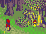 Well I progressed alot in these days, I am sure I will finish it tomorrow. |
Posted By: dro man jerr
Date Posted: 20 September 2008 at 8:52pm
|
i really like the wolf if you finish the grass this will be awesome |
Posted By: pipe
Date Posted: 21 September 2008 at 4:30am
|
I am a newb too so as Solitude said dont take my advice too seriously ;)
1.Trees in the background are a bit confusing.Their left(our left) side is shaded and that means the lightsource is somewhere on the right side but Little red Ridinghood is shaded as the lightsource is in front of her. 2.That light spot below the lamp looks like some glowing poodle of green liquid. 3.Wolf's chest looks a bit too big like he is some body builder XD 4.I dont know how to say this... the dots on her purse are placed in same order.I think if you want to make it look like it's folded you should place the dots differently I will make a little edit later because right now I am typing on my Wii and my brother is on computer.Sorry for bad English I hope you understood at least half of this post. EDIT:I forgot to mention that the shadow of a bush shouldn't have different colour from the rest of the shadow in the forest |
Posted By: Kren
Date Posted: 21 September 2008 at 11:24am
|
Well Finally I completed this, thanks to everyone who helped: http://pixeljoint.com/pixelart/35832.htm - http://pixeljoint.com/pixelart/35832.htm btw pipe, the lightsource is supposed to be the lamp and only that, the light spot below the lamp is just temporary so I know it looks bad D: now I changed it in the final one, lol yeah the wolf looks really muscular, I didn't know how else to make him, the dots in the purse are supposed to be there to make the purse darker not folded :/, the shadow of the bush is also temporary I already changed that in the final version :D! but thanks alot for mentioning that. |
Posted By: pipe
Date Posted: 21 September 2008 at 1:51pm
|
Oh, I see... sorry if I was too harsh.You used dithering for that purse, I tought dots are small holes.Anyway you should click on small picture of a tree to insert your pixel art in your post because I only see URL right now.
EDIT:Oh you wanted to put URL.Its OK now I can click on it.Yeah nice pixel art. |