image needs crits badly
Printed From: Pixel Joint
Category: Pixel Art
Forum Name: WIP (Work In Progress)
Forum Discription: Get crits and comments on your pixel WIPs and other art too!
URL: https://pixeljoint.com/forum/forum_posts.asp?TID=743
Printed Date: 12 September 2025 at 8:58pm
Topic: image needs crits badly
Posted By: Citizen_Insane
Subject: image needs crits badly
Date Posted: 19 August 2005 at 3:06pm
|
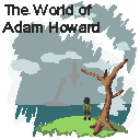
Ok, so I was given the option to make a 128x128 splash logo for the ending credits of a game I did some work on recently, and I came up with this:
It's not really a WIP... though some of the colors and stuff are still a BIT tentative, it's more or less a finished piece. Good ol' fashioned 15 color + 1. GOT CRITS?
thanks kids
image is about to die |
Replies:
Posted By: getrealjoe
Date Posted: 19 August 2005 at 9:20pm
i bet nobody had any crits because this is cooler than anyone who reads this ------------- get real |
Posted By: Citizen_Insane
Date Posted: 20 August 2005 at 2:09pm
|
thanks.. joey...
edit:
please, I'd really like just a few crits. |
Posted By: Maestro
Date Posted: 22 August 2005 at 7:38am
| Allright, so I like the overall style, but maybe you could make the big empty spaces a bit more interesting? I'm talking about the sky (well, that has something already), the sea and the grass. Other than that, it's coming along fine. But do make the tree a bit smoother, colourwise. And it has some holes of green towards the bottom. |
Posted By: Saboteur
Date Posted: 22 August 2005 at 11:21pm
|
Yeah, the colour selection at the moment could use a little improvement. Also, what's with the gash of white the cuts across the sky? Not sure what that's trying to be. And make the text a little less drab, it looks rather plain as it stands. And what's in the background... what is the guy looking at? An a positive note, I like the style. Looks like a scratch-and-win situation ------------- "I was minding my own business and walking across a pebbled path, and a Duck started giving me the business." |
Posted By: Citizen_Insane
Date Posted: 23 August 2005 at 12:20am
|
it was more of an abstract piece, maybe even surreal, or more towards that end of the spectrum at least. he's looking at some large tower in the distance, and another floating thing.. don't know what it is, either, so I can't give you a straight answer I was going for a plane look, but maybe I'll put a few more things in to make it a little more interesting.
thanks for the crits, I was really starting to wonder if I was ever gonna get any. |
Posted By: Maestro
Date Posted: 23 August 2005 at 7:09am
|
The light green at the bottom doesn't go very well with the grayish, number colours. Try changing that maybe. |
Posted By: Rifts
Date Posted: 23 August 2005 at 4:39pm
|
i like it exept the text could use some imagination.... and i dnt kno wht
that weird arrow thing in the sky is -------------  |
Posted By: Citizen_Insane
Date Posted: 23 August 2005 at 10:53pm
|
it's some floating structure, of some sort. ok, I'll change up the colors a bit and see what I come up with.. |
Posted By: pixelblink
Date Posted: 24 August 2005 at 9:06pm
|
The text definitely needs some spicing up. Some colours on it or something else... anything else! I think the scene itself it great but it could use some defining such as the floating castle in the background. Some slightly darker lines to outline it or shade it would be good... also the bottom island thingy looks like a penis. Is it meant to look so? The clouds and sky contrast a bit too much for my tastes as well. Back to the foreground, the tree has no leaves or anything which I understand but why not add some extra tiny twigs on the branches and/or some fallen leaves on the ground ------------- |
Posted By: Citizen_Insane
Date Posted: 25 August 2005 at 12:51am
|
I was just about to applaud you for actually calling it a castle.. and then.. yeah. that was really un called for. I'm working on figuring out what to do with this piece. |
Posted By: Maestro
Date Posted: 25 August 2005 at 5:25am
|
"I'm working on figuring out what to do with this piece." |
Posted By: Wannahlakujuu
Date Posted: 25 August 2005 at 7:25am
|
Originally posted by Maestro
I'm working on figuring out what to do with this piece. What was the point of that post. Hehe... Anyway, nice job on this one, but I don't like the green specks on the bottom of the tree. I don't think you should outline the castle, just because It shouldn't stick out much. Also like they all said, the lettering, and the grass...ya |
Posted By: pixelblink
Date Posted: 25 August 2005 at 3:44pm
|
Originally posted by Citizen_Insane
I was just about to applaud you for actually calling it a castle.. and then.. yeah. that was really un called for. I'm working on figuring out what to do with this piece. I apologize but, it really does look very http://dictionary.reference.com/search?r=2&q=phallic - phallic . Anyways, would love to see some updates on this (Edit: corrected my own spelling on phallic and hyperlinked so you understand the meaning) ------------- |
Posted By: getrealjoe
Date Posted: 25 August 2005 at 4:25pm
|
it only looks like that if you're looking for it. ------------- get real |
Posted By: Wannahlakujuu
Date Posted: 25 August 2005 at 4:33pm
| I know, I wouldn't realize it. I actually had to look for it. |
Posted By: getrealjoe
Date Posted: 25 August 2005 at 4:34pm
|
why would you do something like that? ------------- get real |
Posted By: Citizen_Insane
Date Posted: 25 August 2005 at 10:47pm
|
for the record, it's supposed to be some sort of tower, and some sort of flying structure. Had I first concidered the maturity level of the forums, I probably wouldn't have even posted the piece.. |
Posted By: Saboteur
Date Posted: 25 August 2005 at 11:32pm
|
Mmm, nice putting yourself above everyone there, Citizen_Insane. Pixelblink just had the guts to point out something that would have been pointed out eventually. Probably aware that it would get yelled at. And for your desperate need for crits, I've seen no changes. Where are the updates? ------------- "I was minding my own business and walking across a pebbled path, and a Duck started giving me the business." |
Posted By: pixelblink
Date Posted: 25 August 2005 at 11:51pm
|
My maturity level is fine. I don't get the giggles or get offended by the word "penis". It is a proper term to use... others could've taken its place. Anyways, I'm pretty blunt most of the time and I had meant no offence. If you reread my post you'll see that. Back on topic though, I agree with Saboteur and I said it before... updates? None to be seen so far ------------- |
Posted By: Citizen_Insane
Date Posted: 26 August 2005 at 12:41am
|
Originally posted by Maestro
"I'm working on figuring out what to do with this piece." I was talking about this.. sorry I didn't specify. see? I'm not perfect. that's why I asked for some critttz |
Posted By: Citizen_Insane
Date Posted: 26 August 2005 at 1:21am
|
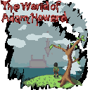
well.. sorry about everything.. here's the update. I just didn't have much time this week to do anything else other than take in suggestions.. fall semister started this week, so it's been kind of crazy.
I'm just trying a bunch of stuff.. I don't really know what to do with this. I got really frustrated with the letters so I just traced over them. |
Posted By: Saboteur
Date Posted: 26 August 2005 at 1:23am
|
Ahh, nice! Thanks for the update, definitely some improvement there. Might wanna work on the text a little more. If I didn't know it said "world" I'd not have figured it out. The castle's depictable as a castle, the foreground colours are clear and bright... as I said, nice update. ------------- "I was minding my own business and walking across a pebbled path, and a Duck started giving me the business." |
Posted By: Rifts
Date Posted: 26 August 2005 at 3:28am
|
loveing the update, the castle is much easyer to work out much better,
the black gives it more depth and the text does look much better than the last one, although it is harder to make out, mayby work on it a bit apart from that it seems gr8  -------------  |
Posted By: Maestro
Date Posted: 26 August 2005 at 5:35am
|
Yea, cool update, it's clear you're going somewhere with this now. As for further C&C, I'd advise you to spend a little more time on the borders of some areas, namely the clouds and the "frame", Id try to make them a little more delicate. And my comment up there, well. It's unecessary, I see that, but then it's neither malevolent or insulting, I made the ;) to make that clear. Everyone is in the situation of not knowing how to continue a piece sometimes, and I was being amicable. Let's just forget about it. |
Posted By: pixelblink
Date Posted: 26 August 2005 at 12:55pm
|
Yay! An update! I noticed you removed the phallic symbolism... I think it works better this way because it is more easily recognizaed for what it's for. The dark lines give it better definition now too. Nice work. Now for the things you've added which I think detract from the picture... The "frame" or whatever you wanna call it as well as the outlines on the letters... way to dark IMO. I would suggest going back to the original colour and adding some dithering to that and perhaps the clouds as well. Just noticed you've got a few leaves on the tree now too. I like that. Keep the updates coming! :) ------------- |
Posted By: inkspot
Date Posted: 26 August 2005 at 1:02pm
|
Whats that arrow in the middle of it? And the text is unreadable, at least my poor eyes cannot see it clearly. Glasses are foggy (read dirty) too.
I like the first one. Black ruins the second one. Maybe add just some lighter dark color instead of complete black? |
Posted By: Wannahlakujuu
Date Posted: 26 August 2005 at 1:13pm
| It's the castle, as stated earlier. and the text is quite readable. I like it. |
Posted By: Citizen_Insane
Date Posted: 26 August 2005 at 1:39pm
|
thanks guys instead of the black border I might just do something contrasting with the other colors... that usually works. the letters are still too unreadable.. but I like the direction I'm going with them. I don't know when I'll have another update, though.. sometime between tomorrow and sunday. |


