Pixel art Tennis
Printed From: Pixel Joint
Category: Pixel Art
Forum Name: Collaborations/Challenges
Forum Discription: Submit pixel art project ideas/templates or contribute to an existing pixel art collaboration.
URL: https://pixeljoint.com/forum/forum_posts.asp?TID=7893
Printed Date: 05 November 2025 at 12:26am
Topic: Pixel art Tennis
Posted By: Hapiel
Subject: Pixel art Tennis
Date Posted: 16 February 2009 at 3:34am
|
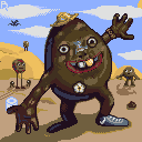
So, when you are completely bored. Demotivated. Uninspired and even the OT topic cant bring a solution for your lazy butt. You can now come and play Pixel Tennis Let me explain: There is an image. One modifies it (no redrawing). Canvas size stays the same. Your edit MUST be pixel art. NPA tools are not allowed. Next one modifies it again And again. Modifing can be anything. Putting in a joke, selecting better colors, dithering someone elses work, putting your sign at the bottom, whatever. As long as you respect others work (do not just remove what the last guy posted), and do not change the canvas size, everything is fine! Good luck! Starting image nr1 (by platnium):  Current version nr1 (v6):  Starting image nr2 (by dogmeat):  Current version nr1 (v14):  Edit one of the current versions of whatever image you like. It can take 10 seconds or 10 minutes, whatever you like! |
Replies:
Posted By: Dr. Grammer
Date Posted: 16 February 2009 at 11:44am
 Is this an okay edit? ------------- Misspelled name is on purpose. |
Posted By: Hapiel
Date Posted: 17 February 2009 at 3:07am
of course its okay! ------------- |
Posted By: skamocore
Date Posted: 17 February 2009 at 3:53am
|
What was wrong with your http://pixeljoint.com/forum/forum_posts.asp?TID=5091 - other thread ? erm anyway: 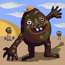 I think this was a little over 10 mins D: ------------- |
Posted By: Dr. Grammer
Date Posted: 19 February 2009 at 10:55am
Where's the light source in this image? From the shadow of Mr. Craptastic and the dune it's from top right but everything else says it's top left.
 Here's my new edit. ------------- Misspelled name is on purpose. |
Posted By: Antiboton
Date Posted: 19 February 2009 at 10:59am
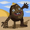
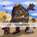
Here is my contribution: |
Posted By: Damian
Date Posted: 20 February 2009 at 5:01am

So thats a little something I did to help ;) I'm really sorry I went all out with the colours. you guys seem to be playing it safe. Experiment! and if there's something you don't like...well then get rid of it! This Edit took me 10 mins. Changed: The Hat, eye's Some AA(not all though and not properly), flower? sand dunes. one of the blokes in the bacgground. Well this is fun. Someone do more!!!! ------------- |
Posted By: skamocore
Date Posted: 20 February 2009 at 5:41am
 Time: 10 mins. ok, I'm making a executive decision here, the light source is coming from the top right.
------------- |
Posted By: Damian
Date Posted: 20 February 2009 at 6:33am
|
The ambient light is working wellish. Its a good thing as there are to many warm colours so to introduce cooler colours gives a sense of balance and really adds volume to the dude ;) I'm going to have another go :D ------------- |
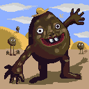
Posted By: Damian
Date Posted: 20 February 2009 at 7:19am
Sorry for double post XD

Small things -finger are anatomically to big, so reduced the amount by one on each hand :D -Some more AA and also started on the sand texture and mini dunes, but don't have enough time and any references XD 10 minutes! lets do this guys. This is really fun ! ------------- |
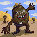
Posted By: Platnium
Date Posted: 21 February 2009 at 4:45am
Well, I increases the canvas size because if loads of people join in there in then there won't be much to do, so I made it bigger, and since he is poo I added some thing to clean him up and small poo rock, lol. ------------- 
|
Posted By: Damian
Date Posted: 21 February 2009 at 4:57am
|
Rules are rules I'm afraid. We'll have to make it normal size again as it would corupt our lovely WIP animations in the end. So here it is in normal size again.
Anyway. You can add,change and more, so why increase the canvas size. Please reduce it to noraml size and some lovely weird stuff there Plat ;) Nice to have something that associates with you(Also the P in the clouds  ) )
And I guess its Lollige's choice to increase canvas size. Read please. Whats up with you lately? ------------- |
Posted By: Hapiel
Date Posted: 21 February 2009 at 5:38am
|
Those rules were based on the origina idea for this: Photoshop tennist.
But since we are at the moment just improving stuff, and not really
adding stuff the way that goes with what I had in mind, the keep the
canvs size rule does not have a function, except that I prefer not
everyone to change it every time. I will remove the rule, and plats thing is fine :) Noone willing to work on the other image? ------------- |
Posted By: Platnium
Date Posted: 21 February 2009 at 6:38am
I will!
 I'll let someone else make the blood look better... -------------
|
Posted By: skamocore
Date Posted: 21 February 2009 at 6:38am
|
IMO,keeping the canvas size as it is is a good idea. As Jim said, it means we can create a nice WIP animation at the end. It's probably best if we just work on perfecting what we have rather than continuously adding more and more. If we add a million new things to the image then it will probably result in a huge drop of quality and we'll never end up finishing it. ------------- |
Posted By: Hapiel
Date Posted: 21 February 2009 at 8:07am
|
ok, ill put the rule back, I am convinced. Plat! That is the kind of jokes I was hoping to see in this topic! Great stuff! How about generally keeping that image for jokes, and the potato man for improvement? ------------- |
Posted By: Photocopier
Date Posted: 22 February 2009 at 7:40am
 a total colour edit, I prefer it this way but I won't be offended if you tell me why I'm wrong and the edit doesn't work. |
Posted By: Hapiel
Date Posted: 22 February 2009 at 2:15pm
|
This is really not an improvement. Hard edges, wrong colors, weird mixing background tone, no inbetweens, I am not going to put this in as an update, since you did not add anything.
------------- |
Posted By: Metaru
Date Posted: 22 February 2009 at 3:22pm
|
that color edit makes no sense
------------- I ate leel's babies |
Posted By: jeremy
Date Posted: 22 February 2009 at 4:04pm
Too much?
 I tried to keep the same colours, added one I think.
|
Posted By: Hapiel
Date Posted: 23 February 2009 at 7:20am
|
Nope, just perfect :) ------------- |
Posted By: Metaru
Date Posted: 23 February 2009 at 10:22am
why not no ice skating isohorses were killed ------------- I ate leel's babies |
Posted By: Platnium
Date Posted: 23 February 2009 at 11:29am
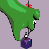
Little horse in the background comes to save the day! -------------
|
Posted By: Haay
Date Posted: 28 February 2009 at 3:43am
|
I added some content. I am not entirely happy with the grass but I think adding something like rocks and bigger plants might break the monotony. |
Posted By: skooba-dude
Date Posted: 24 April 2009 at 10:25pm
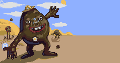
 added-watch, dragon in sky, nike shoe, gold tooth, a tiny bit of AA.
------------- |
Posted By: fucbillgates
Date Posted: 27 April 2009 at 12:08pm
Made the sky have 3 colors.
|
Posted By: Igthorn
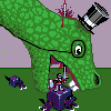
Date Posted: 24 May 2009 at 4:43am
Added a bandana and made the knee further away from the sun darker
|