CHALLENGE 6/29/2009: The Mysterious Glow
Printed From: Pixel Joint
Category: Pixel Art
Forum Name: Collaborations/Challenges
Forum Discription: Submit pixel art project ideas/templates or contribute to an existing pixel art collaboration.
URL: https://pixeljoint.com/forum/forum_posts.asp?TID=8643
Printed Date: 31 May 2026 at 2:17pm
Topic: CHALLENGE 6/29/2009: The Mysterious Glow
Posted By: administrator
Subject: CHALLENGE 6/29/2009: The Mysterious Glow
Date Posted: 29 June 2009 at 12:02am
 Are you gonna believe it fisherman ? by /p/17579.htm' target='_blank'>Ergg
 I Wouldn't Open That... by /p/13995.htm' target='_blank'>Onichi
 Mysterious glow by /p/6741.htm' target='_blank'>Fool
 Mysterious light by /p/17898.htm' target='_blank'>minipuck
Replies:
Posted By: generatedanomaly
Date Posted: 29 June 2009 at 2:40am
| Sweet! I've got a bit more time this week, so hopefully I'll be able to take part :). So now I've got to come up with a concept... |
Posted By: minipuck
Date Posted: 29 June 2009 at 4:32am
|
same, schools over after tomorrow so i'll have time to participate. edit: wip  ------------- http://dragcave.net/viewdragon/G3eW"> 
please click it, otherwise it will die, and it seems special. |
Posted By: ellie-is
Date Posted: 29 June 2009 at 5:33am
| My vacations finally started, so hopefully I ll be able to actually finish something this time... xD |
Posted By: Eldorn
Date Posted: 29 June 2009 at 5:55am
A little wip : |
Posted By: minipuck
Date Posted: 29 June 2009 at 6:18am
man that took long ------------- http://dragcave.net/viewdragon/G3eW">
please click it, otherwise it will die, and it seems special. |
Posted By: Peeter
Date Posted: 29 June 2009 at 6:25am
| Does a night scene with a glowing moon count as a mysterious glow? |
Posted By: minipuck
Date Posted: 29 June 2009 at 6:29am
|
well it is misterious, HOW DOES THE MOON GLOW!?!?!??! yes i know why it does, but you could act really stupid and say that. ------------- http://dragcave.net/viewdragon/G3eW">
please click it, otherwise it will die, and it seems special. |
Posted By: orenshtiv
Date Posted: 29 June 2009 at 7:04am
|
that look's great minipuck! :D hwo knows,maybe I'll vote for you. |
Posted By: orenshtiv
Date Posted: 29 June 2009 at 7:08am
here's a WIP: I'm thinking make it an alien,that would be cool.. so...what do you think?... |
Posted By: ellie-is
Date Posted: 29 June 2009 at 8:41am
Ignore the really sh*tty dithering on the right side x)

Any ideas? I am not sure on how to finish this. |
Posted By: Peeter
Date Posted: 29 June 2009 at 9:13am

My WIP. Don't ask why there isn't any glow. There is going to be a moon soon. C+C |
Posted By: Kagirinai
Date Posted: 29 June 2009 at 9:38am
| This sounds like a fun one -- my brain keeps coming back to ideas that are less 'mysterious' and more 'ridiculous', however. I'm thinking I'll use just a greyscale pallet, and hopefully I'll post some WIP this time. :D |
Posted By: orenshtiv
Date Posted: 29 June 2009 at 1:58pm
|
I did it!, I finished :P ../pixelart/44400.htm"> |
Posted By: Someone
Date Posted: 29 June 2009 at 8:51pm
sounds fun, this could get very interesting....well its my second week here at pixel joint and my second challenge so here is my WIP |
Posted By: Lahra
Date Posted: 29 June 2009 at 10:03pm
Up to now, I have this. I make it smaler

|
Posted By: minipuck
Date Posted: 29 June 2009 at 10:58pm
|
yayayayayaya update: someone told me that maybe i should try blues or greens for the lighting, as it's more misterious, so here it is.  ------------- http://dragcave.net/viewdragon/G3eW">
please click it, otherwise it will die, and it seems special. |
Posted By: skamocore
Date Posted: 29 June 2009 at 11:01pm
|
@Someone - An interesting interpretation of the challenge, but I think it would be a good idea to remove the text, it doesn't do anything for the piece as the ant's thoughts are clearly implied. ------------- |
Posted By: Celri
Date Posted: 29 June 2009 at 11:05pm

|
Posted By: skamocore
Date Posted: 29 June 2009 at 11:27pm
|
@Celri, I can't understand why you are saving these WIP images as jpegs, it only serves to make it harder for anyone to give any kind of reasonable critique on your pixeling techniques. Also, I suggest you consider reducing your canvas size. I know the challenge calls for at least 100x100, but I think it would be beneficial if you limit the canvas size in order to gain greater control over individual pixels. ------------- |
Posted By: Celri
Date Posted: 29 June 2009 at 11:50pm
|
@skamocore
Thanks for the suggestions - last I looked I saved it as bmp...must've uploaded it incorrectly into tinypic - my apologies (will attend to immediately).
As for the size - I like it that way and I am experimenting a little - so please bear with me
 PS: Have decided that I'd rather not post WIPS anymore as they are so obviously annoying.
Anyway - I went back to tinypic - the file I upload is a bmp but it is somehow converted into a jpg when uploaded into their database...don't really know how to get around that...
|
Posted By: minipuck
Date Posted: 30 June 2009 at 12:23am
|
Originally posted by Celri @skamocore Thanks for the suggestions - last I looked I saved it as bmp...must've uploaded it incorrectly into tinypic - my apologies (will attend to immediately).
As for the size - I like it that way and I am experimenting a little - so please bear with me
PS: Have decided that I'd rather not post WIPS anymore as they are so obviously annoying.
Anyway - I went back to tinypic - the file I upload is a bmp but it is somehow converted into a jpg when uploaded into their database...don't really know how to get around that... save it as .gif or .png ------------- http://dragcave.net/viewdragon/G3eW">
please click it, otherwise it will die, and it seems special. |
Posted By: Celri
Date Posted: 30 June 2009 at 12:40am
|
@minipuck
Thnkx - will do =)
|
Posted By: Burnthemdown
Date Posted: 30 June 2009 at 12:54am

My W.I.P, its pretty rough atm..
|
Posted By: Celri
Date Posted: 30 June 2009 at 12:58am
| Too cool! I like! |
Posted By: ShoySlayer
Date Posted: 30 June 2009 at 3:02am
|
i'll join, progress:  |
Posted By: pinkfish
Date Posted: 30 June 2009 at 3:18am
I've done a small outline for a glowing frog. Going to go crazy with the colours/shading tomorrow. Any ideas about the line art? I am new.

I used this as a reference image. http://animals.nationalgeographic.com/staticfiles/NGS/Shared/StaticFiles/animals/images/primary/red-eyed-tree-frog.jpg - Frog Picture |
Posted By: Someone
Date Posted: 30 June 2009 at 9:07am
update: |
Posted By: God_Is_Evil
Date Posted: 30 June 2009 at 11:14am
I sorta got started on my pic, But I'm not sure if i will end up getting it finished by the end of the week. It's a dragon looking at a dragon egg that's about to hatch and will be glowing, I'm going to switch the scene to a cave so i can have more stuff to cast light on. I need to add some scales to the dragon and give it horns, I was also thinking that i could add part of it's wings and hands. member_profile.asp?PF=22498&FID=1 - Burnthemdown :: I would not use dithering on the teeth just because dithering on a shiny surface makes it look gritty, So unless you want the teeth to look gritty or like they have a rocky texture I would avoid using dithering on them. You can use dithering and still make some thing look smooth but it's hard. |
Posted By: Burnthemdown
Date Posted: 30 June 2009 at 12:38pm
|
Originally posted by God_Is_Evil
member_profile.asp?PF=22498&FID=1 - Burnthemdown :: I would not use dithering on the teeth just because dithering on a shiny surface makes it look gritty, So unless you want the teeth to look gritty or like they have a rocky texture I would avoid using dithering on them. You can use dithering and still make some thing look smooth but it's hard. Thanks for the tip, I always seem to want to completely dither everything when I pixel, lol.. I was kinda going for gritty and dirty, with the yellow and brown tints so i guess the dither kinda did help the colors I used. I'll try and not use as much dithering in later pieces
 |
Posted By: Lahra
Date Posted: 30 June 2009 at 12:47pm
Up to now,

|
Posted By: God_Is_Evil
Date Posted: 30 June 2009 at 1:22pm
|
member_profile.asp?PF=22498&FID=1 - Burnthemdown :: You can use tons of dithering on a picture but when your dithering cirtain surfaces you could reduce the dithering to help make it look shiny or smooth. Check out this picture http://www.pixeljoint.com/pixelart/2812.htm notice how the plane has WAYYYY less dithering then the clouds, smoke, glass, ect ect but still a little. member_profile.asp?PF=21997&FID=1 - Lahra :: When your doing the lighting on the hands remember that light shines threw your skin. Check out this photo. http://wysewomen.org/iStock_000000153526Small%5B1%5D.jpg%20holding%20light.jpg |
Posted By: Lahra
Date Posted: 30 June 2009 at 1:26pm
|
Thank you,
I will process it |
Posted By: susuwataris
Date Posted: 30 June 2009 at 1:33pm
| Minipuck, i love it. |
Posted By: 0xDB
Date Posted: 30 June 2009 at 1:34pm
|
"The Mysterious Glowjob" rough start, based on yesterdays brainfart(edit: linking seems broken: http://img5.imageshack.us/img5/6837/2009062902.png): (obviously very unrefined and far far away from being pixelart yet, also I don't know if I'll have time to finish this before the deadline)  |
Posted By: Lahra
Date Posted: 30 June 2009 at 1:50pm
Like this?

|
Posted By: Celri
Date Posted: 30 June 2009 at 1:52pm
| Totally love it! Freaky eyes and all! |
Posted By: ellie-is
Date Posted: 30 June 2009 at 2:00pm
|
Anyone has any ideas on what I could improve on mine?
And Lahra, I think your picture has too little contrast in it. You could try adding some, otherwise it gets a bit boring. Dennis, I really like yours so far. |
Posted By: Celri
Date Posted: 30 June 2009 at 2:31pm
|
@ Lucas
I think, maybe, you could add a hint of a shoulder - the head would seem less detached... I like the limited palette - very difficult as it can look very stark. Maybe animate the twinkle in the eye?
|
Posted By: ellie-is
Date Posted: 30 June 2009 at 3:19pm
Kinda like this?

|
Posted By: Celri
Date Posted: 30 June 2009 at 3:28pm
|
Yeah...I think it's working...now all you need to decide is whether the sparkle in his eye is the "mystery" or if you're going to add an external light source
|
Posted By: God_Is_Evil
Date Posted: 30 June 2009 at 3:45pm
|
You could move him to the right more and add a secondary light source that reviles his dark side. you could even make the secondary light source have color. like this..  |
Posted By: ellie-is
Date Posted: 30 June 2009 at 4:18pm

Kinda like this? I will try to add some more stuff later. EDIT: Or this. 
|
Posted By: God_Is_Evil
Date Posted: 30 June 2009 at 4:33pm
|
Yah, that's the general idea of what i was saying. Just whatever you think of, i was just suggesting a direction you could take the picture if you want to. there is a unlimited number of directions you could take the picture. You could have the dark side turn into a crazy star field and have his eye by the north star. You could make the dark side be a robot and the shinny eye be light reflecting off of his robot eye lens. whatever works. |
Posted By: slym
Date Posted: 30 June 2009 at 5:30pm

Its still wip. I hate the colors right now. I'll update it soon. |
Posted By: ellie-is
Date Posted: 30 June 2009 at 5:53pm
|
Lots of directions I could take, yes.
Slym: Not bad. I am guessing that you still havent added the glow? And what's your avatar doing? x) |
Posted By: God_Is_Evil
Date Posted: 30 June 2009 at 8:55pm
|
I added some scales but i still have to remake the background and add the glow.  |
Posted By: Dr D
Date Posted: 30 June 2009 at 9:09pm
|
@lucas Looks pretty nice, but it doesn't really make sense. (If it doesn't bother you, then by all means, keep going.) If light was hitting his face, as we on the left of his face, naturally, the skin color would be shown.. in color. (Unless he was really pure white for some reason.) Thus making me believe that the black-and-whiteness is more of a stylistic choice. Having color on only one part of the picture kind of confuses that. Anyways, the contrast between b-n-w and color is nice. @God_Is_Evil Looking GREAT, keep it up. @slym I think maybe you're trying to apply a little too much detail in such a small space. Increase the size, maybe magnify the picture a little. I assume you're going to add the glow inside of the hole in the trunk of that tree, that would be a nice place for it, but if you do, I feel that it would be too small. In fact, I think the picture is too small altogether. I'd love to see your work in a larger area. Keep it up. @Dennis Also looking great, I seem to be enjoying the drawing more at this point, but I'll say that's just due to the WIPiness. You seem to know what you're doing, I look forward to a finished version. @lahra Much too dark, and too little contrast, like was mentioned. You could probably do without the dithering, too, just use some extra colors, and shade some folds into the fabrics, and extra details, to make things less flat. Shade according to the glow. |
Posted By: God_Is_Evil
Date Posted: 30 June 2009 at 9:19pm
|
I was bored so i made a example of the star idea i was talking about.  |
Posted By: susuwataris
Date Posted: 30 June 2009 at 11:00pm

I'm not sure if this works for the challenge or not, what do you guys think? It's just an early wip. |
Posted By: Celri
Date Posted: 30 June 2009 at 11:05pm
| Really cool idea! Why don't you add red to your palette - the digital data can then provide an interesting contrast ... just a suggest - I love |
Posted By: Elk
Date Posted: 30 June 2009 at 11:32pm
|
Originally posted by Lahra Up to now, I have this. I make it smaler
Please provide the reference for this |
Posted By: Lahra
Date Posted: 30 June 2009 at 11:35pm
|
I draw it on my wacom.
Therefore are the hands not good. But here is the reference: 
|
Posted By: susuwataris
Date Posted: 01 July 2009 at 12:39am
|
Originally posted by Celri
Really cool idea! Why don't you add red to your palette - the digital data can then provide an interesting contrast ... just a suggest - I love It's supposed to be a night camera, so I can't use reds. |
Posted By: Celri
Date Posted: 01 July 2009 at 1:42am
|
Oh...blonde moment I guess - I'm the kind of person who'd buy a car because it's pretty (not bothering to notice it has no engine!) LOL! Didn't know they didn't have red light thingies =) Anyway - I like |
Posted By: susuwataris
Date Posted: 01 July 2009 at 2:35am
Here's the finished version:

I'm really happy with it. |
Posted By: Celri
Date Posted: 01 July 2009 at 3:36am
I've had yet another idea - reference and WIP below...need help with colouring ...
 The light is supposed to fade away towards the right - almost like those explosions in space...think armageddon asteroid splitting light effect...
 |
Posted By: Celri
Date Posted: 01 July 2009 at 4:02am
LOOK! Less dithering! Can't believe it!
 I like this one better...want to add in texture on the egg cell - will experiment with some patterns...been getting lessons from a pro!
|
Posted By: Celri
Date Posted: 01 July 2009 at 5:11am
Yet another update... played with a circular dithering pattern
 I think this is the first attempt of mine that looks like real pixel art!...I might be wrong....
I think I'll call this one: Conception - The final frontier! Where we shall strive to splice no more infinitives and only dither when we need to!
|
Posted By: ellie-is
Date Posted: 01 July 2009 at 6:00am
| Hahaha. Looking great so far Celri. |
Posted By: Club Beuker
Date Posted: 01 July 2009 at 6:23am
|
Looks good, tho it seems like the lightsource is in between the two cells? It also looks kinda flat, since the shading gives a really 2 dimensional feeling. And what the heck is that thing around the sperm? ------------- Without me, it's just aweso |
Posted By: generatedanomaly
Date Posted: 01 July 2009 at 7:32am
Here's a WIP:

Got a lot to work on, still. :) Everyone elses ideas look superb!! Celri, I adore your circular dithering. What an improvement! |
Posted By: Spirou
Date Posted: 01 July 2009 at 7:47am
http://www.casimages.com">
|
Posted By: Celri
Date Posted: 01 July 2009 at 8:33am
 Thanx everyone! Lemme 'splain.... Thanx everyone! Lemme 'splain....
This is the the little swimmer that could - the light source is indeed inbetween the two cells as it is kind of drawing the one towards the other - the "thing" around said swimmer is kind of a light-wake he's causing due to his exteme efforts in getting to his final destination! hope that clarifies - as for flatness...wellllll you can either have round and over-dithered or flat and slightly dithered with me - still getting my head around a LOT of these concepts...
PS: Gen/anom - I love the angler fish - they are the coolest predators!
Spirou - lookin' freaky good :)
Thanks Lucas =)
|
Posted By: God_Is_Evil
Date Posted: 01 July 2009 at 12:37pm
I did some more work on this. |
Posted By: generatedanomaly
Date Posted: 01 July 2009 at 1:59pm
Gnah. Photobucket is being extreeeeemely difficult today! It keeps giving me the same image tag as my first WIP, so I'll use tinypic instead :|

The jaggedness of the angler's head (the yellow bit above the mouth) is supremely annoying. Any help would be much appreciated!!! I've tried messing around with it, but this is the best I can get :S |
Posted By: God_Is_Evil
Date Posted: 01 July 2009 at 2:59pm
|
I was not sure what part you are talking about so i applied the general smoothing that i would do to the yellow parts.  |
Posted By: SHANN0N
Date Posted: 01 July 2009 at 3:19pm
|
@ generated- I fixed the aa for you for the most part- Its still a tad rough imo but you can do whatever you want from there. I didnt add any colors. the small fish is cute, btw  member_profile.asp?PF=22539&FID=1 - |
Posted By: susuwataris
Date Posted: 01 July 2009 at 8:09pm
| i LOOOVE that tiny fish so far. |
Posted By: Yogurt
Date Posted: 01 July 2009 at 8:21pm
| I have a feeling the fish one is gonna be, at least, in the top 3. |
Posted By: Celri
Date Posted: 01 July 2009 at 10:55pm
It's lookin' good Gen/Anom - I adore the pattern on the nose! 
|
Posted By: Argyle
Date Posted: 02 July 2009 at 12:18am
| Haha, nice one, GenAnom. I had the exact same idea this morning but haven't had time to get anything down on the canvas yet. No worries though, I decided I wanted to go a different direction before I even saw yours :) Looking great so far! |
Posted By: robotic76
Date Posted: 02 July 2009 at 3:33am
|
susuwataris and generatedanomaly, i really love yours !
here's my wip :   
|
Posted By: kodoktua
Date Posted: 03 July 2009 at 10:36am
|
hi.. i'm new here.. here's my wip  ..confuse with lightning..hu2...someone help me... O_o ?? |
Posted By: ellie-is
Date Posted: 03 July 2009 at 12:03pm
|
Originally posted by God_Is_Evil
I was bored so i made a example of the star idea iwas talking about.
Cool. But then the glow would be a star, and stars arent that mysterious, are them? :P Originally posted by Dr D
@lucasLooks pretty nice, but it doesn't really make sense. (If it doesn't bother you, then by all means, keep going.)If light was hitting his face, as we on the left of his face, naturally, the skin color would be shown.. in color. (Unless he was really pure white for some reason.) Thus making me believe that the black-and-whiteness is more of a stylistic choice. Having color on only one part of the picture kind of confuses that.Anyways, the contrast between b-n-w and color is nice. Yeah. I was gonna make it just black and white, but then God is Evil told me I should add another lightsource with color, so I did. =P Think I ll stick with these colors though, even if they dont make sense. :/ |
Posted By: Celri
Date Posted: 03 July 2009 at 3:46pm
| He reminds me of Patrick Stewart...Capt. Picard!!!! |
Posted By: Henoi
Date Posted: 04 July 2009 at 1:06am
|
@minipuck Just a suggestion but what about using a bare tree, or a lightning struck tree, so you could have a creepy silhouette and cast some interesting shadows...? |
Posted By: susuwataris
Date Posted: 04 July 2009 at 7:22am
|
Originally posted by kodoktua
hi..i'm new here..here's my wip ..confuse with lightning..hu2...someone help me... O_o??
I really like the face, but I'm not getting the other stuff, is that his hair or black&white fire ? and is that water or a ponytail? |
Posted By: kodoktua
Date Posted: 04 July 2009 at 8:29am
| @susuwataris ..mmm...it was smoke and the pony tail like thing is water with a mouth of bottle stick in his head...he2..I don't know how to make it more real..hu2...(sorry for my bad english :p) |
Posted By: ellie-is
Date Posted: 04 July 2009 at 8:48am
| It looks like smoke to me. :P |
Posted By: Souly
Date Posted: 04 July 2009 at 12:27pm
|
------------- 
I am the jesus of PJ. |
Posted By: Arun Dhir
Date Posted: 04 July 2009 at 1:30pm
This is what i've got so far:

but I have no clue as to how I can create the 'glow'. I'd like to do something like http://www.frominsighttoaction.com/sites/frominsight/uploads/OpenBoxSmall.jpg - this but again, I'm not sure how to do that. Anyone mind starting me off? Also, any other tips? |
Posted By: Souly
Date Posted: 04 July 2009 at 6:04pm
|
My tip is look at the picture you already provided. :/ Dennis' piece is also a good idea for how to start your glow The rays are what I'm talking about. -------------
I am the jesus of PJ. |
Posted By: Arun Dhir
Date Posted: 04 July 2009 at 6:35pm
I worked on it some more and now I've got this:

Ignore that stray white pixel. I want to ray to fade off, and for that I'd have to dither, but I don't want to make it look like I Just learned what dithering is and I'd like to abuse it whenever possible. |
Posted By: minipuck
Date Posted: 05 July 2009 at 12:52am
im not sure, im not great at lighting but i think you made a mistake, the closest side of the box is the lightest side, but it also is the side where shadow is. Seems a bit weird to me.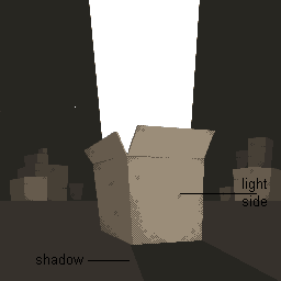 ------------- http://dragcave.net/viewdragon/G3eW">
please click it, otherwise it will die, and it seems special. |
Posted By: Arun Dhir
Date Posted: 05 July 2009 at 10:27am
| Yeah, a friend pointed that out to me. The shadow is now to the left. |
Posted By: slym
Date Posted: 05 July 2009 at 5:46pm
| how many entrees are allowed? |
Posted By: AngelOTG
Date Posted: 05 July 2009 at 6:00pm
| As many as you can make. :3 |
Posted By: slym
Date Posted: 05 July 2009 at 9:39pm
| Shoot, I submitted my piece (http://www.pixeljoint.com/pixelart/44610.htm) but time is running short. If it isn't accepted by the challenge deadline does that mean its invalid? I would hope not because I submitted it 4 hours short of the deadline. |
Posted By: minipuck
Date Posted: 05 July 2009 at 10:33pm
|
no, you can even just submit it 1 second before the deadline i believe, the person who starts the voting and stuff will have a look at all the final unapproved pieces. ------------- http://dragcave.net/viewdragon/G3eW">
please click it, otherwise it will die, and it seems special. |
Posted By: generatedanomaly
Date Posted: 05 July 2009 at 11:57pm
| Aww. I'm not going to be able to finish mine in time :( sorry guys! |
Posted By: slym
Date Posted: 13 July 2009 at 11:16am
| I know challenges aren't about winning... but last place? Not exactly what I had intended... I didn't think my piece was that bad, I was hoping for maybe not in the top 3 but certainly the top 5. |
Posted By: Blueberry_pie
Date Posted: 13 July 2009 at 11:33am
| Entries that don't make the top three are listed in a random order. I doubt you came in last place :) |
Posted By: slym
Date Posted: 13 July 2009 at 11:46am
| Oh, that's nice to know lol. Thanks for letting me know that. |