A green guy
Printed From: Pixel Joint
Category: Pixel Art
Forum Name: WIP (Work In Progress)
Forum Discription: Get crits and comments on your pixel WIPs and other art too!
URL: https://pixeljoint.com/forum/forum_posts.asp?TID=8783
Printed Date: 12 September 2025 at 6:18am
Topic: A green guy
Posted By: theguy
Subject: A green guy
Date Posted: 15 July 2009 at 5:11am
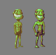
I put this up on the gallery, I was told that it's body was too boring in comparison to it's face. So how can I fix that?
 I'm working with paint so I'll add transparency once it's finished.
|
Replies:
Posted By: God_Is_Evil
Date Posted: 15 July 2009 at 3:48pm
|
Try redrawing the body in a pose so it fits the face more. like one of these poses or something.  |
Posted By: Hatch
Date Posted: 15 July 2009 at 6:52pm
Hey theguy. I know you posted here primarily to get help with the body, but I noticed some issues with your coloring and shading that I wanted to bring up and see if you agree. Here's a scrappy edit of his head:

The brief time we spent together was apparently enough to turn him to the Dark Side and rob him of all the charm and likeableness you originally imbued him with. I guess I have that effect on people D: Anyway! The main problem I noticed is that you're trying to do too much shading with speculars alone. Speculars, in case you've forgotten, are the bright points of light present on things that are at least a little shiny. They're properly called specular reflections, because they're where the object is actually reflecting a light source like a mirror. The thing is, the values for your skin tones were so far apart that you didn't really have much choice! Let's look at each of our skintone palettes: 
I've lined up each of our midtones. Notice how big the jump is from your mid to the next brightest? You basically have black->deep shadow->midtone->specular->white. You really need more buffer shades if you're gonna make your colors so far apart. It doesn't take much; notice I only added one color on each side of the midtone, but this was enough to flesh out the palette and allow significantly nicer, smoother shading. Doing so also let me use dither without getting so much of the rough sandpapery texture that yours had--the closer together your dithered color are in value, the less obvious the dither pattern will be. I also tweaked all of the tones a bit. Your overall color identity was leaning more towards blue than pure green becuase you seemed to be shifting towards blue at both ends of the value range, and you midtone green had a a lot of blue in it to begin with. I tried to lean towards reds in shadow and yellows in light. Just remember that you don't always have to shift towards blue, even in shadow. So yeah, about shading. The thing about overusing speculars is that while it gives individual parts of your subject some pleasant 3D volume, the overall look is usually quite flat, as was the case here. Your deep shadow color was only used near the edges. I really only used the deep shadow color near the edges too, but with my extra buffer shade I was able to carve out deeper 3D shapes. And you'll get a much more finished look if you define features using shading rather than explicitly drawing them with lines. It seems like a subtle distinction, but it really does make a world of difference. Things in real life don't have lines all over them, they just have light and shadow. It seemed like in a lot of spots you weren't exactly sure what shapes you were trying to render, particularly the nose. I read it as sort of a flattened half-cone. Always try to break down your subject into simple 3D shapes--primitives, we call 'em--and shade accordingly. If you can shade primitives, you can shade anything by just putting them all together in the right configuration, ya know? I also employed colored outlines instead of the more-or-less uniform outlining you were using. Use brighter tones for the outline in places that are receiving light and darker tones for areas in shadow. Oh, and I also did a lot more antialiasing. I think there was more, but that's all I've got at the moment. Let me know if any of this is unclear or if you want to know why I did this or that in the edit. Good luck! [EDIT] I just remembered the last thing I wanted to point out. While I've increased the color count in your skintone ramp, the three darkest shades in it could be used instead of your separate loincloth ramp, so the net number of colors shouldn't change! \o/ ------------- |
Posted By: Dr D
Date Posted: 15 July 2009 at 7:37pm
| I love your critique, Hatch. Very helpful. I hope you do it forever. |
Posted By: theguy
Date Posted: 16 July 2009 at 7:49am
Wow awesome critique thanks. I would just like to say that I wanted the nose to be a sort of voldemort shape:
 Though alot wider.
And I'll edit with an... edit.
EDIT: Why. Wont. This. Stupid. Image. SCALE. Ugh.
EDIT 2: Aww forget it, I'll just start editting my sprite.
|
Posted By: theguy
Date Posted: 16 July 2009 at 9:05am
|
Wow the improvement is quite vast I have to say:
Old ---------> New
  EDIT: after looking at them both together I'm not sure if it's lost it's stylistic aspect.
|
Posted By: Hatch
Date Posted: 16 July 2009 at 9:32am
|
Huge update. HUGE! I don't have any time atm, but I wanted to stop and say AWESOME JOB :D ------------- |
Posted By: cure
Date Posted: 16 July 2009 at 1:45pm
 |
Posted By: theguy
Date Posted: 18 July 2009 at 4:05am
|
First --------------------> Last
 Wutcha think?
|
Posted By: jeremy
Date Posted: 18 July 2009 at 4:27am
|
Massive improvement :D
The nostril slits sorta give that impression of a bulbous nose outline to me, they're also going the opposite way to voldy's- if you were to invert them it may give a more correct impression.
|
Posted By: theguy
Date Posted: 18 July 2009 at 6:30am
|
Originally posted by Jeremy Massive improvement :D The nostril slits sorta give that impression of a bulbous nose outline to me, they're also going the opposite way to voldy's- if you were to invert them it may give a more correct impression. When I said voldemort I meant the shape of his nose in itself so flat more or less I didn't mean the nostrils.   any better? |
Posted By: Dr D
Date Posted: 18 July 2009 at 1:21pm
|
Someone took some critique to heart. Like Jeremy said, MASSIVE improvement. You obviously learned quickly in a very short amount of time, very well done. Hope to see this skill, or at least what some of the critique covers in all of your future pieces. |
Posted By: theguy
Date Posted: 18 July 2009 at 3:22pm
| Thanks the main two things I think I really learned were about buffer shades and to put a bit more detail into my stuff. |
Posted By: ellie-is
Date Posted: 18 July 2009 at 4:12pm
|
You should go upload it now. ------------- |
Posted By: cure
Date Posted: 18 July 2009 at 4:54pm
|
only thing that still bugs me much is the neck: still quite long and odd that it widens at the top. vast improvement, kutgw |