Shadow creature
Printed From: Pixel Joint
Category: Pixel Art
Forum Name: WIP (Work In Progress)
Forum Discription: Get crits and comments on your pixel WIPs and other art too!
URL: https://pixeljoint.com/forum/forum_posts.asp?TID=8888
Printed Date: 10 June 2026 at 8:20am
Topic: Shadow creature
Posted By: inphy
Subject: Shadow creature
Date Posted: 01 August 2009 at 12:11pm
|
Helloes! I'm trying to nail down a shadowy look, so meet Bakenekobooru, the long lost brother of Catball from La-Mulana: 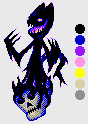 One thing that bugs me the most is that I'd like to have shadowy tendrils "grab" a skull, but what I have doesn't look very convincing to me. What would you suggest to improve that (or the image in general)? -- Update 2, moved the skull a bit to the right, changed shadow colour to black and fixed the nose. 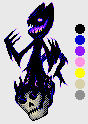 |
Replies:
Posted By: Dhr. Bosch
Date Posted: 13 August 2009 at 4:14am
|
the skull needs more definbed cheekbones, cheekbones have an almost 90 degree angle yours seems to have a 45 degree angle. i like the creature but i woulds reposition the tail because the proximity of the colours makes it hard to distinguish. i'd like to help you with the tentacles but it's kinda hard, maybe if you use a tad bit more colour instead of only black. the opwardspointing flames?/spikes? on his tentacles are also a bit confusing to eye. good luck ------------- Vanitas, vanitatum omnia vanitas |
Posted By: DNAK
Date Posted: 13 August 2009 at 12:03pm
| Looks very good imo! Maybe a little more definition? It's a little flat now i think. |
Posted By: inphy
Date Posted: 14 August 2009 at 12:50pm
|
Ok, thanks for the advice, I'll try these changes out. I uploaded a v2 to the gallery on the 8th ( http://www.pixeljoint.com/pixelart/45520.htm - http://www.pixeljoint.com/pixelart/45520.htm ), but it's not a whole lot different from this. edit: So here's what I'm thinking of:  I tried adjusting the skull, haven't found a place for the tail yet. Instead of playing around with tentacles, I thought about changing it to tar-like goop. I also removed the upward pointing 'spikes', they were supposed to be kind of like vaporizing trails of shadow matter but that didn't quite work out. Also tried to define parts better with highlighting. What do you think? |
Posted By: Dhr. Bosch
Date Posted: 30 August 2009 at 3:13am
|
that looks a lot better. the only thing that still truly bothers me is the lighting on his right arm (our left) which is very heavy, and seems to be from the wrong side. and perhaps the skull could use a bit more depth. perhaps you can bring back the bone-like grey to do the highlights? ------------- Vanitas, vanitatum omnia vanitas |
Posted By: KittenMaster
Date Posted: 30 August 2009 at 2:05pm
|
The skull is so dull in comparison to the creature. Use some of the creature's colors as shading. And yeah, the lighting on his right arm is on the wrong side. Then again, it's a shadow creature, shouldn't really have highlights in the first place, though if you prefer to keep the highlights, have one on the face as well. |
Posted By: inphy
Date Posted: 02 September 2009 at 8:59am
 Tried to give the skull more action and depth, also removed the old tail. I'll try redoing the whole right arm to match the left arm's orientation, I feel it was disjointed when compared to the left arm. One idea was changing the right arm into some form of a weapon (or holding one). Yeah, a shadow having highlights is a bit silly - then again, it'd have be solid to use those claws for anything. :) Plus, I feel they define individual parts better and establish at least some level of volume. For now, I think I'll keep the highlights. |
Posted By: Vitkauskas
Date Posted: 06 September 2009 at 2:34am
| Well in my opinion its great, but the skull needs more work. |
Posted By: cure
Date Posted: 06 September 2009 at 9:52am
| not a big fan of the dithering, really. It's not really adding anything. Agree that the skull could use more work (looks more or less symbolic now, google actual skulls to get it more accurate) |
Posted By: ellie-is
Date Posted: 06 September 2009 at 10:03am
|
I agree, it looked better with the lines.Just fix the skull and it will be awesome =) ------------- |
Posted By: inphy
Date Posted: 09 September 2009 at 11:28am
Thanks, everyone. The skull is still quite dull, but here's what I have now:  I'll take another go at the highlights/dithering too. |
Posted By: Dhr. Bosch
Date Posted: 09 September 2009 at 4:23pm
|
that skull is waaaaaaay better.
------------- Vanitas, vanitatum omnia vanitas |
Posted By: Hatch
Date Posted: 09 September 2009 at 4:44pm
Skull is indeed much better. I'm not really feeling the dithering though, how about something more like this?

Dunno if you're going for the melty candle look. Hard to say honestly, as your shading is a little indistinct. I'd focus more on rendering realistic volumes and less on fussy dithering. ------------- |
Posted By: inphy
Date Posted: 07 November 2009 at 2:16pm
|
Sorry for taking such a long time, I got mixed up in all kinds of time consuming stuff. Still, that's no excuse for not even saying thanks for the feedback and edit for two damn months. Thanks for the feedback and edit, and apologies. :( I was trying to go for a melting look/tar-like goop, and your edit was pretty much what I was after. I suppose I was too preoccupied with dithering the living daylights out of everything I couldn't visualize it. If you would still care to comment, here's what I have. I tried to figure out what to do with the other arm - I tried swords, spears, knives, axes and such but they just didn't seem right. So.. now there's a wick. 
|