A sword.
Printed From: Pixel Joint
Category: Pixel Art
Forum Name: WIP (Work In Progress)
Forum Discription: Get crits and comments on your pixel WIPs and other art too!
URL: https://pixeljoint.com/forum/forum_posts.asp?TID=8931
Printed Date: 14 September 2025 at 2:15am
Topic: A sword.
Posted By: arrrgh
Subject: A sword.
Date Posted: 08 August 2009 at 8:02pm

Well, it's a sword.  There's something wrong with the blade, but I can't quite put my finger on it... There's something wrong with the blade, but I can't quite put my finger on it...
|
Replies:
Posted By: arrrgh
Date Posted: 08 August 2009 at 10:09pm

Fiddled with the colours a bit. edit: transparency 
edit2: and another update: 
The handle looked very flat, just realized that. |
Posted By: MrSkeleton
Date Posted: 09 August 2009 at 2:03pm
|
The everything looks very flat. You might try experimenting with...well, not using that gold color for starters, and making the handle longer.
------------- http://protomen.com/lightupthenight"> 
i'll make your mouth look like an open can of mushroom soup. |
Posted By: Hatch
Date Posted: 09 August 2009 at 7:44pm
An edit approaches: Handle was very stubby, all parts of it needed to be longer and more slender. The pommel was huge! By far, you're biggest problem is colors. You need to shake the GREEN IS GREEN, YELLOW IS YELLOW, GRAY IS GRAY mindset. Also need a ton more contrast. The palette in my edit isn't great, but try to analyze it and figure out why I did what I did. [EDIT] Also, I like black outlines :D ------------- |
Posted By: arrrgh
Date Posted: 10 August 2009 at 12:14am

How's this? 
edit: still fiddling with colours... |
Posted By: linx
Date Posted: 10 August 2009 at 1:18am
| I personally think black outlines would make this look better :o |
Posted By: arrrgh
Date Posted: 10 August 2009 at 6:14am

I don't think the outline looks very good. edit: this doesn't look so bad: 
|
Posted By: minipuck
Date Posted: 10 August 2009 at 6:15am
|
i think the outline defines it better i like it,
------------- http://dragcave.net/viewdragon/G3eW"> 
please click it, otherwise it will die, and it seems special. |
Posted By: Hatch
Date Posted: 10 August 2009 at 6:23am
|
I like the outline :(
Regardless, it's much improved! You're still being way too conservative with the contrast though, particularly on the jewels. Jewels are shiny!  
The flat faces on gems are called facets. Think more in terms of facets when drawing gems. Notice how the facet that faces the light source is almost white? It's reflecting the light source. That's what makes gems look so shiny and bling. Obviously you can't put so much detail into your tiny gems, but the basics still apply. More contrast, all over! ------------- |
Posted By: arrrgh
Date Posted: 10 August 2009 at 6:37am

I get what you mean about the gem contrast stuff, I added a highlight and it looks much nicer now. They're meant to be more of a stone rather than a gem, so they're smooth and round. But still shiny! |
Posted By: PulkoMandy
Date Posted: 10 August 2009 at 7:10am
|
This black outline acts as a shadow below the sword, that's why it makes it look better.Maybe you could add it only on one side of the blade. It would make it really look like a shadow. As they said, more contrast!
"If your picture doesn't include both black and white, then it can be improved" |
Posted By: Antifarea
Date Posted: 10 August 2009 at 8:54am
|
I agree with most of the comments on regards the issues... you should try less flat colors... did you do this in paint? not that it matters much, but with other programs you could easily change the color palette, and mess with it really easy... anyways, deffinitely download that edit hatch did and observe it, since it is a good reference. Also, go ahead and check sprites of swords from games, those help come up with ideas to improve it. ------------- |
Posted By: bonehead11
Date Posted: 10 August 2009 at 10:13am
You use too bright colours look out of window nothing is so bright, maybe very shiny things but still they tend to be very dark in places where light doesnt land, dont be afraid to add too much contrast belive me I know what I am saying it was mine main problem too  and when choosing pallete, mind that light is white and shadow is black, but you too must think about reflections from every rock to every mirror, sky is blue so darker tones should go into blue, think what kind of light source you are having, if its sun than light should be white little yellow, if its flame than it should be a yellow red...its all just basic elementary physics, some materials reflect light more and other absorb it for instance white and black colour, shiny and not shiny materials etc. etc. like I was an expert and when choosing pallete, mind that light is white and shadow is black, but you too must think about reflections from every rock to every mirror, sky is blue so darker tones should go into blue, think what kind of light source you are having, if its sun than light should be white little yellow, if its flame than it should be a yellow red...its all just basic elementary physics, some materials reflect light more and other absorb it for instance white and black colour, shiny and not shiny materials etc. etc. like I was an expert 
Just experiment, there isnt better way to learn, dont be afraid to delete your work and do it from start, believe me it will look 100% better. |
Posted By: Manupix
Date Posted: 10 August 2009 at 10:29am
|
I think your main problem with the blade, is your choice of lighting. The way you made it, it looks hollow along the middle, or almost like 2 narrow blades side to side. http://www.pixeljoint.com/pixelart/19385.htm# - Look at this , it is easier to explain with a picture (btw, this work is amazing, but I don't think it is very good pixelart: it's too large and misses the point). This blade clearly has 2 well-defined halves, one reflecting the light source, the other not. Those halves are even slightly concave, which adds to realism (but I doubt you can do this at the scale you're working). There are probably other nice swords on PJ, I used the search engine and stopped at the first good one. |
Posted By: arrrgh
Date Posted: 11 August 2009 at 12:01am
Thanks for all the help and comments, everyone!

I tried what you said, Manupix and it looks heaps better now! I added a bit more contrast to the colours, but I'm not sure if there's much else to do... Should I upload to the gallery now? |
Posted By: Manupix
Date Posted: 11 August 2009 at 1:59am
|
Much better! But not there yet... The hilt still looks very flat. Too saturated and/or too little contrast. Look again at Hatch's edit and Grim666's piece. You have to decide if it is brand new: shiny, with highlights and flares; or old, dusty, dirty, rusted, bumped. (and the blade could use highlights too) Also, you should shift hue and saturation when shading, not just lightness. Look at Hatch's: he shifted the shadows towards red and the highlights towards green. Depends on what kind of light you want to make it: this is what you get in a warm-colored room; in the outside on a sunny day / blue sky, the shadows should be blue / green. You have room for a little texture too. The jewels are really flat. Look carefully at Grim666's: they're just perfect. Yours are big enough to do it too. I have a problem with your outlines. Your 'selout' doesn't work, because you just have 1 color for the blade and 1 color for the hilt. You have 3 options here: - no outline; - real selout (darker outline in shadows); - uniform outline. Depends on what you plan to do with this piece. Gallery: well, I understand you want to upload something, but. As it is, even when it will be good (it will!), it is more of an exercise than a real self-standing piece. It depends on your further plans. Will you make more of these, weapons, armour? then a good idea would be to make a sheet of them when you have a bunch and upload that. If not, maybe try to add some background, so that there is at least the beginning of a story, for the viewers. |
Posted By: arrrgh
Date Posted: 11 August 2009 at 4:07am

Removed the outline and added lots more contrast. Grim666s gems look really good, but they're not quite what I wanted:  
I was going more for the look on the left(ie, a precious stone) more than the one on the right(a transparent gem.) Still working on highlights... |
Posted By: PulkoMandy
Date Posted: 11 August 2009 at 5:21am
| These stones are still reflecting light and look shiny. Look at Hematite and Pyrite, they have a white line because of the light. And none of them look as smooth as yours. A polished stone always have some strips on it. Particularly as the one in the picture are really small, I think the one on your sword are somewhat bigger, so more likely to have such marks. |
Posted By: arrrgh
Date Posted: 11 August 2009 at 6:17am
| I've added stronger highlights, but I'm not sure how to go about adding streaks of other colours on such a small area. I think it looks fine as-is with the better highlights. |
Posted By: A.B. Lazer
Date Posted: 11 August 2009 at 6:20am
|
Hatch effectively closed the case - colours, rendering all look tasty.
With different route you took, you can add extra shine on gem by changing highligt to 2x2 pixel rectangle and eliminating middle colour between white and second grey. With so much tones of grey highlight is not so obvious, so it's better to put more contrasting colour under white. Colours on gem: 1 white 2 light grey (fill this area with (3)) 3 darker grey 4 darkest grey. |
Posted By: arrrgh
Date Posted: 11 August 2009 at 6:34am

Thanks for the tips, the 2x2 square highlight looks better than what I was doing. 
This is with the lighter shade removed as you suggested, but it looks a bit flat... edit: btw it's a blue gem, not a grey one
|
Posted By: A.B. Lazer
Date Posted: 11 August 2009 at 6:37am
|
Hmmm... Maybe first one looks better, after all, but I'm not shure now.
Well, I don't know exact name of this colour (not too blue and not too grey). |
Posted By: Hatch
Date Posted: 11 August 2009 at 6:41am
|
I would:
1) Remove the single pixel line of midtone in the center of the blade. I know it seems like it should smooth things out, but it really does not have that effect. 2) Increase the area of midtone on the crossguard (the horizontal portion of the handle). It's creating a banding effect at the moment. 3) Have the crossguard cast a very slight shadow onto the grip. It appears to be thicker, so really show it. 4) Rethink the pattern on the grip. I'm not sure exactly what you can do, but the hugged, jagged lines look very rough. It, too, is a kind of banding. 5) Experiment with colors. Not saying yours are unacceptable, but I think you should just play around; try crazy hues everywhere, experiment with saturation, etc. You might learn something, or find some unexpected combinations that look good. All that said, huge improvement! It's really looking much better. :Y: ------------- |
Posted By: hyperbear
Date Posted: 11 August 2009 at 4:00pm
|
Big improvement from the beginning, though I think that some darkish fabric on the grip would make more sense and look better, as well. |
Posted By: arrrgh
Date Posted: 12 August 2009 at 12:21am
|
Originally posted by Hatch
I would: 1) Remove the single pixel line of midtone in the center of the blade. I know it seems like it should smooth things out, but it really does not have that effect. 2) Increase the area of midtone on the crossguard (the horizontal portion of the handle). It's creating a banding effect at the moment. 3) Have the crossguard cast a very slight shadow onto the grip. It appears to be thicker, so really show it. 4) Rethink the pattern on the grip. I'm not sure exactly what you can do, but the hugged, jagged lines look very rough. It, too, is a kind of banding. 5) Experiment with colors. Not saying yours are unacceptable, but I think you should just play around; try crazy hues everywhere, experiment with saturation, etc. You might learn something, or find some unexpected combinations that look good. All that said, huge improvement! It's really looking much better. :Y: 
I didn't do anything too drastic with the colours, but I toned them down a bit. Also I kinda borrowed your grip pattern because I liked it I cut down a few colours - the green gem was small enough to look fine without a midtone, and I could use the brightest sword colour as the gems' highlights. It now only uses 12 colours including the background. I don't think I'm going to spend much more time on this, I've learned heaps from this and I'd like to move onto something else now
|
Posted By: minipuck
Date Posted: 12 August 2009 at 3:25am
sorry for late edit, mainly cuz i was bored, i hope if you decide to work on it a bit more you can use it a bit, and else might be able to use it too.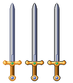 ------------- http://dragcave.net/viewdragon/G3eW">
please click it, otherwise it will die, and it seems special. |
Posted By: arrrgh
Date Posted: 12 August 2009 at 3:29am
Sorry, but I just uploaded it to the gallery  They look excellent, though. They look excellent, though.
|
Posted By: Iron
Date Posted: 12 August 2009 at 5:30am
| * Note the black outlines |