CHALLENGE 9/7/2009: Seeing Red
Printed From: Pixel Joint
Category: Pixel Art
Forum Name: Collaborations/Challenges
Forum Discription: Submit pixel art project ideas/templates or contribute to an existing pixel art collaboration.
URL: https://pixeljoint.com/forum/forum_posts.asp?TID=9089
Printed Date: 29 April 2026 at 5:04am
Topic: CHALLENGE 9/7/2009: Seeing Red
Posted By: administrator
Subject: CHALLENGE 9/7/2009: Seeing Red
Date Posted: 07 September 2009 at 12:01am
 McLaren 2007 by /p/1419.htm' target='_blank'>Lawrence
 Death OR Dishonor by /p/23821.htm' target='_blank'>DawnBringer
 Fear and Madness fight for life by /p/19163.htm' target='_blank'>Victor Rojo
 Pixel Sumos by /p/24085.htm' target='_blank'>kingphilip
Replies:
Posted By: Club Beuker
Date Posted: 07 September 2009 at 1:27am
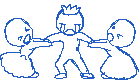
Going to enter! And what I came up with an hour later:  ------------- Without me, it's just aweso |
Posted By: orenshtiv
Date Posted: 07 September 2009 at 2:59am
|
I'm making a pic that is about a song of "My Chemical Romance" - one of my favorite bands,the song is "i don't love you" and it have a line that goes like this "i don't love you like i did yesterday" and that's what im doing,Pon likes Zi less then yesterday cuz she didn't listen to him,lol hope you like it :] Done:  this time zi cryes! >< the pure red will be theyr belly hearts :P Credit: to http://www.ponandzi.com/ - Pon n' Zi [EDIT] added AA [EDIT] added boddies and chat bubble [EDIT] Done :D |
Posted By: d-p
Date Posted: 07 September 2009 at 4:14pm
Two nice entries so far - I'll join. Here is my result: Any hints welcome. ------------- http://iso.webmonk.de">  http://cc.webmonk.de"> http://cc.webmonk.de">
|
Posted By: crow
Date Posted: 07 September 2009 at 4:28pm
|
ill whip one up
http://img199.imageshack.us/img199/4677/conflictf.png
|
Posted By: yrizoud
Date Posted: 07 September 2009 at 4:54pm
wip: Don't worry, red is coming up. |
Posted By: kingphilip
Date Posted: 07 September 2009 at 6:30pm
|
I will start working on this tonight.
[edit]  >> >> 
My idea is to show a sumo tournament. This is a rough idea of the scene I am going for. Update 2: More filled in and now with basic color. I think I will try for a spotlight effect on the wrestlers to make sure they stand out from the crowd. I also want to show the kanji for "sumo wrestler" on the banners if it will work that size. |
Posted By: cheezburger
Date Posted: 07 September 2009 at 11:42pm
here is my wip. was playing pacman tournament |
Posted By: Photocopier
Date Posted: 08 September 2009 at 8:35am
| looks like paper sumo :D |
Posted By: Arthurio
Date Posted: 08 September 2009 at 9:55am
wip : I'm not sure of the colors :S and the letters . |
Posted By: OnWalls
Date Posted: 08 September 2009 at 12:08pm
| Excuse me, but must the palette be my own, or I can use someone else's? |
Posted By: sapphira83
Date Posted: 08 September 2009 at 1:10pm
|
WIP:
just want to know if this would be acceptable as conflict. i will do the rest of the details later today.
|

Posted By: skamocore
Date Posted: 08 September 2009 at 1:16pm
|
@Sapphira - why wouldn't it be? @On Walls - You may use someone else's palette if you like; but if you do, make sure you give credit to its creator. The only restrictions on colours this week are that you must use at most 32 colours and that pure red must be present. ------------- |
Posted By: sapphira83
Date Posted: 08 September 2009 at 2:40pm
|
more detailed WIP
|

Posted By: Elk
Date Posted: 08 September 2009 at 5:48pm
 before anyone uses my idea XD |
Posted By: ellie-is
Date Posted: 08 September 2009 at 6:03pm
Haha.

Still really sketchy and stuff... But well, someone would have this idea sooner or later, I am just making sure I am the first one to post. xD ------------- |
Posted By: susuwataris
Date Posted: 08 September 2009 at 7:33pm
| Elk's, cheezburger's and luca's are just genius! |
Posted By: orenshtiv
Date Posted: 08 September 2009 at 9:32pm
|
@lucas_irineu - Nice! i like it already! :D ,but i was the 1st one to post,lol (if you didn't saw it,go to my gallery and press "I don't love you -weekly challenge" i've maded pon and zi! :D ) @susuwataris - umm...what's so special with Elk's piece? :/ |
Posted By: Club Beuker
Date Posted: 09 September 2009 at 12:40am
|
Originally posted by orenshtiv @lucas_irineu - Nice! i like it already! :D ,but i was the 1st one to post,lol (if you didn't saw it,go to my gallery and press "I don't love you -weekly challenge" i've maded pon and zi! :D ) @susuwataris - umm...what's so special with Elk's piece? :/ I believe Lucas meant he was the first one to post his idea.. Pokémon. And Elk's piece is nothing else but marvellous. You'll understand when you notice his/her technique ------------- Without me, it's just aweso |
Posted By: Arthurio
Date Posted: 09 September 2009 at 4:10am
 i followed the noobtorial for the rocks , now i should make a background , bt ive no idea -_- i followed the noobtorial for the rocks , now i should make a background , bt ive no idea -_-
|
Posted By: Club Beuker
Date Posted: 09 September 2009 at 4:42am
|
Arthurio: I see 2 things I would like to point out for you ;) - The rocks use 4 colors now, You can already achieve this with 3 (besides, the shading is a bit off towards the side.) - You used pillowshading for the characters, this is a big no-no in pixelshading land. Please fix that. Hope this can help you further. ------------- Without me, it's just aweso |
Posted By: Arthurio
Date Posted: 09 September 2009 at 5:02am
|
thanks for your help
it's really not possible to use the pillowshading?i know it's taboo here but I think in this work it's not really necessary to change it (but if i must do it , i'll do it ) for the rock , i'm gonna try wiz 3 colors , but i think it will be difficult on the large rock . |
Posted By: sapphira83
Date Posted: 09 September 2009 at 11:39am
|
i think i need some tips or whatever |

 especially am wondering if the dog looks like he's snarling or smiling (and yes i do have a ref pic)
Posted By: Sneep29
Date Posted: 09 September 2009 at 3:31pm
I'm not done yet, but is this good? |
Posted By: RollerKingdom
Date Posted: 09 September 2009 at 5:23pm
|
Originally posted by Elk before anyone uses my idea XD Wow this is amazing already ;P I gotta vote for you cauz NARUTO ftw. |
Posted By: RollerKingdom
Date Posted: 09 September 2009 at 6:24pm
Any thoughts so far? |
Posted By: Sneep29
Date Posted: 09 September 2009 at 7:30pm
It's finally done.  |
Posted By: annezca
Date Posted: 09 September 2009 at 9:12pm
 This is my idea. A very quick rough draft of 2 princesses fighting over prince charming. Im thinking Sleeping beauty and snow white, because both were kissed. XD my 1st time too to post here. ;3 |
Posted By: kingphilip
Date Posted: 10 September 2009 at 8:51am
I started rethinking the design because there was just too much going on in the original for this size. Now there is a greater focus on the wrestlers.

Any tips and suggestions are welcome! I should be finishing this up tomorrow. |
Posted By: Jocher
Date Posted: 10 September 2009 at 11:14am
| philiip, great idea |
Posted By: Cocazero1c
Date Posted: 10 September 2009 at 9:38pm
|
Originally posted by cheezburger
here is my wip. was playing pacman tournament
Where is the red ? you can make the ghost red... |
Posted By: cthulhu
Date Posted: 11 September 2009 at 12:07am
        White T-shirt or Autobot T-shirt? ------------- Artist formerly known as "herbert_west" |
Posted By: Manupix
Date Posted: 11 September 2009 at 3:31am
|
@Arthurio: pillow-shading isn't taboo, it's just usually ugly and indication of basic misunderstandings about light. It is equivalent of a very frontal lighting, not what you'd expect to make a nice light, and not one we see in current life except when wearing a headlamp in a dark place, and in flash photography. If that's the effect you're after, then it's perfectly legitimate. In your case, the guy on the right could be a good example of acceptable frontal light, but unfortunately your rocks say otherwise. However, I'd say you have more pressing issues: anatomy, banding, and dithering (unnecessary in the rocks). The guy on the left doesn't seem to have feet and hands: is this intended? |
Posted By: architectus
Date Posted: 11 September 2009 at 6:00am
|
Sup all, I'm new. Here's my entry. I might still work on the other girl's face.  |
Posted By: Club Beuker
Date Posted: 11 September 2009 at 7:43am
|
Boobs always get +1 Sorry.. Did I just say that out loud? ------------- Without me, it's just aweso |
Posted By: Semmu
Date Posted: 11 September 2009 at 8:45am
|
yes, i heard it :D i have a nice idea, but i cant draw pixel art, i dont have the skill to do that... i think u have all seen the Firefox ad video (Weeee!) and thats my idea:  i drew the IE icon, but Firefox is a screenshot, and the palette is reduced, but i dont like this :( yeah, and if you dont understand me just see this video ;) http://www.youtube.com/watch?v=7t7uZd7qmgY - http://www.youtube.com/watch?v=7t7uZd7qmgY |
Posted By: Victor Rojo
Date Posted: 11 September 2009 at 9:12am
|
Hello,
I have a problem with the screen and I see no good ... and I am old ...
urgh ... Someone tell me if it looks too saturated?
Also I do not know if the darker colors are distinct from black ... thanks ^ ^ My entry is Madness and Fear fighting for the heart...26 colors for now  http://translate.google.com/translate_s?hl=es&sl=es&tl=en&q=prost%C3%ADbulo%0A&source=translation_link - buscar |
Posted By: Setzer
Date Posted: 11 September 2009 at 1:29pm
|
Victor: that is a little saturated, but I think it works very well for this picture.
------------- http://sj-gfx.com"> 
|
Posted By: RollerKingdom
Date Posted: 11 September 2009 at 4:13pm
|
finished mine.. is it good? |
Posted By: kingphilip
Date Posted: 11 September 2009 at 4:50pm
Mine is done too:

I think it turned out okay. |
Posted By: jalonso
Date Posted: 11 September 2009 at 6:28pm
|
Originally posted by RollerKingdom finished mine.. is it good? me likes :| ------------- |
Posted By: RollerKingdom
Date Posted: 11 September 2009 at 7:07pm
|
Originally posted by kingphilip Mine is done too:
I think it turned out okay. Like i said i really liked the pose :) maybe try to add a audience in the back that wouldn't be the main attention at the same time. @Jalonso: Thank you :) I have to say i liked the outcome too.. it's kinda bloody and funny at the same time |
Posted By: kingphilip
Date Posted: 11 September 2009 at 7:32pm
I like the shocked look on the guy's face who just got cut.  Also, the highlights on the black hair are really well done. I had to deal with that in mine too. Also, the highlights on the black hair are really well done. I had to deal with that in mine too.
|
Posted By: RollerKingdom
Date Posted: 11 September 2009 at 8:39pm
|
Originally posted by kingphilip I like the shocked look on the guy's face who just got cut. Also, the highlights on the black hair are really well done. I had to deal with that in mine too.I noticed it :P and it came out great! |
Posted By: crow
Date Posted: 11 September 2009 at 10:03pm
 any advace? its my 3rd ever so dont tear it to shreads any advace? its my 3rd ever so dont tear it to shreads
|
Posted By: Setzer
Date Posted: 11 September 2009 at 11:10pm
 i call pandas with a sexual conflict ------------- http://sj-gfx.com">
|
Posted By: RollerKingdom
Date Posted: 12 September 2009 at 8:44am
|
Originally posted by Setzer i call pandas with a sexual conflict Wow this is a killer :P @Crow: That's very nice.. i am just unsure of the red shades but well done. |
Posted By: orenshtiv
Date Posted: 12 September 2009 at 8:50am
|
I just don't get it, weird :/ |
Posted By: Jocher
Date Posted: 12 September 2009 at 10:22am
should i load it up?

|
Posted By: InkBreath
Date Posted: 12 September 2009 at 10:29am
|
Originally posted by Setzer i call pandas with a sexual conflict well, maybe its not really a sexual conflict.. unless he wants to hump the bamboo. lol. nice. the panda chic looks hot. |
Posted By: architectus
Date Posted: 12 September 2009 at 1:08pm
|
cthulhu, I like the Transformers shirt.
|
Posted By: architectus
Date Posted: 12 September 2009 at 1:30pm
|
I updated. I replaced the original file.
Nice jobs so far. I'm digging them.
|
Posted By: Catghost
Date Posted: 12 September 2009 at 1:38pm
 Comments/critique appreciated. Also are we allowed to enter more then once? |
Posted By: skamocore
Date Posted: 12 September 2009 at 6:10pm
|
@Cat - Yes. Also, are they original characters?
------------- |
Posted By: Catghost
Date Posted: 12 September 2009 at 8:02pm
|
Yay! Thanks. Also, no. It's Ichigo & Hollow Ichigo from bleach. |
Posted By: DanielHyaku
Date Posted: 12 September 2009 at 11:55pm
Laaaaate WIP. I barely had the time to pixel these last times... gosh. Gotta heat up back again. |
Posted By: Jocher
Date Posted: 13 September 2009 at 4:38am
well, now thats my entry for the challenge:

|
Posted By: cthulhu
Date Posted: 13 September 2009 at 3:59pm
  2nd entry. Probably won't finish... ------------- Artist formerly known as "herbert_west" |