55mins Adell (Disgaea 2)
Printed From: Pixel Joint
Category: Pixel Art
Forum Name: WIP (Work In Progress)
Forum Discription: Get crits and comments on your pixel WIPs and other art too!
URL: https://pixeljoint.com/forum/forum_posts.asp?TID=9193
Printed Date: 11 September 2025 at 8:25pm
Topic: 55mins Adell (Disgaea 2)
Posted By: Antifarea
Subject: 55mins Adell (Disgaea 2)
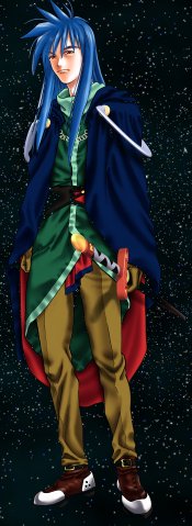
Date Posted: 02 October 2009 at 11:52am
|
10-10-2009 =
Back! still no internet so I'm testing my speed at the library, and so I made this....
 I used the disgaea 2 palette for the colors... please critique, this was done really really fast, took me about 55mins, with my limit which is an hour top.
Here is the artwork I used as reference...
 10-05-2009 =
Not done yet, but I'm making a bit more complex sprite this time around, hopefully will get it done in an hour and a half so far I'm advancing pretty quick on it... I'm posting the wip in case I run out of time and can't get it finished... need to still work on the hands and a bunch of other stuff...
UPDATED = So far 1hr of Work. Be back tomorrow.
10-06-2009 completed it =
 And the reference official artwork:
 10-03-2009 =
Recently made this again at the library... this one took me an hour. Critique.
 This is the reference art:
 10-2-2009 =
I made this in the computers are the library, I have very limited time so this was done really fast... 45 mins, with some restrictions... it's supposed to be finished, but I wanna post it cause I plan to update it if you find any issues...
 Sorry about the white BG, I can't change that cause of the restrictions...
I don't have internet at home, that's why the only way I can post new pixel art is by doing it using these computers... well you can see the process of how I made it below...
|
Replies:
Posted By: MadMage
Date Posted: 02 October 2009 at 3:34pm
|
Think it looks great; maybe more contrast in the hair?
------------- This is not a signature. |
Posted By: Antifarea
Date Posted: 03 October 2009 at 7:25am
|
Thanks for the comments haha... and yeah, the hair could use another touch. Lol anyone else wanna comment? I'm happy that I could make this really fast... I'm getting faster now, trying to. ------------- |
Posted By: ellie-is
Date Posted: 03 October 2009 at 8:32am
|
He looks like he has gray hair. You should make it darker.
He's a little too tall. The Goku from GT (which I think is what you are doing) is shorter The feet look weird hope I could help |
Posted By: Antifarea
Date Posted: 03 October 2009 at 9:10am
|
thanks lucas, please critique my new Brian. ------------- |
Posted By: Hatch
Date Posted: 04 October 2009 at 9:11pm
I think if for the style of line art you do, you really need to rethink the way you shade. Have a look at this edit:

I know it's not great, but I think your line art style demands simple, crisp cell shading. You have a tendency to overshade and add too many buffer tones, which usually results in pillow shading (Goku's hair). The simpler style looks better, and actually requires less work. ------------- |
Posted By: r1k
Date Posted: 05 October 2009 at 1:58am
|
as lucas said gokus hair is too gray, try making it more black and for the lighter part try using a color that isnt pure gray (use a very desaturated purplish color) or something like in this image http://web.tiscali.it/angoku/Immagini%20Rare/Goku%20SSJ4,%20Goku%20SSJ,%20Goku,%20Goku%20Piccolo.jpg also, both your characters seem to be tipping over slightly to the right, maybe you could try shifting the head or shoulders left 1 or 2 pixels could fix it. |
Posted By: Antifarea
Date Posted: 05 October 2009 at 9:45am
|
Originally posted by Hatch I think if for the style of line art you do, you really need to rethink the way you shade. Have a look at this edit: I know it's not great, but I think your line art style demands simple, crisp cell shading. You have a tendency to overshade and add too many buffer tones, which usually results in pillow shading (Goku's hair). The simpler style looks better, and actually requires less work. Thanks, I'll give it a shot. Looks better... I have always been aiming at making it more complex less simple, but if it works better, then that's an advantage for me.
Originally posted by r1k as lucas said gokus hair is too gray, try making it more black and for the lighter part try using a color that isnt pure gray (use a very desaturated purplish color) or something like in this image http://web.tiscali.it/angoku/Immagini%20Rare/Goku%20SSJ4,%20Goku%20SSJ,%20Goku,%20Goku%20Piccolo.jpg also, both your characters seem to be tipping over slightly to the right, maybe you could try shifting the head or shoulders left 1 or 2 pixels could fix it. Thanks for the comments and the reference. I sadly can't edit it at the library, but there will be an update... lol you have no idea how much fast I have to work when I'm at the library here... (I don't have internet at the moment) so that's why in some cases you'll see small issues more than usual. I appreciate pointing out where I failed in the piece, it all adds up for better chances next time. :P ------------- |
Posted By: TheChan
Date Posted: 05 October 2009 at 9:20pm
|
Originally posted by Hatch I think if for the style of line art you do, you really need to rethink the way you shade. Have a look at this edit:
I know it's not great, but I think your line art style demands simple, crisp cell shading. You have a tendency to overshade and add too many buffer tones, which usually results in pillow shading (Goku's hair). The simpler style looks better, and actually requires less work. I disagree. I think his looks better, to be honest. |
Posted By: Antifarea
Date Posted: 07 October 2009 at 10:41am
|
Thanks for the comments. I completed the Dias sprite, critique please. ------------- |
Posted By: Antifarea
Date Posted: 10 October 2009 at 11:09am
|
Made something else... please critique, in the shading, also consider this last one I made (adell) was made in 55mins... ------------- |