CHALLENGE 10/19/2009: Windows Se7en
Printed From: Pixel Joint
Category: Pixel Art
Forum Name: Collaborations/Challenges
Forum Discription: Submit pixel art project ideas/templates or contribute to an existing pixel art collaboration.
URL: https://pixeljoint.com/forum/forum_posts.asp?TID=9287
Printed Date: 21 April 2026 at 12:36am
Topic: CHALLENGE 10/19/2009: Windows Se7en
Posted By: administrator
Subject: CHALLENGE 10/19/2009: Windows Se7en
Date Posted: 19 October 2009 at 12:01am

 Wrath Be My Name by /p/23821.htm' target='_blank'>DawnBringer
 Gluttony-Money to Burn by /p/17355.htm' target='_blank'>SHANN0N
 Mr Creosote - Weekly Challenge by /p/17621.htm' target='_blank'>Jinn
 Envy by /p/24785.htm' target='_blank'>Genius At Play
Replies:
Posted By: JoCh
Date Posted: 19 October 2009 at 1:01am
| Can we represent all the seven death sins or is it important to represent just one ? |
Posted By: jeremy
Date Posted: 19 October 2009 at 1:14am
|
Create an image representing one of the seven deadly sins
:) |
Posted By: Manupix
Date Posted: 19 October 2009 at 2:23am
| But you may have 7 entries. |
Posted By: orenshtiv
Date Posted: 19 October 2009 at 11:03am
|
i have an idea! i'll do "sloth",i'll make patrick sitting on a couch with a remote control,ohh oops...i already did :]] there it is:  small isn't it? :/ im not gonna upload it to my gallery,just did for fun xP happy halloween everybody! http://i238.photobucket.com/albums/ff88/hotpinknchocolat/pumpkinfunnypic.jpg |
Posted By: Moskau
Date Posted: 19 October 2009 at 3:13pm
Pfftt....I gave up on this after 45 minutes. :C I was trying to do "The Lady Wrath", but she looks more like a demented Ariel from The Little Mermaid. Hahaha. Not gonna upload either....XD I won't finish it. Not motivated. :c There was gonna be fire and 'splosions and chaos and whatnot in bg, but....never got that far. |
Posted By: Manupix
Date Posted: 19 October 2009 at 3:30pm
|
Moskau: I hope you change your mind sometime this week. If you don't she'll come haunt your sleep every night for the next 7 years. Mhwahahaha. If only I could do that in 45'... :( |
Posted By: Pragz
Date Posted: 19 October 2009 at 4:09pm
|
Does it need to be an actual personification of the sin, or can we do anything that portrays it? Like, say I drew a massive feast with a bunch of teeth marks, bites, crumbs, etc. for gluttony. Would that be okay? ------------- Hello - I'm new here. :) |
Posted By: dpixel
Date Posted: 19 October 2009 at 6:09pm
|
Originally posted by Pragz Does it need to be an actual personification of the sin, or can we do anything that portrays it? Like, say I drew a massive feast with a bunch of teeth marks, bites, crumbs, etc. for gluttony. Would that be okay? That's sorta my idea. Sounds ok to me though. Still a long way to go.  ------------- |
Posted By: Ryath
Date Posted: 19 October 2009 at 6:43pm
Looks a lot better than my WIP.

I was thinking an animation where the food keep moving into the guy's mouth. This is a really early one, though. I may switch to a whole 'nother sin. EDIT: Small update. It's not looking amazing, so I have a question. Are we allowed to have multiple entries into a single challenge? 
|
Posted By: linx
Date Posted: 19 October 2009 at 8:16pm
|
Demon of gluttony ;) Reference: 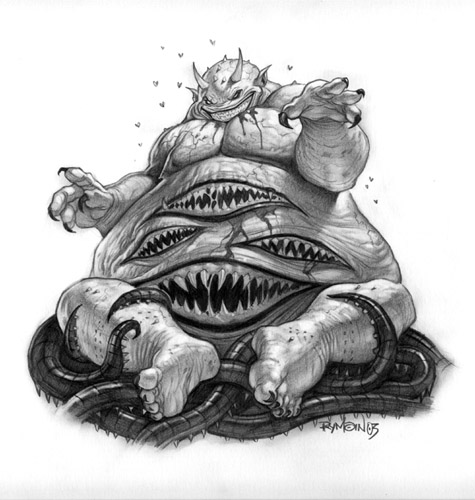 WIP:  [/IMG] Just blobbing the out the right shape/pose took forever :S |
Posted By: jeremy
Date Posted: 19 October 2009 at 9:46pm
Wrath

I rather like this pallette, better'n the XP MS Paint one :) @Ryath: There's no limit to the number of entries. Also, your piece could benefit from a more zzomed in look. Profile views are extremely difficult. |
Posted By: Pragz
Date Posted: 19 October 2009 at 10:13pm
|
I think his eyes should either be leveled out more or further distorted. It just kinda' looks lopsided as-is instead of intentional displacement. Still looks great, though! :D
------------- Hello - I'm new here. :) |
Posted By: mickeydonald
Date Posted: 20 October 2009 at 6:39am
|
i make a sort of 2 fat people and the controller of the tv is next to them and one ask for the controller and the other says no
forgot which one it is.
fast previeuw
 left text : get it yourself
right text : may i have the controller ?
|
Posted By: Hapiel
Date Posted: 20 October 2009 at 6:49am
|
You would better mirror that image, as everyone naturally reads from left to right!
------------- |
Posted By: mickeydonald
Date Posted: 20 October 2009 at 7:47am
| hate the pallete gr. |
Posted By: Manupix
Date Posted: 20 October 2009 at 12:41pm
| http://www.wayofthepixel.net/pixelation/index.php?PHPSESSID=3bfd5d6efe820fceba306835fc41ce7f&topic=1353.0 - Restricted palette challenges are the best ever. They're incredible learning tools, and force you to creative solutions and good art you'd never think to make in the first place. |
Posted By: dpixel
Date Posted: 20 October 2009 at 1:35pm
|
That's so true about restricted palette challenges. If you look at my wip above, you'll see the dark purple in the floor. It might not be the best choice but it sort of works. I would have never thought of that without the restricted palette. ------------- |
Posted By: JC Denton
Date Posted: 20 October 2009 at 1:57pm
| Can I represent Lucifer which is ( according to Wiki ) the demon related to Pride ? |
Posted By: SHANN0N
Date Posted: 20 October 2009 at 7:33pm
| Moskau -you should totally finish it,lol. Even unfinished I'd say it has my vote;) |
Posted By: jeremy
Date Posted: 21 October 2009 at 2:43am
Grr.

|
Posted By: Claredeth
Date Posted: 21 October 2009 at 4:40am
|
WHAT 9000?!?!
The eyes are misplaced on the head, look at the nose, then look at the eyes, I'm guessing you intentionally did this since it's still a WIP, but I'm just reminding you for later, the rendering looks great so far. |
Posted By: Manupix
Date Posted: 21 October 2009 at 5:48am
| Jeremy: the hand doesn't work, a http://commons.wikimedia.org/wiki/File:Schwer_sauer.jpg - closed fist might be more appropriate and easier (maybe). Great light! |
Posted By: JoCh
Date Posted: 21 October 2009 at 11:22am

My WIP, i have choose lust, it's joke about meetic and luustic. What do you think about it ?
I hope that it will not inappropriat, it's just border line, isn't it ?
PS. : Just a comment about the palette "the pink is so bad" is too clear for me !
EDIT : @ dex :i'm not jocher, i'm JoCh ! it's very near i'm sorry for jocher but for me this alias is the 2 first letter from my first and last name Joffrey Chouéla
|
Posted By: AdamF
Date Posted: 21 October 2009 at 1:49pm
|
Jocher? ------------- http://www.pixelxcore.net |
Posted By: linx
Date Posted: 21 October 2009 at 9:02pm
 It's not looking so good ;( |
Posted By: JoCh
Date Posted: 22 October 2009 at 12:22am
|
@ dex : i'm not jocher, i'm JoCh ! it's very near, i'm sorry for jocher, but this alias is the 2 firsts letters of my first and last name "Joffrey Chouéla"
@ linx : i think it could be great at the end, you must continuate !
|
Posted By: KORCHA
Date Posted: 22 October 2009 at 6:21am
|
Here's my take on Windows Se7en challenge; lust. Hopefully I got the lust part down.. Anyhow it still needs a bit more love here and there before I'll put it up in the ol' gallery. 16 colors altogether:  |
Posted By: dpixel
Date Posted: 22 October 2009 at 7:54am
|
Originally posted by linx
It's not looking so good ;( I think there was some perspective issues. Mainly being too wide and not enough leg and foot or something like that. Anyway, I played with it for 20 minutes. Maybe it might give you some ideas and motivation to finish. This is a really cool beast. It is a rather large piece.
 ------------- |
Posted By: susuwataris
Date Posted: 22 October 2009 at 4:42pm
|
Originally posted by KORCHA
Here's my take on Windows Se7en challenge; lust.Hopefully I got the lust part down.. Anyhow it still needs a bit more love here and there before I'll put it up in the ol' gallery. 16 colors altogether:
aw my gawd, i love that. |
Posted By: ekobor
Date Posted: 22 October 2009 at 10:13pm

This is as far as my entry id going to get this week due mainly to life making me want to lie on the floor crying and swearing until the world goes away. It was supposed t oshow gay pride. Not because I think it is a sin (being openly gay and all) but more to show that the things once thought to be sins aren't always, and that even though gay pride is a good thing, it can be taken too far. But I don't really remember or care about the original fervor I had to finish this. So, I thought I'd show it here in case I ever feel like picking it up again. ------------- |
Posted By: jeremy
Date Posted: 23 October 2009 at 12:25am
|
That looks real nice KORCHA! I reckon that the woman's nose isn't as dainty as you'd expect, thought it's likely a stylistic thing :)
@ekobor: Sorry to hear that :( Cool concept, and props to you for attempting a sin more difficult to imply, as well as employing the saturated colours to good use! |
Posted By: Seiyouh
Date Posted: 23 October 2009 at 1:04am
|
I put this image.
 |
Posted By: jeremy
Date Posted: 23 October 2009 at 1:56am
|
Finished :D
|
Posted By: Manupix
Date Posted: 23 October 2009 at 4:33am
|
@ekobor: I feel sorry for you. I do hope you pick this up and finish it! :) @Seiyouh: looks great! @Jeremy: looks great too! The wrist looks too thin, and impossibly placed. This close to the face, the arm should come at an angle; or with no angle but further left from the face. |
Posted By: Timbit
Date Posted: 23 October 2009 at 8:24am
Alright! Found some time and inspiration to get a PJ challenge done! But before gallery submission (and preview creation): For those who don't follow, it's greed! Crazy business lady causes a huge mess in a bank, and wants all the money, but there's one guy standing in the way. Basically the plan was to create an RPG style isometric game mockup thing. My own personal challenge was to create an RPG styled character portrayal like such, and I think I did that well (from my own perceived abilities prior to this). The real problem was the isometricness, which was incredibly hard to get good looking for me with the limited palette. |
Posted By: SHANN0N
Date Posted: 23 October 2009 at 4:23pm
Money to burn..

IDK if I'll finish this one,lol.. Its not that readable but the paper part of whats in her mouth is money. Jeremy- I like your use of the palette! |
Posted By: RollerKingdom
Date Posted: 23 October 2009 at 5:10pm
|
Originally posted by SHANN0N Money to burn..
IDK if I'll finish this one,lol.. Its not that readable but the paper part of whats in her mouth is money. Jeremy- I like your use of the palette! Deff. worth finishing it :) It's very readable! keep it going! |
Posted By: Brod
Date Posted: 23 October 2009 at 5:23pm
I love this idea, mainly cause I'm a FMA fan. So I thought I'd give it a try. Sin: Pride I'm going to make the guy simple and the background complex or whatever. (Well, I'm going to try, at least.  ) ) |
Posted By: ekobor
Date Posted: 23 October 2009 at 8:46pm

I'm still working on this... as best I can. Very little progress from before, but still. It's something. ------------- |
Posted By: susuwataris
Date Posted: 23 October 2009 at 8:56pm
|
Originally posted by SHANN0N
Money to burn..
IDK if I'll finish this one,lol.. Its not that readable but the paper part of whats in her mouth is money. Jeremy- I like your use of the palette! Please finish it or I'll cry. |
Posted By: skamocore
Date Posted: 23 October 2009 at 10:38pm
|
zomg, Shannon entering a challenge. Is this Pride? You are doing some amazing things with these colours, I immediately saw it as rolled up money. But I think you could try introducing a little bit more green into the note, other than that I can't think of much else to help indicate that it's money. Also, Oren Shtiv won't be happy. BTW happy b'day o: ------------- |
Posted By: andy0_0black
Date Posted: 24 October 2009 at 12:34am
|
great stuff everyone
i made one too 
|
Posted By: SHANN0N
Date Posted: 24 October 2009 at 1:20pm
|
Okay so I finished,lol
thanks skamocore^^ I did make it a bit more green afterwards. Somehow I cant stop myself from adding the moleXD |
Posted By: d-p
Date Posted: 24 October 2009 at 6:38pm
So many good results already I think the palette is really hard to work with but here is my result on wrath: ------------- http://iso.webmonk.de">  http://cc.webmonk.de"> http://cc.webmonk.de">
|
Posted By: jalonso
Date Posted: 24 October 2009 at 6:57pm
|
hiya d-p :) <3 The colors aren't that awful. I think that andy0_black has made sense of it. You can add blues pinks and greys to your piece. ------------- |
Posted By: d-p
Date Posted: 24 October 2009 at 7:12pm
|
hiya jalonso, nice to see you. Originally posted by jalonso You can add (...) pinks (...) to your piece. Well, I see.  Keep reaching the rainbow. Keep reaching the rainbow.------------- http://iso.webmonk.de"> http://cc.webmonk.de">
|
Posted By: IQbrew
Date Posted: 24 October 2009 at 11:21pm
 The hammock's basic shape is eluding me. |
Posted By: x-death
Date Posted: 25 October 2009 at 7:38pm
| perfect excuse for a design based on "full metal alchemist" if i get the time i'll do something. |