CHALLENGE 11/30/2009: Gears of Summer
Printed From: Pixel Joint
Category: Pixel Art
Forum Name: Collaborations/Challenges
Forum Discription: Submit pixel art project ideas/templates or contribute to an existing pixel art collaboration.
URL: https://pixeljoint.com/forum/forum_posts.asp?TID=9494
Printed Date: 08 September 2025 at 5:26pm
Topic: CHALLENGE 11/30/2009: Gears of Summer
Posted By: administrator
Subject: CHALLENGE 11/30/2009: Gears of Summer
Date Posted: 30 November 2009 at 12:01am
CHALLENGE: Gears of SummerSummer is right around the corner for those in the Southern Hemisphere. Therefore, challenge winner http://pixeljoint.com/p/3171.htm - Adarias challenges you to create a http://en.wikipedia.org/wiki/PlayStation_Portable - PSP mockup for a beach party game featuring ROBOTS! CHALLENGE RULES
CHALLENGE JUDGING
CHALLENGE PRIZES/GOODIES
CHALLENGE VOTING/pixels/poll.asp?id=1166' name='vote' target='_blank'>Vote now for your favorite pixelart in this week's challenge!CHALLENGE AWARDSThe Gears of Summer pixel art challenge is complete and we have three new champions. This week's challenge awards go to the following pieces:/pixelart/48470.htm' target='_blank'>  Tactical Combat Beach Soccer by /p/23474.htm' target='_blank'>inphy Tactical Combat Beach Soccer by /p/23474.htm' target='_blank'>inphy/pixelart/48442.htm' target='_blank'>  Robot Drinking Game Bonanza Mockup by /p/23720.htm' target='_blank'>Tiger/5T1N9R4Y Robot Drinking Game Bonanza Mockup by /p/23720.htm' target='_blank'>Tiger/5T1N9R4Y/pixelart/48388.htm' target='_blank'>  robo-volley by /p/25032.htm' target='_blank'>d-muerte robo-volley by /p/25032.htm' target='_blank'>d-muerteThanks so much to all who took the time to vote and participate in the challenge! /pixelart/48417.htm' target='_blank'>  Get the Booze by /p/19218.htm' target='_blank'>Jeremy Get the Booze by /p/19218.htm' target='_blank'>Jeremy/pixelart/48464.htm' target='_blank'> surf by /p/24369.htm' target='_blank'>Seiyouh/pixelart/48454.htm' target='_blank'> Clank's Beach Adventure by /p/20917.htm' target='_blank'>ak4oper/pixelart/48473.htm' target='_blank'>
Dubai Beach Tycoon by /p/24557.htm' target='_blank'>JoCh |
Replies:
Posted By: Petrichor
Date Posted: 30 November 2009 at 7:55pm
I dunno that I am gonna finish this :P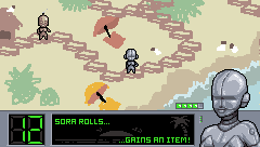 I think probably the whole thing's gonna be in oblique perspective of some sort, just not sure yet. Everything is just extremely roughed in at this point (clearly) but I like how the portrait's coming along so far, and the little steampunk bot sprite. :D |
Posted By: dpixel
Date Posted: 01 December 2009 at 10:35am
|
Originally posted by Petrichor
I dunno that I am gonna finish this :P I think probably the whole thing's gonna be in oblique perspective of some sort, just not sure yet. Everything is just extremely roughed in at this point (clearly) but I like how the portrait's coming along so far, and the little steampunk bot sprite. :D Very nice start. I like your idea. I hope you do finish. Too large of a canvas for me this week. :-( ------------- |
Posted By: inphy
Date Posted: 01 December 2009 at 11:40am
 Tactical Combat Beach Soccer. ..yeah. I'll try to work out an animation. -- pew pew  -- Getting there..  |
Posted By: jalonso
Date Posted: 01 December 2009 at 1:57pm
|
Adarias said this on the gallery's challenge page and it may be useful to some who don't quite get the PARTY part of the challenge. Mockup, in the vein of beach and party games. Party games are any that can be multiplayer or where you can pass the controller around by design (so mario party definite is, as is Super Smash, Left 4 Dead counts, Call of Duty possibly is, final fantasy definitely not). Something like DOA beach volleyball and that kind of sub-genre (that's what i had in mind), only it's robots. Of course, come up with your own format that involves robots and beaches and you could earn bonus points (I don't vote). It would be a tough argument but if you can do a piece of full-screen static art and sell it as a game mockup (beach robot multiplayer dating sim?) more power to you. The only requirements are that it must be 240x136 and that it must appear to be a party game mockup. Again though the basic rules are there and beyond that it's up to fate and the audience. You could potentially sell a picture fried chicken as long as it's 240x136 with no transparency, it's just going to be a hell of a lot harder to convince. ------------- |
Posted By: Shawn
Date Posted: 01 December 2009 at 6:04pm
|
Originally posted by inphy thats like 4 awesome things in one.Tactical Combat Beach Soccer. ..yeah. I'll try to work out an animation. best idea ever? I THINK SO! ------------- |
Posted By: jeremy
Date Posted: 01 December 2009 at 11:47pm
I've got animation mapped out, just need to mind-numbingly put it together >.<

(I originally read it as a game about a robotic party :D ) |
Posted By: ak4oper
Date Posted: 03 December 2009 at 9:04pm
 This is a rough draft of my idea. I still need to fix up the sprites, and a gradient to the Select Weapon box and add a background. Also, the terrain is temporary, I'm planning on changing it. Does anyone have any feedback? P.S. That's supposed to be Clank in case you couldn't tell. |
Posted By: Seiyouh
Date Posted: 05 December 2009 at 5:01am

|
Posted By: JoCh
Date Posted: 05 December 2009 at 12:38pm
http://joffreychouela.hautetfort.com/images/RETROPIXEL/Dubai%20Beach%20Tycoon.gif"> My idea for this week !
|
Posted By: skamocore
Date Posted: 05 December 2009 at 6:34pm
|
* - gradients * why is the Dubai Bank logo the only AA'd thing in this whole piece? * ...There are also some really ugly jaggies/unrefined lines * insert coins...into a PSP!? * should be transport without the s ------------- |
Posted By: JoCh
Date Posted: 06 December 2009 at 12:55am
|
Thanks a lot for your remarks,
the dubai bank logo is an error (it's not the good version of the picture, i ve do an other one, i must change it)
Insert coins into a PSP, clearly is incorrect, but i had imagine that it will be interesting to have retrogaming aspect for the game over and things like that, and it fun to see now in the medias a state wich is supposed very rich like dubai who ask for money cause of the crisis.
The unrefined line that you speak are these of the hummer ? i ve not finish it, i must redesign the back of it.
|
Posted By: A.B. Lazer
Date Posted: 06 December 2009 at 9:24am
|
And where are robot beauties?
Beach theme and title of the challenge require (though inderectly) some robotic girls in the mockup. Without them most of the fun is lost. Imagine 60's beach movie only with bearded men as the cast! |
Posted By: Clovvach
Date Posted: 06 December 2009 at 10:54am
Here is my "finnished" product.

I'm planning to submit it today, if no constructive criticism is said for it. |
Posted By: Clovvach
Date Posted: 06 December 2009 at 10:59am
|
Let me explain. There are 3 colors used in this piece. It's like a fake classic video game on the PSP. The "press O" button is because there is a real "O" button on the PSP, for those who have never seen one before.
I'm doing the best I can, although the rules were sort of confusing. :| |
Posted By: A.B. Lazer
Date Posted: 06 December 2009 at 11:21am
|
Clovvach, when you feel that something should be explained, you should explain it through the picture, and use words only when all is done on the picture ( for button 'o', for example, you could draw a part of PSP with flashing 'o' button).
As for the whole piece - if you aimed for retro look, you could use the grid as basis - constructing the playfield from 8x8 or 16x16 blocks or something as distinctive, so the viewer could remember something similar from back in the day. Palmtree looks crammed in at the last moment. |
Posted By: Clovvach
Date Posted: 06 December 2009 at 3:44pm
|
Thanks AB! Although, I really don't FEEL like it should be explained, it's just usualy needed to be explained anyway, some people are really clueless. OK so, edited the palmtree, and the O button... but I need an opinion. I have 4 versions of this picture, 3 of witch are retro, and the other 1 is the original.
OOOKKKK so, 1rst one has tall pixels... 
the good part is that it looks retro... although some of it is not understandable. 2nd one has wide pixels... 
it's like the 1rst one... 3rd one is the normal one. 
It's my personal favorite, although it has less of a "retro" feel. 4th one is the 16x16 pixel grid. 
It has a retro feel, the text is readable, although it's hard to tell what the center of the picture is. OK, so if no opinion is given before the end of the day, I'm going to submit the normal one. |
Posted By: A.B. Lazer
Date Posted: 06 December 2009 at 4:05pm
| Doubling every second row doesn't makes anything retro yet. It is predefining the rules according to some hardware possibilities and taking in account state of pop culture in that hardware's time period which really makes it. |
Posted By: Clovvach
Date Posted: 06 December 2009 at 4:21pm
| Yah I never liked those versions any way. So I think the normal one looks the best, y'know. It still has that 3 color restriction, and it still makes since. |
Posted By: A.B. Lazer
Date Posted: 06 December 2009 at 4:59pm
|
Uh, it's still very scribbly and composition not thought out (like mentioned palmtree - no matter how well you draw it, it still visible that it was added last) and therefore existing colors have no proper use, so in complex it does not look good at all. Problems that are still present in most of your works.
Maybe it deals with the way you work. For me - I make big vertical canvas and copy-paste the whole piece to new place each time I make noticeable changes - so that I could quick revert to any previous state if I make mistake. It gives me freedom and I make major changes without second thought because everything is saved (I create new file when canvas becomes too big to avoid any problems with RAM). |
Posted By: Clovvach
Date Posted: 06 December 2009 at 5:14pm
| I didn't add the Palm tree last though. I have no clue why it turns out the way people says it does though, and it doesn't help when I can't see the problem. I do something similar to you, each time I make a notable change, I create a new file. Thanks for the advice though. |
Posted By: A.B. Lazer
Date Posted: 06 December 2009 at 5:28pm
|
It makes such impression because it's width is exactly the same as the width between side of pic and head of robot. And robot is already in the center of area bordered by black space and the same left border of the screen.
I fit all variants in the same file changing it when canvas is filled up. So all recent changes are one click away. |
Posted By: schafft
Date Posted: 07 December 2009 at 4:11am
| 2 ALL MODERATORS: I know I'm late to this challenges. But I have a whole day was off the Internet. At the city was a terrible snow. Entire 4Hrs I reached the house. Please pass my work for the competition. I worked for a week. I can not conquer, but I want very participate. http://www.pixeljoint.com/pixelart/48492.htm |