Just another woman portrait.
Printed From: Pixel Joint
Category: Pixel Art
Forum Name: WIP (Work In Progress)
Forum Discription: Get crits and comments on your pixel WIPs and other art too!
URL: https://pixeljoint.com/forum/forum_posts.asp?TID=9647
Printed Date: 12 September 2025 at 4:01am
Topic: Just another woman portrait.
Posted By: Sinsky
Subject: Just another woman portrait.
Date Posted: 31 December 2009 at 4:23pm
|
Hello, I'm new on this forum and it's my first WIP. 2,5 hours ago I started drawing this image on paint, and I want to fix mistakes,if they exists. Did distance between eye and ear is correct? I think it's too short.  oh, and HAPPY NEW YEAR!!! oh, and HAPPY NEW YEAR!!!
|
Replies:
Posted By: Sinsky
Date Posted: 31 December 2009 at 4:24pm
There's previous WIP: |
Posted By: r1k
Date Posted: 31 December 2009 at 5:23pm
|
what exactly are you going for in this peice? Do you want to make a realistic looking face (anatomy wise atleast)? Im asuming this because you seem to be concerned with the proportions. The face here is very stylazied. Yes, the distance between eyes and ear is too short. Eyes are also too big. Also the face appears to be sloping foreward. You might want to look at a reference for this. Practice drawing eyes, nose and lips from references or life, you are having problems with them. Also, are you useing the spray can to blend between shades? You might want to try putting down a middle tone over the whole thing, then adding shadows, and then highlights. Keep it simple at first, then after you have it all in you can go in and refine/blend between shades. I did this draw over, although I dont think its exactly what you are going for, it may be helpful anyways  hope that helps. |
Posted By: cure
Date Posted: 31 December 2009 at 5:44pm
|
well i wrote a bunch of stuff but it got deleted so here's the abbreviated version: -always work from reference, if possible -canvas size is really, really huge for pixelart (unless it were some huge elaborate scene "if they exist"- even the best of us aren't above making mistakes! it's not a matter of if they exist, but identifying the mistakes that are undoubtedly there. what immediately pops out as incorrect anatomy-wise: -forehead much too small -cranium too small -face slopes outward (nose slopes, mouth positioned too far forward -no trapezius muscles -no actual neck anatomy (there are many muscles and structures in there) -neck has an almost conical, rather than cylindrical, shape -eyes far too big -eyes simplified as almond-shapes. steer clear of symbolism. especially incorrect on the far eye at a 3/4ths view -lips are straight/rigid/not lip-shaped -chin not well-defined here's an edit to get you started, but nothing will be more useful than google images: 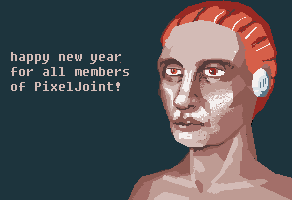 i see r1k posted while I was typing. everything he said is pretty solid, and now you have two nice edits! also: i didn't see that it was supposed to be a woman :P so my manly edit might not be as useful as originally thought. Either way you really need to make sure it's obvious it's a woman by giving her feminine characteristics (smaller chin, less pronounced jaw, fuller lips, etcetc |
Posted By: Sinsky
Date Posted: 01 January 2010 at 6:36am
|
Many thanks for the answers. I'll get to redraw all. SFME |
Posted By: Sinsky
Date Posted: 01 January 2010 at 7:24am
 So, this is the next version, but I think I'll must abandon this pixelart and start new one. So, this is the next version, but I think I'll must abandon this pixelart and start new one.Many thanks for edits again. //EDIT: There is another portrait:  |
Posted By: cure
Date Posted: 01 January 2010 at 12:04pm
|
on the second portrait: the ear should be larger and farther back. if the red is hair, then it shouldn't come to a point in the center (unless it were the opposite- a widow's peak). the head is too simplified of a shape, while starting with an oval is ok you need to keep in mind the skull beneath the head. the chin has been shaved off again and the lips are a slanted/lopsides (also, keep in mind that the upper lip is a bit curvier [more curvy?] than shown here, you may want to include the dip in the center or curl it a bit at the ends). the cheeks could use more definition and the eyebrows could be more shapely. that being said i think the new one is much improved and much more feminine, kutgw |
Posted By: sharprm
Date Posted: 04 January 2010 at 12:04am
| use a ref here is one u might find useful: http://stapletonkearns.blogspot.com/2009/02/drawing-suppresion-of-values-in-light.html |