[getting my feet wet] isometric spriting
Printed From: Pixel Joint
Category: Pixel Art
Forum Name: WIP (Work In Progress)
Forum Discription: Get crits and comments on your pixel WIPs and other art too!
URL: https://pixeljoint.com/forum/forum_posts.asp?TID=9675
Printed Date: 12 June 2026 at 10:10am
Topic: [getting my feet wet] isometric spriting
Posted By: alcott
Subject: [getting my feet wet] isometric spriting
Date Posted: 08 January 2010 at 7:48am
|
Hey guys! I'm pretty new to this whole pixel art thing but it sounds like a lot of fun and the good results are really professional looking so I thought I'd give it a try. =) I have no idea if this is correctly at 26 degrees (I eyeballed it from a pencil sketch!) and I threw in colour haphazardly just to get some shading down -- once I have some criticisms to work off of though those issues will probably be resolved some more, haha. Hopefully if I can make some good bases I can start animating basic sequences -- walking, running, jumping,  Any input is extremely helpful! Thanks in advance. |
Replies:
Posted By: jalonso
Date Posted: 08 January 2010 at 12:47pm
|
The sprite shape is ok but its not iso. Make a wireframe to work from so you stay in iso perspective. The feet and hands especially are placed in the wrong place. ------------- |
Posted By: alcott
Date Posted: 08 January 2010 at 1:24pm
Sorry, I'm not really sure what a wireframe is (going to go look it up right now!) The ratio for isometric drawings is two pixels across/one up, right? All right, I tried putting in some guidelines and shifting the proportions to match up with it -- colors and lineart are a little messy in the process! When the two images are put up next to each other the new one looks a lot better but his right foot (our left) still looks a little off. Is this in good shape to start animating soon? Or should I push the contrast more with complementary colors/more shades? |
Posted By: iggybork
Date Posted: 09 January 2010 at 2:07pm
|
I've been a lurker on these forums for awhile now, because I love seeing how WIPs change over the course of a post. I'm still learning about the ins and outs of pixel art, so I can't help you with banding or noise or anything, but I can certainly help you here - you've got some anatomy issues.
A wireframe is a way to model the anatomy of the form you're drawing before you put skin or clothes on. It's like you're drawing a simplified skeleton, and in this case, a skeleton with the shapes of different basic body parts on top. They can be as simple as glorified stick figures, but the point is that they help you see how the character is moving. Mine has lines on top of some of the sections - these show what direction each part of the body is facing, which really helps when tweaking the body and adding clothes on.
Assumption: You're making a character sprite that faces SW. If I'm wrong, ignore all this.
The body you had before was okay, but when you tried to make it iso, some scary things happened. The first picture is your original, and the second is a wireframe I put on top of it. I'm pretty sure you meant this to be an idle pose, but it looks like she's trying to roll her shoulders - her left shoulder is way too high in comparison to where her head is and it pushes her chest forward. Her upper body is sort of facing in the correct direction, while her lower body is still facing forward. The straightness of the bottom of her shirt and the top of her pants makes her hips look flat. Her feet are actually on the right line, but her entire body needs to shift with them, because it's making her left leg too short (and slightly bovine). Her knees seem to be in ambiguous places and her right arm is bent strangely.
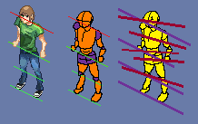 In the third image, the purple lines are actual iso lines, while the dark reddish ones are the way different parts of your character are facing. In true iso, all these lines would be (for the most part) parallel. The first red line is the line of her eyes, the second is the line of her chest, the third her stomach, the fourth her hips, and the fifth her knees. I didn't include one for her feet because they're in the right place.
Nitpick: Increase the contrast on the skin on her arms. When I look at her from the wrong angle, the shading beneath the sleeves make them seem to disappear, Rayman-style.
{I'll continue this post in a bit}
|
Posted By: jalonso
Date Posted: 09 January 2010 at 2:12pm
|
@Iggybork, Hope you continue posting often as your comment is great in every way. @alcott, ... what Iggy says is what I hoped to say in the laziest possible way. E: Iggy, So impressed by your first post that you get a star in your profile :) ------------- |
Posted By: iggybork
Date Posted: 09 January 2010 at 2:41pm
|
@jalonso: I swear, that is what everyone on the internet hopes to hear at some point. You have made my life complete! :D
And here are some screenies to illustrate the point about facings in isometric views. Final Fantasy Tactics: Advance is a great isometric game, and you can see how all the characters are facing either NE/NW/SE/SW, and not just their heads but their entire bodies. The direction a character faces in FFTA is extremely important, because an enemy that isn't facing you is 25% easier to hit.
 Not really sure what game this is, but again, you can see how the body is facing one of the secondary directions and the head is facing the same direction as the body. The mole knight is facing west, but I assume this is a cutscene or something.
 One of the challenges with drawing people in an isometric environment is to keep them from looking too blocky. Example:
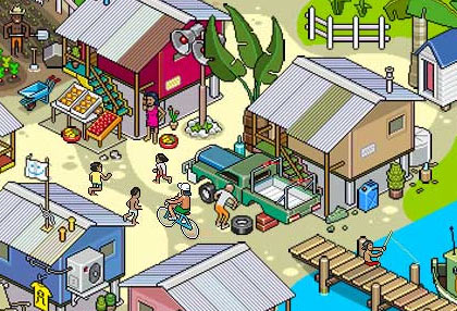 With some of the people here, you can really tell - the arms and legs are very straight. (And why is that kid about to jump off the roof?) So if you stick with an iso world, you have to decide if you want it to look like iso #3, where you can really tell it's isometric and things sort of look like blocks, or iso #2, where it's the defining point of the art but not the first thing you think about, or iso #1, where the characters are all sprited small in the game world to make them easier to manipulate.
|
Posted By: alcott
Date Posted: 09 January 2010 at 2:57pm
|
Holy crap iggybork, that was really wonderful to read! Thanks so much, I'll definitely try and resolve the "different parts of the body facing different directions" stuff going on next time I work on this =) Your impression of the sprite does beg another question though -- does the figure read as male enough? Granted, he's kind of a girly man but it's definitely a guy. Might have to make a female sprite for comparison purposes, haha |
Posted By: iggybork
Date Posted: 09 January 2010 at 4:05pm
|
Ask, and ye shall receive. This is why I assumed he was a lady:
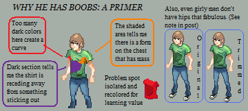 Note about fabulous hips: You don't seem belligerent, but some people might say, "But I wanted him to have those fabulous hips! He's a girly man!" At that point, you have to decide whether it's more important to you for him to look as girly as humanly possible, or if it's more important for your players to understand they're playing a guy.
Also, the dark blob on his shirt isn't exactly realistic. Even in very dark areas, there's still reflected light all over the place - even if there's only one lamp in a room, the light from that lamp bounces off every wall it hits and will get to the left side of his stomach.
|
Posted By: alcott
Date Posted: 10 January 2010 at 12:41am
http://f.imagehost.org/view/0357/more_isometric"> One more attempt tonight to make all elements of the figure more conducive with the isometric angle. It still kind of feels like he's shrugging his shoulders ridiculously -- I'm going to add a bit more to his neck and maybe fuss around with the general proportions a bit more! This definitely feels like improvement from the first and second ones, though... EDIT: Ugh, really? Did that imagehosting site really make my sprite a JPEG? I keep trying to upload it to photobucket though, and I'm getting "invalid file type" notifications. Better luck tomorrow? |
Posted By: kenpokis
Date Posted: 10 January 2010 at 12:44am
| It looks like it is coming along. You are starting to get the isometric perspective. I'm not much of a spriter myself, but I think maybe if you lowered his shoulder that it would make it look much better. Also maybe if you straighten his arms out a bit, as it looks like he is clinching his fist. (Unless that's the look you're going for of course.) Keep up the good work. |
Posted By: iggybork
Date Posted: 10 January 2010 at 1:13am
|
Well, that's because from this angle you can see more of him, mainly his neckline and a peek at the top of his back, because iso is a partially top-down perspective. Did some quick edits, I think I might be showing too much of the back of his neck, but you get the idea:
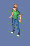 But ZOMG what an improvement on your last one! :D Great edits on the shirt, I can tell he has elbows and that he aint a lady. *encouragement!*
Also, .PNG is the god of filetypes. I'm using photobucket for everything, so you can't tell me it's not taking .PNGs. :P
|
Posted By: alcott
Date Posted: 10 January 2010 at 4:03pm
http://f.imagehost.org/view/0357/more_isometric">  Took your advice, still working out some anatomical kinks (elongation of the torso - the legs were getting a little too long - taking everybody's advice) and figuring out shading on the legs. Also, the image from last night was probably just a faulty file because my PNG's are uploading fine now! Might have an update later tonight, but don't count on it. |