| Active TopicsSearchRegisterLogin |
| WIP (Work In Progress) | |
| |
  |
| Author | Message |
|
capnbubs
Seaman 
Joined: 14 December 2010 Online Status: Offline Posts: 12 |
  Topic: Scifi Platformer Mockup WIP Topic: Scifi Platformer Mockup WIPPosted: 07 July 2011 at 2:48am |
|
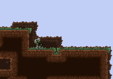
I'm drawing this game mockup as a free time project around other work. I don't have a particularly large amount of experience in pixel art so I thought i'd post regular WIPs here in case anybody could give me some useful advice on colour choices, pixel placement etc.
Thanks for checking my topic =] [EDIT 12:46- 14th July]    Edited by capnbubs - 14 July 2011 at 4:46am |
|
 IP Logged IP Logged |
|
|
Psychotic_Carp
Commander 
Joined: 02 April 2005 Online Status: Offline Posts: 1008 |
Posted: 07 July 2011 at 9:08pm |
|
i really like the ground but The grass is a bit too busy for me (at the corners)
|
|
 got game? got game?
|
|
|
IP Logged |
|
|
capnbubs
Seaman
Joined: 14 December 2010 Online Status: Offline Posts: 12 |
Posted: 08 July 2011 at 7:24am |
|
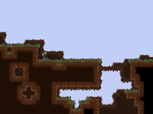
I made some background tiles. Would you say the grass being too busy at the corners was a stylistic opinion or does it actually hurt the look? because I'm quite fond of it.
 |
|
|
IP Logged |
|
|
Alex Pang
Commander
Joined: 23 February 2025 Online Status: Offline Posts: 224 |
Posted: 08 July 2011 at 8:12am |
|
Damn this reminds me of terraria!!!!
|
|
|
IP Logged |
|
|
capnbubs
Seaman
Joined: 14 December 2010 Online Status: Offline Posts: 12 |
Posted: 08 July 2011 at 8:56am |
|
I was thinkin doing a similar tile setup to terraria would make a level editor nice and easy, I was hoping it was far enough from terraria's style to differentiate it. So much for that xD
|
|
|
IP Logged |
|
|
vlad61
Midshipman 
Joined: 22 April 2015 Online Status: Offline Posts: 96 |
Posted: 08 July 2011 at 4:13pm |
|
lol dont worry its definitively way better pixel art than terrarias
edit: Would like to see some animation Edited by vlad61 - 08 July 2011 at 4:13pm |
|
|
IP Logged |
|
|
capnbubs
Seaman
Joined: 14 December 2010 Online Status: Offline Posts: 12 |
Posted: 08 July 2011 at 4:21pm |
|
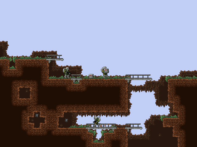
Here's an update on the scene mockup and the first animation for the little character!
  Originally posted by vlad61 lol dont worry its definitively way better pixel art than terrarias edit: Would like to see some animation Thanks, happy to hear it! There's some animation for ya. Edited by capnbubs - 08 July 2011 at 4:28pm |
|
|
IP Logged |
|
|
crozier
Commander
Joined: 08 May 2023 Online Status: Offline Posts: 190 |
Posted: 08 July 2011 at 5:31pm |
|
Looking good! Much better then terraria!
A little curious as to how the holes in the ground are emmiting light :p
Can't wait to see more of this one.
|
|
|
IP Logged |
|
|
vlad61
Midshipman
Joined: 22 April 2015 Online Status: Offline Posts: 96 |
Posted: 08 July 2011 at 8:57pm |
|
heh yeah i thought at first that was artistic license but i think if you actually plan on making underground parts to it then just copy and paste the dirt texture everywhere it belongs.
Also i saw no answered your grass question - i think its totally pro really just as the rest of your work I will deffinetly be watching your gallery! So far no crits really other than nit picks...Did you make that animation in a matter of minutes btw??? EDIT: This is a nitpick but i did want to give one crit lol but the sprites run i think is way to light and fast for the suite he wears. Edited by vlad61 - 08 July 2011 at 9:20pm |
|
|
IP Logged |
|
|
capnbubs
Seaman
Joined: 14 December 2010 Online Status: Offline Posts: 12 |
Posted: 09 July 2011 at 2:33am |
|
Originally posted by vlad61 heh yeah i thought at first that was artistic license but i think if you actually plan on making underground parts to it then just copy and paste the dirt texture everywhere it belongs. Also i saw no answered your grass question - i think its totally pro really just as the rest of your work I will deffinetly be watching your gallery! So far no crits really other than nit picks...Did you make that animation in a matter of minutes btw??? EDIT: This is a nitpick but i did want to give one crit lol but the sprites run i think is way to light and fast for the suite he wears. About the light emitting caves, there would be a lighting system in the game so those would only be seen once there was light in there. I'll add a mockup of that on a higher layer. The animation took a couple of hours, I just happened to be making it already when the guy asked =P Thanks for the crit on the run but in my ideas for this project this is the lightest and fastest suit. I might slow it down a bit in the actual game. Edited by capnbubs - 09 July 2011 at 2:33am |
|
|
IP Logged |
|
|
capnbubs
Seaman
Joined: 14 December 2010 Online Status: Offline Posts: 12 |
Posted: 10 July 2011 at 5:58am |
|
Added some bits, I was thinking these boxes would contain building pieces like bridge tiles, you have to carry them over to where you want to use them.
|
|
|
IP Logged |
|
|
vlad61
Midshipman
Joined: 22 April 2015 Online Status: Offline Posts: 96 |
Posted: 10 July 2011 at 10:30am |
|
I am liking it sir - i didnt realize you are involved with that drill bot game. Maybe you should try to make the grass hang off the side edges a bit? just to see if it would look better because it looks a bit strange with the side top being dirt and then suddenly grass
|
|
|
IP Logged |
|
|
CELS
Commander
Joined: 23 September 2022 Online Status: Offline Posts: 758 |
Posted: 10 July 2011 at 10:51am |
|
I think the tiles look awesome, but when it's all assembled in the mock-up, it all looks too blocky for my taste. It looks like a huge dirt-covered industrial complex.
By the way, if that cube has a function similar to the ones in Portal, I demand to play this game. I also demand that you make a companion cube easter egg. |
|
|
IP Logged |
|
|
capnbubs
Seaman
Joined: 14 December 2010 Online Status: Offline Posts: 12 |
Posted: 11 July 2011 at 7:09am |
|
Thanks for the advice both of you. I added some grass hanging over the foreground to break up the top surfaces and it looks much better thanks, I also rounded the bottom corners of the terrain to try and stop it feeling so blocky.
I'm not totally sure about my colour choices on the tree but I'm very proud of it. I also started working on a background. 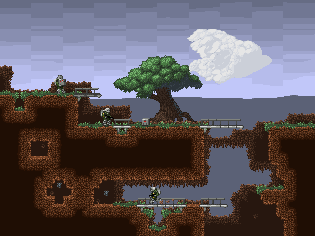 Edited by capnbubs - 11 July 2011 at 10:10am |
|
|
IP Logged |
|
|
CELS
Commander
Joined: 23 September 2022 Online Status: Offline Posts: 758 |
Posted: 11 July 2011 at 1:53pm |
|
I think the background looks great. The gradient sky against the monotone horizon reminds me of the old classic Scorched Earth. Speaking of the sky, are you sure you don't want to reduce the number of colours, maybe try some dithering? It's just that the whole art style seems to have a very limited palette, except for the background. (Apropos, the tree looks amazing. Wish I could do that with so few colours)
The bottom corners look a lot better. I didn't think such a small change would make such a difference. My next question is; when you look at the second layer of foreground, or the immediate background, I don't understand why you need to stick with the blocky format of the foreground. I understand that the foreground needs to be squares because of gameplay, and you don't want the hassle of rolling hills. But why should the second layer follow the same pattern? Wouldn't it be better with some round edges and/or 45 degree lines? The cloud looks great, except for the middle part which kind of looks like an organ. I probably wouldn't react if it was part of a bigger piece with a photorealistic approach, but when everything looks very cartoony, the hyperrealistic cloud looks out of place. |
|
|
IP Logged |
|
|
capnbubs
Seaman
Joined: 14 December 2010 Online Status: Offline Posts: 12 |
Posted: 11 July 2011 at 3:38pm |
|
Originally posted by CELS I think the background looks great. The gradient sky against the monotone horizon reminds me of the old classic Scorched Earth. Speaking of the sky, are you sure you don't want to reduce the number of colours, maybe try some dithering? It's just that the whole art style seems to have a very limited palette, except for the background. (Apropos, the tree looks amazing. Wish I could do that with so few colours) The bottom corners look a lot better. I didn't think such a small change would make such a difference. My next question is; when you look at the second layer of foreground, or the immediate background, I don't understand why you need to stick with the blocky format of the foreground. I understand that the foreground needs to be squares because of gameplay, and you don't want the hassle of rolling hills. But why should the second layer follow the same pattern? Wouldn't it be better with some round edges and/or 45 degree lines? The cloud looks great, except for the middle part which kind of looks like an organ. I probably wouldn't react if it was part of a bigger piece with a photorealistic approach, but when everything looks very cartoony, the hyperrealistic cloud looks out of place. Thanks for all the critique! The sky at the moment is just something quick I threw together so I had some kind of background, I'll probably try and do something with fewer colours once I've had more practice (the cloud may evolve into a full piece of background artwork). I want to use the more dithered approach on the cloud and background art to help differentiate the background from the foreground. The reason the next layer back is built in a square tiled style like that is because I want it to be automatically generated easily by the level editor. [Update] Here's the newest version, I brightened up the highlights on the foliage like suggested over at pixelation, I messed around with the less saturated dirt but I didn't like it as much as this fertile bright look. Finally came up with a sky design I'm happy with, I improved the cloud too. Darkened up the shadow on the tree leaves and a bunch of other little things. Edited by capnbubs - 12 July 2011 at 8:38am |
|
|
IP Logged |
|
|
vlad61
Midshipman
Joined: 22 April 2015 Online Status: Offline Posts: 96 |
Posted: 12 July 2011 at 9:23pm |
|
You are so good and i hate you for it! One thing i noticed is that your perspective on the bridges

|
|
|
IP Logged |
|
|
capnbubs
Seaman
Joined: 14 December 2010 Online Status: Offline Posts: 12 |
Posted: 14 July 2011 at 1:40am |
|
Originally posted by vlad61 You are so good and i hate you for it! One thing i noticed is that your perspective on the bridges Haha thanks for compliment, I'm sorry you hate me now! I noticed that about the bridges too, I just haven't gotten around to fixing them yet. I've been reworking the troopers and working on their animations. [EDIT] I added left handed so when you change direction you won't swap hands. Edited by capnbubs - 14 July 2011 at 4:44am |
|
|
IP Logged |
|
|
vlad61
Midshipman
Joined: 22 April 2015 Online Status: Offline Posts: 96 |
Posted: 14 July 2011 at 12:12pm |
|
What is it supposed to be? Its not very clear
|
|
|
IP Logged |
|
|
capnbubs
Seaman
Joined: 14 December 2010 Online Status: Offline Posts: 12 |
Posted: 19 July 2011 at 3:55am |
|
Thanks for the help everybody!
I'm happy with where the style and quality is now so we're getting on with getting the game made. I won't be updating this thread anymore. Thanks again all of you for taking the time to comment and critique my work. I hope you'll like the game when it's finished, keep an eye out for it on tigsource if you're interested it should pop up over there in a couple of weeks. ps. vlad61 I haven't decided what that gun is yet, all the weapons will have larger inventory portraits so it'll be clearer in the game. |
|
|
IP Logged |
|
|
SpeedXaaa
Seaman
Joined: 14 July 2011 Online Status: Offline Posts: 11 |
Posted: 20 July 2011 at 7:57pm |
|
The only problem I have is with the second animation you have here. While the one before it looks of decent length, the view in the second one...eh, the gun seems to be much too exaggerated, thus appearing a bit less than double the size of how it should. If you could just alter that by a few pixels, I'm sure that would help quite a bit.
Otherwise, what all you have here is amazing. |
|
|
IP Logged |
|
| |
||
Forum Jump |
You cannot post new topics in this forum You cannot reply to topics in this forum You cannot delete your posts in this forum You cannot edit your posts in this forum You cannot create polls in this forum You cannot vote in polls in this forum |
|
