| Active TopicsSearchRegisterLogin |
| WIP (Work In Progress) | |
| |
  |
| Author | Message |
|
Friend
Commander 
Joined: 01 April 2015 Online Status: Offline Posts: 710 |
  Topic: First rejection Topic: First rejectionPosted: 07 October 2011 at 8:32am |
|
My pomegranate wasn't adequate for the PJ gallery
 (but this is great incentive to improve)I don't know how I should begin to improve. So, yeah, I hope I can receive a bit of help here. (but this is great incentive to improve)I don't know how I should begin to improve. So, yeah, I hope I can receive a bit of help here.Edited by Frost Butt - 07 October 2011 at 11:03am |
|
 IP Logged IP Logged |
|
|
Melee
Midshipman 
Joined: 06 August 2015 Online Status: Offline Posts: 63 |
Posted: 07 October 2011 at 9:52am |
|
I'd really like to see the piece without the background/frame. :D The character kind of just sinks into it.
|
|
|
IP Logged |
|
|
mase0ne
Midshipman
Joined: 08 September 2011 Online Status: Offline Posts: 49 |
Posted: 07 October 2011 at 10:21am |
|
Not to be mean or anything, but what is it?
|
|
|
IP Logged |
|
|
Friend
Commander
Joined: 01 April 2015 Online Status: Offline Posts: 710 |
Posted: 07 October 2011 at 11:03am |
|
I'm sorry. It's a pomegranate! Please forgive me, I slept like 2 hours last night
|
|
|
IP Logged |
|
|
Delicious
Rear Admiral 
Joined: 18 January 2015 Online Status: Offline Posts: 273 |
Posted: 07 October 2011 at 11:34am |
|
It looks quite flat. The shading is inconsistant for a fruit with a smooth sphere. The shadow core is a bit small and you should give it reflected light at the bottom of the pomegranate to further bring out it's shape and texture. Also, I suggest adding another mid-tone to make the transition to the shadow a bit smoother. Did you look at reference? If not, I suggest you do. If you did, I suggest you look harder at it and learn from the study.
Also, remove that background or change it to a different hue that will compliment the pomegranate. Doesn't seem to do much other than distract from the acual piece.
Edited by Delicious - 07 October 2011 at 11:36am |
|
|
IP Logged |
|
|
Friend
Commander
Joined: 01 April 2015 Online Status: Offline Posts: 710 |
Posted: 07 October 2011 at 11:55am |
|
No I didn't look at a reference. I wanted to try to shade something without the aid of a reference. I really struggle with the concept of shading. I can only perceive flat objects if I don't use a ref. What do you mean by shadow core? The curve doesn't occupy enough of the shape? And how do you portray reflected light on the bottom?
Edited by Frost Butt - 07 October 2011 at 11:55am |
|
|
IP Logged |
|
|
Delicious
Rear Admiral
Joined: 18 January 2015 Online Status: Offline Posts: 273 |
Posted: 07 October 2011 at 2:09pm |
|
Most draw/paint fruit as a study, so reference is required if you want to learn anything. Doing it from your head wont help you understand how to properly create such an object. Definitely suggest you do some reference studies to help you learn how it works before moving into imagination. I guess the curve does give it shape, but it doesn't do justice and make it pop out which is what you should aim for.
 Mine was really rushed, so it's not nearly as clean as yours but it should help you understand better on the sphere and how to shade it. Also, a bit help for the colors too, even though they're not that great it gives you an idea of how to pick better ones by shifting hues. Also, kinda a bad example of reflected light, but hopefully you get the point.
Not sure why this wasn't accepted though, heaps better than previous work that where allowed in recently. Ah well, gives you some more time to improve on it and learn!
|
|
|
IP Logged |
|
|
Friend
Commander
Joined: 01 April 2015 Online Status: Offline Posts: 710 |
Posted: 07 October 2011 at 2:24pm |
|
whoa... You are so much more talented than me lol. I'm not quite sure I understand your shading, because in the reference you have, the bottom right corner is lighter, where you have your deepest shadow with only a sliver of reflected light.
I don't understand how you each color layer. You have a sort of S shape, which I can't discern in the reference. Your colors are delicious; I actually did the hue shifting, but you proved that I need to shift much more Thanks a bunch to everyone helping. It really means a lot :) Edited by Frost Butt - 07 October 2011 at 2:30pm |
|
|
IP Logged |
|
|
Friend
Commander
Joined: 01 April 2015 Online Status: Offline Posts: 710 |
Posted: 07 October 2011 at 3:24pm |
 I think... this is better. I still don't think I am there yet |
|
|
IP Logged |
|
|
Melee
Midshipman
Joined: 06 August 2015 Online Status: Offline Posts: 63 |
Posted: 07 October 2011 at 3:39pm |
|
When you shade an object, it's... okay, it's weird. You have all kinds of levels. You'll rarely find something that's actually just DARK on one part. You have your core-- the darkest part-- the reflected light (which is that light bit at the bottom. It's not super bright but looks so b/c it's against a really dark part of the image), your highlight, and a few inbetweens. This is because light isn't just... like an arrow? It bounces around-- and then hits your eye. So light could be hitting the table, then bouncing up and hitting the pomegranate-- so there's the reflected light.
The way the pom is currently shaded (before Delicious' edit), it looks almost as if your character is a flat... button? Like he sticks out a little, but is actually flat (a short, squat cylinder! :D) Extending that shadow-- not being afraid to give something dramatic lighting, is what helps you express that as a 3-D object. That's why your art teacher turned off all the lights and lit a few lamps/whatever when you were in art class (if he/she did that, of course. :P). If you take a picture of something using a flash on your camera, or just having it be in a normal, brightly lit room, it'll end up super flat in any reproduction b/c there's not much shadow to it. So more shadow's a good thing. :) Though going overboard isn't advised either. You'll know when you hit a happy medium. Shadow often influences the mood of your piece. So if it feels wrong, you mess with it more. :) With the shadow on Delicious' edit, the reason it bends in an S is because a pomegranate isn't a perfect sphere (you'll rarely find a perfect sphere-- unless it's manmade). So, within the shadows, there will be movement to suggest the fact that it isn't round. I found a nice image of the labelled parts of shadow. They help (or did last year in my drawing class). ^^ 
|
|
|
IP Logged |
|
|
Friend
Commander
Joined: 01 April 2015 Online Status: Offline Posts: 710 |
Posted: 07 October 2011 at 3:52pm |
|
ugh this just complicates it further. I have absolutely no artistic teaching at all, and trying to understand shading online just isn't doing it for me. thinking of light as something that bounces around and hits your eye is something I can't quite grasp. I just don't understand. Or I don't think I do. So, the reflected light on the bottom, would make that area closer to the color of whatever the pomegranate is sitting on? For instance, if it is sitting on a brown wooden table, that area would have a slighter browner hue? I still really can't grasp how to form or block out your shadows and highlights.
Is my second edit at least a little better? To me it looks more shapely. |
|
|
IP Logged |
|
|
jeremy
Rear Admiral
Joined: 25 November 2024 Location: New Zealand Online Status: Offline Posts: 1704 |
Posted: 07 October 2011 at 4:48pm |
|
Essentially, yeah. Read all of this tutorial by Arne.
Look at the texture in the pic Delicious posted - all the wrinkles, the colours. horrible blocking-in:  |
|
|
IP Logged |
|
|
Delicious
Rear Admiral
Joined: 18 January 2015 Online Status: Offline Posts: 273 |
Posted: 07 October 2011 at 4:58pm |
|
Second version is much better color-wise, though that second shadow shade is still too simular to the shadow core.
 Pull out the shadow core and second darkest color closer to the highlight. Give the shadow some shape as (which Melee already mentioned) a pomegranate isn't a perfect sphere, I only said sphere as it's the base shape of one (Which is exactly why the shadow core bends). make the bottom bit have the core shadow
Also, highlights are far sharper than shadows (Which you did correctly), however you should still ease a bit further into it and create a second highlight color that's a bit brighter from the mid-tone and a bit darker than the highlight so it's not too distracting (see my edit and how theres another orange color).
I only made the reflect light on the other side because it's often on the opposite side from the highlight. The reference has it put down all down the bottom, which is because the lightsource in that picture is directly above and on the right, whilst my image has the lightsource only facing the left side making the reflected light on the bottom right.
|
|
|
IP Logged |
|
|
Friend
Commander
Joined: 01 April 2015 Online Status: Offline Posts: 710 |
Posted: 07 October 2011 at 5:49pm |
|
I feel like I've failed everyone here who is trying to help. I'm trying
as hard as I can, I've read everyone's post over and over again. I sat
at my computer alone for hours and this is what I have
 It looks like a stupidly stratified ball with a stem. I give up. Thanks to everyone who helped |
|
|
IP Logged |
|
|
Delicious
Rear Admiral
Joined: 18 January 2015 Online Status: Offline Posts: 273 |
Posted: 07 October 2011 at 5:57pm |
|
You're joking? That's awesome! Much improved. Very well done! :)
|
|
|
IP Logged |
|
|
jalonso
Admiral 
Joined: 29 November 2022 Online Status: Offline Posts: 13537 |
Posted: 07 October 2011 at 6:06pm |
|
You did great. All you need now is to clean and polish each pixel area or 'cluster'. I would stay away from dithering tho since this is a shiny object. Just AA once the areas are clean.
|
|
|
|
|
|
IP Logged |
|
|
Melee
Midshipman
Joined: 06 August 2015 Online Status: Offline Posts: 63 |
Posted: 07 October 2011 at 6:09pm |
|
THAT'S A LOT BETTER!
What are you talking about failing for? Okay, so you've added shadow. That's awesome. And reflected light-- addressing that is like... okay, it won't reflect back as brown because it's on a wooden table. It'd still be a lighter shade of whatever it is. There's just more light hitting it in that spot (think of it as another light source underneath the fruit and a lot weaker than the main light source). The next step is to add texure. Don't give up. That's messing with light too, technically. But... not really. (If that makes sense.) You have the basic lighting covered pretty nicely. You could add some random highlights to get more light on the object, but it's nice. :D Texture would just be dithering with the "wrinkles." They'd just be like... stripes up from the "Stem" to the bottom of the fruit. 
I scribbled some on it to show what I can't say properly. I have faith in you!! Don't give up! |
|
|
IP Logged |
|
|
Friend
Commander
Joined: 01 April 2015 Online Status: Offline Posts: 710 |
Posted: 07 October 2011 at 8:47pm |
|
well, at least now I know I can kind of do a strawberry texture
  Edited by Frost Butt - 07 October 2011 at 10:36pm |
|
|
IP Logged |
|
|
onek
Commander
Joined: 19 May 2009 Online Status: Offline Posts: 416 |
Posted: 08 October 2011 at 5:18am |

|
|
|
IP Logged |
|
|
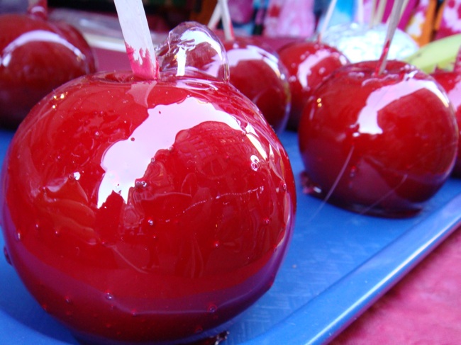
seiseki
Seaman 
Joined: 18 February 2022 Online Status: Offline Posts: 15 |
Posted: 08 October 2011 at 6:07am |
|
Looks like a sugar glazed apple :D
|
|
|
IP Logged |
|
|
ChrisButton
Commander
Joined: 10 September 2010 Online Status: Offline Posts: 371 |
Posted: 08 October 2011 at 6:25am |
|
LOL @ Onek's post.
You've come a long way. It's definitely better than your original piece.
But yeah, it does look a liiiitttle bit choppy in terms of texture at the moment.
|
|
|
IP Logged |
|
|
Friend
Commander
Joined: 01 April 2015 Online Status: Offline Posts: 710 |
Posted: 08 October 2011 at 7:01am |
|
Haha Onek..
yeah, the shading suggests it is more round than I like, and the texture looks weird. Also the coloring does make it too glossy. I think I'll move onto something else though. Huge thanks to everyone who helped, even after I was really discouraged |
|
|
IP Logged |
|
|
CELS
Commander
Joined: 23 September 2022 Online Status: Offline Posts: 758 |
Posted: 08 October 2011 at 7:57am |
|
I think the texture looks pretty good, except for the bright bumps at the bottom, which are almost as bright as the brightest area on the top.
I don't think it looks like a sugar glazed apple, except that it's round, red and shiny. It's not as shiny as the reference pic, and certainly not as shiny as anything glazed. |
|
|
IP Logged |
|
|
Friend
Commander
Joined: 01 April 2015 Online Status: Offline Posts: 710 |
Posted: 08 October 2011 at 10:30am |
|
I tried to fix the bright bumps, but it didn't look as good when I toned
down the bright bits and I wanted to keep the color to 8. I also added
a leaf just for accompaniment. It was hard to add one and retain the 64X64 size.
 Edited by Frost Butt - 08 October 2011 at 10:31am |
|
|
IP Logged |
|
|
reis
Commander
Joined: 13 March 2014 Online Status: Offline Posts: 118 |
Posted: 22 October 2011 at 5:21pm |
|
His photos give an error here.
|
|
|
IP Logged |
|
|
Zeratanus
Commander
Joined: 03 December 2020 Online Status: Offline Posts: 576 |
Posted: 22 October 2011 at 6:03pm |
|
THe original photo is errored for me too (I assume it was taken down) but every other photo in the thread shows up fine for me.
|
|
|
IP Logged |
|
|
CELS
Commander
Joined: 23 September 2022 Online Status: Offline Posts: 758 |
Posted: 22 October 2011 at 11:54pm |
|
Well, it's an old thread. Pics gets moved around. You can see the finished piece in the gallery.
|
|
|
IP Logged |
|
| |
||
Forum Jump |
You cannot post new topics in this forum You cannot reply to topics in this forum You cannot delete your posts in this forum You cannot edit your posts in this forum You cannot create polls in this forum You cannot vote in polls in this forum |
|
