| Active TopicsSearchRegisterLogin |
| WIP (Work In Progress) | |
| |
  |
| Author | Message |
|
underwood
Seaman 
Joined: 14 January 2013 Online Status: Offline Posts: 16 |
  Topic: I wanna be, the very best.. that no one ever was.. Topic: I wanna be, the very best.. that no one ever was..Posted: 14 January 2013 at 12:51am |
|
*EARLY DISCLAIMER - NO POKEMON*
I am new to pixel art / I cant draw. This is where I will spam my "works of art" in hope that I will get criticized, mocked, perhaps trolled terribly for using the forums seemingly as a garage disposal for useless pixel art. Although I hope in time my skills improve so myself as well as others don't feel like they just wasted what sometimes feels like a hellofalong time. Here is my first attempt at a sword. 
My bud replies back to me after looking at it: carl: but that aint pixel art carl: well it is carl: but.. That's all he needed to say. So I put in some random shading/patterns because solid colours aren't "cool" to a vast majority of people. V2 of my 1st sword. 
... So it begins... |
|
 IP Logged IP Logged |
|
|
underwood
Seaman
Joined: 14 January 2013 Online Status: Offline Posts: 16 |
Posted: 14 January 2013 at 2:38am |
|
Attempt at a shield..
Carl and I are both looking at the shield like something is a bit off.. I'll give it a second go... 
Attempt #2 
*BLOOOOOOOOD* Edited by underwood - 14 January 2013 at 2:56am |
|
|
IP Logged |
|
|
underwood
Seaman
Joined: 14 January 2013 Online Status: Offline Posts: 16 |
Posted: 14 January 2013 at 6:18am |
|
I don't understand grass, and I am having conflict between what is pixel art and what isn't. All these texture design tutorials on gimp/photoshop for grass... All this layering, clouds, noise, etc.. It doesn't seem like I'm doing it right.. I mean, it comes out with beautiful grass... How am I supposed to tile that?! Honestly it seems like it would be better off if I left my grass just plain green and added my own little shrubs that I make in paint. Hmph.. I'll glance around these forums a bit.

Mind the obvious pixelization feature, I like it. Edited by underwood - 14 January 2013 at 6:19am |
|
|
IP Logged |
|
|
underwood
Seaman
Joined: 14 January 2013 Online Status: Offline Posts: 16 |
Posted: 14 January 2013 at 7:25am |
|
Here is something I've been working on to organize my tiles. Here are a the grass/dirt/sand tiles I've been attempting, you can almost see a little me giving the middle finger to Gimp in transparent pixels.

**BTW, I'm pulling an all nighter/dayer... Coffee is made.  Edited by underwood - 14 January 2013 at 12:17pm |
|
|
IP Logged |
|
|
Adcrusher
Commander 
Joined: 04 January 2016 Online Status: Offline Posts: 148 |
Posted: 14 January 2013 at 1:28pm |
|
Honestly, I don't think a plain green for grass is a bad idea. Take a look at Zelda : A Link to the Past
 There are two separate tiles for grass, one is just plain green and the other is a few stylized blades of grass. This gives us as a viewer the interpretation that all of the green is grass, but it is not cluttered with every blade. I would suggest you give that a try. Also, I don't think Gimp is ideal for pixelart. I think Graphics gale is great, others use grafx2. I would give those a try. Okay, So for your first post, I made a little edit.  What you need is a light source. Without a light source, the object is just shaded randomly and it is not convincing. Think of the sword as a 3d object, where would the light hit the most? Where would the light hardly hit? Drawing with a pencil and paper would help alot with this because it is much faster than pixelart and you do not have to worry about color pallet. A good rule of thumb for picking nice colors is to pick you base color, then as your vary from that color shift the hue values and brightness. Generally, as the brightness increases, you want to shift the hue towards a warm color, say yellow or orange, and as the brightness grows darker shift the hue to a darker color such as purple or blue. You don't want to make the shifting obvious, or else it will look like a rainbow sword. Just a tiny bit to give it a hint of extra color. Use my edit as an example, go in and look at each color and see how they change from each other. Good luck with you art man! Edited by Adcrusher - 14 January 2013 at 1:52pm |
|
|
IP Logged |
|
|
underwood
Seaman
Joined: 14 January 2013 Online Status: Offline Posts: 16 |
Posted: 14 January 2013 at 2:12pm |
|
Funny you posted Zelda, as Graal online remains my favourite game to this day. I love what you did with my sword, it looks fantastic. I feel ya about the grass
- http://media.photobucket.com/image/recent/Ducati/graal2a.png -- originally the grass is all green and then all those little shrubs/grass pieces, etc, are added afterwords. Basically same as Zelda, they just use stuff nicely. I would much rather go down this path then fiddling with the perfect grass tile while i'm still amateur. The light source tip is very helpful... Basically it seems like everything i make i'm gonna have to remind myself that the sun is coming from the east side of the room. It also helps me decide where the eff i'm going to put these colours hah. I want to learn to make tilesets, so i can view my work in form, work on multiple objects that will fit in to a scene(also keeps me busy). So I'm attempting to hurdle this learning curve - which is formatting a tileset so my tiles are properly selected -.- |
|
|
IP Logged |
|
|
underwood
Seaman
Joined: 14 January 2013 Online Status: Offline Posts: 16 |
Posted: 14 January 2013 at 3:31pm |
|
A new beginning!
So... I decided to embrace Graals Editing software that comes with the game... I now have : 1. An organized tileset template, I figured out how to get a 32x32 grid over that also. 2. Game engine to test my maps afterwords, perhaps some more motivation to keep me eager after Topia Online is released and I actually go to bed. 3. 0.2% Pixel Crafting Skill Completed 
(self reminder - that was a pain getting perfect)  Edited by underwood - 14 January 2013 at 3:47pm |
|
|
IP Logged |
|
|
underwood
Seaman
Joined: 14 January 2013 Online Status: Offline Posts: 16 |
Posted: 15 January 2013 at 10:59am |
|
God it is hard to make grass. I don't know if I can keep content with just 1 colour of grass.. This isn't TOO cluttered ((yes.. yes it is.)), although.. I might make a few blank ones as well so if i was in editor I could pattern them.

**RAH.. Why doesn't GIMP auto save when power goes out for a minute. After some other tiles.  Edited by underwood - 15 January 2013 at 11:29am |
|
|
IP Logged |
|
|
underwood
Seaman
Joined: 14 January 2013 Online Status: Offline Posts: 16 |
Posted: 15 January 2013 at 11:59am |
|
I was making some rice krispies cerial and realized that I am getting political with a skill that needs to be earned. I don't need an editor, a tileset - grass, I don't need to revolve my urge to create pixelated things around the fact i want to make the video game I've never played, I just need to make things. And in time I'll be better... So forget all this previous nonsense. I'm going to make a cool sword with a lighting source.
Edited by underwood - 15 January 2013 at 11:59am |
|
|
IP Logged |
|
|
underwood
Seaman
Joined: 14 January 2013 Online Status: Offline Posts: 16 |
Posted: 15 January 2013 at 12:06pm |
|
Originally posted by Adcrusher
I think Graphics gale is great, Neat.. Edit* I think it is great too! Edited by underwood - 15 January 2013 at 1:06pm |
|
|
IP Logged |
|
|
underwood
Seaman
Joined: 14 January 2013 Online Status: Offline Posts: 16 |
Posted: 16 January 2013 at 9:10am |

#2 
#3 
Dirt + Stone #1 
Dirt + Stone #2 (constantly being edited)  Edited by underwood - 17 January 2013 at 5:14pm |
|
|
IP Logged |
|
|
Soundlst
Seaman
Joined: 12 January 2013 Online Status: Offline Posts: 12 |
Posted: 16 January 2013 at 9:15pm |
|
You know I'm just as new as you but, I wanted to try, at least, and give some suggestions. As well as an excuse to try and stay busy with learning pixel stuff.
Hope this is ok! I thought the base tile was too dark, and that maybe making it a little lighter in value would make it easier to create things on top and hit shadows without being almost pure black. The reason I wanted to mess with your tiles, that rock path was pretty cool to me, I've tried 3 or 4 times myself and it always looked so baaad. But I picked a few brighter shades and pretty much copied yours, and then added a shadow. Just wanted to see what I could do if I fiddled with what you already did.  |
|
|
IP Logged |
|
|
underwood
Seaman
Joined: 14 January 2013 Online Status: Offline Posts: 16 |
Posted: 17 January 2013 at 10:33am |
|
Very nice! That does look nicer, more defined. Maybe the bits of green in mine were a bit much.. Thanks for the suggestions and glad I could give you some stuff to work off. Keep it up.
|
|
|
IP Logged |
|
|
Zeratanus
Commander
Joined: 03 December 2020 Online Status: Offline Posts: 576 |
Posted: 17 January 2013 at 12:03pm |
|
Your colors need more contrast. Right now almost all the greens and browns look like a completely flat color at 1x
|
|
|
IP Logged |
|
|
underwood
Seaman
Joined: 14 January 2013 Online Status: Offline Posts: 16 |
Posted: 17 January 2013 at 12:51pm |
|
I've yet to figure out grass. And I think my dirt is fine for now, hm... I'd be adding separate tiles that would fit into the dirt and grass and stuff that would liven it up - although I get what you mean - grass is probably my next goal, then probably more detailed dirt lol.
Better version / more complete.  Edited by underwood - 17 January 2013 at 6:57pm |
|
|
IP Logged |
|
|
Raf
Commander
Joined: 18 January 2013 Online Status: Offline Posts: 109 |
Posted: 18 January 2013 at 7:20am |
|
Grass is actually fairly easy to do once you know how to. I've had a good loooooong look at grass tiles here:
http://gas13.ru/v3/tutorials/sywtbapa_de-mystifying_greats_1.php It boils down to thinking: "some leaves stick out". draw those (small pixel clusters, unless you want kinda bushy grass as well. Then one slightly bigger pixel cluster'll do). Then imagine your light source, add some highlights and darker pixels according to that light source, and tâdaa! Your grass tile is done! It might not look that good as a single tile, but if you try it out in a larger area, tiled, it'll look pretty good :) |
|
|
IP Logged |
|
|
underwood
Seaman
Joined: 14 January 2013 Online Status: Offline Posts: 16 |
Posted: 18 January 2013 at 7:58am |
|
Wow Raf, thanks for that link. A sh*t load of text describing grass and lighting on it - I love it=). In a bit I'll give grass another re attempt... If I could get it to look kind of like this, i'd be happy.
Although - All these tiles are HUGE... Bahh.. I was going for 32 x 32 tiles, i might have to split em up into 4 or something. *bahh.. this guys style/games style is so bulky, but looks soo pretty. attempt #1 
**Inserts rant** 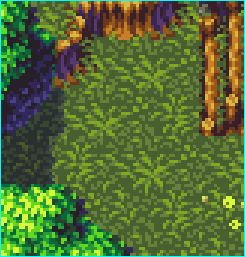
Look at that, that is beautiful. He used 3 colours on the grass... I couldn't get it for the LIFE of me, so I just copied one of his markings/leafs w.e into mine just to see, and all his pixels are twice the size of mine! Am I doing it all wrong?! Like, he has beautiful tiles and I do NOT notice he only has 3 colours - perhaps structure overrules colour in the pixel world.. I donno.. Edited by underwood - 18 January 2013 at 10:14am |
|
|
IP Logged |
|
|
underwood
Seaman
Joined: 14 January 2013 Online Status: Offline Posts: 16 |
Posted: 18 January 2013 at 10:07am |

|
|
|
IP Logged |
|
|
Adcrusher
Commander
Joined: 04 January 2016 Online Status: Offline Posts: 148 |
Posted: 18 January 2013 at 11:46am |
|
The only reason the pixels are larger is because wherever you got that from increased the original image by 300x so it would be easier to view.
I think the biggest problem with your tile is saturation. Look at the reference grass tile. The two darkest colors are at roughly 25% saturation and the brightest color has a saturation of 65% (according to graphics gale.) Your grass tile has the same level of saturation the whole way across, 100 % which makes it hard to look at and read. High saturation also draws your eye towards the object, which you don't usually want in background tiles, as the main focus should be the character. Also you have a bunch of unnecessary colors in yours. Try to make a tile with just 2-4 colors, that's all you should need. Lots of colors makes it difficult to control the pallet and make quick changes. Generally you want to keep the color count low, the less unnecessary colors you have the easier it is to control the pallet and it gives the piece readability. Edited by Adcrusher - 18 January 2013 at 11:49am |
|
|
IP Logged |
|
|
underwood
Seaman
Joined: 14 January 2013 Online Status: Offline Posts: 16 |
Posted: 18 January 2013 at 12:02pm |
|
Originally posted by Adcrusher
The only reason the pixels are larger is because wherever you got that from increased the original image by 300x so it would be easier to view. I think the biggest problem with your tile is saturation. Look at the reference grass tile. The two darkest colors are at roughly 25% saturation and the brightest color has a saturation of 65% (according to graphics gale.) Your grass tile has the same level of saturation the whole way across, 100 % which makes it hard to look at and read. High saturation also draws your eye towards the object, which you don't usually want in background tiles, as the main focus should be the character. Also you have a bunch of unnecessary colors in yours. Try to make a tile with just 2-4 colors, that's all you should need. Lots of colors makes it difficult to control the pallet and make quick changes. Generally you want to keep the color count low, the less unnecessary colors you have the easier it is to control the pallet and it gives the piece readability. Thank you. I'll give it another go in a bit considering these tips. |
|
|
IP Logged |
|
| |
||
Forum Jump |
You cannot post new topics in this forum You cannot reply to topics in this forum You cannot delete your posts in this forum You cannot edit your posts in this forum You cannot create polls in this forum You cannot vote in polls in this forum |
|
