| Active TopicsSearchRegisterLogin |
| Diversions | |
| |
  |
| Author | Message |
|
Koyot1222
Midshipman 
Joined: 26 April 2022 Online Status: Offline Posts: 16 |
  Topic: UGLY PIXEL Topic: UGLY PIXELPosted: 07 March 2026 at 2:43am |
|
UGLY PIXEL #1
I browse social media and generally see either streaks of success or Ai's gluttons. It's as if no one else has problems in life, only you. I've done, and I still do, a bit in pixels. It's like I often try, work hard on a piece, and then present it. There are reviews and comments. However, along the way, there are a lot of failures and bad work. There's no tolerance for ugliness in our space. It wasand is, in my opinion, an important and vital element of the landscape. This didn't work out. I'll share. #Krzysiek #draws #ugly #pixels #promotion #ng #promotonNG 
|
|
 IP Logged IP Logged |
|
|
Koyot1222
Midshipman
Joined: 26 April 2022 Online Status: Offline Posts: 16 |
Posted: 14 March 2026 at 2:07am |
|
UGLY PIXEL #2
I wanted this subject to feature works that were "in production," "unfinished," or "poorly drawn." The idea was to provide a platform for debate over the techniques and methods of pixel art. No one has to be a virtuoso right away, but often, despite the sheer number of good works, they fail at the very beginning. Furthermore, social media platforms poison young artists by bombarding them with "success propaganda." I returned to Promotion NG. I was wondering how to make working with this tool even more enjoyable. It seems to me that this tool has become too advanced compared to Aseprite. I made a "preview" as if I were seeing minor tweaks to the tool's general menu. #Krzysiek #rysuje #ugly #pixels #promotion #ng #promotonNG 
|
|
|
IP Logged |
|
|
Koyot1222
Midshipman
Joined: 26 April 2022 Online Status: Offline Posts: 16 |
Posted: 04 April 2026 at 8:53am |
|
UGLY PIXEL #4
I'm continuing the thread of interesting, unsightly things in pixel art. A PC version of Caveman is coming soon. This might seem like a dig at someone who's down, but I'm aiming to find errors and imperfections. To provoke discussion. To show that this art isn't a cheap and easy medium. I used my favorite software to work with it. 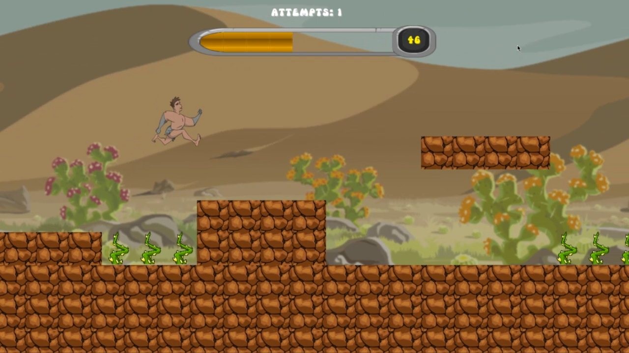
The lack of outlines for ground elements is particularly striking. The ground textures almost match, but you can still see that it's a single square. 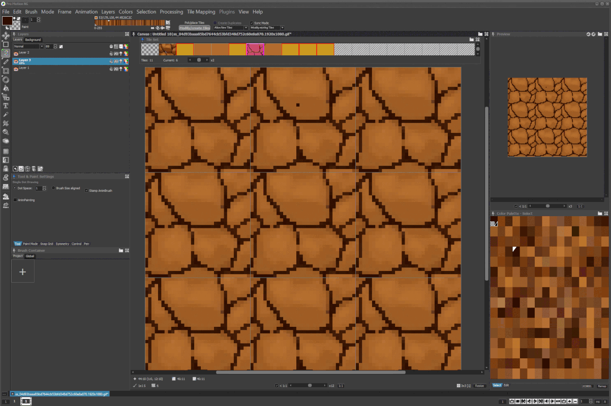
I decided to upload it to the workshop in #PromotionNG. 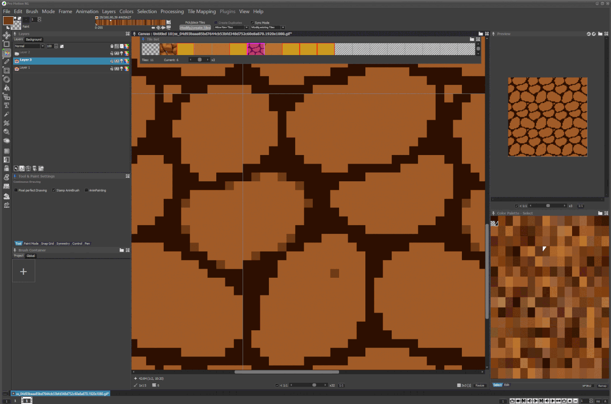
Caveman, Developer: 7Tech, Publisher: kovalevviktor, Release Date: April 3, 2021, Source: https://store.steampowered.com/app/1579030/Caveman/ I've reduced the drawing to just the outline. As you can see, the palette of this drawing after converting it to JPG is garbage. I think what's most striking is the stark disproportion in the sizes of the elements. As more harmony is introduced, the boundaries slowly begin to blur. 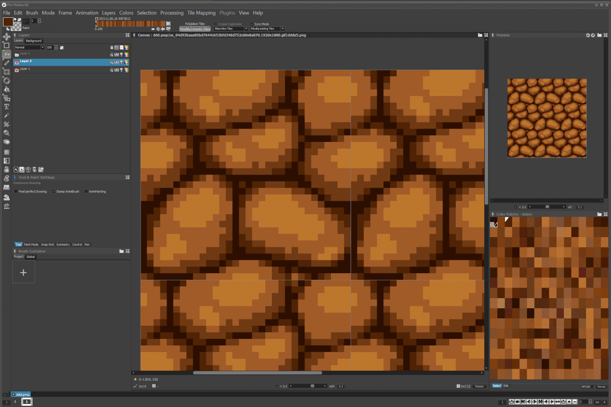
It's clear Promotion NG did a good job. Five shades were practically enough. Is it a masterpiece? Probably not, but it does apply a bit better. Ready-made texture. 5 colors, size 32x32pix. 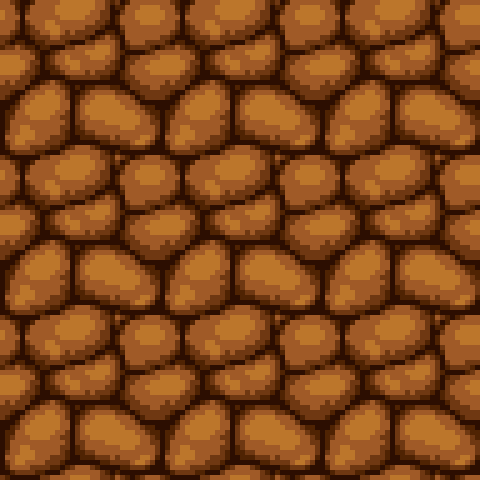
#Krzysiek #rysuje #ugly #pixels #promotion #ng #promotonNG |
|
|
IP Logged |
|
| |
||
Forum Jump |
You cannot post new topics in this forum You cannot reply to topics in this forum You cannot delete your posts in this forum You cannot edit your posts in this forum You cannot create polls in this forum You cannot vote in polls in this forum |
|
