| Active TopicsSearchRegisterLogin |
| WIP (Work In Progress) | |
| |
  |
| Author | Message |
|
Paramonium
Seaman 
Joined: 06 July 2010 Online Status: Offline Posts: 3 |
  Topic: Old West Shooter Help Topic: Old West Shooter HelpPosted: 20 November 2010 at 11:51am |
|
Hello everyone. This is my first post on here but I have been lurking in the shadows for years now. :O
Long story short I wanted to make a scrolling shooter game in the style of the old west, as somewhat of a tribute/remake of Gun.Smoke on the NES (arcade and a bunch of other consoles too). http://en.wikipedia.org/wiki/Gun.Smoke I figured I would start out with the main character(s) and here is what I have so far. I am not really sure which direction to go with in terms of colouring, texturing, detail, style and so on. Check out the images and let me know what you think/suggest. It isn't much right now but I didn't want to get into the rest of the animations, characters and whatnot til I had chosen a specific artistic direction to go in. Refer to the picture. I blew it up 200% so you guys could see the details better. I also like how they look when they are that big so I might end up just going with that size in the end, but either way it is very simple to change sizes so that isn't my biggest concern right now. 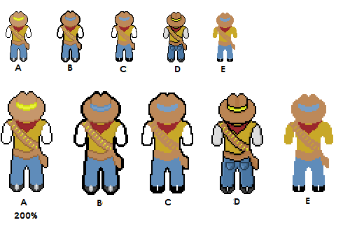
ABC- These three very similar with the only differences being the borders and slightly different colours. B- I was trying to go with a cell-shaded look which I think turned out alright. C- Slightly thinner border compared to B, but thicker than D. Less colours than both. D- this is what I originally came up with. Slightly detailed but nothing too crazy. I wasn't satisfied with it so I copied it and began to try different things in terms of colours and the borders mainly. This one has by far the most colours and detail but I still like the simplistic looks of the other ones. E- This ugly one is with only 6 colours and no border. Not planning on using this or I would just go with the original Gun.Smoke sprites (which look better anyways) Please give me some suggestions and insight on all the above mentioned. If you want to edit them to show me something feel free to go ahead. I know a lot of my concerns are personal preference but I really would like to go with what looks best. I am leaning towards B and D. D is more along the lines of my usual style so I am very familiar with it but at the same time I think it would be a lot of fun and pretty unique to make a 16bit cell shaded scrolling shooter. (Try saying that three times fast) Edit: I just added a thicker border to the most detailed one and I also like how it turned out. I guess it isn't cell shaded since there are a lot of black lines separating everything inside the border but I still like it.  Edited by Paramonium - 20 November 2010 at 11:58am |
|
 IP Logged IP Logged |
|
|
Hatch
Admiral 
Joined: 05 August 2015 Online Status: Offline Posts: 1387 |
Posted: 20 November 2010 at 7:41pm |
|
Hello! Glad you've decided to participate
 Your latest edit is definitely the best of the bunch. A few problems. though: 1) The colors are a bit flat. You should try to shift hue around as well as lightness to keep from getting dull "color ramps". This is especially true with yellow: when you just slide the brightness down, it starts to look really muddy and unpleasant. With many yellow ramps, you can shift straight into oranges and reds and not touch the brightness slider at all. 2) Your colors lack contrast. Not much to say about this--just need brighter brights and darker darks. They're a bit hard to tell apart at the moment. 3) Shading is something you've just added around the edges. Remember that shading defines the entire 3D shape of your subject--you have to do it all over. The "edge shading" you're using makes it look like a beveled emblem rather than a real 3D person. 4) Partly because of your edge shading, you've got a lot of "banding" going on--see here for a very good explanation of what I mean. It's fairly advanced, but it's a good read nonetheless. 5) You generally shouldn't work on a pure white (or, for that matter, pure black) background. It can really screw with your color perception. If I'm making something functional, I use whatever color I expect it will be in front of most (e.g. if I'm making an emoticon for a forum with a green theme, I'll use a green background). Otherwise I tend to use a desaturated blue. Up to you really--just avoid anything really bright and/or saturated. Here's a quick edit to illustrate some of these suggestions:   Anyhoo, you seem to be off to a great start. Looking forward to updates :D Oh, and this forum has a built-in clickzoom feature, so you don't need to keep posting 2x copies. Edited by Hatch - 20 November 2010 at 7:42pm |
|
|
IP Logged |
|
|
Paramonium
Seaman
Joined: 06 July 2010 Online Status: Offline Posts: 3 |
Posted: 21 November 2010 at 9:56am |
|
Thanks a lot for the very helpful advice.
I think I have addressed all the issues that you brought up. I was aware of the colour ramping and how that is generally frowned upon but that is exactly why I came here for advice. I know it looks dumb but I wasn't sure how to go about fixing it but you example is exactly what I needed to see.
Currently I am doing my best to not make the same mistakes that I have been doing so far. I am somewhat paranoid now when I shade to make sure there is no colour ramping, but I guess that is a good thing. Thanks for the link about colour banding too. I think I have a general concept of what it means, but I am still 100% don't understand the topic at the moment. I figure it will be easier to grasp the concept when I get rid of the colour banding, so if I keep doing it somehow please let me know. Here are two icons I made to represent different powerups. They look nothing like they used to and I tried to use all your pointers while detailing them so let me know if I am going in the right direction. I definitely used a different technique when changing colours so it should be a somewhat drastic change from my old work. Also I don't normally work with a white or black background. I just changed the colour when I posted the image so it would look better but I do appreciate the advice. 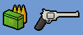 Edited by Paramonium - 21 November 2010 at 9:57am |
|
|
IP Logged |
|
| |
||
Forum Jump |
You cannot post new topics in this forum You cannot reply to topics in this forum You cannot delete your posts in this forum You cannot edit your posts in this forum You cannot create polls in this forum You cannot vote in polls in this forum |
|
