Where is Captain Planet?
Printed From: Pixel Joint
Category: Pixel Art
Forum Name: WIP (Work In Progress)
Forum Discription: Get crits and comments on your pixel WIPs and other art too!
URL: https://pixeljoint.com/forum/forum_posts.asp?TID=3295
Printed Date: 12 June 2026 at 3:05pm
Topic: Where is Captain Planet?
Posted By: cure
Subject: Where is Captain Planet?
Date Posted: 02 November 2006 at 8:28am
So you know, I'm not scrapping my last WIP, the shark thing, but I've got graphic design projects that need gettin' done, so I don't have time for fine tuning much of anything at the moment.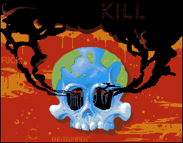 So, yeah, another Graph. Design project that I've got going. C+C welcome and wanted, as usual. |
Replies:
Posted By: Blick
Date Posted: 02 November 2006 at 9:49am
|
I'd say lose the text, the message is clear enough without it. And the factory exhausts in the eyes aren't very recognizable at first. I first thought that you were using the rad and blue as a way to gradient the black into... black. Which is the only reason I thought "That doesn't make sense" and say there for a moment trying to find our what was actually going on in the eyes. ------------- http://punaji.com/"> 
|
Posted By: jalonso
Date Posted: 02 November 2006 at 9:50am
|
Nice. Couple of things. The skull is now shadowed as a flat piece with the shadow just to the right. Assuming the orange/yellow is some sort of lava/sludge I would think the skull floating on the liquid would make a better image. This would entail some of the lower part floating/being 'in' the lava. Some rippling around the edges with appropriate shadows. The skull itself seeems very light and almost too pretty. If you shadow the top of the skull as shadowed top-down by the cloud using a much deeper blue and green ramp. Maybe with a dash of orange and purple. Not a soft blend but a harsh shadow treatment. This could also be used to indicate the ozone if you will. The beakers inside the eyes are a good detail but seem too busy and or complicated to understand. I suspect its the color rather than the composition. I would test a purple color ramp on these with the yellow and browns you already have. An idea to explore is a light inside the skull that backlights the beakers and glow out to the viewer. Purple here could work too. You can use the blue and green ramps to create a good light effect here. You might want to include the chemical icon somewhere like you have done with the words. I don't know what its called but its the logo of the baseball team on the Simpsons 'the isotopes'. I see what Blick means by deleting the copy. However, since this is for a graphic design class. Typography is a big aspect of graphic design so I would keep them. There is an overall soviet propaganda poster look to this that is great. Maybe cuz I'm making a soviet style pixel myself so I'm into that look atm. I guess my overall feeling about your piece is that I would like it to be more 'in your face'. Its too pretty somehow. Is this another 13 colors and I'm not adding more piece? edit: added more ramblings ------------- |