An I for an I
Printed From: Pixel Joint
Category: Pixel Art
Forum Name: WIP (Work In Progress)
Forum Discription: Get crits and comments on your pixel WIPs and other art too!
URL: https://pixeljoint.com/forum/forum_posts.asp?TID=4541
Printed Date: 05 April 2026 at 5:57am
Topic: An I for an I
Posted By: K.s
Subject: An I for an I
Date Posted: 29 June 2007 at 1:37pm
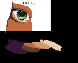
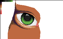
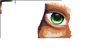
Well i recently picked up pixel art from a short term break, and well i hope to get better at it 
 |
Replies:
Posted By: Christopher
Date Posted: 29 June 2007 at 1:45pm
|
I tihnk its looking great so far, especially the eye itself. ------------- 
|
Posted By: Platnium
Date Posted: 29 June 2007 at 1:48pm
| It needs some eye lashes,and AA around the outside. |
Posted By: K.s
Date Posted: 29 June 2007 at 2:01pm
yeah dont worry i'll take care of that in the next wip 
|
Posted By: PixelSnader
Date Posted: 29 June 2007 at 9:45pm
|
ditherrrrrrr..... ------------- ▄▄█ ▄▄█ ▄█▄ ▄█▄ |
Posted By: K.s
Date Posted: 01 July 2007 at 2:56am
updated, however i gave a shot at the eye lashes and they didn't turn out too great so im just going see how i'll do those later on
 ------------- |
Posted By: SoulChild
Date Posted: 01 July 2007 at 3:25am
| I liked the eye the other way. You should keep it like that but dither in that one. |
Posted By: K.s
Date Posted: 01 July 2007 at 3:34am
|
Originally posted by SoulChild that's what i did?I liked the eye the other way. You should keep it like that but dither in that one. ------------- |
Posted By: SoulChild
Date Posted: 01 July 2007 at 3:47am
| You don't have the light green or the white in the eye now. |
Posted By: leel
Date Posted: 01 July 2007 at 7:11am
|
I think the upper lid needs to be bigger. Bigger than the lower, even.
------------- |
Posted By: K.s
Date Posted: 01 July 2007 at 8:07am
|
Originally posted by leel
I think the upper lid needs to be bigger. Bigger than the lower, even. yeah i also need to make it go down a bit more as well ------------- |
Posted By: Omegavolt
Date Posted: 02 July 2007 at 6:22am
|
Im not sure if it will improve the picture at all, and you may have just made the eye this way for cosmetic purposes, but the pupil of the eye should be in the direct center of the iris and should not have highlights. (I know the brighter highlight is from the cornea, but the lower, darker highlight looks like its on the pupil itself, and it shouldnt be there. The pupil IS essentially a hole.
The rest looks great though.  ------------- http://www.ongamedev.com/ - OnGameDev |
Posted By: K.s
Date Posted: 03 July 2007 at 4:25pm
ok well i made a few changes
 ------------- |
Posted By: SoulChild
Date Posted: 04 July 2007 at 7:59am
| Yes, i think that looks much better! |