| Active TopicsSearchRegisterLogin |
| WIP (Work In Progress) | |
| |
  |
| Author | Message |
|
Pumpkinbot
Commander 
Joined: 05 May 2009 Online Status: Offline Posts: 202 |
  Topic: Original Character Topic: Original CharacterPosted: 22 November 2009 at 1:53pm |
|
An unnamed character. The arms are pissing me off.
 Any suggestions? Also, this is the first time I tried the six-heads-then-stick-figure method. |
|
 IP Logged IP Logged |
|
|
Anoniguy
Seaman 
Joined: 17 May 2009 Online Status: Offline Posts: 37 |
Posted: 23 November 2009 at 1:29am |
|
Well.. it's a good start. Just keep plugging away at it I suppose.
I'd thicken the right (HER left) leg a bit - it seems sort of spindly compared to the other. |
|
|
IP Logged |
|
|
Pumpkinbot
Commander
Joined: 05 May 2009 Online Status: Offline Posts: 202 |
Posted: 23 November 2009 at 5:21pm |
|
(Yay, a reply! Finally!)
Here's a new version. I took that into consideration, too, Anoniguy.  She's bald, currently, though. :V |
|
|
IP Logged |
|
|
Petrichor
Midshipman 
Joined: 09 October 2009 Online Status: Offline Posts: 59 |
Posted: 23 November 2009 at 6:25pm |
|
Hi, it's me again xD
First off, it's good that you're looking at techniques for improving your figures, and it's obvious you've made a lot of progress since last time--I'm impressed at how far you've already come, but I of course I'm going to mosey in here and drop a gigantic post on you again D: forgive me. I hope you'll benefit from it! The six heads rule is... debatable. In art it's more usually seven and a half. This is "ideal" even if real, average people tend to be between six and seven. In my personal opinion, the proportion of WIDTHS in a figure is more important to the overall believability than the proportion of heights. There are exceptions--chibis mostly--but for the type of art I think you're targeting, it's very true! In this case, the widths of the body are not quite right. This isn't just because they are mostly too small, but because the head is too big. The chin/lower part of the head are approximately the right size, but the dramatic outward angles of the jaw and cranium should be straightened a little and brought into line with the skull. Obviously you'll still have cheeks and jawbones, but the head shouldn't be shaped like an ice cream cone or inverted tear drop. I've gone and looked for a picture of a swimsuit model, since, again, I think this is the sort of beautiful, idealized female you are most likely to attempt to draw, and because this is a body type good for reference in any case. She's on the scrawny side, but even she, you will notice, has two head widths across her shoulders and across her hips:  Also, her waist--although she is very skinny!--is still wider than one head width across the thinnest point (from this angle at least; I'm sure if she turned sideways she'd vanish into thin air. Jealous). Your character, by contrast, has about a half a head's width at the narrowest point. And just to simplify the view, look what happens when we draw vertical lines down from the ears on both your pixel and the photograph:  I've shown you some better widths in this rough sketch:  Which you can see more clearly here:  As you can see, though, now we have another problem. Although your girl is now delightfully curvy, she's looking... stumpy. So what happened? Believe it or not, the six heads rule. Anime girls, idealized girls, and runway models violate the six heads rule. Tall people violate the six heads rule, as do lanky people. I, in fact, violate the six heads rule (I'm pretty tall). And it's common in art to violate it as well. See the below runway model (remember her from last time? God, she is so hot): 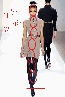 SEVEN AND A HALF HEADS Jesus I didn't realize how ridiculously lovely her proportions were until I did that, actually--perfect. See how she has a full two heads across the shoulders but still comes across as willowy and lovely? That's how you get away with that. It doesn't have to be a full two heads, so long as it's close; it definitely doesn't have to be the massive and gorgeous two-and-some-change you see on the runway model. See: 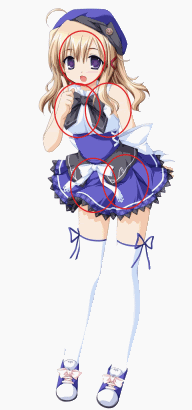 (random anime img plucked off google, no credit there D: ) Not quite two heads, but very close. Her shoulders are broader than her head by a half of a head at the very least, and her hips are even broader. She's still not a realistic two-heads-across-the-shoulders, but she's well-balanced. Part of the reason this works is because the style is obviously meant to portray her as childlike, and children have larger heads in proportion to their bodies. But you'll notice her proportions are still pleasant, and her hip-to-tummy-to-shoulder ratio is nice! However... 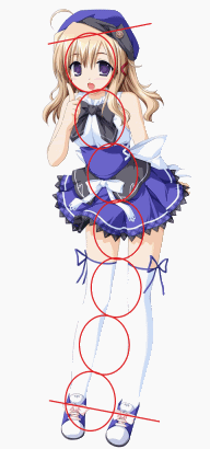 She is also six and a half heads high. Even childlike, exaggerated characters share this trait in anime unless they are outright chibi--in fact, six and a half heads is VERY short for an anime character--which enhances her childishness. You'll have to decide whether you want your image to tend childish or womanly and work from there. I usually tend towards womanly; other artists favour the other direction. It's all preference--but something needs to be changed--either your head size or your figure widths. At this point it would be easier to redraw the head, but the hips still need to be adjusted to carry the weight presented by the shoulders. Huge epic post of doom! I hope you don't mind, I am just really pleased with your progress and want to throw in my two cents. Also, posting all this helps ME, because I have raging proportion problems myself and revisiting the rules like this is good for me. It'll help me too :D Also, and this is another post for another time, but the straight-ahead pose is EXTREMELY hard to draw, especially with the hips and shoulders level. Remember the conflicting/dynamic shoulder vs. hip thing? It becomes even more important in a static pose like this. It's hard to stand with your hips perfectly even! I haven't really got any good examples lying around so I'm going to send you the first applicable thing I find in my Photobucket which will be, ahh...  ... This, apparently. This is the last time (and one of the only times) I drew a forward-facing character. It's not very good, please excuse it, but you'll see that she has some hip/shoulder action, with the weight distributed to one foot. The slightly-turned head helps to break up the pose and add interest as well. That said, it IS possible to draw straight-on, especially for doll bases and the like, but I thought I'd include that, maybe for next time :) Edited by Petrichor - 23 November 2009 at 6:35pm |
|
|
IP Logged |
|
|
Pumpkinbot
Commander
Joined: 05 May 2009 Online Status: Offline Posts: 202 |
Posted: 23 November 2009 at 8:57pm |
|
:U Holy carp! Thanks, Petrichor!
EDIT: Not very good? ARE YOU CRAZY, MAN?! Better than I could do. D: EDIT2: Pseudo-checklist ftw. -Make head smaller -Lengthen body a bit (stomach=1 head, not 1/2) -Waist=1 head wide -Make her taller (6 1/2 heads at least) -Moar dynamic pose Also, this is mainly an OC for DeviantArt. I guess I could upload my pixel-y Deviant stuff here, too. Edited by Pumpkinbot - 23 November 2009 at 9:16pm |
|
|
IP Logged |
|
|
Petrichor
Midshipman
Joined: 09 October 2009 Online Status: Offline Posts: 59 |
Posted: 23 November 2009 at 11:18pm |
|
I noticed something else about your original, too--you counted the entire foot as part of her height. Height stops at the heel, so if you're measuring using the head, keep that in mind :) If the toes are angled towards us or she's wearing heels, you'll see more foot below that point.
Your checklist looks good! I am glad you asked for critique before you got too far into colouring--I always make the mistake of being halfway into my AA before I go, oh yeah, maybe I should get some input on this >< I can't wait to see what you do =3 |
|
|
IP Logged |
|
|
Pumpkinbot
Commander
Joined: 05 May 2009 Online Status: Offline Posts: 202 |
Posted: 24 November 2009 at 5:04pm |
 Bleh, her upper body looks too long nao. D: But the only thing I didn't do yet was make her pose more dynamic. Other than that, I did everything on the |
|
|
IP Logged |
|
|
Pragz
Commander
Joined: 09 August 2009 Location: Ireland Online Status: Offline Posts: 136 |
Posted: 24 November 2009 at 5:17pm |
|
That's because her hips are too far down and her stomach is far too thin.
|
|
|
Hello - I'm new here. :)
|
|
|
IP Logged |
|
|
Pumpkinbot
Commander
Joined: 05 May 2009 Online Status: Offline Posts: 202 |
Posted: 24 November 2009 at 5:21pm |
|
Originally posted by Pragz FFFFUUUUUUUU...That's because her hips are too far down and her stomach is far too thin. Her hips, as in the example, should be in the 4th head down, right? From top to bottom, it's head, chest, stomach, hips, upper legs, lower legs. EDIT: I return bearing links of win. http://my-star-seeker.deviantart.com/art/Female-Anime-Body-Tutorial-130363401 Edited by Pumpkinbot - 24 November 2009 at 5:56pm |
|
|
IP Logged |
|
|
Pragz
Commander
Joined: 09 August 2009 Location: Ireland Online Status: Offline Posts: 136 |
Posted: 24 November 2009 at 6:18pm |
|
Your link doesn't help you... Here's proof, taken from your link:
 |
|
|
Hello - I'm new here. :)
|
|
|
IP Logged |
|
|
Pumpkinbot
Commander
Joined: 05 May 2009 Online Status: Offline Posts: 202 |
Posted: 24 November 2009 at 6:37pm |
|
Originally posted by Pragz ...Que? That person's anatomy looks more correct than mine. D:Your link doesn't help you... Here's proof, taken from your link: |
|
|
IP Logged |
|
|
Pragz
Commander
Joined: 09 August 2009 Location: Ireland Online Status: Offline Posts: 136 |
Posted: 24 November 2009 at 6:51pm |
|
...exactly? XD
I mapped it out to show your the fallacies in your character's anatomy. I didn't do an edit to your character since I think you should be the one figuring it out. :) Edited by Pragz - 24 November 2009 at 6:53pm |
|
|
Hello - I'm new here. :)
|
|
|
IP Logged |
|
|
Pumpkinbot
Commander
Joined: 05 May 2009 Online Status: Offline Posts: 202 |
Posted: 24 November 2009 at 6:54pm |
|
Originally posted by Pragz Ah. You said "That link doesn't help you" so I thougt...gah, whatever. But the only thing that's bugging me is that the neck is one of those measures and it looks fine on theirs, but it just looks long on mine. D:...exactly? XD I mapped it out to show your the fallacies in your character's anatomy. EDIT: My lineart was making me get angry so I'm starting from scratch. Edited by Pumpkinbot - 24 November 2009 at 7:05pm |
|
|
IP Logged |
|
|
Petrichor
Midshipman
Joined: 09 October 2009 Online Status: Offline Posts: 59 |
Posted: 24 November 2009 at 7:11pm |
|
I actually STRONGLY disagree that that person's anatomy is... even good, let alone something to model yourself after. Please, please--don't look at anime tutorials, especially not from just anyone on deviantART! I learned the hard way that this is a bad, bad way to go, and that you'll end up having to unlearn everything you've picked up.
That person's art isn't bad, but it's extremely amateurish, and they shouldn't be offering up that sort of advice, imho. Just like I wasn't showing you my own art to demonstrate proportions (just the hip/shoulder thing, as I was too lazy to go dig up a good picture). There's a scale of reference here, and it goes, from best to worst: - drawing from life - drawing from a LOT of photographs and 3d models (this is what I try to do) - drawing from professional or highly respected tutorials and art books - drawing from random "blank art style" tutorials on deviantART or elsewhere Don't get me wrong--looking at how other artists whose style you enjoy and would like to emulate a little is a great way to learn. I frequently reference Disney stills and whatnot. But looking at these tutorials that these people frankly should not be illustrating with their own art--and like I said, it's not bad, just... not something to emulate from the ground up--is a good way to wreck yourself. If you want my honest opinion, I think your new lineart actually has BETTER proportions than that girl's tutorial figures, for the most part (she has some okay ones in there). All you need to do is thicken the waist and shove the hips up a bit. Think of where her clasped hands would be--right at the hips, right? Right now they're closer to her navel, but everything above that looks okay. Don't rely too heavily on building elaborate ladder-like guidelines. Eyeball it, or measure with the tips of your fingers against the screen. Is her head one knuckle high on you? Go with that. Building those complicated grids for a thing like anatomy will only make you feel frustrated and limit your posing ability. It's good to keep in the back of your head certain "rules" like the seven-and-a-half-heads thing, but don't feel like you have to painstakingly map this out each time, or you'll end up in the situation you are now. So ignore your grid and look again: what strikes you? Exactly what you noticed: her torso is too long. Don't worry about making it fit into the grid. Just shorten her torso. Also, may wanna widen her waist (unless you like that stylized tiny waist; I think the the hips coming up might balance it and make it okay) and legs a hair. Don't forget that the thighs and arms also have width in proportion to the arms and legs. As a final note, I know that you want to draw anime style, but studying real people is what's going to make your anime art shine. Learn proportions first, style later :D This is a HUGE improvement, despite this lecturing post. You're doing a great job so far. Don't let the temptation of internet tutorials lead you astray when you're doing so well with your own eyes :) Edited by Petrichor - 24 November 2009 at 7:13pm |
|
|
IP Logged |
|
|
Hatch
Admiral 
Joined: 05 August 2015 Online Status: Offline Posts: 1387 |
Posted: 24 November 2009 at 7:16pm |
|
I also want to point out that trying to fuss over pixel perfect lines while also working out proper anatomy, thus having to redraw large chunks, is a nightmare. I encourage you to use big, sloppy, scratchy strokes while you're working out the anatomy. Just rough sh*t in, make a mess, stop caring about single pixels. Seriously. Once you get your anatomy good and solid, start refining. Your current workflow will only frustrate and discourage you.
|
|
|
IP Logged |
|
|
Pumpkinbot
Commander
Joined: 05 May 2009 Online Status: Offline Posts: 202 |
Posted: 24 November 2009 at 7:17pm |
|
...I suppose you're right. D: Both of you. *goes back to work*
Edited by Pumpkinbot - 24 November 2009 at 7:17pm |
|
|
IP Logged |
|
|
Hatch
Admiral
Joined: 05 August 2015 Online Status: Offline Posts: 1387 |
Posted: 24 November 2009 at 7:19pm |
|
Attaboy! :D
|
|
|
IP Logged |
|
|
Petrichor
Midshipman
Joined: 09 October 2009 Online Status: Offline Posts: 59 |
Posted: 24 November 2009 at 7:26pm |
|
... yeah, what Hatch said! On both points.
The fact that you're so willing to stick to it and rework it already puts you WAY ahead of the fold, so to speak. Your persistence is good. I know this personally, because I frequently give up easily :( |
|
|
IP Logged |
|
|
Pumpkinbot
Commander
Joined: 05 May 2009 Online Status: Offline Posts: 202 |
Posted: 24 November 2009 at 7:34pm |
|
Originally posted by Petrichor Yeah, but now I fear I'm starting to go crazy from the frustration of this piece. ... yeah, what Hatch said! On both points. The fact that you're so willing to stick to it and rework it already puts you WAY ahead of the fold, so to speak. Your persistence is good. I know this personally, because I frequently give up easily :(    It looks a little better, but the hips look awkward. Halp? EDIT: Photobucket's also contributing to my steadily increasing insanity. EDIT2: And Twilight fangirls. *shudders* Edited by Pumpkinbot - 24 November 2009 at 7:35pm |
|
|
IP Logged |
|
|
Petrichor
Midshipman
Joined: 09 October 2009 Online Status: Offline Posts: 59 |
Posted: 24 November 2009 at 8:00pm |
|
Shift the knees up and fatten up the biceps and legs (thighs and calves and feet--her feet are so tiny!) and I think you'll see the hips magically fall into place. I may know why they look awkward to you: there's usually some dip between the bum area and the calves from this view but it's extremely difficult to draw on this small a scale, so the smooth curve from torso to thigh shouldn't be a problem :) It's a common aesthetic decision anyway. It's either that or you're alarmed by her shoulder-to-waist-to-hip ratio, but I think it looks good, stylistically.
Now to point something out: Your torso is way short now, right? Falls way outside the grid at two heads high, and if you look at the two photos I posted, way outside reality (three heads high). But it LOOKS good, yeah? Now go back and look at the anime girl and you'll notice that her torso is only two and a half heads long. This is why grids, all that mess--they're important, but you can't rely on them. Look how much more pleasing to the eye she is now than she was before. If you were trying to draw photorealistically, obviously this would have been a bad choice, but with the style you're drawing it makes so much more sense. Style CANNOT excuse bad choices, but making judicious, circumspect choices in favour of style is okay. It's a fine and elegant line to walk and you're learning it :) I'm biased though; I really like the short-torso-long-legs look. Maybe I'm vain, cos that's how I'm shaped, but I like it. If you don't, change it: it's all about what you want and what makes sense to you. However, if you do choose to lengthen the torso, you may want to try lengthening it just a couple of pixels ABOVE the hands/hips, rather than below, as you tried before. The ribcage and lack of space under it are what's creating the tiny torso (and again, not necessarily a bad thing--you said you were inspired by Anoniguy's Martian ((wait, was that you? Or was it someone else... Oh crap it was someone else sorry, well still)), and if you go back and look, she's rocking the two-heads-torso as well :) ) EDIT: I have also been having HUGE Photobucket issues lately. I just accidentally typed Photosucket, perhaps because of this. Edited by Petrichor - 24 November 2009 at 8:01pm |
|
|
IP Logged |
|
|
Pumpkinbot
Commander
Joined: 05 May 2009 Online Status: Offline Posts: 202 |
Posted: 24 November 2009 at 9:54pm |
|
Originally posted by Petrichor Ah, 'kay. I'll do that later tonight or tomorrow.Shift the knees up and fatten up the biceps and legs (thighs and calves and feet--her feet are so tiny!) and I think you'll see the hips magically fall into place. I may know why they look awkward to you: there's usually some dip between the bum area and the calves from this view but it's extremely difficult to draw on this small a scale, so the smooth curve from torso to thigh shouldn't be a problem :) It's a common aesthetic decision anyway. It's either that or you're alarmed by her shoulder-to-waist-to-hip ratio, but I think it looks good, stylistically. Now to point something out: Your torso is way short now, right? Falls way outside the grid at two heads high, and if you look at the two photos I posted, way outside reality (three heads high). But it LOOKS good, yeah? Now go back and look at the anime girl and you'll notice that her torso is only two and a half heads long. This is why grids, all that mess--they're important, but you can't rely on them. Look how much more pleasing to the eye she is now than she was before. If you were trying to draw photorealistically, obviously this would have been a bad choice, but with the style you're drawing it makes so much more sense. Style CANNOT excuse bad choices, but making judicious, circumspect choices in favour of style is okay. It's a fine and elegant line to walk and you're learning it :) I'm biased though; I really like the short-torso-long-legs look. Maybe I'm vain, cos that's how I'm shaped, but I like it. If you don't, change it: it's all about what you want and what makes sense to you. However, if you do choose to lengthen the torso, you may want to try lengthening it just a couple of pixels ABOVE the hands/hips, rather than below, as you tried before. The ribcage and lack of space under it are what's creating the tiny torso (and again, not necessarily a bad thing--you said you were inspired by Anoniguy's Martian ((wait, was that you? Or was it someone else... Oh crap it was someone else sorry, well still)), and if you go back and look, she's rocking the two-heads-torso as well :) ) EDIT: I have also been having HUGE Photobucket issues lately. I just accidentally typed Photosucket, perhaps because of this. Also, I've typed in "Photonbucket" before. Photons are atoms, so I made up a slogan: "Photonbucket. We story your atoms." I crack myself up...I'm so lonely. D: |
|
|
IP Logged |
|
|
Anoniguy
Seaman
Joined: 17 May 2009 Online Status: Offline Posts: 37 |
Posted: 25 November 2009 at 2:13am |
|
Man, what an educational thread this is turning out to be. Way to go Pumpkinbot, you're helping us all. :D
And I totally agree with Hatch. Sloppy is the only way to go when you're roughing an image out. Perfection can wait. :D Edited by Anoniguy - 25 November 2009 at 2:13am |
|
|
IP Logged |
|
|
Pumpkinbot
Commander
Joined: 05 May 2009 Online Status: Offline Posts: 202 |
Posted: 25 November 2009 at 2:28pm |
|
Originally posted by Anoniguy xD 'Kay. Here's what I got after a few edits. Think it's ready for coloring now? :UMan, what an educational thread this is turning out to be. Way to go Pumpkinbot, you're helping us all. :D And I totally agree with Hatch. Sloppy is the only way to go when you're roughing an image out. Perfection can wait. :D  Edited by Pumpkinbot - 25 November 2009 at 2:31pm |
|
|
IP Logged |
|
|
Dhr. Bosch
Commander
Joined: 01 February 2016 Location: Netherlands Online Status: Offline Posts: 215 |
Posted: 25 November 2009 at 4:22pm |
|
id say you really need to make her pose more interesting. nobody actually stands like that. she is so symetrical it frightnes me. you need to get her to be less balanced and in doing so you wil make your piece a million times more apealing. i did an edit to show you what i mean. pay special attention to the red lines between her hips and shoulders, because these are the key to understandin a natural pose. from the posture presented by your picture i assume you try to have her be a timid girl so i tried emphasizing that because right now she isn't convincing as a human. she's to stiff.
 go to posemaniacs (dot) com and do some 30 second drawing, for general skill and on youtube there's this guy called sheldon with a channel, i believe sheldon's art academy, who has some very nice tutorials on composition and anatomy. |
|
|
Vanitas, vanitatum omnia vanitas
|
|
|
IP Logged |
|
|
Pumpkinbot
Commander
Joined: 05 May 2009 Online Status: Offline Posts: 202 |
Posted: 25 November 2009 at 5:13pm |
|
Originally posted by Dhr. Bosch Maybe she's not human! :Uid say you really need to make her pose more interesting. nobody actually stands like that. she is so symetrical it frightnes me. you need to get her to be less balanced and in doing so you wil make your piece a million times more apealing. i did an edit to show you what i mean. pay special attention to the red lines between her hips and shoulders, because these are the key to understandin a natural pose. from the posture presented by your picture i assume you try to have her be a timid girl so i tried emphasizing that because right now she isn't convincing as a human. she's to stiff. go to posemaniacs (dot) com and do some 30 second drawing, for general skill and on youtube there's this guy called sheldon with a channel, i believe sheldon's art academy, who has some very nice tutorials on composition and anatomy. ...Kidding. Yeah, that's the one thing I forgot to do on the tutorial. *goes to do that* EDIT: But that means I'd have to start the whole thing over again! FFFFFFFFUUUUUUUUUUUUUUUU... Or at least most of it. T-T EDIT2: New version.  It does indeed look better, but I'm having a liiiiiiitle trouble: I CAN'T FORESHORTEN THE EFFING LEG!  I was gonna have her leg bend backward, but I SUCK AT FORESHORTENING AND IT MAKES ME MAD AND POST IN CAPS. I was gonna have her leg bend backward, but I SUCK AT FORESHORTENING AND IT MAKES ME MAD AND POST IN CAPS.Edited by Pumpkinbot - 25 November 2009 at 6:40pm |
|
|
IP Logged |
|
|
Hatch
Admiral
Joined: 05 August 2015 Online Status: Offline Posts: 1387 |
Posted: 25 November 2009 at 6:45pm |
|
I want to again advise you to start getting scratchy. Dhr. Bosch was able to rough out a really nice pose, quickly, because he wasn't fussing over pixel perfect lines. I know it's painful after all this precision, but I promise you'll be a hundred times faster and less frustrated. You'll be able to rapidly try many different lines to achieve proper foreshortening. I can't even imagine what it's like trying to preserve your pristine line art...
|
|
|
IP Logged |
|
|
Pumpkinbot
Commander
Joined: 05 May 2009 Online Status: Offline Posts: 202 |
Posted: 25 November 2009 at 7:32pm |
|
Originally posted by Hatch Blah. ;A; I'll try that.I want to again advise you to start getting scratchy. Dhr. Bosch was able to rough out a really nice pose, quickly, because he wasn't fussing over pixel perfect lines. I know it's painful after all this precision, but I promise you'll be a hundred times faster and less frustrated. You'll be able to rapidly try many different lines to achieve proper foreshortening. I can't even imagine what it's like trying to preserve your pristine line art... EDIT: i got a non-craptastic foreshortened leg before finding out it didn't look natural. Now, I don't know what to do with the legs. Any suggestions? EDIT2: Nevermind. I got it. *goes on to coloring* EDIT3: Yeah, actually, that pose wasn't all that good, either. Anyone wanna suggest a pose? I don't really like Bosch's pose, though. It looks...I dunno, just weird.  EDIT4: DAYUMN! Another edit! D: Well, I decided that if I had to edit her sooooo much just to change the pose, I might as well start fresh. So here's take 2. Ignore teh sketchiness. :3  If you still think the previous pose was better, I still have the first version on my computer. Edited by Pumpkinbot - 26 November 2009 at 1:24am |
|
|
IP Logged |
|
|
Anoniguy
Seaman
Joined: 17 May 2009 Online Status: Offline Posts: 37 |
Posted: 26 November 2009 at 1:44am |
|
You... you're doing this with a mouse, aren't you? That explains why the sketching isn't coming easily.
But this new pose is so much more alive and energetic than the first. You're on the right track, now! I personally like the rather knock-kneed stance, and the angled shoulders and such imply weight being balanced, etc, etc... things that say 'living creature'. she looks much more human, and much less robotic. I personally might widen the hips, and maybe make the crotch a little narrower, but that's your call. And BTW, remember - it's no shame to start over. When something is simply not working, continuing to bash at it is silly. The sketches in my WIP threads? Those have been the tenth, fiftieth, the hundredth attempt at finding a nice, clear pose. |
|
|
IP Logged |
|
|
Pumpkinbot
Commander
Joined: 05 May 2009 Online Status: Offline Posts: 202 |
Posted: 26 November 2009 at 1:34pm |
|
Originally posted by Anoniguy Yes, I'm doing this with a mouse. D:> Not everyone has a tablet.You... you're doing this with a mouse, aren't you? That explains why the sketching isn't coming easily. But this new pose is so much more alive and energetic than the first. You're on the right track, now! I personally like the rather knock-kneed stance, and the angled shoulders and such imply weight being balanced, etc, etc... things that say 'living creature'. she looks much more human, and much less robotic. I personally might widen the hips, and maybe make the crotch a little narrower, but that's your call. And BTW, remember - it's no shame to start over. When something is simply not working, continuing to bash at it is silly. The sketches in my WIP threads? Those have been the tenth, fiftieth, the hundredth attempt at finding a nice, clear pose. Anyway, thanks. :d |
|
|
IP Logged |
|
|
Pumpkinbot
Commander
Joined: 05 May 2009 Online Status: Offline Posts: 202 |
Posted: 26 November 2009 at 4:24pm |
 Here it is, more fleshed out. :D C+C, pl0x. EDIT: The right (her left) leg seems TOO bent. *goes to fix* EDIT2: Changed her left (our right) leg a bit and gave her boobs. xD  Think it's good enough to get coloring? EDIT3: Hellooooooooo? Anyone? Please? Edited by Pumpkinbot - 26 November 2009 at 11:43pm |
|
|
IP Logged |
|
|
Pumpkinbot
Commander
Joined: 05 May 2009 Online Status: Offline Posts: 202 |
Posted: 27 November 2009 at 1:13am |
 Did the hair and face, along with other minor changes. About the hair, I followed a tutorial, but it doesn't seem to fit...me, I guess. It looks good, but not what I would do. Any suggestions? EDIT: Bleh, I may just leave the hair until I get more done, then see if I like it. Edited by Pumpkinbot - 27 November 2009 at 1:14am |
|
|
IP Logged |
|
|
Manupix
Commander
Joined: 07 May 2026 Online Status: Offline Posts: 771 |
Posted: 27 November 2009 at 2:10am |
|
Great improvement from the earliest version!
The navel is too high; smaller pointy boobs might look better on this thin lady - matter of personal preference here ;) |
|
|
IP Logged |
|
|
Pumpkinbot
Commander
Joined: 05 May 2009 Online Status: Offline Posts: 202 |
Posted: 27 November 2009 at 3:57pm |
|
Originally posted by Manupix :P Yeah, probably. Damn hormones. xDGreat improvement from the earliest version! The navel is too high; smaller pointy boobs might look better on this thin lady - matter of personal preference here ;) |
|
|
IP Logged |
|
|
Pumpkinbot
Commander
Joined: 05 May 2009 Online Status: Offline Posts: 202 |
Posted: 27 November 2009 at 4:48pm |
 Better? I lowered her naval, shrunk her breasts, and moved her hips up a bit. |
|
|
IP Logged |
|
|
SHANN0N
Midshipman
Joined: 20 July 2008 Online Status: Offline Posts: 54 |
Posted: 27 November 2009 at 7:05pm |
|
I think you need to stop focusing so much on formulas and using circles and lines to make a skeleton. They do help someone just beginning, yes, but only so much. They're far from foolproof and what you really need to focus on is being able to use a reference properly to help you, imo. Drawing from a couple of pictures is so much better than those lines you're using. Yes, the skeleton can be derived from lines and ball joints but you really need to look at a real person to understand how to fill in those lines. Yours looks very stiff and all the lines are far too straight. I made a quick edit to help you out a bit. I didn't draw the feet though because I suck really bad at them and was too lazy to look for a reference.
Idk if the ref I found for you shows too much to be acceptable to post here, so my apologies if it is. And I know there is more space between the model's body and the inside of her arms and that your pixel is also like that whereas my edit is not but that is because her arms are moved a little to the side and her body is curving more because shes in a slightly different position because of the way her legs are. Alsooo, I think its quite beneficial to draw the torso and get that right before placing the arms over top of them- I think thats why you've drawn the crotch so low.. 
And, I have to agree with everyone about sketching and not focusing so much on keeping the lines clean when you're still refining. |
|
|
IP Logged |
|
|
Pumpkinbot
Commander
Joined: 05 May 2009 Online Status: Offline Posts: 202 |
Posted: 27 November 2009 at 7:15pm |
|
Thanks, Shannon, but I'm just kinda losing interest in this already. I feel like I'm getting nowhere. D:
Edited by Pumpkinbot - 27 November 2009 at 7:15pm |
|
|
IP Logged |
|
|
Pumpkinbot
Commander
Joined: 05 May 2009 Online Status: Offline Posts: 202 |
Posted: 28 November 2009 at 1:02am |
 I fail at clothes. Halp? |
|
|
IP Logged |
|
|
A.B. Lazer
Commander
Joined: 21 July 2007 Online Status: Offline Posts: 310 |
Posted: 28 November 2009 at 9:33am |
|
Sorry that I'm a bit too late, but I'm with top-quality vengeance!
Why she's hiding crotch? She fears something? Perhaps she is a football player and waits for penalty. Why feet are placed inwards? (same question) For the future (and maybe for the present) - it is more useful to use big brush and sketch a shillouette with flat color before refining outline - like Syosa does: http://blog-imgs-12.fc2.com/c/o/l/collet66/20080304003951.png Making outline right from the start may become very limiting if you'll want to change the pose in the future. Originally posted by Pumpkinbot
I fail at clothes. Halp? Lotsa refs. Originally posted by SHANN0N
Idk if the ref I found for you shows too much to be acceptable to post here, so my apologies if it is.
I was utterly disgusted by what you did with the nipples. Censoring implies that they are something to be ashamed of. Edited by A.B. Lazer - 28 November 2009 at 9:57am |
|
|
IP Logged |
|
|
Manupix
Commander
Joined: 07 May 2026 Online Status: Offline Posts: 771 |
Posted: 28 November 2009 at 11:26am |
|
I'm just kinda losing interest in this already. I feel like I'm getting nowhere.
Yes you are! You just need a little time to digest all the input you got lately... It's okay to do something else for a while and let it settle. The human body and whatever it wears are the most difficult things to draw: congrats for trying and for the progress you've made already: it's here to stay! (I haven't even started on that road yet, so I can't give really helpful anatomy advice.) If you don't do that already, draw on paper, it's way faster and easier for experiments and learning. And it's fun! Btw, yes, a tablet is really helpful, there are cheap ones, from 20$. @ AB: don't let yourself get disgusted so readily! ;D Shannon was just concerned about possible site restrictions, and it doesn't affect the purpose of her post. |
|
|
IP Logged |
|
|
Pumpkinbot
Commander
Joined: 05 May 2009 Online Status: Offline Posts: 202 |
Posted: 28 November 2009 at 12:26pm |
|
Originally posted by A.B. Lazer Why she's hiding crotch? She fears something? Perhaps she is a football player and waits for penalty. Why feet are placed inwards? (same question) First, this is an OC for DeviantART. This is for her bio, so her pose shows her personality. It's more of a shy pose than hiding her crotch. How did you get into football? o_O Wait, football, as in American football, or football, as in black and white ball? Originally posted by A.B. Lazer For the future (and maybe for the present) - it is more useful to use big brush and sketch a shillouette with flat color before refining outline - like Syosa does: http://blog-imgs-12.fc2.com/c/o/l/collet66/20080304003951.png Making outline right from the start may become very limiting if you'll want to change the pose in the future. That may very well help. I was thinking about doing that after lurking on the WIP thread about the baseball player, after seeing how well it came out. *headdesk* "Google is your friend", yes, shoulda thought about that. |
|
|
IP Logged |
|
|
Pumpkinbot
Commander
Joined: 05 May 2009 Online Status: Offline Posts: 202 |
Posted: 29 November 2009 at 3:21pm |
|
Hello? I still need help! D: I don't know how to shade her jacket!
|
|
|
IP Logged |
|
|
Hatch
Admiral
Joined: 05 August 2015 Online Status: Offline Posts: 1387 |
Posted: 29 November 2009 at 5:00pm |
|
Originally posted by Pumpkinbot
Hello? I still need help! D: I don't know how to shade her jacket! 1) Decide what material it's made of 2) Google Images for "[material] jacket" 3) Shade as best you can, following your refs 4) Post your attempt and we'll critique it Ya gotta TRY first. We can't critique what isn't there. |
|
|
IP Logged |
|
|
Pumpkinbot
Commander
Joined: 05 May 2009 Online Status: Offline Posts: 202 |
Posted: 29 November 2009 at 5:59pm |
 There ya go, Hatch. 'Tis all I could do But I'm reeeeeeallly thinking about a different medium. Any suggestions? EDIT: Hatch, you said, you'd help meeeeeee. D: [/whine] Yeah, I give up, since nobody's helping. I may try this again, but from scratch and smaller. Edited by Pumpkinbot - 29 November 2009 at 10:56pm |
|
|
IP Logged |
|
|
Hatch
Admiral
Joined: 05 August 2015 Online Status: Offline Posts: 1387 |
Posted: 30 November 2009 at 1:33pm |
|
Rgh. You need to be patient. You've been working on this for so long It's surprising to see you so impatient in the short term. I have a full-time job and a life outside PixelJoint and things are still settling down from the holiday. Same for most others here. We're not always gonna be able to respond in under 24 hrs., I'm sorry to say.
You're developing the bad habit of waiting for people to show you how to do things. You've only done the most basic shading with no attempt to define a material, and you haven't even told us what material it's supposed to be. You need to experiment and try things for yourself. Failing is ok--more than ok, it's necessary--but you have to try. Your commitment to this piece is admirable, and I'm sure you've learned a lot from it, and I totally understand if you decide to just close the book on it and use what you've learned for the next piece, but you need to stop throwing up your hands and saying "I quit!" when you don't get constant feedback, critique, and edits. You meed to have an independent drive to practice and improve. Your current workflow does not lend itself to experimentation. Shading is no different than line art: be quick and sloppy, blob in rough shapes, refine later. I can see the same tedious and meticulous attention to pixels in your shading as I did with your line art. This is good and necessary in the finishing stages, but pure poison in the early stages. I don't know what drawing software you're using, but most have layers or some other mechanism you can use to "protect" your line art while you swipe shadows in madly with a big brush and paint outside the lines (perfectly ok and necessary, no matter what coloring books taught you). If you're psychologically unable to get loose and sloppy with pixels, you need to change your medium. You are never going to improve at artistic fundamentals if you keep fussing over the pixel grid. That's all I have for you. I don't have any specific critique. There comes a time when you need to spread your wings and leave the nest. |
|
|
IP Logged |
|
|
Pumpkinbot
Commander
Joined: 05 May 2009 Online Status: Offline Posts: 202 |
Posted: 30 November 2009 at 2:58pm |
|
Originally posted by Hatch Rgh. You need to be patient. You've been working on this for so long It's surprising to see you so impatient in the short term. I have a full-time job and a life outside PixelJoint and things are still settling down from the holiday. Same for most others here. We're not always gonna be able to respond in under 24 hrs., I'm sorry to say. *headdesk* Forgot about that "real life" thing people keep talking about. Originally posted by Hatch You're developing the bad habit of waiting for people to show you how to do things. You've only done the most basic shading with no attempt to define a material, and you haven't even told us what material it's supposed to be. You need to experiment and try things for yourself. Failing is ok--more than ok, it's necessary--but you have to try. Your commitment to this piece is admirable, and I'm sure you've learned a lot from it, and I totally understand if you decide to just close the book on it and use what you've learned for the next piece, but you need to stop throwing up your hands and saying "I quit!" when you don't get constant feedback, critique, and edits. You meed to have an independent drive to practice and improve. Yes, but it seems when I get something I'm satisfied with, when I ask for critiques, someone says, "oh, doing this will help it a lot!" and when I do, it looks worse. Like the hair. I don't like how I did the hair, yet nobody said the hair needed work. EDIT: I do agree, though, that I need to stop relying on others (and tutorials...) but sometimes, it's necessary for things that I don't know how to do, like hair and clothes. You can't throw someone in front of a broken airplane, give him a pat on the back, and expect him to be able to fix it. He's gotta learn the ropes first, and I feel that's what happened with me. I jumped in headfirst without checking to see how deep the pool was because I thought I'd be afraid of the reality. Before this, I tried making an RPG with a game engine. I quickly threw it all away because I thought to myself, "I have to make all the graphics, stats, items, music, sound effects, maps, shops..." I don't want to throw my pixel art hobby away that quickly. Originally posted by Hatch Your current workflow does not lend itself to experimentation. Shading is no different than line art: be quick and sloppy, blob in rough shapes, refine later. I can see the same tedious and meticulous attention to pixels in your shading as I did with your line art. This is good and necessary in the finishing stages, but pure poison in the early stages. I don't know what drawing software you're using, but most have layers or some other mechanism you can use to "protect" your line art while you swipe shadows in madly with a big brush and paint outside the lines (perfectly ok and necessary, no matter what coloring books taught you). If you're psychologically unable to get loose and sloppy with pixels, you need to change your medium. You are never going to improve at artistic fundamentals if you keep fussing over the pixel grid. That's the point: HOW do I shade? I can usually think in 3D and turn the model in my mind to make, oh say, a 3/4 view face. But, when it comes to lighting, I fail. Epically. I've viewed multiple shading tutorials, but they all say, "now add the shadows" just like that, as if it were that easy. Originally posted by Hatch That's all I have for you. I don't have any specific critique. There comes a time when you need to spread your wings and leave the nest. How inspirational! =D Edited by Pumpkinbot - 30 November 2009 at 3:08pm |
|
|
IP Logged |
|
|
Petrichor
Midshipman
Joined: 09 October 2009 Online Status: Offline Posts: 59 |
Posted: 30 November 2009 at 3:14pm |
|
I'd be frustrated after nearly fifty posts and all this work, too. I think at this point you pretty much have three options.
Firstly you can just decide you've spent enough time on this piece and turn away from it, which as Hatch said you're probably ready to do, and use the knowledge you've gained next time.
Secondly, and this is what I recommend, you can finish this piece to the best of YOUR current ability, and then move on, instead of aiming for perfection.
Thirdly, you can aim for that perfection and, since being good comes only with practice--not just through tutorials and advice, although those help--never, ever finish.
You express a lack of satisfaction with your shading and say that it's difficult for you to envision. I understand that--it's not a thing that's easily explained and frankly is only going to come with time. Advice will help you improve but only to a certain degree. Do the best you can, learn from from your mistakes if possible, and try again next time. It's not going to just magically manifest (and trust me, I know how much you wish it did. I do too; lighting is definitely one of my weaknesses), so you just have to be patient and do more and more pieces that aren't quite right and let it come with time.
Your piece is looking considerably better than the initial sketch, which proves you're learning from advice and critique. Now it's time to learn from your mistakes, I think. I know it's frustrating, but it's important. There's only so much you can learn from a forum or a webpage, especially when it's something as abstract as lighting. Just do the best you can NOW, instead of striving for perfection on every single piece, and get a little better each time, and you'll be astonished at how much better you get. I promise. :)
|
|
|
IP Logged |
|
|
Pumpkinbot
Commander
Joined: 05 May 2009 Online Status: Offline Posts: 202 |
Posted: 30 November 2009 at 3:36pm |
|
I choose option 1. *faints*
|
|
|
IP Logged |
|
|
Anoniguy
Seaman
Joined: 17 May 2009 Online Status: Offline Posts: 37 |
Posted: 30 November 2009 at 11:26pm |
|
If I may humbly suggest your next project, you could always try to make a simple composition of a sphere, two boxes, a cylinder and a cone, in black and white and a few grays, in perspective.
Use it as a way to experiment with how light falls across a form. That is all shading is, at the core of things - light and shadow on an object. You could even set up a live reference for yourself at home - I have no doubt that if you look around your house you could find an item to refer to for each one. I do things like that -all the time- to remind myself of drawing fundamentals. I am willing to bet that it applies just as well to pixelling. Hell, I'll do one myself. |
|
|
IP Logged |
|
|
Pumpkinbot
Commander
Joined: 05 May 2009 Online Status: Offline Posts: 202 |
Posted: 01 December 2009 at 7:45am |
|
That's a good idea. :U I may do that...
|
|
|
IP Logged |
|
| |
||
Forum Jump |
You cannot post new topics in this forum You cannot reply to topics in this forum You cannot delete your posts in this forum You cannot edit your posts in this forum You cannot create polls in this forum You cannot vote in polls in this forum |
|
