| Active TopicsSearchRegisterLogin |
| Resources and Support | |
| |
  |
| Author | Message |
|
MadMage
Commander 
Joined: 02 September 2021 Location: Brazil Online Status: Offline Posts: 112 |
  Topic: Pixel art: revision please! (now with image) Topic: Pixel art: revision please! (now with image)Posted: 22 February 2010 at 5:13pm |
|
I submited a piece named "Storm in the fields" and apparently it did not match the "minimum score" on the Public Queue.
Seems that people are accusing me of reducing colours of a paint and submitting the quickly done artwork here. So... 1- I am aware that the colour count is on 128 or more. You can check upon all my other artwork; there will be a whole lot of colours used. More colours than one's eye can percieve. 2- This happens everytime I save as GIF or PNG on Photoshop. Maybe I have some configuration problem; I dont know. But it happens to me everytime. 3- For this piece, I used an original painting and its BW version and then I adapted colours, shapes and added/removed some elements. Took me 7h to fix all weird pixels, adjust shading, textures, choose the right colours... 4- ...So I believe this IS to be considered pixel art. If you can't draw something over a picture or a model, you should remove a few of my other pieces as well because this is not the first time I did it. ...Thus I hope you reconsider your position and accept my piece. Thanks H. 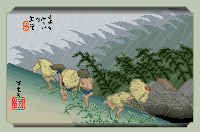 The original: 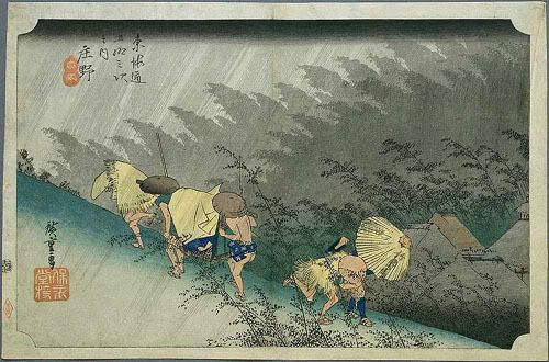 Edited by Haash - 23 February 2010 at 4:41pm |
|
|
This is not a signature.
|
|
 IP Logged IP Logged |
|
|
Manupix
Commander
Joined: 07 May 2026 Online Status: Offline Posts: 771 |
Posted: 23 February 2010 at 8:47pm |
|
I don't know what motivated the decision, but I can venture some guesses.
I don't think it has anything to do with photoshop, it's just that you actually use all those colors. This is obvious when you map them. You have many instances of similar colors which as you say are undistinguishable: why use them then? You have gradients made of far too many colors (ground); and you introduce new ramps in different parts of the pic where it would be much better to reuse colors from other parts. If you study your reference, you'll see the artist was very careful about color conservation, and reused his greys all over the image. This is not for it's own sake, it's one of the best ways to unify your image and give it life. This image should be pixelled in no more than 32 colors, and possibly in 16, or even 8. If I understand you well, this is actually a trace. I'm not sure about the present view about traces, I think they're at least discouraged. To be honest I don't understand the point: if you're willing to spend many hours on a piece, why not redraw it instead of tracing? The learning value would be 10 times better. When you trace you don't even have to think of composition, lines, pixel placement and stuff. Where's the fun then? How do you learn anything from this old masterpiece without at least trying to understand what the artist did? I'm sorry to say that this actually shows in your piece. So, I hope you reconsider your position and make your own good art with inspiration from, but not blindly copying, the old masters. |
|
|
IP Logged |
|
|
MadMage
Commander
Joined: 02 September 2021 Location: Brazil Online Status: Offline Posts: 112 |
Posted: 24 February 2010 at 6:37am |
|
I really appreciated your answer, Manupix. I agree with you that the use of gradients migh have increased the colours used, specially because for some of them (shadows on top and bottom) I used transparency. What I dont understand is why in my other pieces the colour number was increased, without ever using transparency... Thus I still believe photoshop gave me a higher number of colours. Lets say... I used like 80 colours (yes, I know this is a lot) and it accuses 128.
When I started drawing, I often did tracings on silk paper. In the beginning this was very helpful to me. Later, I switched to copying photos or other drawings. I thought It would be helpful as well to do the same in pixel art, as the reduced original image gets really blurry and forces me many times to "guess" what are the elements. I see this as a less evedent form of tracing where the reference is not that obvious. Since I am a "rookie" in pixel art, specially when it comes to colouring and shading, I find this means of drawing w/ pixels to be quite useful and adequate. Moreover, I have often used my own drawings, reduced pictures, video game images and so on for tracing. The results were often satisfactory (at least to me and my expectations). What I intend to do from now on is to drasticalyy reduce my colour usage and avoid using transparency. Still I think PixelJoint's decision about this piece of mine shoud be reconsidered. Thanks for your advices. H. Edited by Haash - 24 February 2010 at 6:39am |
|
|
This is not a signature.
|
|
|
IP Logged |
|
| |
||
Forum Jump |
You cannot post new topics in this forum You cannot reply to topics in this forum You cannot delete your posts in this forum You cannot edit your posts in this forum You cannot create polls in this forum You cannot vote in polls in this forum |
|
