| Active TopicsSearchRegisterLogin |
| WIP (Work In Progress) | |
| |
  |
| Author | Message |
|
Vegard
Seaman 
Joined: 14 February 2010 Online Status: Offline Posts: 39 |
  Topic: First pixel -- horse Topic: First pixel -- horsePosted: 15 February 2010 at 9:36am |
|
Hi!
Until a few days ago, I've only been enjoying pixel art as a viewer, but I decided to try making some myself. In particular, Syosa's beautiful running horse (  ) inspired me to make a horse of my own... ) inspired me to make a horse of my own...I tried to copy this horse at first (shows up as one of the first images of horses on Google): http://www.smokymountainparkarabians.com/ This animation shows approximately how I made it:  Just the final frame:  Before I knew that this WIP forum existed, I tried to post it to the gallery. I got a few comments, which I've tried to address now. I'm still not entirely happy with the back left leg. It looks a bit odd, but I can't get a firm grasp of what exactly is wrong. The head also looks a bit clumsy.  What about the shading, is it too "flat"? (I tried dithering, but I can't do it without at the same time making a lot of single pixels jump out at me.) Note: I will make the background transparent when it's finished. Comments, tips, and improvement suggestions are very welcome! Vegard |
|
 IP Logged IP Logged |
|
|
Ninja Crow
Commander 
Joined: 02 June 2009 Online Status: Offline Posts: 323 |
Posted: 15 February 2010 at 1:11pm |
|
A very good way to learn to draw is as you are attempting here - namely to copy from life (or images if no useful subjects are nearby). You can learn a great amount about form and volume, shading and outlines this way.
So the 'tracing' won't be considered bad, because you are learning, if you put a grid over the horse picture, then try to copy the shapes in each square to a second grid of the size you want (160x144 pixels in this case). If that doesn't appeal to you, it's best now to learn a technique that you can use your entire life (even as the pro you are sure to be) which is to find the shapes of any object you wish to draw. To show this, I have three links for you to quick 'how to' pages: A close up of the head. Useful shapes and measurements. My favourite kind of 'how to' drawing. One slight issue with your image is that his body is too long, which wouldn't happen if you drew a circle or oval to represent his 'rib cage' (as in the tutes) because you would never make a circle or oval that wide - it would just look 'wrong'. I don't know if you have or have access to a scanner, but if it isn't too much trouble, please make a pencil sketch of your horse by following the ideas in the three links from above, and show it here for any further ideas it may need. I'll bet you'll agree it'll look much better, and will make an awesome pixel (that Arabian stallion is very cool)! Thanks, and welcome to the Pixel Joint! JD |
|
|
IP Logged |
|
|
Manupix
Commander
Joined: 07 May 2026 Online Status: Offline Posts: 771 |
Posted: 15 February 2010 at 6:00pm |
|
What Ninja said.
The second tuto seems like better advice in my opinion than the other 2: I think starting with stick horses (or people, or whatever) is probably better than starting from 'basic shapes'. I'm not saying basic shapes are wrong, abstracting any object into shapes is actually something important all artists must learn to do. But it is not easy, and I don't think a beginner can really find those shapes - neither can I. On the other hand, the idea of sticks is easier to understand, and lays the foundation for the study of anatomy. Also, it is necessary to study (and sketch from) lots of refs, not just one. Moving ones too. You can't properly understand how a horse looks like from one single still point of view. Only start to pixel when you can sketch an acceptable-looking horse (I'm not saying good!) without strictly copying a ref. This being said, congrats for going for an animal on your first try! Don't worry about dithering for now. Program should be: 1 = good horse shape; 2 = clean lines; 3 = coloring and shading. Anything else comes afterwards! |
|
|
IP Logged |
|
|
onek
Commander
Joined: 19 May 2009 Online Status: Offline Posts: 416 |
Posted: 16 February 2010 at 3:32pm |
|
i dont think the actual shape isnt too bad at all... compared to what u got in the beginning of ur WIP its a huge improvement... also i dont agree with all that fuzz about using references and studying anatomy like nothing else ... u will get a hang of that when the time comes... but what is much more important is that u draw something that comes from YOU and not what the PEOPLE tell u, copying a life like drawing from some reference isnt anyhow original or creative.... therefore whe have copying machines or cameras nowadays...
on the other hand there are some thing that can really be improved, but more from the craftsman point of view... like the shading, colors and the overall appearance, like composition, i know its ment to be transperant but thats a little boring, some background can highly improve this.... maybe this edit helps... nothing changed about the lineart, except for a few jaggies... 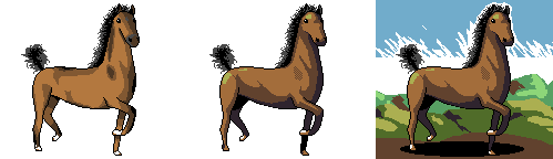
|
|
|
IP Logged |
|
|
RollerKingdom
Commander
Joined: 11 January 2009 Online Status: Offline Posts: 388 |
Posted: 16 February 2010 at 4:26pm |
|
Onek that simple edit is amazing haha xD the simple doodle bkg is so lovely.
|
|
|
IP Logged |
|
|
Vegard
Seaman
Joined: 14 February 2010 Online Status: Offline Posts: 39 |
Posted: 17 February 2010 at 2:15am |
|
Hi,
Originally posted by Ninja Crow One slight issue with your image is that his body is too long, which wouldn't happen if you drew a circle or oval to represent his 'rib cage' (as in the tutes) because you would never make a circle or oval that wide - it would just look 'wrong'. I don't know if you have or have access to a scanner, but if it isn't too much trouble, please make a pencil sketch of your horse by following the ideas in the three links from above, and show it here for any further ideas it may need. I'll bet you'll agree it'll look much better, and will make an awesome pixel (that Arabian stallion is very cool)! I've been practicing over the past two days, mostly trying to copy the sketches in those links you gave. I made this just now, almost (but not entirely) from memory:  (I don't have easily access to the scanner, so I used the webcam. Hopefully it's not too bad -- the perspective could be distorted, but I cannot really tell.) The reason why I am so happy with this horse is that 1. I didn't copy it, and 2. it's ten times as good a horse as I could draw last week. (That said, I am sure there are lots of things wrong with it.) I will practice more and try different poses, but it could take a little bit of time before I get really good. Thanks (also to Manupix) for the encouragement. Originally posted by onek i dont think the actual shape isnt too bad at all... compared to what u got in the beginning of ur WIP its a huge improvement... also i dont agree with all that fuzz about using references and studying anatomy like nothing else ... u will get a hang of that when the time comes... but what is much more important is that u draw something that comes from YOU and not what the PEOPLE tell u, copying a life like drawing from some reference isnt anyhow original or creative.... therefore whe have copying machines or cameras nowadays... I personally believe that practice is the only thing that really helps. As such, I think that references can help me to get started because I don't have to worry about making up the picture in my mind, but I can concentrate on learning what the horse looks like and drawing what I see. I agree, though, that it is not original or creative. It it just for the learning  Originally posted by onek on the other hand there are some thing that can really be improved, but more from the craftsman point of view... like the shading, colors and the overall appearance, like composition, i know its ment to be transperant but thats a little boring, some background can highly improve this.... maybe this edit helps... nothing changed about the lineart, except for a few jaggies... Wow, it makes a huge difference, even if it is not that big a change. This is also encouraging, because it tells me that I wasn't too far off to begin with  Thanks guys! Vegard |
|
|
IP Logged |
|
|
Ninja Crow
Commander
Joined: 02 June 2009 Online Status: Offline Posts: 323 |
Posted: 17 February 2010 at 2:40am |
|
That is excellent! Thank you for the sketch, it was nice to see, and there's a lot of personality in that horse. I hope the practise was fun! I'd recommend keeping it up until you have a picture you feel comfortable with turning into a pixel art, and then posting the pixel outline here.
Can't wait to see it! |
|
|
IP Logged |
|
|
Vegard
Seaman
Joined: 14 February 2010 Online Status: Offline Posts: 39 |
Posted: 19 February 2010 at 2:31pm |
|
Hi,
I didn't really have the time to practice much, but I did make three more sketches (and I was quite happy about them):  This is the same skeleton as my first sketch, I just tried to make it face the other way. I also tried to make it a bit fatter -- perhaps too fat. Also tried to make the legs a bit less skinny.  This one was definitely distorted by the way I am holding the booklet against the webcam -- apart from that, I tried a different skeleton. Not sure it really worked, though -- I don't get the impression of speed that this pose should imply. Oh well.  This is perhaps the sketch that I am the most happy with so far. At first I thought the neck would be too short, but it actually gives (I think) a nice impression of a young horse. I tried to make the face be a little bit more turned towards the viewer, not sure if I was able to do it correctly, though (will look for a "how to" on that later). For these three, though, I did more or less copy the skeleton, so they're not exactly groundbreaking. Will keep practicing; it will probably take a while. |
|
|
IP Logged |
|
|
Ninja Crow
Commander
Joined: 02 June 2009 Online Status: Offline Posts: 323 |
Posted: 19 February 2010 at 7:25pm |
|
Thanks for the sketches, Vegard. I like horses a lot, and sharing them here was fun for me.
Did you enjoy sketching the horses? It may be called practise, but if you liked it, then it's more like play I hope! If you like, I'll point out any areas on the sketches you show that I think need a little extra attention. I hope to see more soon! |
|
|
IP Logged |
|
|
Manupix
Commander
Joined: 07 May 2026 Online Status: Offline Posts: 771 |
Posted: 19 February 2010 at 8:33pm |
|
Impressive! Good work!
The 'running' one doesn't work because although each leg is realistic, they would never appear like this together. |
|
|
IP Logged |
|
|
Vegard
Seaman
Joined: 14 February 2010 Online Status: Offline Posts: 39 |
Posted: 20 February 2010 at 2:37am |
|
Originally posted by Ninja Crow Thanks for the sketches, Vegard. I like horses a lot, and sharing them here was fun for me. Did you enjoy sketching the horses? It may be called practise, but if you liked it, then it's more like play I hope! If you like, I'll point out any areas on the sketches you show that I think need a little extra attention. I hope to see more soon! I enjoyed it! And please do point out the areas that need extra attention. It won't demotivate me :-) Originally posted by Manupix Impressive! Good work! The 'running' one doesn't work because although each leg is realistic, they would never appear like this together. Thanks! :-) The running one I think is supposed to be at the beginning of a jump. I suppose that I should look for photos of jumping horses before I attempt to draw one. Thanks for the link, I will study the diagram (in fact, I think the silhouettes taught me something already, as they show the shape of the horse "without distractions", i.e. I now see better how the neck should be curved (or not) and connect to the head and that the top of the back leg should cut more sharply towards the rear instead of being curved when the horse is standing still). |
|
|
IP Logged |
|
|
Vegard
Seaman
Joined: 14 February 2010 Online Status: Offline Posts: 39 |
Posted: 20 February 2010 at 2:32pm |
|
I tried to make this running one using frame 3 of the Muybridge/Horse in Motion diagram:
 Not entirely happy with the back part (butt and legs), maybe I misread the silhouette. Also erased the skeleton this time. Edit: I actually did what I should have done sooner: Checked out some videos of running horses. Here's the same horse with some modifications:  I think I might actually want to make an outline out of this one. With your approval, of course :-) Edited by Vegard - 20 February 2010 at 2:49pm |
|
|
IP Logged |
|
|
Vegard
Seaman
Joined: 14 February 2010 Online Status: Offline Posts: 39 |
Posted: 20 February 2010 at 4:11pm |
|
Perhaps a little premature, but I couldn't help myself and went for a smaller pixel:
 Hm, now that I see it here, do some of the single pixels of the mane stick out a bit too much? It's 64x64 and 4 colours + transparency. I didn't make a sketch for this, just drew a pixel outline, then refined it. But I liked it. |
|
|
IP Logged |
|
|
Ninja Crow
Commander
Joined: 02 June 2009 Online Status: Offline Posts: 323 |
Posted: 21 February 2010 at 11:15am |
|
Hi, V.
Your pixel looks like it's going to be great - and I like the shading. If you don't mind, I've got a couple things to point out, with this image as a ref:
JD |
|
|
IP Logged |
|
|
Vegard
Seaman
Joined: 14 February 2010 Online Status: Offline Posts: 39 |
Posted: 21 February 2010 at 2:28pm |
|
Thanks. Tried to edit according to your specification, and I think I got at least the right back leg correct, not entirely sure about the left legs (didn't touch them) or the right front leg.
 I actually consulted my sketches, and I seem to have made legs in both directions (for example, the last/previous sketch in this thread, posted "Yesterday at 2:31pm", would have inverted joints, while the other sketches, I think, are correct). But I think it was a very nice thing to be (made) aware of; I wasn't! PS: Will this horse fall over on the side if I don't change the pose too? It just occurred to me that it looks a bit unbalanced (right legs touching the ground, left legs in the air). |
|
|
IP Logged |
|
|
Ninja Crow
Commander
Joined: 02 June 2009 Online Status: Offline Posts: 323 |
Posted: 22 February 2010 at 1:01pm |
|
The new back outside leg looks terrific. I'm also glad the point I made (1. from my previous post) came out well - I wasn't sure if I had explained it properly! And the elbow (mentioned in 3.) is looking good, too.
The back inside leg would actually make a great front leg (as regarding the location of the joints - you don't necessarily need the exact pose, just to keep the lengths and joints in mind). Originally posted by Vegard If you are talking about this picture, then I would have to say that, as far as I can tell, it's articulated correctly, and looks fine - no worries!
(for example, the last/previous sketch in this thread, posted "Yesterday at 2:31pm", would have inverted joints, while the other sketches, I think, are correct) Okay, here are a couple new things to keep in mind:
Oh, and is that a new way of doing the mane? It looks pretty good, though the line of black pixels between it and the neck might look better if they were a transition colour instead of black. JD |
|
|
IP Logged |
|
|
Vegard
Seaman
Joined: 14 February 2010 Online Status: Offline Posts: 39 |
Posted: 22 February 2010 at 3:21pm |
|
Originally posted by Ninja Crow Okay, here are a couple new things to keep in mind:
What do you mean "too long"? I thought we were making a giraffe.  Now, jokes aside... Originally posted by Ninja Crow The new back outside leg looks terrific. I'm also glad the point I made (1. from my previous post) came out well - I wasn't sure if I had explained it properly! And the elbow (mentioned in 3.) is looking good, too. The back inside leg would actually make a great front leg (as regarding the location of the joints - you don't necessarily need the exact pose, just to keep the lengths and joints in mind). Thanks :-) I tried to simply move the back leg, don't think it looked too bad:  I find it really hard to add the last leg, though. I made at least 5 attempts, and they all failed for some reason or another, usually it gets too close to the other back leg, so the pixels clash (if I try to hide it partially behind the other back leg, it looks either too thin (1px of brown) or too thick (2px of brown), and there's no middle ground! Oh, and I'm not too fond of the shading of the back leg. But I suppose that the shading is not that important while the final shape is not done yet. (Actually, I wanted to follow Manupix's advice of finding a right outline before trying for the pixel, and so this smaller pixel is really just a side track on my way to Pixelating Horses.) Originally posted by Ninja Crow
I really couldn't make the shoulder of the leg in an L shape (as per your previous post) unless I was putting the front leg in the air, and so I reverted and redid the leg after a photograph instead. If you think this is worse, I can try to do it again as you said, but then I need to know what sort of general configuration the leg should have too (e.g. in the air, diagonally forwards or backwards, bent, etc.). Thanks a lot for your advice and patience. The skeleton is also very nice reference, it makes it very easy to know exactly what you're talking about. |
|
|
IP Logged |
|
|
Ninja Crow
Commander
Joined: 02 June 2009 Online Status: Offline Posts: 323 |
Posted: 23 February 2010 at 12:30pm |
|
Originally posted by Vegard --- Well, that new inside front leg looks even better than I thought it would - you incorporated it very well! I noticed some things, but they were a bit hard to describe, so I decided to try an edit: 
Let me know if you don't like any of these points. JD |
|
|
IP Logged |
|
|
Vegard
Seaman
Joined: 14 February 2010 Online Status: Offline Posts: 39 |
Posted: 24 February 2010 at 12:25pm |
|
Wow...
I like your edit. A lot. I like especially the new shorter and straighter neck. It makes the horse a lot more horsey. Also the ears. And the new leg is very nice. I have no idea how you did that, though. I thought I'd tried this already. Perhaps the only point I disagree with is the two short curves of dark-brown on the hip and shoulder. I didn't try to change (or remove) them, so I don't know if that would look better. I think what's wrong is that they distract somewhat from the rest of the drawing. Maybe it's just that my eyes land on those two curves automatically. I'm not sure if I'll be able to improve this drawing any more, and it's hard to make those changes without simply copying your edit. Are collaborations allowed now? (I thought I read something about that.) In that case, we could put it up as a collaboration work. Otherwise, I think I will start a new one with a different pose. I've learned a lot from both your comments and your edit. Thanks! V |
|
|
IP Logged |
|
|
Ninja Crow
Commander
Joined: 02 June 2009 Online Status: Offline Posts: 323 |
Posted: 25 February 2010 at 1:12pm |
|
That's very kind of you to say!
Yeah, it's true, I'm a muscle junkie - I knew I was risking the solid-form aesthetic of the piece when I put in those dark brown lines, but I just couldn't help myself! I have the same problem when I like an edit a lot - what do I do if I don't want to change it? This piece, however, is your horse, with your colours (I was quite surprised that there were only four in it, and yet so effective) and your pose, so I would consider it your piece, and therefore if you want to post it to your gallery (or even proudly display it as an avatar) I would be happy with that (and even quite honoured, actually) and the only thing I would require would be, as an attempt to maintain the policies of the gallery, a link to my profile page (such as this one: Ninja Crow) as mentioned in this fine news article here. It's entirely up to you! Of course, for wholly selfish reasons, I'd also love to see another piece! Please do make one and post it here (or just the sketch, or just the line art to begin with even) in this thread. Thanks, JD |
|
|
IP Logged |
|
| |
||
Forum Jump |
You cannot post new topics in this forum You cannot reply to topics in this forum You cannot delete your posts in this forum You cannot edit your posts in this forum You cannot create polls in this forum You cannot vote in polls in this forum |
|
