| Active TopicsSearchRegisterLogin |
| WIP (Work In Progress) | |
| |
  |
| Author | Message |
|
bannanawalrus
Commander 
Joined: 23 April 2010 Online Status: Offline Posts: 230 |
  Topic: new game project(wip) Topic: new game project(wip)Posted: 17 May 2010 at 10:48am |
|
So anyway, i had an idea for a game where you control a plane and fight enemies and you have to collect fuel to keep gooing for as long as you can.
anyway, i just started making a plane, any suggestions for improvements?
 the game will be a side scrolling shooter btw, and the enemies will be ufo's and other aliens aswell as maybe some monsters
 i made a quick ufo too its no inished yet though.
the graphics are simple but this is the style im aiming for and it also makes it faster seeing as im doing the programming too
 Edited by bannanawalrus - 17 May 2010 at 11:23am |
|
 IP Logged IP Logged |
|
|
onek
Commander
Joined: 19 May 2009 Online Status: Offline Posts: 416 |
Posted: 18 May 2010 at 5:48am |
|
here are some suggestions for improvement...

(note its even 5 colors less then ur originals...) |
|
|
IP Logged |
|
|
bannanawalrus
Commander
Joined: 23 April 2010 Online Status: Offline Posts: 230 |
Posted: 18 May 2010 at 11:02am |
|
Thanks onek i agree the plane needs more detail,
and the spaceship is perfecto, ill work on them a bit more tonight.
im aiming for a few enemies and the plane plus some background and the hud for a mockup shot to start with
 EDIT:
i changed the plane but im not sure, ive tried all kinds of colour schemes and detailing but theres something about the original i liked, however i really liked what you did with the ufo and ill change it later
 Edited by bannanawalrus - 18 May 2010 at 11:39am |
|
|
IP Logged |
|
|
Buddy90
Commander
Joined: 27 October 2009 Online Status: Offline Posts: 141 |
Posted: 18 May 2010 at 7:07pm |
|
Try looking at some pictures of planes and spaceships to get inspiration. Notice the shapes of them and try to imitate it.
Here's some examples.   
Edited by Buddy90 - 18 May 2010 at 7:07pm |
|

|
|
|
IP Logged |
|
|
bannanawalrus
Commander
Joined: 23 April 2010 Online Status: Offline Posts: 230 |
Posted: 19 May 2010 at 10:11am |
|
Thanks a bunch, the ones on the right were a real help with the vents.
anyway, while messing about with it i found this, and i know its over dithered, but i like the old effect it gives, and its certainly more interesting than the first:
 what do you think of this style?
EDIT:
 and the ufo, theres probably still alot i can do, but im not gonna get bogged down with these - ill start some other enemies or something, or maybe try and sort out what the hud will be like Edited by bannanawalrus - 19 May 2010 at 11:30am |
|
|
IP Logged |
|
|
onek
Commander
Joined: 19 May 2009 Online Status: Offline Posts: 416 |
Posted: 19 May 2010 at 11:37am |
|
nice... huge improvement... i also like the old feel with that dither, but maybe u should make it closer to the base tones, so it doesnt stand out so much
i think u should definitely keep the '01' on the wing...also id suggest you give it those back wings (elevators?...) , which'd add a kind of shark-like, mean character to it Edited by onek - 19 May 2010 at 11:38am |
|
|
IP Logged |
|
|
Buddy90
Commander
Joined: 27 October 2009 Online Status: Offline Posts: 141 |
Posted: 19 May 2010 at 7:43pm |
|
Looks better. Although, while doing the details, don't forget about the shape of what you're making too. For example, the plane's mid-sections is too narrow and too small compared to the rest of it. The tail wing is also too big. Look closely at the drawing and you'll see that the parts have a relationship to each other.
Also, the dithering works to an extent, but you can also add other colors, Right now it looks you have one purple, black and white. Try adding some red-violet or blue-violet in there, or make it more the color of a plane, like a gray-blue (desaturation). Definite improvement though, keep working on it. |
|
|
|
|
|
IP Logged |
|
|
bannanawalrus
Commander
Joined: 23 April 2010 Online Status: Offline Posts: 230 |
Posted: 20 May 2010 at 8:22am |
|
@buddy - by midsection do you mean between the wings and the cockpit or between the wings and the tail - ill lengthen it but the original plane was based on more a stunt plane than a fighter so im not sure 'bout widening it. Also, im not trying to get out of improving it by saying this, it was a design choice that was thought about beforehand, but i like the purple. i may add a more interesting colour for the highlights tho.@onek - im not sure what you mean, can you show me a picture?
Edit: Changed the dither colour closer to the base tone.
im not sure, it looks more like what dithering is supposed to do, but less oldish looking i think.
 ^comparison^
Btw, do you have any more ideas for enemies ( either small or bosses, but flying only really, because ground based wouldnt make sense with the scrolling background, unless it was going really fast)
Also, im not sure what screen res to go for.
probably about 400 long, and about 200 or a little less height wise.
Edited by bannanawalrus - 22 May 2010 at 6:11am |
|
|
IP Logged |
|
|
bannanawalrus
Commander
Joined: 23 April 2010 Online Status: Offline Posts: 230 |
Posted: 22 May 2010 at 6:11am |
|
Sorry for the double post but i'm really struggling with the curve of the hud, and indeed the hud in general, aswell as ideas

I just cant get the curve to look right :(
 |
|
|
IP Logged |
|
|
onek
Commander
Joined: 19 May 2009 Online Status: Offline Posts: 416 |
Posted: 22 May 2010 at 6:55am |
|
i think u should make the hud much smaller, its very distracting right now, also it aint too good if its like blocking parts of the screen,. try making the hud as clean as possible..... about the roundness... maybe try something else....
heres another edit.... also added a bit of backgroundness to put the hud more in context with the screen 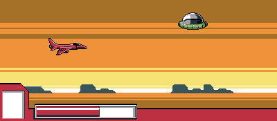
btw... the ufo seems a bit out of perspective |
|
|
IP Logged |
|
|
jeremy
Rear Admiral 
Joined: 25 November 2024 Location: New Zealand Online Status: Offline Posts: 1704 |
Posted: 22 May 2010 at 6:57am |
|
Sorry to post and run, but some of the far wing should be seen from that perspective.
Also, the banded way you've shaded the plane (Lightest purple on top right next to black = jaggedness) makes it look flat; like a coin. I like the spaceship glass, but beware overdithering because it can give a graininess that you don't want with such a smooth material. |
|
|
IP Logged |
|
|
StepDragon
Commander
Joined: 03 April 2010 Online Status: Offline Posts: 258 |
Posted: 22 May 2010 at 8:38am |
|
Your fighter's lightsource appears to be on the right, while your UFO's is on the left.
other than that, I like where this is going, I'm working on a shooter myself. also, if you're working on stuff in the back (read: not posting it) show it off, you can get great c&c here, even if you don't think you need it. |
|
|
IP Logged |
|
|
linx
Commander
Joined: 19 January 2009 Online Status: Offline Posts: 124 |
Posted: 22 May 2010 at 9:02am |
 Just showing how it would look without dithering, and added some hue shifting. |
|
|
IP Logged |
|
|
bannanawalrus
Commander
Joined: 23 April 2010 Online Status: Offline Posts: 230 |
Posted: 22 May 2010 at 10:01am |
|
Latest edit:
 Flipped ufo
Changed HUD, but nothing on it yet as im not sure about what it should have - I'm pretty sure that for this type of game a bar would be better than <insert zelda heart equivalent here> for health.
should you have a character, to give the (albeit basic) story more emotional pull, and therefore have a character protrait?
lOVE THE DESERT PALLETTE ONEK.
made the ground, and one set of rocks, they're very similar to yours though so i will probs change em up a bit.
Thanks all for the c+c, i may get to it tommorow.
Now, a bit more about the game.
There will (hopefully) be these (long) levels at the end of it:
City
Jungle
Desert
Mountains
Space
and your goal is to defeat the alien motherships at the end of each level to save earth!!
(deja vu, huh?)
EDIT: i agree about the ufo perspective, maybe moving the ring up might fix it?
Any more ideas?
Edited by bannanawalrus - 23 May 2010 at 2:22am |
|
|
IP Logged |
|
|
bannanawalrus
Commander
Joined: 23 April 2010 Online Status: Offline Posts: 230 |
Posted: 23 May 2010 at 3:31am |
|
Aside from the shading being wrong ( i made it the wrong way round, damnit!) can help me improve my new alien ship.
 Personally, i think it should be smaller, more of a light fighter.
Edit: made smaller
 Edit: Added flame. not sure about it. should probably remove outline.
 Full background so far 800x 175(so its less obvious that it loops) needs more big rocks.
 any C+C welcome (read:desperately wanted, look at ME,LOOK AT ME, LOOK! AT! ME!) as always
oh and the background is actually on layers, parallax scrolling. Edited by bannanawalrus - 23 May 2010 at 9:00am |
|
|
IP Logged |
|
|
Manupix
Commander
Joined: 05 November 2024 Online Status: Offline Posts: 771 |
Posted: 23 May 2010 at 2:07pm |
|
Loving this bg. But it looks like it's got small persp issues.
The shadows are far too thick considering the buildings are almost on the horizon line (meaning, your angle of view is almost exactly horizontal, you wouldn't see anything of the ground at that distance). I'd raise the horizon by about 2 px, and narrow the shadows down to 2 px or even 1. Then if the buildings are at different distances, introduce some aerial perspective (farthest bldgs need lower contrast and lighter color because seen through more misty air). Dithering is kept under control, but maybe too even: could use some breaking up. |
|
|
IP Logged |
|
|
bannanawalrus
Commander
Joined: 23 April 2010 Online Status: Offline Posts: 230 |
Posted: 24 May 2010 at 11:15am |
|
Ta manupix, good call with lightening the back rocks.
 Better?
|
|
|
IP Logged |
|
|
meagz
Commander
Joined: 09 December 2009 Online Status: Offline Posts: 123 |
Posted: 24 May 2010 at 5:58pm |
|
im really loving the white outlines on everything.
maybe desaturate the back rocks a bit, they stand out more than the front ones. |
|
|
IP Logged |
|
|
bannanawalrus
Commander
Joined: 23 April 2010 Online Status: Offline Posts: 230 |
Posted: 25 May 2010 at 11:04am |
|
i see what you mean, but its not that noticeable scrolling and im against adding ANOTHER purple, i already added one for the highlights on the rock. Any powerup ideas/thoughts about what sould be on the hud? Edit; anyone have any experience of animating a jet flame?Edited by bannanawalrus - 25 May 2010 at 11:14am |
|
|
IP Logged |
|
|
StepDragon
Commander
Joined: 03 April 2010 Online Status: Offline Posts: 258 |
Posted: 25 May 2010 at 12:25pm |
|
Take a look at my starfox gallery entry, is that the type of flame you're looking for? (it was super easy to make)
|
|
|
IP Logged |
|
|
MW360
Seaman 
Joined: 25 May 2010 Online Status: Offline Posts: 4 |
Posted: 25 May 2010 at 3:14pm |
|
Originally posted by bannanawalrus Ta manupix, good call with lightening the back rocks. Better? I think the last rock on the right needs to be a bit higher, but not as high as the first from the left. |
|
|
IP Logged |
|
|
bannanawalrus
Commander
Joined: 23 April 2010 Online Status: Offline Posts: 230 |
Posted: 28 May 2010 at 8:41am |
|
so, what do you think of the titlescreen font before i start shading and adding details and stuff?
 do you think the slant looks bad at the right because the N isnt sloping?
Edited by bannanawalrus - 28 May 2010 at 8:41am |
|
|
IP Logged |
|
|
StepDragon
Commander
Joined: 03 April 2010 Online Status: Offline Posts: 258 |
Posted: 28 May 2010 at 8:55am |
|
hay, nice work on the title, but to me it looks a little unfinished. some cleaner lines would do it some good. i made an edit to show what i'm talking about. I hope you like it:

things i changed: 1 all letters which went below the bottom of the line were cut off. 2 shrank the X as it seemed too thick (judgement based on other letters) 3 modified the back lines to be square rather than slanted 4 modified the O to accommodate the R Edited by StepDragon - 28 May 2010 at 8:57am |
|
|
IP Logged |
|
|
Dhr. Bosch
Commander
Joined: 01 February 2016 Location: Netherlands Online Status: Offline Posts: 215 |
Posted: 29 May 2010 at 3:19am |
|
i'd say your best bet is to make all the letters sloped to the same side. like you hit the italics button in word... i also think that your X looks a little bad because its legs do not properly cross. it looks more like this )( then this X.
i love the dessert background. |
|
|
Vanitas, vanitatum omnia vanitas
|
|
|
IP Logged |
|
|
bannanawalrus
Commander
Joined: 23 April 2010 Online Status: Offline Posts: 230 |
Posted: 29 May 2010 at 6:46am |
|
@dhr. Bosch like so?
 |
|
|
IP Logged |
|
|
StepDragon
Commander
Joined: 03 April 2010 Online Status: Offline Posts: 258 |
Posted: 29 May 2010 at 7:45am |

quick edit no time g2g, for you to think on... |
|
|
IP Logged |
|
|
bannanawalrus
Commander
Joined: 23 April 2010 Online Status: Offline Posts: 230 |
Posted: 30 May 2010 at 1:16am |
|
or take the easy way out

 anything else pefore shadage and detailage occurs?
im thinking mettalic and rivets and ... stuff.
 EMO SMILEY ALERT EMO SMILEY ALERT lol... excuse outburst
EDIT:  Edited by bannanawalrus - 30 May 2010 at 1:38am |
|
|
IP Logged |
|
|
Dhr. Bosch
Commander
Joined: 01 February 2016 Location: Netherlands Online Status: Offline Posts: 215 |
Posted: 30 May 2010 at 3:15am |
|
Much better.
i have to admit that this may purely be a case of personal preferance, but i think that if you use a more radical stile for the v/x it will look extra awesome.  something like this... but you coult make it scratches in the metal or a chopped off three fingered alien hand or whatever. just break the pattern. or not if you prefer it your way... good luck! Edited by Dhr. Bosch - 30 May 2010 at 3:16am |
|
|
Vanitas, vanitatum omnia vanitas
|
|
|
IP Logged |
|
|
bannanawalrus
Commander
Joined: 23 April 2010 Online Status: Offline Posts: 230 |
Posted: 30 May 2010 at 8:39am |
|
tried to make it look like scratches. dont know if i succeeded. at any rate, the browny grey is a better background colour
 i also made the word squadron again in that style, cos its kinda funkalicious
 and now the brain slug has me again :( and now the brain slug has me again :( |
|
|
IP Logged |
|
|
onek
Commander
Joined: 19 May 2009 Online Status: Offline Posts: 416 |
Posted: 30 May 2010 at 9:23am |
|
i dont like the violett.. way too bright and saturated... also it all look very flat maybe add some gradients and stuff
heres an idea 
|
|
|
IP Logged |
|
|
Dhr. Bosch
Commander
Joined: 01 February 2016 Location: Netherlands Online Status: Offline Posts: 215 |
Posted: 30 May 2010 at 10:10am |
|
that is one excellent edit onek! You've absolutly got that super cool 90 arcade style down...
|
|
|
Vanitas, vanitatum omnia vanitas
|
|
|
IP Logged |
|
|
bannanawalrus
Commander
Joined: 23 April 2010 Online Status: Offline Posts: 230 |
Posted: 30 May 2010 at 1:07pm |
|
W.
O.
W.
will get right to it!
(the background wasnt finished btw, i was planning on adding some kind of metallkic texture)
|
|
|
IP Logged |
|
|
bannanawalrus
Commander
Joined: 23 April 2010 Online Status: Offline Posts: 230 |
Posted: 01 June 2010 at 3:07am |
|
k, so heres the deal, im really running low on entusiasm for this project atm, probably i dindnt think about it enough before i started, so im gonna take a break, although i will quite probably ressurectificate this at some point. Adios, peps!
oh, and btw, what size would you reccomend for a (torso and head) portrait (i.e. rollerkingdom's original knovy spength portrait)
|
|
|
IP Logged |
|
|
Dhr. Bosch
Commander
Joined: 01 February 2016 Location: Netherlands Online Status: Offline Posts: 215 |
Posted: 02 June 2010 at 8:28am |
|
too bad, i thought it looked quite promising. at least you're honest about it...
good luck on your portrait |
|
|
Vanitas, vanitatum omnia vanitas
|
|
|
IP Logged |
|
| |
||
Forum Jump |
You cannot post new topics in this forum You cannot reply to topics in this forum You cannot delete your posts in this forum You cannot edit your posts in this forum You cannot create polls in this forum You cannot vote in polls in this forum |
|
