| Active TopicsSearchRegisterLogin |
| WIP (Work In Progress) | |
| |
  |
| Author | Message |
|
Pickles
Midshipman 
Joined: 26 May 2008 Online Status: Offline Posts: 40 |
  Topic: Flash Game WIP Topic: Flash Game WIPPosted: 20 June 2010 at 9:58am |
|
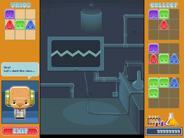
Well guys, this is my game interface.
I'm developing a flash game called Viral Defense, in the game play there are going to fall tetris pieces (viruses) (as you can see in the SS) in different color arrangements. The player must press the SPACE key in order to change the virus shown in the top-left of the screen, when it matches with the virus falling the player must press C or D key, in order to collect or destroy it. There's a list of three viruses the player have to collect in the right portion of the screen, the other ones must be destroyed. 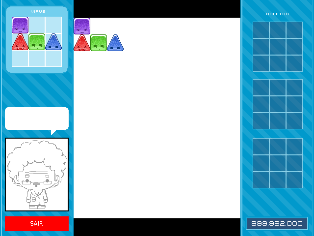
My purpose was to make a cute game... The graphics are only a draft by now... C&C on the interface, on the gameplay, on the name... on anything finally... is VERY welcome... as it's my first game developed =D... ^^ Edited by Pickles - 20 June 2010 at 9:59am |
|
 IP Logged IP Logged |
|
|
PixelSnader
Commander 
Not a troll! Joined: 05 June 2014 Online Status: Offline Posts: 3194 |
Posted: 22 June 2010 at 9:16am |
|
Your character reminds me of an old classmate of mine, he used the same drawing style. I hope you're still going to do something with the black and white center piece because it doesn't look nice. Even filling in with the blue of the 'virus' rounded square would look nicer. Also, I'm not sure why you need the big center area. You only have to choose between keeping and throwing away, right? So no need for the whole dropping part IMO. |
|
|
▄▄█ ▄▄█ ▄█▄ ▄█▄ |
|
|
IP Logged |
|
|
Pickles
Midshipman
Joined: 26 May 2008 Online Status: Offline Posts: 40 |
Posted: 22 June 2010 at 11:00am |
|
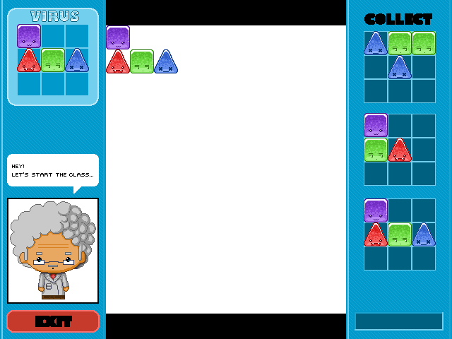
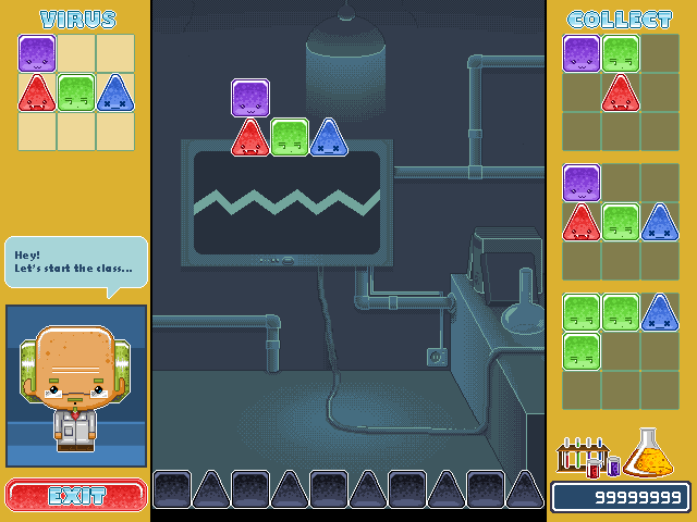
Actually the pieces are going to fall down, just like a tetris gameplay and when the viruses touches the floor it becomes blackish, you cannot remove/collect it anymore...
About the black and the white region surely I'm gonna work on it, it's just a WIP ^^, the last few days I should have made something but I didn't have enough time... If you have any idea of what can be done I'd thank you a lot, ideas are always welcome... Thanks for replying, soon I'm gonna post updates ^^... |
|
|
IP Logged |
|
|
Pickles
Midshipman
Joined: 26 May 2008 Online Status: Offline Posts: 40 |
Posted: 24 June 2010 at 6:01am |
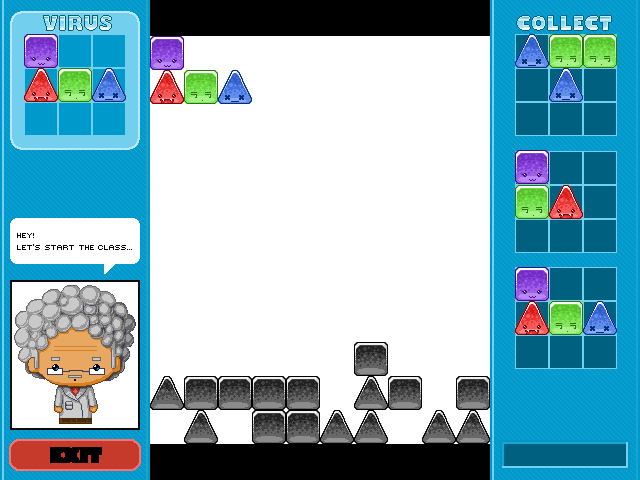
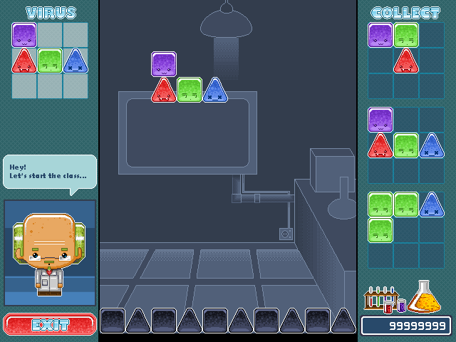
Here it is... The last update of the interface... Is it better to understand the game engine? Any suggestions are welcome... =D |
|
|
IP Logged |
|
|
Manupix
Commander
Joined: 05 November 2024 Online Status: Offline Posts: 771 |
Posted: 25 June 2010 at 3:42pm |
|
The viruses are cute and cool, the scientist is nice but maybe a little out of style, the game environment and fonts are cold and boring. Moar imagination pliz! :)
|
|
|
IP Logged |
|
|
Pickles
Midshipman
Joined: 26 May 2008 Online Status: Offline Posts: 40 |
Posted: 28 June 2010 at 9:16am |
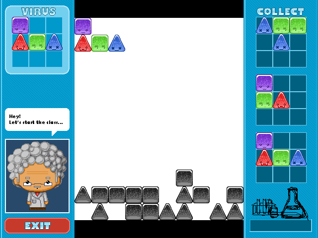
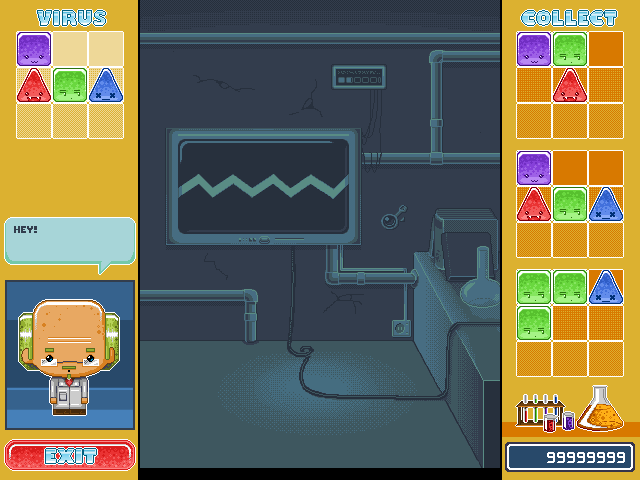
Well.. this is how it is until now... Hey manypix... what do you think about the scientist? what can I improve... |
|
|
IP Logged |
|
|
Pickles
Midshipman
Joined: 26 May 2008 Online Status: Offline Posts: 40 |
Posted: 28 June 2010 at 9:41am |
Update :) Now I'm drafting some lab stuff on the interface ^^ Edited by Pickles - 28 June 2010 at 9:41am |
|
|
IP Logged |
|
|
Manupix
Commander
Joined: 05 November 2024 Online Status: Offline Posts: 771 |
Posted: 28 June 2010 at 4:57pm |
|
what do you think about the scientist? what can I improve... Well, maybe try to give him the same kind of treatment than the viruses: more geometric (his face is already, not his hair), similar light, textures, colors. |
|
|
IP Logged |
|
|
Pickles
Midshipman
Joined: 26 May 2008 Online Status: Offline Posts: 40 |
Posted: 29 June 2010 at 8:29am |

@Manupix Did I understand your suggestion? |
|
|
IP Logged |
|
|
Manupix
Commander
Joined: 05 November 2024 Online Status: Offline Posts: 771 |
Posted: 29 June 2010 at 9:26am |
|
You did, you can go further.
 (Sorry to fall for the bald scientist myth) You might do the same for his clothes too. Also I don't think (after uploading) the difference between hair and eyebrows / moustache / beard is the best option. Edited by Manupix - 29 June 2010 at 9:28am |
|
|
IP Logged |
|
|
Pickles
Midshipman
Joined: 26 May 2008 Online Status: Offline Posts: 40 |
Posted: 05 July 2010 at 11:50am |
|
Here's my last update...
The new scientist really worked, I'm very impressed... thank you a lot Manupix =D ^^ 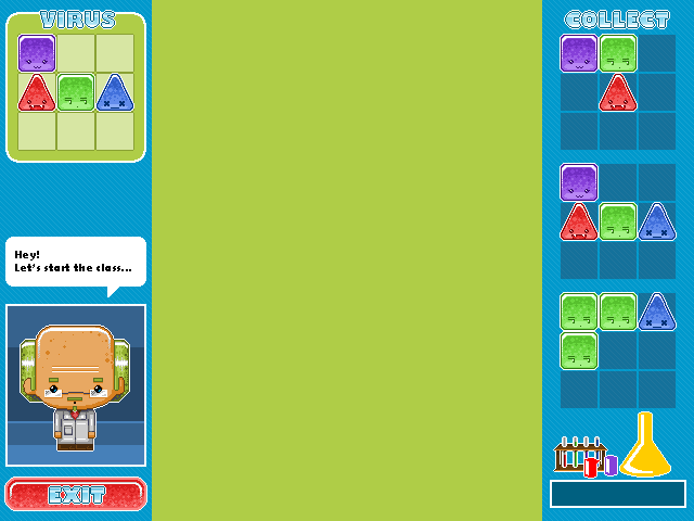
Any ideas are welcome... =) Edited by Pickles - 05 July 2010 at 11:51am |
|
|
IP Logged |
|
|
Pragz
Commander
Joined: 09 August 2009 Location: Ireland Online Status: Offline Posts: 136 |
Posted: 05 July 2010 at 1:06pm |
|
Perhaps give the big green background a little bit of that bubble texture you've used on the virus blocks?
[Edit] Though I'd use the yellow from the beaker at the bottom for the bubbles. If you use the darker green, the green blocks will blend into it too much. Edited by Pragz - 05 July 2010 at 1:06pm |
|
|
Hello - I'm new here. :)
|
|
|
IP Logged |
|
|
Buddy90
Commander
Joined: 27 October 2009 Online Status: Offline Posts: 141 |
Posted: 05 July 2010 at 6:46pm |
|
i think the gameplay area should be dark. Not pure black, but like, a dark blue-violet. You could also try a simple texture, like the inside of a building. Most of the colors are pretty bright here, so that could help balance the piece.
Plus, if I'm looking at the game playing space all the time, I want it to be easy on my eyes. |
|

|
|
|
IP Logged |
|
|
Pickles
Midshipman
Joined: 26 May 2008 Online Status: Offline Posts: 40 |
Posted: 06 July 2010 at 9:52am |
|
Here's my last update... I think Buddy90's advice really worked...
Now I'm gonna work on the background texture... I liked Pragz suggestion of using the bubble texture... Let's try it =D 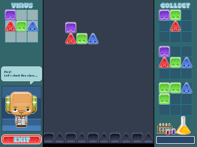
C&C are welcome... Let me know what you think 'bout the new colors... Edited by Pickles - 06 July 2010 at 9:53am |
|
|
IP Logged |
|
|
Pickles
Midshipman
Joined: 26 May 2008 Online Status: Offline Posts: 40 |
Posted: 06 July 2010 at 11:29am |
|
Actually the bubbles haven't worked.... =\\
If somebody come up with another idea i'd be thankful =) |
|
|
IP Logged |
|
|
PixelSnader
Commander
Not a troll! Joined: 05 June 2014 Online Status: Offline Posts: 3194 |
Posted: 06 July 2010 at 7:59pm |
|
This new color looks nice, not so harsh on the eyes. Maybe a simple bubble pattern? Just a quick shoop so don't mind the colorcount =P.

|
|
|
▄▄█ ▄▄█ ▄█▄ ▄█▄ |
|
|
IP Logged |
|
|
Pickles
Midshipman
Joined: 26 May 2008 Online Status: Offline Posts: 40 |
Posted: 09 July 2010 at 2:13pm |
|
Hmmm... I like it =D
Thanx... I'm gonna work on the scientist animations... I'll post 'em soon |
|
|
IP Logged |
|
|
Pickles
Midshipman
Joined: 26 May 2008 Online Status: Offline Posts: 40 |
Posted: 13 July 2010 at 5:00am |
|
Here's the latest update... what do you think of a lab background?
|
|
|
IP Logged |
|
|
wenruto
Commander
Joined: 19 January 2021 Location: United States Online Status: Offline Posts: 115 |
Posted: 13 July 2010 at 7:53am |
|
The ears look kinda strange to me
|
|
|
Earn free stuff by searching like Google

|
|
|
IP Logged |
|
|
Pickles
Midshipman
Joined: 26 May 2008 Online Status: Offline Posts: 40 |
Posted: 15 July 2010 at 4:53pm |
|
I think I'm getting better *_*... With some advices of you, the pixelart masters, I know I can learn a lot and improve my technique even more... so, there it goes, my last update...
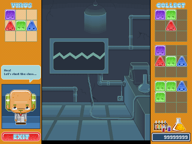
@wenruto What would you suggest for me to change? Its shape? |
|
|
IP Logged |
|
|
jalonso
Admiral 
Joined: 29 November 2022 Online Status: Offline Posts: 13537 |
Posted: 15 July 2010 at 6:42pm |
|
tbh, I thought this would look crappy and seemed hopeless. I was very wrong. It looks great, fun, pixelly and yet very FLASHy, kudos.
My only crit is the fatness, jaggy and overall even line on the screen. I would maybe add a light circle on the floor under the light to make the glow look like one, instead of the beaded curtain look it now has, ya noes. Edited by jalonso - 15 July 2010 at 6:43pm |
|
|
|
|
|
IP Logged |
|
|
StepDragon
Commander
Joined: 03 April 2010 Online Status: Offline Posts: 258 |
Posted: 16 July 2010 at 1:33am |
|
You've got some banding on the wire, which is also uneven and inconsistantly shaded.
what are the 'dithers' on the floor, tiles? shadow from a sunroof (moonlight)? overall, not bad (right now i'm only critiquing the BG) the main thing is that one cord, which is not only irregulary shaded, and has banding, and needs to be smoothed out, but it is also jumping into the center of the picture. (which is not a problem, its just that it's making the 'roughness' of it more pronounced. |
|
|
IP Logged |
|
|
Pickles
Midshipman
Joined: 26 May 2008 Online Status: Offline Posts: 40 |
Posted: 17 July 2010 at 4:01pm |
Well.. here's my last update... I tried to fix the banding by giving it a texture... Still working... |
|
|
IP Logged |
|
|
Pickles
Midshipman
Joined: 26 May 2008 Online Status: Offline Posts: 40 |
Posted: 19 July 2010 at 11:27am |
Well... Maybe this is the final work... If you have any suggestion it's VERY welcome... =D |
|
|
IP Logged |
|
|
Spherical Ice
Seaman 
Joined: 06 January 2014 Online Status: Offline Posts: 8 |
Posted: 19 July 2010 at 11:44am |
|
Wow, seeing the progression on this piece is quite cool.
Some ways to improve: - In the background, you seem to have light lines on the pipes and the desk which sort of makes them stand out, when they are meant to be the background (correct me if I'm mistaken). Perhaps softening those colours will help. - The cute lil' flasks at the bottom-right corner of the screen are really cute, but I think the flask with the yellow chemical inside's highlight should become a light, yellowy-orange shade instead. - The text used for the professor/scientist's "Hey! Let's start the class." isn't very easy to read, and looks very blocky (for want of a better word). Perhaps a slightly smaller version of the text used for the score bar at the bottom-left would work better. - I think making the expressions on the green, red and purple blocks bolder (to suit the style of the blue one) would not only make the piece more consistent, but also make the expressions easier to 'read' (this applies especially to the green one's eyes). - Although it works against the orange background, I think the blue text for the 'Exit' button should be darkened a little, and perhaps the light source should be changed from the bottom to the top. This is more a matter of opinion though, and wouldn't change the quality of the piece much. I really love the way you used dithering in this piece, by the way. Apart from what I've listed above, I think this is a fab piece, and is very colourful and appeals to the eye. Well done! Edited by Spherical Ice - 19 July 2010 at 1:03pm |
|
|
IP Logged |
|
|
Pickles
Midshipman
Joined: 26 May 2008 Online Status: Offline Posts: 40 |
Posted: 20 July 2010 at 7:01am |
|
@Spherical Ice
I'm thankful you sent these suggestions, they're very useful... I tried to make them all... 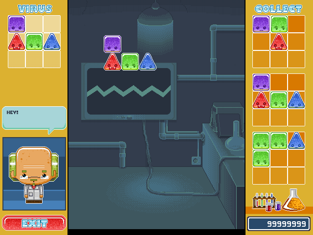
I liked pretty much the new viruses' faces =D ----- I'll only need some help with the doctor's speech font... =\\\ I have no idea of what I can do... Is it better to download a ttf or draw all the characters on an image? |
|
|
IP Logged |
|
|
Spherical Ice
Seaman
Joined: 06 January 2014 Online Status: Offline Posts: 8 |
Posted: 20 July 2010 at 8:46am |
|
Great improvements on the red green and purple ones, though I think the blue one's expression was better before. As for the speech bubble, I think the style and font used for the bar displaying the score would work very well instead. I also think that the light should be removed, as otherwise the lighting on the pipes which are above the light looks incorrect.
Below is an edit I've done. They are mostly minor changes, but I think the overall result is much improved. (:  Edited by Spherical Ice - 20 July 2010 at 8:52am |
|
|
IP Logged |
|
|
StepDragon
Commander
Joined: 03 April 2010 Online Status: Offline Posts: 258 |
Posted: 20 July 2010 at 11:19am |
|
The cord I mentioned before is still a big issue for my eyes.
Another thing I notice is you have very little AA going on in the background. Places i could see it useful are on, the side of the book, the edges of the cords, the edge of the table. I know its only a BG, but people still look at it. (for example, ever looked at the background in something like DDR, ITG, PIU, or BM?) Cheers! |
|
|
IP Logged |
|
|
Pickles
Midshipman
Joined: 26 May 2008 Online Status: Offline Posts: 40 |
Posted: 26 July 2010 at 3:53pm |
I made some changes on the background tetures and added some elements... also tried to improve the biggest wire (center)... I'm still working, gonna post soon |
|
|
IP Logged |
|
|
StepDragon
Commander
Joined: 03 April 2010 Online Status: Offline Posts: 258 |
Posted: 26 July 2010 at 6:31pm |
|
The cord looks much better! perhaps some AA as well?
|
|
|
IP Logged |
|
|
PixelSnader
Commander
Not a troll! Joined: 05 June 2014 Online Status: Offline Posts: 3194 |
Posted: 29 July 2010 at 10:05am |
|
I much preferred the clean look and the blue color.
The orange could work if you unify the colors a bit more, but the background is too busy for gameplay I think. |
|
|
▄▄█ ▄▄█ ▄█▄ ▄█▄ |
|
|
IP Logged |
|
|
StepDragon
Commander
Joined: 03 April 2010 Online Status: Offline Posts: 258 |
Posted: 29 July 2010 at 11:09am |
|
Wow, i didn't even notice the side color changed until snader mentioned it... And i agree the blue worked better.
also for the BG to make it a little less distracting, perhaps making it a little darker, and decreasing the contrast (i know right) i still think that the cord in the center could use some AA. right now its a little distracting. EDIT: "(i know right)" has the wrong tone to it, i meant (I know, its quite the opposite of normal pixel suggestion, right?!) but that seemed a little long. Cheers! Edited by StepDragon - 29 July 2010 at 11:09am |
|
|
IP Logged |
|
|
W M
Commander
Joined: 08 November 2015 Online Status: Offline Posts: 132 |
Posted: 30 July 2010 at 11:23pm |
|
The AA-ing on the shapes (especially the diagonal sides of the triangles) is creating jaggies, which is kinda to the opposite of what that AA is intended for. Try putting those lighter pixels actually in the outline rather than outside them to avoid this problem.
Also, even though you're probably aware of this and intended to do so, the shape of the triangles is not symmetrical -- a portion of the outline is moved out of place. I like the style you've used -- it's very vibrant and exciting :D Please make sure to post a link to the final product for us. |
|
|
IP Logged |
|
| |
||
Forum Jump |
You cannot post new topics in this forum You cannot reply to topics in this forum You cannot delete your posts in this forum You cannot edit your posts in this forum You cannot create polls in this forum You cannot vote in polls in this forum |
|
