| Active TopicsSearchRegisterLogin |
| WIP (Work In Progress) | |
| |
  |
| Author | Message |
|
Berserk
Seaman 
Joined: 05 August 2010 Online Status: Offline Posts: 28 |
  Topic: Got a lot of 'splaining to do. Topic: Got a lot of 'splaining to do.Posted: 21 August 2010 at 5:38pm |
|
So I decided I wanted to do a real pixel art project for the first time and thought Lucille Ball would be a fun subject. I wanted to do an expression like this because I considered that goofy look to be the most iconic of her, but that was actually the only reference of it I could find. Most of her pictures are more glamorous, like this.
Anyways, I wanted to do a straight-on perspective to keep it simple and I wanted to do that goofy expression, so I made a rough sketch on paper, scanned it, and outlined it. The outline kind of lost the expression and looks a little weird, but I figure the details and shading should account for that later. This is the outline before I scaled it all the way down: 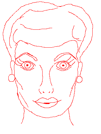
And this is scaled down further: 
I just wanted some consultation/suggestions/help on the outline before I tried proceeding any further. Thanks in advance! |
|
 IP Logged IP Logged |
|
|
jgbarber65
Seaman
Joined: 26 June 2007 Online Status: Offline Posts: 6 |
Posted: 21 August 2010 at 7:17pm |
|
Looks just like her. Very nice. Looking forward to seeing color and shading.
|
|
|
IP Logged |
|
|
Berserk
Seaman
Joined: 05 August 2010 Online Status: Offline Posts: 28 |
Posted: 21 August 2010 at 7:28pm |
|
^^Hey, thanks!
I went ahead and made a rough color draft: 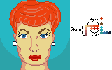
I don't like her hair right now and the shading and expression are going to need some adjustments. She's looking too serious for what I wanted. And I dunno... Maybe her eyes are too high or something? Something looks funky with her proportions now that it's in color. EDIT: Tweaked it a little 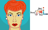 Edited by Berserk - 21 August 2010 at 11:08pm |
|
|
IP Logged |
|
|
PixelSnader
Commander 
Not a troll! Joined: 21 May 2026 Online Status: Offline Posts: 3194 |
Posted: 22 August 2010 at 6:07am |
|
The image looks really flat, mostly the hair. For a moment, forget that the hair is made up of many small strands, and try shading it as if it were one big blob, and then later you can add smaller details.
The face is less flat, but still feels too flat. The source you have chosen doesn't provide much shading info, but you should still be able to get some more volume in the image. 
This might be useful. -shaded eyesockets instantly give more depth -darker under the cheeks -hair is just MSpaint SprayPaint tool, so very messy, but it still looks pretty convincing without too much effort (I did this to get the general shapes in place. More detail could be added to it) -chin/neck shadow -nose shaded |
|
|
▄▄█ ▄▄█ ▄█▄ ▄█▄ |
|
|
IP Logged |
|
|
Berserk
Seaman
Joined: 05 August 2010 Online Status: Offline Posts: 28 |
Posted: 22 August 2010 at 10:33am |
|
Thanks for the pointers! I started fixing the hair... My shading abilities aren't really impressive, but I think it looks bushier and curlier like its supposed to.
I'll be fixing the other things bit by bit. EDIT: I tweaked it a bit more 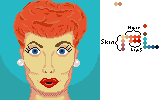 Edited by Berserk - 22 August 2010 at 11:09am |
|
|
IP Logged |
|
|
dpixel
Commander
Joined: 03 February 2015 Online Status: Offline Posts: 564 |
Posted: 22 August 2010 at 11:39am |
|
I had to have a go at the hair. (I hope you don't mind) More of realistic style which I'm not sure if that's what you're going for. Needed way more contrast imo...
 And more contrast on the face too. As snader said...some shading in the eye sockets will go a long way. |
|
|
|
|
|
IP Logged |
|
|
Berserk
Seaman
Joined: 05 August 2010 Online Status: Offline Posts: 28 |
Posted: 22 August 2010 at 12:26pm |
|
^^Holy COW that looks good. I'll have to study that. My only criticism (if I dare criticize it) is that it's not quite her hair color anymore which I think is important to make her recognizable.
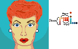
I think I do want a more realistic style like that, but I have to develop my abilities more to achieve it. I think I had the basic concept of the hair texture down, but I definitely didn't go the full mile with it like you did and I think I do need more contrast. So thanks a lot for showing me how it can be done. I'm still struggling with the shading in her face, but I've made some minuscule improvements. I did put some shading around her eyes, and it looks better, but I'm not sure if it's what you guys mean. Here's my latest edit: 
I think the highlights in the eyes help bring them to life. I also tweaked her eyebrows and lips because I'm still struggling to convey her expression. |
|
|
IP Logged |
|
|
dpixel
Commander
Joined: 03 February 2015 Online Status: Offline Posts: 564 |
Posted: 22 August 2010 at 6:30pm |
|
Creating a likeness is tough to do. As far as shading a face like this look at all the different shades in the reference....even color reduce a face to grayscale to help you see them.
A bit of an edit...  I lowered the eyes by 1 pixel and added a few more shades to create more smoothness. Not perfect but it should give you more of an idea on shading. |
|
|
|
|
|
IP Logged |
|
|
Berserk
Seaman
Joined: 05 August 2010 Online Status: Offline Posts: 28 |
Posted: 23 August 2010 at 1:14pm |
|
I just reworked the hair today after studying what you did with it. I didn't realize you used only the colors that were already in the picture--not only does that explain why the hair color became more of a sandy blonde (all the skin tones and stuff that were in there), but that's some real skill right there to be able to take an arbitrary palette and make it work like that. My hat is off to you.
My shading and texture still isn't quite as good as yours, but I'm pretty satisfied with how it looks still: 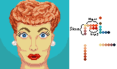
Next I'll move on to the face. EDIT: Meh, I'm starting to have misgivings about the hair now. It's not as orange as it used to be and I like how the orange looks against the teal/blue. Edited by Berserk - 23 August 2010 at 1:39pm |
|
|
IP Logged |
|
|
Berserk
Seaman
Joined: 05 August 2010 Online Status: Offline Posts: 28 |
Posted: 23 August 2010 at 4:02pm |
|
Well it's not perfect, but I think I'm done with it!

Thanks for all the pointers, guys! It was really helpful. I definitely feel like I've learned a lot from this project. |
|
|
IP Logged |
|
|
jalonso
Admiral 
Joined: 29 November 2022 Online Status: Offline Posts: 13537 |
Posted: 23 August 2010 at 4:05pm |
|
You've done such a good job that I think its worth prefecting the jawline/chin first.
|
|
|
|
|
|
IP Logged |
|
|
Berserk
Seaman
Joined: 05 August 2010 Online Status: Offline Posts: 28 |
Posted: 23 August 2010 at 9:05pm |
|
I played around with the cheeks/chin/jaw.

Do you think it looks any better? EDIT: Well I think the chin area looks better now, so I went ahead and submitted it. I can always tweak it in the future as I feel necessary. Thanks, everyone, for all the help! I learned a lot! Edited by Berserk - 24 August 2010 at 1:00pm |
|
|
IP Logged |
|
| |
||
Forum Jump |
You cannot post new topics in this forum You cannot reply to topics in this forum You cannot delete your posts in this forum You cannot edit your posts in this forum You cannot create polls in this forum You cannot vote in polls in this forum |
|
