| Active TopicsSearchRegisterLogin |
| WIP (Work In Progress) | |
| |
  |
| Author | Message |
|
bonehead11
Midshipman 
Joined: 26 February 2009 Online Status: Offline Posts: 94 |
  Topic: WIP Captains cabin Topic: WIP Captains cabinPosted: 21 August 2010 at 12:12pm |
|
Hai guis. I am planning to do something bigger this time, I have done so much on small scale, I think its time to do something on large scale...so here is the sketch for now, I dont know if the composition is good nor not, so thats why Im here. So lets start.
I dont know if I should have the angle from left or right ? From left it looks like he has more space as you can see, from right it looks good but the problem is it looks like he doesnt have enough space or should I change angle totally. Second problem is if I should work with this scale, if its ok or should I cut out just the captain, so the piece is concentrated on him more, but it will be smaller. Third problem is if I should make him do maps or write in journal cant decide, but cartography would suit him better I think. Last problem would be critique,ideas,advices etc. I thank you all forwardly, if such word exists...  Edited by bonehead11 - 21 August 2010 at 12:13pm |
|
 IP Logged IP Logged |
|
|
onek
Commander 
Joined: 19 May 2009 Online Status: Offline Posts: 416 |
Posted: 21 August 2010 at 4:47pm |
|
I thank you all forwardly, if such word exists...
'thank u in advance' the composition doesnt work,.... the point of view is much to high , the important parts are cropped, u should show more of the table and what hes actually doing, now ure mostly showing the windows which are like the least important part of the picture... also add a foreground (which is only possible if u lower the viewers angle a lot), have stuff laying on the table (books, maps, treasures etc etc...), for once to make it more intertesting and also to give more depth... also u dont have to loose the background or anything to have focus on the guy, do that with lighting, candle light for instance gives high contrast, so the captain would stand out highly against a very dark background... but anyway, i think u should work a tad smaller, its quite an ambitious piece big as is heres a very very dirty composition/ lighting edit 
|
|
|
IP Logged |
|
|
bonehead11
Midshipman
Joined: 26 February 2009 Online Status: Offline Posts: 94 |
Posted: 22 August 2010 at 1:10am |
|
Thanks, your edit looks 1000x much better, I have major problems with composition...will post work soon.
|
|
|
IP Logged |
|
|
bonehead11
Midshipman
Joined: 26 February 2009 Online Status: Offline Posts: 94 |
Posted: 22 August 2010 at 3:23am |
|
Made some tweaking, I cant decide if I should put books on the other end as weight or scrambled paper as onek did.

|
|
|
IP Logged |
|
|
onek
Commander
Joined: 19 May 2009 Online Status: Offline Posts: 416 |
Posted: 22 August 2010 at 5:44am |
|
getting there
for the foreground, ...all kinds of stuff would do iguess, funny u interpret my sbibbles as scrambled paper ^^ |
|
|
IP Logged |
|
|
bonehead11
Midshipman
Joined: 26 February 2009 Online Status: Offline Posts: 94 |
Posted: 23 August 2010 at 8:06am |
|
Updating progress, any advices,critique ? Oh and dont mind some uncoloured stuff and such, will remove them, now im working on the character.

|
|
|
IP Logged |
|
|
W M
Commander
Joined: 08 November 2015 Online Status: Offline Posts: 132 |
Posted: 23 August 2010 at 8:21am |
|
Great improvement!
I would have to say that the fabric of the man's shirt looks very metallic - maybe try removing the brightest highlight (that white-ish band of color on the torso), and if that doesn't work, remove the next-brightest color also. |
|
|
IP Logged |
|
|
bonehead11
Midshipman
Joined: 26 February 2009 Online Status: Offline Posts: 94 |
Posted: 24 August 2010 at 10:32am |
|
Yeah redid it,updating process.

|
|
|
IP Logged |
|
|
bonehead11
Midshipman
Joined: 26 February 2009 Online Status: Offline Posts: 94 |
Posted: 25 August 2010 at 10:01am |
|
More work, I have some problems with choosing right colours of the wodden table...still the piece seems somewhat empty, me will be very happy for advices, suggestions, comments, critique.

|
|
|
IP Logged |
|
|
dpixel
Commander
Joined: 03 February 2015 Online Status: Offline Posts: 564 |
Posted: 25 August 2010 at 10:08am |
|
This is looking really good.
|
|
|
|
|
|
IP Logged |
|
|
bonehead11
Midshipman
Joined: 26 February 2009 Online Status: Offline Posts: 94 |
Posted: 25 August 2010 at 10:46am |
|
Thank you, but advices would be more helpful.
Edited by bonehead11 - 25 August 2010 at 10:47am |
|
|
IP Logged |
|
|
cure
Commander
Joined: 23 March 2022 Online Status: Offline Posts: 2859 |
Posted: 25 August 2010 at 10:52am |
|
hands are very small, and the fingers are too short.
the arm on our right looks a bit unnatural, try to find a reference of that position and angle, or create a reference if need be. the pink seems a little strong and doesn't quite fit in the color ramp |
|
|
IP Logged |
|
|
bonehead11
Midshipman
Joined: 26 February 2009 Online Status: Offline Posts: 94 |
Posted: 26 August 2010 at 8:06am |
|
Made midget hands larger, I always had problem with small hands. Changed the right hand does it look more natural now ? And removed the pink colour...now it looks kinda bland, it gave it more candle like shading...

|
|
|
IP Logged |
|
|
PixelSnader
Commander
Not a troll! Joined: 21 May 2026 Online Status: Offline Posts: 3194 |
Posted: 27 August 2010 at 3:11pm |
|
Looks like it's coming along well.
A few remarks: -you don't have to worry about having a superoptimized palette yet. -you could use some more color variation (having a redish ramp for skin and some details, instead of all-brown, for instance) -get some more detail into the darkest areas -the paper is empty!! it's an excellent item to go totally f**knuts on in terms of detail -really like the sleeves and the updated hand, but the face lacks a bit of that awesomeness -but first, get some more shape/volume into all the lineart-objects |
|
|
▄▄█ ▄▄█ ▄█▄ ▄█▄ |
|
|
IP Logged |
|
|
bonehead11
Midshipman
Joined: 26 February 2009 Online Status: Offline Posts: 94 |
Posted: 05 September 2010 at 12:49pm |
|
Originally posted by snader
Looks like it's coming along well. A few remarks: -you don't have to worry about having a superoptimized palette yet. -you could use some more color variation (having a redish ramp for skin and some details, instead of all-brown, for instance) -get some more detail into the darkest areas -the paper is empty!! it's an excellent item to go totally f**knuts on in terms of detail -really like the sleeves and the updated hand, but the face lacks a bit of that awesomeness -but first, get some more shape/volume into all the lineart-objects Yay so much remarks!!! I really didnt knew where to move, so I will put up the shape into lineart, thanks. The main problem I am thinking about, is if I should choose: 1. The smallest amount of colours, so It would be some challenge for me 2. Add more colours, sacrificing personal challenge for overall beauty, I think this could look pretty good If I would add more colours...I am even surprised I made something like this. And dont worry, that paper idea was the first thing in mine mind while doing this piece, will leave it as final touches, if I will try to redo the paper or whatsoever, it would be real pain in the ass to do it again...some minor update.  Edited by bonehead11 - 05 September 2010 at 12:49pm |
|
|
IP Logged |
|
|
onek
Commander
Joined: 19 May 2009 Online Status: Offline Posts: 416 |
Posted: 05 September 2010 at 1:35pm |
|
i think u shouldnt go as detailed as u do at this early stage (mainly captains clothes)try to block out basic forms. dont concentrate too much on lineart try to sculpt out volumes with light and shadow by applying rough patches of color and then go deeper in details like textures and highlights...
alltoghether it looks a bit stiff and static, not very organic... heres another edit, maybe it makes the idea i bit clearer 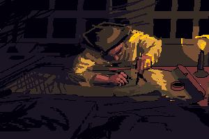
|
|
|
IP Logged |
|
|
squint
Seaman 
Joined: 06 April 2009 Location: United Kingdom Online Status: Offline Posts: 9 |
Posted: 07 September 2010 at 10:06am |
|
I think its really developing nicely, the hat edit of Oneks would really help give
it that nautical look... heres my slightly lazy suggestion, how about cropping off a quarter of the picture from the left? Composition wise I think it helps and it'll save you a lot of hard work too ;-). keep it up!  |
|
|
IP Logged |
|
|
onek
Commander
Joined: 19 May 2009 Online Status: Offline Posts: 416 |
Posted: 07 September 2010 at 11:03am |
|
i wouldnt crop it like that
|
|
|
IP Logged |
|
|
squint
Seaman
Joined: 06 April 2009 Location: United Kingdom Online Status: Offline Posts: 9 |
Posted: 07 September 2010 at 11:47am |
|
I think its much more pleasing to the eye cropped.
Bonehead, read up on the "rule of thirds", the golden ratio and diagonals, these all help greatly in picture composition. I think something along the lines I've suggested might help the flow of the picture, draw the viewers eye in and like I said before help you out slightly in the amount of work you end up having to do. |
|
|
IP Logged |
|
|
cure
Commander
Joined: 23 March 2022 Online Status: Offline Posts: 2859 |
Posted: 07 September 2010 at 12:43pm |
|
i prefer it uncropped. figure is centered, the horizontal composition helps with the feel of everything being sprawled out in front of him. the figure seems lonelier (as a captain up late at night should feel) when he isn't crammed in the composition but has free space around him. composition is over all just much more pleasing uncropped
|
|
|
IP Logged |
|
|
squint
Seaman
Joined: 06 April 2009 Location: United Kingdom Online Status: Offline Posts: 9 |
Posted: 07 September 2010 at 1:27pm |
|
hey guess you're right Cure, I see your point about the loneliness.
Good call. |
|
|
IP Logged |
|
|
bonehead11
Midshipman
Joined: 26 February 2009 Online Status: Offline Posts: 94 |
Posted: 25 September 2010 at 5:26am |
|
Originally posted by onek
i think u shouldnt go as detailed as u do at this early stage (mainly captains clothes)try to block out basic forms. dont concentrate too much on lineart try to sculpt out volumes with light and shadow by applying rough patches of color and then go deeper in details like textures and highlights... alltoghether it looks a bit stiff and static, not very organic... heres another edit, maybe it makes the idea i bit clearer I just lost the apetite to work on for now. Yes that is another way of drawing, I have been using it before,the patches of colours, but now Im trying new things, new techniques. Updated process...dont know If I should make texture for those window rams... 
|
|
|
IP Logged |
|
| |
||
Forum Jump |
You cannot post new topics in this forum You cannot reply to topics in this forum You cannot delete your posts in this forum You cannot edit your posts in this forum You cannot create polls in this forum You cannot vote in polls in this forum |
|
