| Active TopicsSearchRegisterLogin |
| Resources and Support | |
| |
  |
| Author | Message |
|
Indrik
Seaman 
Joined: 03 March 2011 Online Status: Offline Posts: 24 |
  Topic: Divorcing Color Information Topic: Divorcing Color InformationPosted: 04 March 2011 at 12:08am |
|
Hello everyone. I'm running an experiment right now that requires a bit of knowledge I don't have. I'm attempting to create graphics which have the color information removed so that when placed in a program, the user can pick a single color and have that color applied through all the different values.
I've seen the concept used successfully with, for example, textures in games. An example is in recent Soul Calibur games, which let you change the color of various parts on the character - some items having multiple colors controlled by different bars. You could pick a single color from the color field, and the color was then distributed consistently across all the values in the texture. So If you picked bright red, the base values would be the color you picked, then it would be darker/lighter as appropriate to preserve the texture, but just change the coloring. The goal at present is to create a couple art resources with values only (assuming these sorts of things are originally created with values alone and don't have the color removed at a later stage). While I can create things in grayscale already, I won't know what means to use until I understand how I'll be adding the color info in later. Thank you for your help! This is important to a project I'm toying around with. - Indrik |
|
 IP Logged IP Logged |
|
|
jeremy
Rear Admiral 
Joined: 25 November 2024 Location: New Zealand Online Status: Offline Posts: 1704 |
Posted: 04 March 2011 at 1:23am |
|
So basically keeping saturation+luminescence values constant but changing hue?
You could pick a range of base colours I guess, and just make the different highlights and shadows have set "distances" between 'em. |
|
|
IP Logged |
|
|
tanuki
Commander 
Joined: 01 April 2014 Online Status: Offline Posts: 333 |
Posted: 04 March 2011 at 1:30am |
|
do you use photoshop?
It sounds like you're describing something that can be gotten like this- 1. Make a layer that has the greyscale image on it. 2. Make a layer under that. 3. Change the blending mode on the greyscale layer to Luminosity. 4. Fill the layer below it with whatever color you want. The result is preserved values while completely changing the color. Of course that image will only be that single color, with different values, but you can paint in different colors on that bottom layer rather than fill the whole layer with just one color. Or was there something that I didn't understand about what you meant? |
|
|
IP Logged |
|
|
Indrik
Seaman
Joined: 03 March 2011 Online Status: Offline Posts: 24 |
Posted: 04 March 2011 at 12:03pm |
|
I think using visual aids will be infinitely more useful than just describing what I'm doing, so I made a quick mock-up:
 The luminosity change demonstrates a technical problem I'm trying desperately to understand and avoid. The Soul Calibur example I gave does not suffer from this problem (I can find an image/video if necessary). I believe I've seen the problem avoided by illustrators that add color to gray images as well. This tells me that a luminosity change is a different technical process than what I've seen, even though they seem similar visually. Here's what happens with a luminosity change: 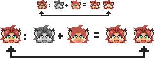 The arrows point to the original I created (in color). The other items are: The grayscale version + The color underneath that layer = The result The outcome is similar from afar, but it's obvious on closer inspection that there's a loss in contrast. I imagine this is because one color is applied at a fixed value, rather than the program finding new colors to complement it at different values. The problem is much more obvious when I try to make her dark-skinned with black hair: 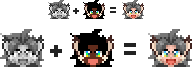 Now, the way this concept was executed in Soul Calibur's Create-a-Character, if I wanted to give a bright blond, white character this darker coloring, it would work. Selecting the color box for Brown in the Skin Option would modify the texture such that all the values picked up a complementary color to the one chosen, so it looked naturally brown. Same with hair: Choosing black hair would not make it gray because of the values that go into creating blond hair. This seems to indicate that the texture exists in one file and upon each color selection, the color information file is modified, the new color forced upon the texture, and then SOMETHING happens to force the texture values to adapt to the selected color's own value. Or it could be that a texture is made for every color, but that seems unlikely. This is a huge problem because I don't know if the color-divorced version of the art I'm creating can be used viably or not with whatever technical process I'll need to take. I'm at a standstill in my production until I figure this out, because I can't afford to spend hours creating things just to have to remake them later because of a technical problem. It's certainly possible that I'm misunderstanding the concept from the get go. Is it that every field of pixels on a striped shirt texture, for example, is made with a special designation? That even if the grayscale version seems like a solid image, the light stripes are made with one kind of brush, and the dark stripes with another so that the art program reads them differently? This technical process may be more in the knowledge realm of 3D artists, but haven't some sprite-based fighters had a custom color option? It should be the same thing. 1 color box so as not to create a ton of work for the player, and multiple values on the sprite for every part that's modified (jeans, hair, etc.). I hope this makes things clearer. Thank you again for any help! Edited by Indrik - 18 March 2011 at 11:29am |
|
|
IP Logged |
|
|
tanuki
Commander
Joined: 01 April 2014 Online Status: Offline Posts: 333 |
Posted: 04 March 2011 at 1:27pm |
|
How did you get either the greyscale version or the color only version of the first first head? When I reduce saturation to 0 on the first head the grey I get is different than the grey you got.
The left one is your greyscale, the right one is mine made by reducing saturation on the full color version to 0. 
It's very close, but slightly different, especially the eyes. I'm not sure how you produced the color only version. What program are you working in, and what color mode? Do you use RGB, HSB/HSV or Lab color models? I feel like some terms are being mixed up or used interchangeably. When I hear the word "value", because I have training as a fine artist, I think of it as a measure of light and dark only. In fine art value only refers to how light or dark something is, and not to any other aspect of what makes a color what it is. It seems to me that you're saying value in reference to the numeric code for various aspects of colors (like maybe how much red is in a color), but in other places it looks like you mean it as a measure of light and dark? That's just confusing me a bit. Also in the HSB/HSV color model value means the same thing there that I just described. Now when I hear "luminosity" I think of the L channel in the Lab color model. Those two terms should be interchangeable, but they're not because HSB calculates value differently than how Lab calculates luminosity. |
|
|
IP Logged |
|
|
DawnBringer
Commander
Joined: 11 August 2024 Online Status: Offline Posts: 568 |
Posted: 04 March 2011 at 2:26pm |
|
I'm not 100% sure what you want. But it sounds like your looking for a method to colorize AND have the ability to alter brightness at the same time.
My first suggestion is that you just try to logically/mathematically define what you expect/desire to from an RGB-value when other RGB-values are applied to it. The most basic process I can think of that achieves said result would be to apply the differance between a value and a baseline (like medium-gray: 127) to another value (like a grayscale image). As opposed to additative RGB-values or a normalized color-balance application (colorize) c = c_gray + (c_apply - baseline) This will colorize a greyscale image with a higher contrast. So I suppose one would have to experiment with the application colors to find desired relations. If you find some other cool methods or tweaks I'd like hear about it :) |
|
|
IP Logged |
|
|
Indrik
Seaman
Joined: 03 March 2011 Online Status: Offline Posts: 24 |
Posted: 04 March 2011 at 2:45pm |
|
Originally posted by tanuki How did you get either the greyscale version or the color only version of the first first head? When I reduce saturation to 0 on the first head the grey I get is different than the grey you got. The left one is your greyscale, the right one is mine made by reducing saturation on the full color version to 0. It's very close, but slightly different, especially the eyes. I'm not sure how you produced the color only version. What program are you working in, and what color mode? Do you use RGB, HSB/HSV or Lab color models? I feel like some terms are being mixed up or used interchangeably. When I hear the word "value", because I have training as a fine artist, I think of it as a measure of light and dark only. In fine art value only refers to how light or dark something is, and not to any other aspect of what makes a color what it is. It seems to me that you're saying value in reference to the numeric code for various aspects of colors (like maybe how much red is in a color), but in other places it looks like you mean it as a measure of light and dark? That's just confusing me a bit. Also in the HSB/HSV color model value means the same thing there that I just described. Now when I hear "luminosity" I think of the L channel in the Lab color model. Those two terms should be interchangeable, but they're not because HSB calculates value differently than how Lab calculates luminosity. Yes, my art-relevant vocabulary needs clarification. I've been doing creative things since I was a kid, but since none of my friends have creative hobbies, I don't often talk about this stuff. As a result, my vocabulary's been twisted to what I need for my supplementary-income work. I'm usually able to get by, but I've misused words before. If there's any confusion, don't hesitate to correct me. I always thought of value being the lightness/darkness of it, meaning the white-black scale (no color), but also as a component of color (because red mixed with a dark gray value to make a dark red should logically be considered as having a dark value). If there's some specific sentence where that wasn't clear, point it out to me. As for how my grayscale version was created, I changed the mode to Grayscale instead of RGB (which just discards the color information instead of modifying it). I've tried reducing the saturation to zero before and seen that same version, but it's less representative of what's actually there. I don't know why there's such a big difference in parts. For the color version... If you're referring to the one with the arrow pointing to it, the original, that's how I painted it. It was always like that. There was never a grayscale version until I threw away the color information. I painted it from scratch in Photoshop under the default RGB setting. Never bothered trying the others since I can do everything I want with RGB. So I don't know anything about the HSB/HSV color model at present. |
|
|
IP Logged |
|
|
tanuki
Commander
Joined: 01 April 2014 Online Status: Offline Posts: 333 |
Posted: 04 March 2011 at 5:30pm |
|
It sounds like you understand value just fine, I was just confused.
I tested it out and the way you change to grayscale instead of reducing saturation does seem to be more accurate. I mean the color version that's in the middle of the five, between the + and the =. The reason being that even if you do what I described before by having two layers with a greyscale luminance layer on top, the resulting color will have slightly different luminance in lab and much different value in HSB depending on what color you chose for the bottom layer. This is one of the problems with HSB, which you can read about here. I've been reading a lot about different color models for a while now and it's kind of a headache. Even though you're working in RGB, it still holds true from what I've seen that your values are going to change slightly depending on what's on the bottom layer for the method I described before. I think maybe the best thing to do would be to draw something in greyscale to begin with and then make color versions from that, instead of converting something in color to greyscale and trying to recreate it. I want to test out things like this so I have a better understanding of it, but I'm kind of in a rush right now and won't get to it until tomorrow. Edited by tanuki - 04 March 2011 at 5:30pm |
|
|
IP Logged |
|
|
Indrik
Seaman
Joined: 03 March 2011 Online Status: Offline Posts: 24 |
Posted: 04 March 2011 at 8:56pm |
|
Originally posted by tanuki I mean the color version that's in the middle of the five, between the + and the =. The reason being that even if you do what I described before by having two layers with a greyscale luminance layer on top, the resulting color will have slightly different luminance in lab and much different value in HSB depending on what color you chose for the bottom layer. This is one of the problems with HSB, which you can read about here. I've been reading a lot about different color models for a while now and it's kind of a headache. Even though you're working in RGB, it still holds true from what I've seen that your values are going to change slightly depending on what's on the bottom layer for the method I described before. I think maybe the best thing to do would be to draw something in greyscale to begin with and then make color versions from that, instead of converting something in color to greyscale and trying to recreate it. I want to test out things like this so I have a better understanding of it, but I'm kind of in a rush right now and won't get to it until tomorrow. I just painted the third face under the luminosity layer. I tried the different color modes I had. CMYK was hideous. HSB isn't available in Photoshop 7, but I can test it on my university's computer on Monday, which has CS3. 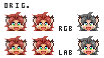 The LAB version had better contrast in the hair (less so with the skin), but it still didn't make a difference when I wanted to drastically alter the coloring. Alternative Blend Modes didn't seem to make a difference either, but a newer version of Photoshop might have more options. I don't think starting in grayscale would make any difference, since painting any gray image would still result in a collection of neutral pixels, like what I have. I copied the face from out of the Grayscale Mode image, so the computer shouldn't be able to tell the difference. But I'll give it a shot anyway just to be sure. Originally posted by DawnBringer QUOTE Ha! That was pretty much all Greek to me. but I've written down the terms I'm not familiar with and will research them tomorrow. Everything I figure out I'll post here. Who knows when it could be useful to someone else? |
|
|
IP Logged |
|
|
Indrik
Seaman
Joined: 03 March 2011 Online Status: Offline Posts: 24 |
Posted: 05 March 2011 at 7:09pm |
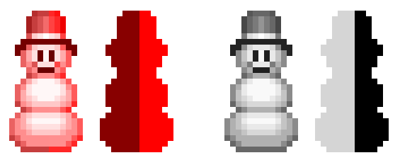 As I suspected, starting gray from scratch does nothing. It appears a Luminosity Blend Mode never changes the values of the image no matter what colors go underneath it. A darker value of any color simply results in reduced saturation along the diagonal path of the IMAGE'S value. I took some screen caps so you can see what happens. The image's value is the gray dot on the left (bottom row of the snowman), and the ones on the far right side are the selected colors in the color layer: 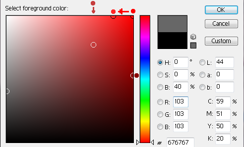 This shows me in Luminosity Blend, the selected color's own value level is forced to adapt to the image's value level. That seems like the inverse of what I'm trying to do. I need the image's values to adapt to the selected color's value so that colors can be filled in looking natural. Anyone care to hazard what the opposite process of Luminosity blend would be? EDIT: I'm not sure it's relevant at present, but I do find it interesting that the saturation difference expands proportionally with how dark the Image's value is. Picturing the relationship if the dots were animated, the colors are forced onto the Image Value's saturation diagonal. Before a certain point, that diagonal hits the top row too soon, so the forced color values have no room to deviate. The lightest values on the snowman took the same Forced Color for both sides. As it got darker they had insignificant differences in forced color values (FCV for my ease), then significantly different after the Image Value (IV) passed the medium gray marker (~127). Maybe the more technologically inclined will be able to draw some conclusions from that insight. Edited by Indrik - 05 March 2011 at 7:32pm |
|
|
IP Logged |
|
|
DawnBringer
Commander
Joined: 11 August 2024 Online Status: Offline Posts: 568 |
Posted: 05 March 2011 at 8:18pm |
|
Well, that's colorize you got there. This is what happens to the grayscale image when your masks are applied using the formula in my previous post:
 Is this closer to what you're looking for? (coz I'm still not clear on that) Edited by DawnBringer - 05 March 2011 at 8:19pm |
|
|
IP Logged |
|
|
tanuki
Commander
Joined: 01 April 2014 Online Status: Offline Posts: 333 |
Posted: 05 March 2011 at 8:42pm |
|
Originally posted by Indrik
It appears a Luminosity Blend Mode never changes the values of the image no matter what colors go underneath it. Oh, I thought that's what you were going for. XP That's pretty much the point of luminosity blending mode, because it prevents the shifts in luminosity that you had mentioned before in that example. What you're doing in the color square above (which I'm sure you figured out but is displaying color in HSB by the way, with H being the vertical rainbow to the right, S being the left to right position in the square and B/V being the top to bottom position) actually shows perfectly what I meant before about the problem with HSB. Theoretically, value should be 100% independent of saturation, but as you can see even with value remaining at the top the apparent value of the color darkens as saturation increases. For that reason, I don't think you can rely on HSB for controlling value at all. That's something that Lab is much better (but not perfect) with. When you measure value of anything but grey with HSB you're only getting that color model's understanding of value, not the actual true value. I'm still trying to figure out how to accomplish this now that I know what the goal is. I've been testing things with layer masks and such with limited success, but I still can't figure out a way to do something like make a dark skin version of a sprite without simply using a completely different method than the one used for a recoloring of a sprite at the same luminosity. One possible option I guess would be to have the greyscale sprite on the bottom layer, set the layer above it to Multiply blending mode (preferably with a layer mask that blocks out anything outside the sprite), and color on that. The downside is that it's hard to keep from making a color either too dark or too dull, but it can work in at least some cases. Edited by tanuki - 05 March 2011 at 8:55pm |
|
|
IP Logged |
|
|
Indrik
Seaman
Joined: 03 March 2011 Online Status: Offline Posts: 24 |
Posted: 09 March 2011 at 8:51pm |
|
Just an update:
Been a busy week for me, but I should have everything I need by the weekend to get some answers about this. I'm surprised this is so difficult! I've thought of a seemingly functional work-around, but it's less than ideal as a final solution, so I'm gonna keep trying. |
|
|
IP Logged |
|
|
Indrik
Seaman
Joined: 03 March 2011 Online Status: Offline Posts: 24 |
Posted: 21 March 2011 at 7:18pm |
|
In one of my attempts I discovered that Photoshop CS5, which I use at school, has superior Brightness & Contrast settings to 7's. So that added a new wildcard into this! Joy. But it might lead somewhere, because I managed to achieve the kind of color modification I wanted simply by manually changing the brightness & contrast settings, which would have been impossible in Photoshop 7.
In the meantime, I got some photos of this problem solved in a game. Here's the post I made at CGtalk, which might clear up what I'm doing if anyone is still confused: --------------------------------------------- the grayscale map = static (creating the illusion of hair texture) http://i5.photobucket.com/albums/y193/Shin_Magi/Medium_Gray.jpg You can see that no color is chosen in the selection box. It's in the colorless column (01). That's what the grayscale map looks like without color information added. For clarity, those numbers under 'Color 1' that say, "5: 01, 12" stand for, "Saturation: Hue (Column), Value (Row)" One single color is added to make it colorful. (Making the hair look blonde) http://i5.photobucket.com/albums/y193/Shin_Magi/Medium_Color.jpg You can see by the numbers (7,12) that the value (row 12) didn't change any. There was just a color added to the texture. Color is in columns 2 and later, since the white-black range is colorless. Now, say I change my mind and want a dark value of that color. I choose the color at (7,32) now instead of (7,12): http://i5.photobucket.com/albums/y193/Shin_Magi/Dark_Color.jpg The hair looks dark now. But this changed the value of the grayscale map in order to select that color! This is what the texture now looks like if you take away the color information: http://i5.photobucket.com/albums/y193/Shin_Magi/Dark_Gray.jpg Now, it makes no sense that they would save 32 versions of the same texture; One for every value. More logically, there is one grayscale map file (the hair) which is static. That file never changes. It is drawn on by the computer and a composite image is made out of the Grayscale Map + Color Info (the Hue, Saturation, & Value info of the color you chose. This is HSB info). Because of that process, the composite image looks normal no matter what color you choose. I want to know how such a composite image is made. So far, I've been trying random processes with my own work to accomplish the same thing. It hasn't worked. Edited by Indrik - 21 March 2011 at 7:18pm |
|
|
IP Logged |
|
|
tanuki
Commander
Joined: 01 April 2014 Online Status: Offline Posts: 333 |
Posted: 21 March 2011 at 11:00pm |
|
So this is still not what you're wanting, but I thought it was a positive outcome that's fairly close. Note that this is not how I normally work and is not how I made this portrait to begin with, it's just an option for editing it.
   
Here's my layers in the state they were in for the second version above. Turning on Layer 5 produced the first version above, turning on Layer 4 made the third version, and Layer 6 made the last version. I saved them in a slightly mixed up order. 
I probably should have named them better, but anyways Group 1 has a layer mask that is a greyscale version of the portrait I'm using. It's inside of Group 2 which has a layer mask to block out anything not skin, horns, or ears. Inside of Group 1 are some filled colors. They'll be applied to the skin keeping with the greyscale map. Group 1 copy is identical to Group 1, it just has different colored layers inside it. Group 2 copy is also identical to Group 2, but I inverted it so that this will all be applied to everything not skin, horns, or ears. Everything is inside Group 3 which has a layer mask to block out anything not the character (plus the border, which I forgot to block out too). At the bottom of everything is Layer 3 which has black everywhere that the character's head is (plus the border) and white for the background. This is both important to this method and also the reason that it's not exactly what you want. You see, the layer masks are causing the colors of the layers inside those groups to become partially transparent, so they need a background to rest on. A black background works well, but it also limits how light any of the end result colors for the character can be. A white background would also work well (but would require you to invert the masks on Group 1 and Group 1 copy to work right) but would instead limit just how dark any of the colors can be. Anything other than black or white doesn't work well. Here's a couple of other versions I made after adding a Levels adjustment layer on top of everything to brighten it up a little, and also a couple of new color layers.  
One last note is that every one of the six versions here has the exact same number of colors. Edited by tanuki - 21 March 2011 at 11:13pm |
|
|
IP Logged |
|
|
Indrik
Seaman
Joined: 03 March 2011 Online Status: Offline Posts: 24 |
Posted: 15 April 2011 at 12:24am |
|
I havent given up on this, and Im making progress! I also understand
HSB now.
One color file for each art resource (probably masked to fit art silhouette) To make Re-colored Composite Image, an Algorithm must be made to do the following: 1. Computer brings up Value Map file (for a single item like hair, face, shirt) 2. Color File Placed underneath --> Desired color Selected by user (Modifies color file) 3. Computer References Selected Colors HSB info 4. Computer modifies Value Map File to reach the Colors
Brightness value. This creates a
complementary value map to the selected color, at any color. 5. Computer sets Value Map file to Luminosity Blend Mode --> Composite Image should be visible with appropriate coloring. 6. Composite Image accepted by user and spit out as separate,
single-layer file, leaving the value map & color info files for the
individual art resources unmodified. |
|
|
IP Logged |
|
| |
||
Forum Jump |
You cannot post new topics in this forum You cannot reply to topics in this forum You cannot delete your posts in this forum You cannot edit your posts in this forum You cannot create polls in this forum You cannot vote in polls in this forum |
|
