| Active TopicsSearchRegisterLogin |
| WIP (Work In Progress) | |
 Topic: [WIP] Here be dragons Topic: [WIP] Here be dragons |
  |
| Author | Message |
|
CELS
Commander 
Joined: 23 September 2022 Online Status: Offline Posts: 758 |
  Topic: [WIP] Here be dragons Topic: [WIP] Here be dragonsPosted: 11 May 2011 at 6:31pm |
|
Going to draw a series of dragons, based on artwork I've found on the web.
As you can see, this is a very early state, but I'd like to get some input on the anatomy if there are any glaring mistakes right off the bat. I haven't really started thinking about jaggies, or stuff like that. It's not intended to be identical, I'll probably make some changes in anatomy. Already, I can see that the end of the tail needs to be slimmer. But basically, any C&C is welcome. Particularly concerning the wings. Reference pic (From draconica.com) WIP1  WIP2 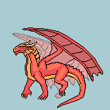 Edited by CELS - 20 August 2011 at 3:07pm |
|
 IP Logged IP Logged |
|
|
dpixel
Commander
Joined: 03 February 2015 Online Status: Offline Posts: 564 |
Posted: 12 May 2011 at 8:31am |
|
Not bad. I think the stance is weak and unconvincing. It's kind of hard to tell the angle with the legs.
Here's a little edit:  Back leg needs attention for this edit to work. But you get the idea. |
|
|
|
|
|
IP Logged |
|
|
CELS
Commander
Joined: 23 September 2022 Online Status: Offline Posts: 758 |
Posted: 12 May 2011 at 8:31pm |
|
Thanks for taking the time to do that edit! I absolutely agree concerning the stance, and I've tried to remedy that. I've only started playing with shadows, but I need to have the outlines somewhat set before I spend too much time on that.
So does this stance look better? 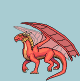 |
|
|
IP Logged |
|
|
dpixel
Commander
Joined: 03 February 2015 Online Status: Offline Posts: 564 |
Posted: 12 May 2011 at 8:55pm |
|
Yes. That looks much better.
It looks like you're trying to rotate it..head more towards the viewer. If so, I'd pull that back leg in (towards the front of the dragon) and pushed further out (further away from the viewer) . And the tail somehow looks a little large. The rear wing doesn't match the front wing. I think you may have the shape wrong. I think the actual wing should extend to the shoulders more. Check some dragon references. Edited by dpixel - 12 May 2011 at 9:50pm |
|
|
|
|
|
IP Logged |
|
|
CELS
Commander
Joined: 23 September 2022 Online Status: Offline Posts: 758 |
Posted: 13 May 2011 at 11:30pm |
|
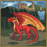
I'm rotating it a little, yes. But it's actually away from the viewer, compared to the reference artwork which facing more towards the viewer. In my version, the dragon is moving almost sideways from the viewer. Its head is completely sideways, its body is not quite sideways.
I've fixed the tail a little, not sure if it's still too large. Have not fixed the wing yet. To be honest, I'm still not happy with the front wing, so I'll start working on that next. Then I'll do the rear wing.  Anyway, I know it's not a good idea to start working on ten things at once, but I've started just drawing a very crude background, to show where I'm headed with this. I know, I know - just when you thought this couldn't get more original, I added a castle. I'm a genius. Any feedback is very welcome. I'm rather unsure about the colours (too saturated?) and how I've used a kind of dithering to look like dragon scales. Edited by CELS - 13 May 2011 at 11:33pm |
|
|
IP Logged |
|
|
W M
Commander
Joined: 08 November 2015 Online Status: Offline Posts: 132 |
Posted: 14 May 2011 at 12:47am |
|
The highlights make it appear a little pillow-shaded. Try moving the lightsource.
|
|
|
IP Logged |
|
|
CELS
Commander
Joined: 23 September 2022 Online Status: Offline Posts: 758 |
Posted: 14 May 2011 at 6:52pm |
 Have tried to move the light source a little, so it's more clearly from the top right. |
|
|
IP Logged |
|
|
onek
Commander
Joined: 19 May 2009 Online Status: Offline Posts: 416 |
Posted: 15 May 2011 at 4:48am |
|
the black outlines stand out way too much -> brighter tone/ selective outlining
colors are very dull -> increase saturation too few contrast -> more difference between dark and bright values dithering doesnt really make sense -> should only be used if u have a very restricted palette, or to create special kind of textures (maybe u wanted it too look like scales but its not really working) waaaaay too many colors - reduce colors heres an edit .... (note: its 14 colors instead of 96!!!) 
|
|
|
IP Logged |
|
|
CELS
Commander
Joined: 23 September 2022 Online Status: Offline Posts: 758 |
Posted: 15 May 2011 at 11:43am |
|
Thanks. I see your point, although I expect there's a fair bit of residue from various colour changes. Some cleanup should sort that out and bring the number of colours down.
The colours are intended to be toned down, due to the weather. It's very cloudy, except for a few beams of sunlight here and there. The edited version looks like noon on a clear, sunny day. However, I might try to make the dragon pop a bit more with a more vivid red. I'm going to make 7 different dragons in different colours, and I want the dragons to really pop, instead of just blending in with the background. And yeah, like I wrote above, the dithering was to look like dragon scales. Not sure how else to do it, but I'll play around with it. I just don't want it to look smooth like an eel. Personally, I kind of like it as it is, but we'll see. EDIT: 46 colors and counting....  Edited by CELS - 15 May 2011 at 12:45pm |
|
|
IP Logged |
|
|
onek
Commander
Joined: 19 May 2009 Online Status: Offline Posts: 416 |
Posted: 15 May 2011 at 6:59pm |
|
ok i see ur going for a cloudy day feel, but ur version doesnt really say that either... it a bit darker ok, but due to the high saturation it reads more like sunset to me...
u should desaturate the colors a lot, almost b/w-ish... also add a blue tint to them .... to make the dragon pop out, maybe make one of the rays of light (ur talking about) illuminate it .... heres another quick edit 
for the scales u should definetly try something different than 50:50 dither ... there should be another possibility on this not necessarely small scale inspiration : |
|
|
IP Logged |
|
|
jeremy
Rear Admiral 
Joined: 25 November 2024 Location: New Zealand Online Status: Offline Posts: 1704 |
Posted: 15 May 2011 at 9:52pm |
|
Scales definitely work to make colour transitions smoother too.
 Edited by Jeremy - 15 May 2011 at 9:51pm |
|
|
IP Logged |
|
|
CELS
Commander
Joined: 23 September 2022 Online Status: Offline Posts: 758 |
Posted: 16 May 2011 at 9:22pm |
|
Originally posted by onek
colors are very dull -> increase saturation Originally posted by onek u should desaturate the colors a lot, almost b/w-ish... Irony  Originally posted by onek ok i see ur going for a cloudy day feel, but ur version doesnt really say that either... it a bit darker ok, but due to the high saturation it reads more like sunset to me... u should desaturate the colors a lot, almost b/w-ish... also add a blue tint to them .... Well, that depends on how dense the clouds are. Example vs example. But I guess you're saying that the landscape is too saturated compared to the darkness of the sky. I'll try to balance that out. Originally posted by onek to make the dragon pop out, maybe make one of the rays of light (ur talking about) illuminate it .... heres another quick edit Hmm, very interesting idea. That looks very cool. I'm not sure I could do that in a realistic manner though. Originally posted by onek for the scales u should definetly try something different than 50:50 dither ... there should be another possibility on this not necessarely small scale Originally posted by Jeremy Scales definitely work to make colour transitions smoother too. Thanks guys, those were very helpful. I've tried to use the technique here. 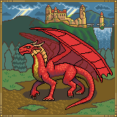 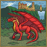 EDIT: Tried to improve on the colours. Working on the contrast, decreasing the saturation, brighter skies, etc. Edited by CELS - 16 May 2011 at 11:41pm |
|
|
IP Logged |
|
|
CELS
Commander
Joined: 23 September 2022 Online Status: Offline Posts: 758 |
Posted: 22 May 2011 at 1:53am |
|
Alright, I've implemented the new wing design on the original picture
and tried to fix the dragon's skin so it has less colours. Also, reduced
the saturation of the background and made everything slightly darker.
I'm a bit at a loss at where to go from here. When you keep looking at
the same piece for ages, it's increasingly difficult to notice mistakes.
What bothers me is that there's too much contrast on the skin, but if I reduce the contrast it just looks flat and uninteresting. Right now it goes from dark purple to orange in just a few colours, but I don't want to lose the orange or the purple. Here are two different versions. One looks fresher, the other is probably more realistic and has fewer colours. 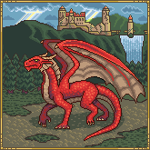 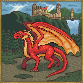 By the way, is there a program that makes it easier to change colours? I've been using MS Paint, but every time I use the eraser to swap colours, I miss a few pixels. After a few changes back and forth, I suddenly have 20 new colours hidden in the picture. EDIT: Just realized that I shouldn't really be able to see the inside of the far wing. Only the outside (red) should be showing. DOH! Edited by CELS - 22 May 2011 at 7:39am |
|
|
IP Logged |
|
|
CELS
Commander
Joined: 23 September 2022 Online Status: Offline Posts: 758 |
Posted: 05 June 2011 at 10:51pm |
|
Tried to fix the contrast on the outlines, as onek recommended.
 |
|
|
IP Logged |
|
|
yrizoud
Commander
Joined: 03 May 2021 Location: France Online Status: Offline Posts: 343 |
Posted: 07 June 2011 at 11:03am |
|
Originally posted by CELS By the way, is there a program that makes it easier to change colours? Wikipedia's Comparison of raster graphics editors : Every program which has the "Indexed" color space. In this mode, each pixel refers to a palette entry, so that if you tweak the palette itself, the change is reflected on the whole image. |
|
|
IP Logged |
|
|
CELS
Commander
Joined: 23 September 2022 Online Status: Offline Posts: 758 |
Posted: 09 June 2011 at 5:12pm |
|
Originally posted by yrizoud Wikipedia's Comparison of raster graphics editors : Every program which has the "Indexed" color space. In this mode, each pixel refers to a palette entry, so that if you tweak the palette itself, the change is reflected on the whole image. Thanks a lot. That will be very useful. Meanwhile, fixed one of the wings, tweaked the colours and added some shade to the belly.  Edited by CELS - 09 June 2011 at 5:12pm |
|
|
IP Logged |
|
|
jalonso
Admiral 
Joined: 29 November 2022 Online Status: Offline Posts: 13537 |
Posted: 09 June 2011 at 7:34pm |
|
You have done a great job so far.
I would suggest you try to get rid of as much of the lineart as you can. Not everything has to go but a lot can. For example, the lineart on the trees add nothing. Most of the lineart on the dragon looks unsophisticated and can be blended in or at least colored to define instead of outline. The castle area is nice but seems too bright and again this might be the lineart. What's the deal with the lime green colors in the sky o.O |
|
|
|
|
|
IP Logged |
|
|
CELS
Commander
Joined: 23 September 2022 Online Status: Offline Posts: 758 |
Posted: 09 June 2011 at 8:16pm |
|
Thanks for the quick reply. You're absolutely right about the lineart. I guess the only reason I kept so many clear lines was because I didn't know how to remove the lineart without leaving the image dull. The colours in this image are somewhat dull and unsaturated already.
 I've tried to remove or fade the outlines somewhat here, but I'm not sure what to do with the edges. I guess the outlines should be brighter on the side of the light source as opposed to the shadow side of the object. But I'm not sure how to fix the edge seperating the two wings, for example. In regards to the lime green colours, I simply didn't know what colours to use. If you take a dark green mountain and put a bright yellow ray of light in front of it, wouldn't it look bright green? Edited by CELS - 09 June 2011 at 8:17pm |
|
|
IP Logged |
|
|
jalonso
Admiral
Joined: 29 November 2022 Online Status: Offline Posts: 13537 |
Posted: 10 June 2011 at 11:19am |
|
Beyond pixel placement precision, nothing is as important in pixelart as color choices and palette development.
In my analysis of your current WIP you are thinking colors as 'things' to use and not as a creation tool. For example, in the sky you are using blues because the sky is blue. In the castle you are using browns because its a stone building. You are using greens because its grass, etc. You use bright greens because the rays of light from a blue sky are going over green grass. This is noobish thinking. Its better to pick colors because they help you regardless of the color the 'area' is. So... Your current dilemma is mostly colors... "not sure how to fix the edge seperating the two wings" and "If you take a dark green mountain and put a bright yellow ray of light in front of it, wouldn't it look bright green?" Now if defining the area between the wings is a concern then you need to find a shade that will solve this issue on its own regardless of the rest of the picture. The dragon is 'red' so naturally you'll want to be dark red/brown or purple. This is fine in a stand alone sprite but here you need to consider the image as a whole. Therefore a 'blue' is the smarter choice because it is within the realm of the needed colors for the dragon shadowing/definition but also because the surrounding area is 'green' so blue blends and neutralizes the color areas. Choosing this shade of blue is a balance between the needs of the dragon AND the shadowing of the mountain and trees. This is done for every shade as you are working. Take the sky to mountain areas and choose shades that work with both areas. When doing this you'll find that some shades will work in other areas too. This is the smart way. Notice in my edit how blues from the sky and water are also in the greens. Taking every shade and doing this so it helps you everywhere NOT just the section you are working on is easy, smart and makes for better pixels. Notice in my edit that the ground is no longer as green as your WIP. Its not that I wanted a brown ground its that in choosing colors in other areas forced me to work with it. This is how you make a 59 color piece into a 26 color piece without much creative sacrifice and on a technical pixelart way makes for a better piece. Another color choice question to consider is the dragon's yellow areas vs. the castle's brown areas. Here its finding whats yellow enough yet brown enough AND works with the ground highlights. Choosing 6-8 colors that work all these areas is where you want to go. Think of it this way. When you begin to color anything, first find a color already in the picture. If that doesn't work and no color works, then which existing shade can be shifted to work in the new area but still work with the existing area. If nothing works, then AND ONLY THEN do you introduce a new shade. You keep doing that as you work and not only will things work but you don't stress with 'picking' colors blindly. You are picking and shifting hues because the picture is telling you what works (visually). The color that 'works' may be in any hue and often is nowhere you thought it should be. Art is visual communication and if it looks/reads well then the actual shade is almost irrelevant. Such is the way of pixelart and the reason color conservation and palette development separates the boys from the men. As I said before, sometimes the lineart showing in places is fine and in certain pieces it can remain intact but sometimes you gotta erase parts of it to define instead of outline.  Third image just shows shadowing. The wings should cast some shadows over the body which you haven't done yet. |
|
|
|
|
|
IP Logged |
|
|
CELS
Commander
Joined: 23 September 2022 Online Status: Offline Posts: 758 |
Posted: 10 June 2011 at 12:47pm |
|
Well... that's quite an improvement. It seems I'm going to spend quite a few more hours on this stamp-sized artwork. :) And you've certainly spent some time already, so thanks a million!
First of all, you're absolutely right about the colours. I'm a total noob when it comes to colours. I just watched a youtube tutorial the other day, there was a guy doing an oil painting and he used both yellow and blue when painting grass. It blew my mind. So yeah, I'm still coming to terms with the idea that you cain paint green mountains blue and red dragons purple. I'm also slowly coming to terms with the fact that pixel art isn't really as easy I hoped it would be. I can't draw mountains in pixel art without knowing how to paint mountains, I can't draw people or animals without understanding anatomy, I can't draw clouds without properly studying real clouds, etc. For a while, I pondered whether to learn how to draw on paper or whether to learn pixel art. Except for the fact that pixel art doesn't really train your hand-eye coordination (unless you're speed painting), the two are closer than I thought. In regards to adding shade, there's something I can't quite figure out. Most of the tutorials on shading and shadows just deal with single objects and single light sources. I'm not sure how to deal with multiple objects. For example, going back to the wing: I notice the far wing is now quite dark, which gives nice contrast to the closest wing. Is the darkness just artistic license to make it more readable? After all, if the closest wing wasn't there, the far wing would probably be painted brighter, right? Also, I'm not sure how the wings should cast a shadow on the dragon's body. We're dealing with round and organic shapes, so I guess I should look at spheres. I've only just learned to highlight spheres, but I'm not sure to deal with shadows from other objects. I've tried to illustrate my points here: 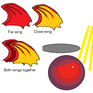 Edited by CELS - 10 June 2011 at 12:47pm |
|
|
IP Logged |
|
|
Cyangmou
Midshipman 
Joined: 15 December 2022 Online Status: Offline Posts: 68 |
Posted: 10 June 2011 at 2:31pm |
|
Jalonso's edit was great, it improved the whole thing.
Because of that i decided to show you also some interesting things, at the end I came up with this:  Here is a little WIP process of all the changes I did:  I. Decreased brightness while increasing contrast, the piece is not as washed out as before. II: as you said there are tons of anatomical issues in it, i just changed some really worse with minimal methods. I also rounded some of the jaggie lines. You should put more attention at your shapes. III: the background castle. At first I removed the outline, then i cleaned up the whole thing and played around with the lighting, it's a really bad idea to indicate a information in the background, like that it is ruined by a structure, this ruins the completely depth effect. It's more effective to keep it clean and put the information in the shape. I also improved some things at the waterfall, it was more cartoonish and a little bit awkward. IV: Just a suggestion how much you could improve the foreground if you use another texture. You can let the midground as it is, but depth can also be indicated over the texture. There are tons of other things left which could be improved, the biggest issue is at the moment the lighting. Edited by Cyangmou - 10 June 2011 at 2:47pm |
|
|
IP Logged |
|
|
jalonso
Admiral
Joined: 29 November 2022 Online Status: Offline Posts: 13537 |
Posted: 10 June 2011 at 5:34pm |
|
Cyangmou
has made extremely valid points and I fully agree with everything he says. I didn't go where he went because I was hoping to show your certain things without swaying your creativity. I figured stuff like anatomy and form would just improve as you work on this piece.
About your "It seems I'm going to spend quite a few more hours on this stamp-sized artwork" comment. Its worthwhile working on any piece if its a teaching tool. I often ditch all work and start over once a valid point has been made. I see it all as part of the process. Some pieces move easy others are more challenging. Regarding, art forms and learning and practicing. I dabble in other art forms and some before computers even existed. I find that pixelart helps you improve in other art forms more than other art forms help pixelart. Because pixelart is precise and delibarate in both form and technique I think its a great way to learn anatomy, color theory, lighting and everything else. If you master pixelart all other art forms benefit from it. Pixelart is in fact a bit harder to master than many other artforms so I think it makes an excellent training/learning hobby. Keep at it. Regarding lighting and secondary light sources. First thing to accept is that you always use some artistic license or else its photography or hyper-realism. Sometimes you gotta play and experiment. This is why I colored the far wing a bit darker. It really should be lit more as light comes in between the wings enough but it was more important to define the front and back wing. Pixelart tends to be smaller so sometimes these decisions are more about the room you have to work with more than what is true. By your image example you show that you have a good understanding of lightsources and that's all you need. It may be easy at first to throw in your 'general' lightsource and introduce secondary lightsources after the general is all laid in. Almost like layers in your brain. In your dragon the shadow from the wing over the body and ground would actually take a lot of area to be darkened and probably not look as good. This is why I added that shadow edit before. I think in this case its about suggesting rather than being true so the dragon remains the focal point. So yeah, don't worry about the small 'post' size art. Work on it. Learn from it and don't be afraid to rework, rethink and/or remake entire areas if called for. Your goal should be to impress yourself when its complete not just because it will be a better picture but because you will be a better artist. When you move to the next piece you'll be just a bit more confident with new knowledge and this never ends. Every piece is an exercise for the next piece. This is why most artists always nitpick and dislike older works*. You want to feel this ;) * (cept Reo. He thinks he's purrfect) Edited by jalonso - 10 June 2011 at 5:39pm |
|
|
|
|
|
IP Logged |
|
|
CELS
Commander
Joined: 23 September 2022 Online Status: Offline Posts: 758 |
Posted: 05 August 2011 at 7:25pm |
|
First of all, I'd like to thank you guys for all your help. Second of all, I'd like to apologize for not following your instructions sooner.
To be honest, your help was so overwhelming that my reaction was "good Lord. Now I really have to get to work!" In order to show appreciation of your helpful gestures, it wouldn't be right to just tweak a few pixels and then announce completion. So instead, I paused my work untill I would have time to really finish it. Unfortunately, that meant I never got around to doing it. 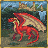 As a spineless compromise, I've tried to amend a few things in this edit. I still feel like a bastard for not putting more work into it, but rest assured that your lessons were not wasted. I'll return to this thread continuously in the future, as I complete the series (this was the first of seven dragons I want to draw) If I were to perfect this, I would have to fix the anatomical issues, fix the grass and dirt in the foreground, improve the castle, mountains, waterfall and clouds in the background, decrease brightness, increase contrast, set up a real palette of connected colours, fix the shading on the dragon, reduce the number of colours, fix the bloody lightrays from the clouds and work out the light source and secondary shadows, among other things. I guess it was too ambitious for what is arguably my first piece of pixelart (not counting some rather primitive computer game sprites). It forced me to learn a whole lot of things at once, instead of taking the time to post pictures of simple apples and cardboard boxes. Again, mea culpa. With that out of the way, I am glad to say that realizing the connection between pixelart and traditional art forms has rejuvenated my interest in art. I'm once again back to drawing simple pencil sketches of human anatomy and the like. When going from A to B, more often than not, I will stop in the middle of the street to look at the clouds or at distant mountains - ignoring the strange looks from people walking by. I find that any kind of art improves your sense of appreciation. Being a musician gives you a higher sense of appreciation of good music, and the same goes for cooking, doing sports or whatever else. Well, painting (and pixelart) lets you see your surroundings with different eyes. You pay more attention to shapes and colours. For example, I'll watch a sunset and study how the colour blends between orange and blue, without ever crossing into purple. With that said, I do take your point, jalonso, about using colours as tools rather than restrictions from reality, in terms of artistic license versus hyper-realism. It may not show in some of my recent work, I'm sure I'll repeat my mistakes many times before getting it right. But as in all things, I'll make up for a lack of talent with repetition. Anyway, I have posted this piece to the PixelJoint gallery. If I have made some horrendous mistakes, I will fix them. Otherwise, I hope to remedy some of the above shortcomings in my future work. Thanks again. |
|
|
IP Logged |
|
|
jalonso
Admiral
Joined: 29 November 2022 Online Status: Offline Posts: 13537 |
Posted: 05 August 2011 at 7:41pm |
|
You did a great job and as you've learned from other's input then no harm is done. It is precisely by taking knowledge from one piece into the next that improvement happens.
It is common here, and seen many times over, where someone starts something that is far too ambitious for their skill level and c+c either becomes overwhelming or the person loses confidence and abandons the work or even pixelart :'( You are an exception to this and I have no doubt that soon enough your skilz/powerz will be vastly improved. We've seen this often enough too which is why, at least I, never mind sharing whatever c+c I can. PJ members like you restore my faith in all the time I spend posting on WIP threads. Naturally, the piece was added right away :) Edited by jalonso - 05 August 2011 at 7:42pm |
|
|
|
|
|
IP Logged |
|
|
CELS
Commander
Joined: 23 September 2022 Online Status: Offline Posts: 758 |
Posted: 20 August 2011 at 10:17am |
|
Here is my next piece. Number two in a series of seven, hopefully.
It's still very early in the running, but I'd like to get any feedback that you can provide, while it's still easy to change major mistakes. I expect there are some troubles with anatomy. I'm not happy with the pose yet, the stance looks "unconvincing" as dpixel called it. Bear with me, as I'm no doubt going to repeat many of my mistakes. I'm diligent, but a bit slow :) 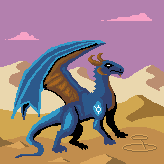 |
|
|
IP Logged |
|
|
Andrew-M
Commander
Joined: 08 February 2011 Online Status: Offline Posts: 195 |
Posted: 21 August 2011 at 2:39pm |
|
Looks good so far, but the front legs don't look like they're touching the ground and there should be another wing like with your first dragon.
|
|
|
IP Logged |
|
|
CELS
Commander
Joined: 23 September 2022 Online Status: Offline Posts: 758 |
Posted: 21 August 2011 at 3:09pm |
|
Thanks. That's definitely the problem right now - the position and angle of the legs compared to the ground. And the other wing will come in time, of course.
|
|
|
IP Logged |
|
|
CELS
Commander
Joined: 23 September 2022 Online Status: Offline Posts: 758 |
Posted: 02 September 2011 at 5:30pm |
|
Made some changes. Hopefully this is an improvement.
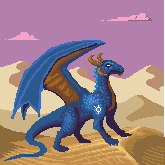 Let me know what you think. EDIT: And some more changes.  Edited by CELS - 02 September 2011 at 11:07pm |
|
|
IP Logged |
|
|
Miumau0
Commander
Joined: 26 January 2007 Online Status: Offline Posts: 118 |
Posted: 03 September 2011 at 3:03am |
|
wings should be casting shadows over the body. Dragon and background got different lightsources. To me it looks good :)
|
|
|
IP Logged |
|
| |
||
Forum Jump |
You cannot post new topics in this forum You cannot reply to topics in this forum You cannot delete your posts in this forum You cannot edit your posts in this forum You cannot create polls in this forum You cannot vote in polls in this forum |
|
