 | Active TopicsSearchRegisterLogin |
| WIP (Work In Progress) | |
 Pixel Joint Forum : Pixel Art : WIP (Work In Progress) Pixel Joint Forum : Pixel Art : WIP (Work In Progress) |
 Topic: Potion WIP Topic: Potion WIP |
  |
| Author | Message |
|
Kane Genji
Seaman 
Joined: 19 July 2011 Online Status: Offline Posts: 6 |
   Topic: Potion WIP Topic: Potion WIPPosted: 24 July 2011 at 1:23pm |
|
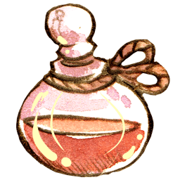
Please give me helpful tips and pointers on how I may improve upon my artwork, thank you for your time.
Health Potion Full:  Empty Potion: 
|
|
 IP Logged IP Logged |
|
|
Miumau0
Commander 

Joined: 26 January 2007 Online Status: Offline Posts: 118 |
Posted: 24 July 2011 at 1:31pm |
|
It looks just like all the "smallpotions" in games. Why not to give it an unique shape? Also i think the glass should reflect (dont know if it right word) more light.
 And heres reference what i mean with the light. And theres another  Edited by Miumau0 - 24 July 2011 at 1:39pm |
|
|
IP Logged |
|
|
MacNcheese
Seaman

Joined: 13 July 2011 Online Status: Offline Posts: 36 |
Posted: 24 July 2011 at 3:13pm |
|
I agree with Miumau, don't get restricted in fear that people won't understand that it's a health potion and therefore making it a simple red bottle.Also, I made a quick edit because I needed some quick practice:
 Made them in two different styles. |
|
|
IP Logged |
|
|
Kane Genji
Seaman
Joined: 19 July 2011 Online Status: Offline Posts: 6 |
Posted: 24 July 2011 at 3:41pm |
|
I got the idea for the shape from Japanese Soda bottles.
http://www.japanator.com/elephant/ul/10371-620x-MarblePOP1_2.jpg. Is it better or worse?   Edited by Kane Genji - 24 July 2011 at 3:42pm |
|
|
IP Logged |
|
|
Miumau0
Commander
Joined: 26 January 2007 Online Status: Offline Posts: 118 |
Posted: 24 July 2011 at 4:00pm |
|
Better alot. :) Why not making it lil bit bigger? :)
|
|
|
IP Logged |
|
|
Kane Genji
Seaman
Joined: 19 July 2011 Online Status: Offline Posts: 6 |
Posted: 24 July 2011 at 5:28pm |
|
The people I'm working for said it had to be within 32x32 pixels but I'll try to convince them that it would look better if I was allowed more leeway.
|
|
|
IP Logged |
|
|
Miumau0
Commander
Joined: 26 January 2007 Online Status: Offline Posts: 118 |
Posted: 24 July 2011 at 5:33pm |
|
Ofcourse it must be 32x32 if you are doing it for someone/some project. And ofcourse you must do what your "boss" says :)
After the project you can always study what you have done and then revisit the pixelpiece. |
|
|
IP Logged |
|
|
ChrisButton
Commander

Joined: 10 September 2010 Online Status: Offline Posts: 371 |
Posted: 24 July 2011 at 7:11pm |
|
In my opinion you definitely need more contrast. Red loses so much
saturation when you add white to it (for some reason), so you have
to shift it over towards orange a bit to bring the saturation back. :-)
|
|
|
IP Logged |
|
|
Kane Genji
Seaman
Joined: 19 July 2011 Online Status: Offline Posts: 6 |
Posted: 25 July 2011 at 11:48am |
|
Like this?
 I feel like the the shine I give the bottle doesn't look right, but I don't know what to do. |
|
|
IP Logged |
|
|
Miumau0
Commander
Joined: 26 January 2007 Online Status: Offline Posts: 118 |
Posted: 25 July 2011 at 12:01pm |
|
I think that it does not need than few colors for shading. I made edit with white highlight and dark red shade. Also made the cap littlebit darker.
 |
|
|
IP Logged |
|
| |
||
Forum Jump |
You cannot post new topics in this forum You cannot reply to topics in this forum You cannot delete your posts in this forum You cannot edit your posts in this forum You cannot create polls in this forum You cannot vote in polls in this forum |
|
