| Active TopicsSearchRegisterLogin |
| WIP (Work In Progress) | |
 Topic: The gardener [Not pixelArt] Topic: The gardener [Not pixelArt] |
  |
| Author | Message |
|
MacNcheese
Seaman 
Joined: 13 July 2011 Online Status: Offline Posts: 36 |
  Topic: The gardener [Not pixelArt] Topic: The gardener [Not pixelArt]Posted: 13 July 2011 at 3:04pm |
|
Hello everyone
 I hope the wall of text doesn't scare people away since i need some help. I hope the wall of text doesn't scare people away since i need some help.I'm working on a character so far know as "The gardener", but i decided that i needed to change his palette:  The above one is the new one. Any way to reduce the amount of colors? What can be improved in the sprite? Please do tell  . .Here's the latest version upscaled so you can easily identify the flaws:  Thank you for your time ^^ Edited by MacNcheese - 07 October 2011 at 4:43am |
|
 IP Logged IP Logged |
|
|
MacNcheese
Seaman
Joined: 13 July 2011 Online Status: Offline Posts: 36 |
Posted: 13 July 2011 at 8:17pm |
|
Here's the walking animation I'm working on:
 |
|
|
IP Logged |
|
|
ChrisButton
Commander 
Joined: 10 September 2010 Online Status: Offline Posts: 371 |
Posted: 14 July 2011 at 12:18am |
|
I think this piece looks pretty good as is. The colour choices are quite good as well. The pinky colour on the hat could be removed if you wanted to lower your colour count, unless it's being used somewhere else. You can't really notice it on the hat. Also, you don't have to upscale images for Pixeljoint, if you simply click on them with the mouse they will enlarge. :-)
|
|
|
IP Logged |
|
|
CELS
Commander
Joined: 23 September 2022 Online Status: Offline Posts: 758 |
Posted: 14 July 2011 at 10:03am |
|
I don't know enough about colours to help with that. In terms of anatomy, I would probably place the ear one or two pixels higher, so that the top of the ear is aligned with his eyes.
The animation looks good, except that you should make his apron bulge a little bit as he bends his knees. Right now, the apron is stiff as a board, and not moving at all, so it's hard to imagine how he can walk properly. |
|
|
IP Logged |
|
|
vlad61
Midshipman 
Joined: 22 April 2015 Online Status: Offline Posts: 96 |
Posted: 14 July 2011 at 12:23pm |
|
Yeah i saw this - and i didnt know what to say because i think it looks like top notch work.
Though i am a bit not sure about the walking direction is this a sidescroller or something else? It would help to see the environment. |
|
|
IP Logged |
|
|
MacNcheese
Seaman
Joined: 13 July 2011 Online Status: Offline Posts: 36 |
Posted: 15 July 2011 at 4:50am |
|
¨Hello everyone.
@Chrisbutton, Weirdly enought the pink colour is actually the colour of the skin, however while looking i realised that orange was the color i didn't need, both dark and light ornage were only used on that location which seeme like a waste. Thanks for lletting me know that you can upscale images here, will save me alot of time, thanks :). @CELS, You're absolutely right, his ears are too low down for it to look natural, I decided moving it up 1 pixl looked best. As for the apron, I have tried numerous times to get it to look right, but it seems I keep failing at making it look natural, however I will give it another go soon, thank you for your time :) @vlad61 Thanks alot for the compliment ^^ It's supposed to resemble a sidescroller althought the charachter isn't necessarily looking in that direction, hopefully as soon I'm satisfied enough with his animation I'll start working on the enviroment, thank you for the comment vlad61. So here's the latest animation attempt:  Fixed the orange on the hat, replaced it with pink, moved the ears up 1 pixel, smoothed out the arms movements and fixed the Aprons top So it looks smoother. However, i realised I've accidentally placed colours that aren't in the palette, so I'll get to work on removing those. Edited by MacNcheese - 15 July 2011 at 4:53am |
|
|
IP Logged |
|
|
jalonso
Admiral 
Joined: 29 November 2022 Online Status: Offline Posts: 13537 |
Posted: 15 July 2011 at 6:53am |
|
The sprite looks nice and as a standalone item everything is fine. However, you may wish to rethink the colors before you move on.
If the sprite is a gardener and will presumably be in logical environments then there will most likely be lots of greens and browns. So, maybe his shirt should be light blue/white. The apron in grey and the pants in dark blue. Perhaps the hair could lean to being a redhead. Whatever will make the sprite standout in the environment. Keeping the BG environment in mind a lot of the edges will surely look crazy and really stand out so make yourself a WIP BG so you can see how the sprite fits in. I can see the pink pixels on the shoes and the red on the hat edges really being an eyesore on say, for example a green BG. The red on the hands may be fine as they shadow. As far as color counts and keeping it low. Color the sprite with colors that will be shared in the environment and keep the 'overall' color count low instead of fighting to keep the sprite low. After all, the sprite is THE important thing so whatever colors are on it are important and needed. Environment colors are secondary and a better place to conserve. |
|
|
|
|
|
IP Logged |
|
|
Friend
Commander
Joined: 01 April 2015 Online Status: Offline Posts: 710 |
Posted: 15 July 2011 at 6:26pm |
|
reminds me of golden sun!!
|
|
|
IP Logged |
|
|
MacNcheese
Seaman
Joined: 13 July 2011 Online Status: Offline Posts: 36 |
Posted: 15 July 2011 at 6:59pm |
|
Hi jalanso,
Thanks for all the advice, You sir have saved me alot of time, fixing such mistakes are way easier now. I am recoloring the sprite and fixing the outline standing out too much, I will also think less about colour counts for this sprite, You've helped me alot, thanks. My progress:  *Update 1:  *Update 2:  Saturated some colors. Didn't add too much, but I'll update when I'm done. I know this is a bit off-topic but your game Medici which by the way looks very promissing, Is it made in any kind of program for creating games, does it require alot of experience in coding? Hello Forst Butt. I used to play Golden sun when I was younger, so there's a high possibility it has influenced me. Although i honestly don't remember a whole lot about the game, it seems like the perfect time to replay it :). Edited by MacNcheese - 16 July 2011 at 12:53pm |
|
|
IP Logged |
|
|
MacNcheese
Seaman
Joined: 13 July 2011 Online Status: Offline Posts: 36 |
Posted: 16 July 2011 at 4:03pm |
 Needs a little more detail around the legs and right arm, but if there aren't any urgent mistakes I'd like to move on yo animating his idle pose and hopefully some jumping animations. I do know that i wasn't supposed to use brown, but hopefully this brown is red enough to not melt in with the dirt. I have a problem with the frame where the gardener is looking toweards the screen, he shouldn't have a nose sticking out of his cheek. But it shouldn't be completely flat either, so I'm not sure if there is a good solution to this. Here's the frame I'm talking about:  |
|
|
IP Logged |
|
|
Hatch
Admiral
Joined: 05 August 2015 Online Status: Offline Posts: 1387 |
Posted: 16 July 2011 at 4:15pm |
|
I actually think he was at his best in update 1 of your previous post. The colors are much more clean and straightforward, and he has a healthier complexion.
unrelated: you don't need to keep posting blown-up copies. this forum has a click-zoom feature. EDIT: as for your problematic frame, people don't actually rotate their upper body or head much, if at all, when they walk. Edited by Hatch - 16 July 2011 at 4:18pm |
|
|
IP Logged |
|
|
MacNcheese
Seaman
Joined: 13 July 2011 Online Status: Offline Posts: 36 |
Posted: 16 July 2011 at 7:33pm |
|
Sorry about the click-zoom thingy :( CAn't believe I already forgot about it, ChrisButton told me about it only 2 days ago or so...
I liked some of the old colors better although the new sprite is better drawn, better edges and all. So i tried creating something in between and this is what i came up with. |
|
|
IP Logged |
|
|
ChrisButton
Commander
Joined: 10 September 2010 Online Status: Offline Posts: 371 |
Posted: 18 July 2011 at 2:37am |
|
Animator's insight:
Hatch is right, people don't rotate their head when they walk.
Depending on the length of their stride their whole body will go
will naturally fall and rise. The longer the steps you take, the more
you go down - and if you take short steps, your body obviously won't
move much. The body doesn't really turn at all. I can't teach you animation in a comment, but my best suggestion would be to walk
back and forth in your room, and take notes of what happens.
There's something odd about your walk cycle though, it could be in
the legs maybe. It kinda looks like he takes a step forwards, and then
lets his other foot catch up, and then he takes another step forward
and catches his other foot up again. If you want it to look more like a
walk cycle, the back foot has to surpass the front foot, but that might
be difficult on your angle.
Also, I can't tell because I can't freeze the animation frames, but make sure your character is falling when he's taking the step. For some reason
I'm getting the impression that you're just bumping him up and down and having a walk cycle simultaneously going on. I could be wrong though. It
might have to do with the mini step thing I mentioned.
|
|
|
IP Logged |
|
|
jeremy
Rear Admiral 
Joined: 25 November 2024 Location: New Zealand Online Status: Offline Posts: 1704 |
Posted: 18 July 2011 at 2:50am |
|
As an aside, it seems as if the head is twisted too far away even in the closest frames.
Edited by Jeremy - 18 July 2011 at 2:51am |
|
|
IP Logged |
|
|
Wayne
Seaman
Joined: 03 April 2014 Online Status: Offline Posts: 14 |
Posted: 18 July 2011 at 5:57am |
|
Originally posted by ChrisButton
<FONT style=": #eeeeee"> There's something odd about your walk cycle though, it could be in
the legs maybe. It kinda looks like he takes a step forwards, and then
lets his other foot catch up, and then he takes another step forward
and catches his other foot up again. If you want it to look more like a
walk cycle, the back foot has to surpass the front foot, but that might
be difficult on your angle. Hey MacNcheese, Nice work, love the style of your sprite. The design is very fun. For the walk, Chris is correct about the legs... If this is a side-scroller, the legs feel like they are shuffling instead of walking. When I first saw this, I felt the same way as vlad61, in that his walking direction appears more 3/4 than fully to the right. Because his walk cycle is animated at 3/4 but his direction is that of a side-scroller, it gives the illusion that he is shuffling instead of walking. Here's a few other notes on the walk that I hope help: -When his feet hit the ground, they are currently planting flat. This gives the impression of a stomp. If you want it to feel more like a walk, have the contact with the ground occur on the heel first, then on the next frame have the foot flat on the ground. This is the first part of a "foot roll". -As a side note, the frame where the foot is flat just after the heel contact, is when you should have the head/body at it's down pixel position to show weight upon impact. Currently the body drop is on the first contact frame, but when the foot is adjusted so the heel contacts first, the body drop will also need adjustment. -On his right foot, you've animated the 2nd part of the foot roll correctly, where the heel lifts off the ground before the foot does, but it appears as if the foot is raising up 1 frame too early. The reason the heel lifts at the end of a foot roll is actually because the foot is pushing off the ground to propel the body forward, but if you lift the foot too soon then you don't feel the foot push off the ground. -The apron should raise and lower, even if it's a sub pixel thing. This is because you've animated the body and head raising lowering, and the end of the apron appears disconnected if it doesn't raise and lower as well. -About the head and body rotating... Hatch and Chris bring up a good point about the head and chest rotating too much but I feel this should be a character choice. If you want your gardener to kick butt and be macho, rotating the chest and head like a tough guy who means business would be in character. I'm not sure if that's what you're going for though. :) In any case, I do feel there should be rotation in the chest, but if you compare the amount of rotation in the chest to the head, it looks like the equal amount and that feels wrong/odd, but then again, I've seen it done in games and maybe that's a style thing. To me personally, the head is the thing that should not rotate as much if at all, because the head is usually focused on something when walking. Looking forward to seeing your character come to life. Lookin good! |
|
|
IP Logged |
|
|
ChrisButton
Commander
Joined: 10 September 2010 Online Status: Offline Posts: 371 |
Posted: 18 July 2011 at 9:47pm |
|
Well said Wayne, I forgot to mention the feet clapping and toes bending! :-)
|
|
|
IP Logged |
|
|
MacNcheese
Seaman
Joined: 13 July 2011 Online Status: Offline Posts: 36 |
Posted: 19 July 2011 at 6:10am |
|
Hello everyone, I'm terribly sorry that it has taken me time to respond, but I thought I'd wait until I was in a fairly good mood to write this, I don't wwan't to simply respond with a half-assed "alright" since I've seen you've really put effort in helping me out, I thought I needed to make an effort to respond.
@ChrisButton I have actually noticed the fall and rise people naturally have when they walk, but I didn't quite understand it. So you're right, I simply threw it in there to hopefully make it look better. Also, I remember why I made the body tilt so much when moving, I made the sprite looking towards the screen, and tried animating it, it looked completely wrong though, since he was moving right while looking towards the screen. So I decided that I fon't want it that way so i remade the body and partially the head, to make it completely facing the sides. The foot catching up was another mistake I made. I couldn't figure out how to get the apronto move, so instead of doing that I didn't let the other leg move forward as much, it was a stupid mistake to not animate the apron before adding details and hopefully I've fixed that with the new sprite. I also took your advice and walked back and forth across the room taking notes, rises and falls. Hopefully once I'm done animating you'll be somewhat pleased with the result. Thanks alot for your insight Hi Jeremy, I also noticed it tilting too much, hopefully I've fixed that in my latest animation attempt. It looks like he's looking at a 45 degrees angle, where 90 is towards the screen and 0 to the right. Thanks for pointing that out, I'll avoid tilting the head in the walking animation, I might reuse it for the charachter saying no  Hello Wayne, I'd like to thank you for taking your time to learn me how to animate legs properly, you and Chrisbutton have been alot of help especially to an almost fresh animator :). Hopefully the new direction my sprite is taking will look alot more like walking than shuffeling. The foot roll, I kept seeing that in the old Sonic games, although it looked really good on the animations I saw i never learned the lesson and actually used them when animating. I'm still working on body drop/weight and balance. It's still abit alien, but with a whole lot of practice I'll probably get the hang of it. I always thought the heel lifted up in animations beacuse the leg didn't reach any longer back, so it starts to move closer to the body to catch up, I should've done some more research and studied animations more properly before posting. When I slapped on the new face of my character on the tilting body, it sure looked like he meant buisness, all tough and proud. Unfortunatoely it didn't fit my characters role, but I'll remember that if I want to animate some tough-guy in the future. I want to thank everyone again for their help, I'll post an update with the new animation soon enough  |
|
|
IP Logged |
|
|
ChrisButton
Commander
Joined: 10 September 2010 Online Status: Offline Posts: 371 |
Posted: 19 July 2011 at 6:35am |
|
I'm glad I could help you, I look forward to your next update! :-) |
|
|
IP Logged |
|
|
MacNcheese
Seaman
Joined: 13 July 2011 Online Status: Offline Posts: 36 |
Posted: 20 July 2011 at 9:04pm |
|
Working on the animations, which one looks better?


|
|
|
IP Logged |
|
|
onek
Commander
Joined: 19 May 2009 Online Status: Offline Posts: 416 |
Posted: 21 July 2011 at 4:30am |
|
O________O'
stick with the 1st animation!!!!! its soooooooooo much better i really like it... the rotation was very nice and gives him a kinda happy feel, maybe could be a bit less extreme, but still keep it for gods sake!!!! the update is just stiff.... hes leanining to much backwards and the timing seems off... dont listen to those people!!!!! :P |
|
|
IP Logged |
|
|
jalonso
Admiral
Joined: 29 November 2022 Online Status: Offline Posts: 13537 |
Posted: 21 July 2011 at 5:25am |
|
Gotta agree with onek. New animation has taken away all the personality. I would tweak the original with the given suggestions, especially the movement in the apron.
|
|
|
|
|
|
IP Logged |
|
|
MacNcheese
Seaman
Joined: 13 July 2011 Online Status: Offline Posts: 36 |
Posted: 21 July 2011 at 6:16am |
|
I do realise this might look stiff, I will add some arm movement and shoulder rotation. As this image shows:
I'll finish animating it and if you guys still think it looks stiff when it's done. Then I'll go back and edit the old one. Sorry if I seem kinda rude for not listening. But i want to give this one a fair attempt :) Here's the shoulder animation, I'll start adding the arm movement soon enough:  Edited by MacNcheese - 21 July 2011 at 6:53am |
|
|
IP Logged |
|
|
onek
Commander
Joined: 19 May 2009 Online Status: Offline Posts: 416 |
Posted: 21 July 2011 at 8:04am |
|
ok try what u can make from this then :)
getting better the movements are a bit too slow.. they are also too smooth and too linear (?)... |
|
|
IP Logged |
|
|
Friend
Commander
Joined: 01 April 2015 Online Status: Offline Posts: 710 |
Posted: 21 July 2011 at 8:42am |
|
gosh, your first animation was 100 times better.. I don't care that the head turning isn't realistic. sprites don't need to be realistic. The animation you had fit PERFECTLY with the style of the guy
|
|
|
IP Logged |
|
|
MacNcheese
Seaman
Joined: 13 July 2011 Online Status: Offline Posts: 36 |
Posted: 21 July 2011 at 8:56am |
|
I might add slight head turning. But that's ffor later, i made the animation less smooth and less linear:

Head-movement: 
Hater's gonna hate: 
 Edited by MacNcheese - 21 July 2011 at 4:41pm |
|
|
IP Logged |
|
|
ChrisButton
Commander
Joined: 10 September 2010 Online Status: Offline Posts: 371 |
Posted: 21 July 2011 at 7:41pm |
|
Far out I missed my animation class today! Well atleast I'll do something
related to animation. Anyways, again, I won't teach you the whole scope of
animation, but I took a look at that Angry Animator website you posted. His example is pretty good because in any form of animation/real life acting exaggeration is very important. Exaggeration makes everything more understandable. If you were looking at someone from 50m away and they had just a sad face, you wouldn't know they're sad.. but if they had their head down and slouched over you'd probably pick it up. I would probably have to agree with everyone thus far relating to your new edit.. but I wouldn't call it just yet. I think the new one has a lot of potential but I definitely wouldn't call it finished. You forgot to make the arms swing but in your latest edit 'Hater's gonna hate' they're finally swinging. All the other ones had the shoulders just shifting backwards and forwards. People
look weird if they don't swing their arms when they walk. Anyways, your newest edit and the angry animator's one both take the sh*t out of a walk animation (in terms of exaggeration) so it's now extremely readable. I still think the legs are a problem (I think someone stated it looks like he's leaning back). They're right! That's because the legs aren't going back far enough when he's taking a step! Sorry this was kind of rushed because I'm doing some work myself! I might come back to all this later and add more. (I got something in mind to explain later actually) Adios! |
|
|
IP Logged |
|
|
MacNcheese
Seaman
Joined: 13 July 2011 Online Status: Offline Posts: 36 |
Posted: 21 July 2011 at 9:01pm |
|
Hi again ChrisButton.
You keep helping me out so I thought i needed to tell you this. The reason I'm animating the gardener is because here in sweden, by the end of our final year at gymnasium(college preparatory high schools), we pust present our project that we've been working on for over a year. For a very long time I've wanted to create my own game, so i found people with similair intrests among some of my friends and asked them to join me on this not so noble quest. Our group project is to create a game, while we don't have to succeed to get good grades, it's more about what you learn and how you've progressed. My part in the project so-far is to draw the character and some enviroments. While i have drawn some images before, I haven't animated a whole lot. I used to browse a graphics section in the game maker community for a long time and although not very skilled hopefully help some people out. The reason I'm saying this is because I'll have to write some kind of essay about what I've learnt, in my case it will be about animation. So everytime you give me advice such as the exaggeration one. Be sure that it has been noted, and is very helpful to me when I'll finally write my essay. So, thank you for all that. And also thanks for coming back and checking out my progress, I know you can't teach me everything about animation but your advice is appreciated. I do try to follow it and will give the leg thing another attempt to hopefully improve it. I'm looking forward what you wanted to explain :D |
|
|
IP Logged |
|
|
jeremy
Rear Admiral
Joined: 25 November 2024 Location: New Zealand Online Status: Offline Posts: 1704 |
Posted: 21 July 2011 at 9:57pm |
|
this one is fantastic; captures the same energy as the earlier ones but head and body are now facing the same direction :f It may be slightly too swaggah-ish, 'cos he's leaning back a little far. |
|
|
IP Logged |
|
|
MacNcheese
Seaman
Joined: 13 July 2011 Online Status: Offline Posts: 36 |
Posted: 21 July 2011 at 10:14pm |
|
Haha, thanks alot, I actually tried to get it to resemble the old animation, however the whole leaning back thing, I'm unsure how to fix it. ChrisButton suggested that the legs go off the ground to early and that they should move back a little more, however I'm starting to belive his back also has a part in it and needs to be tweeked.
|
|
|
IP Logged |
|
|
Wayne
Seaman
Joined: 03 April 2014 Online Status: Offline Posts: 14 |
Posted: 22 July 2011 at 1:45am |
|
Hey MacNcheese,
I just saw your new side-view versions and agree that he initially lost his charm, but glad to see your latest version successfully succeeded in getting your character's appeal back, now in side-view. I know it's still WIP but I feel you're moving in the right direction.
I saw you weren't sure how to fix the leaning back problem, so made some notes for you. It's a little sloppy but hopefully it'll make sense. 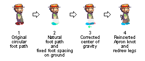
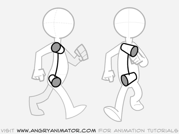
1. This image is your latest version. Similar to your 3/4 view version, I noticed that the leg behind the body was lifting off the ground too early, which made the walk look unnatural as the foot never pushed off to help move the character forward. Also the rate of the foot on the ground has a hitch in it, where as it should be constant for a walk cycle. The foot pattern was also unnatural for a standard walk as it was circular (marked in red) instead of swooping as the foot comes forward. 2. Here the issues listed above have been corrected. The new foot path with swoop is marked in green. A live-action example of this can be found HERE on getty images. (btw: Getty Images is a great reference resource. I like using it to study motion because you can step frame the Quicktime videos) 3. Here's the issue that many of us were commenting on. It's a center of gravity issue. The hips were too far back, which would make him fall backward instead of forward. In animation, you'll often hear that a walk is really a controlled fall. Try it. Stand up, and try leaning forward. You'll start to fall forward but your legs will catch you at the last moment because you didn't want to smack the floor. The result is that you used gravity to help you walk forward without expending much energy in your leg muscles. Neat, huh?
4. I redrew in the legs roughly. You may want to consider making the left leg stand out from the right leg when you do the final pixel coloring. That way the legs will be clear and not mush together. I also copy-and-pasted your apron knot back into this version. I thought it balanced out his design a little better. By the way, I didn't touch the apron itself but it could use some cleanup. Hope that helps. Good luck with your project! |
|
|
IP Logged |
|
|
MacNcheese
Seaman
Joined: 13 July 2011 Online Status: Offline Posts: 36 |
Posted: 22 July 2011 at 2:40am |
|
Thanks for the notes, Wayne, they weren't sloppy at all :)
Thanks for teaching me how to make a foot cycle, and showing me how to fix the different problems. I suspected that the center of gravity was off but i would never have found the foot cycle error on my own. The Natural one moves back as far as possible before the sweep, where as my circular foot cycle simply lift up to resemble a circle. That was the problem that Chris kept talking about but for some reason i couldn't fix it. Thanks for posting getty Images by the way, I'll definately need it when making another animation. Maybe taking some notes before jumping in and animating will make much smaller errors and i want have to revise the animation several times. I'll have to work on the apron, since deleting some frames earlier made it choppy. I'll also do the same thing you did with the legs, give the one in the back a darker color to seperate them. The apron knot(I'm not sure how you figured out what it was), needs some work, I'll fix the hat dent so it rotates aswell. I honestly wouldn't have come this far with the animation if it wasn't for you and Chris, you've both been great help :) I really didn't want to say this but I've sort of stayed away from animating characters for a long time beccause I wasn't good at it, the Gardener would be the second character I've animated a walking cycle for. That might explain why I don't really understand alot about it. Infore the next animation I'll be doing a lot of homework before starting to draw. You know what, I think I have my old animation saved somewhere on my computer, if I find it I'll post it here for fun. Thanks again for returning and checking out my progress :D EDIT: I found it, i knew I still had it saved somewhere: 
As you can see, rotating upper body has always been my style 
But for some reason, I almost got a decent foot cycle, it resembles a sweep more than my hater's gonna hate circle cycle  Edited by MacNcheese - 22 July 2011 at 2:46am |
|
|
IP Logged |
|
|
ChrisButton
Commander
Joined: 10 September 2010 Online Status: Offline Posts: 371 |
Posted: 22 July 2011 at 6:39am |
|
Looks like Wayne got to it before I did, good job Wayne!
That was a great in depth explanation, and you covered my point about
the foot leaving early. It could be coincidence, but it I'm pretty sure you've read the Animator's Survival Kit by Richard Williams (you should check that out Mr. MacNCheese!). I'm glad to hear you're learning from all of this Mr. Cheese. I bet your talk on Animation will be entertaining, it definitely beats boring science talks about atoms and stuff. If you want to learn more about animation.. you should google the 12 principles of animation! That's a nice Banjo animation, it's always good to have some of your earlier work to compare your new work to so you can see how much you've progressed! Like in your Banjo animation you've got his shoulders rotating parallel with his hips, woops! But in your Gardener animation, that's a whole new story! I look forward to your edit. :-) |
|
|
IP Logged |
|
|
MacNcheese
Seaman
Joined: 13 July 2011 Online Status: Offline Posts: 36 |
Posted: 24 July 2011 at 10:23am |
|
I'm sorry for not updating in a while, been feeling kind of lazy. But today i feel somewhat motivated. I've been reading up on the 12 principles on animation on wikipedia and some other sites, really helpful link. Thanks for posting it
 At my gymnasium, my studies are mostly science, math and programming. Then the basic English, swedish, history, geography etc. but I've also chosen art as one of my secondary classes. Mostly painting, drawing and some History. I got an A at it this year, however next year will be digital arts and some other stuff. So I'm getting a false start (tactical start, if you want) on digital arts. So alot of people have chosen science projects, so you're right, it'll be refreshing and hopefuully more entertaining and definately more of a visual presentation, therefore easier to grasp than som other projects. The banjo animation was actually made for someone on the game make community. He wanted someone to redraw his sprite, I did that, but I wasn't a good animator. So i told him I'll simply draw it for him but not animate it. Yet he insisted, so I gave it a shot. Being new at animating it took a very long time to make just one animation. I was really busy with exams and all, my laptop broke, so i didn't help him with the rest of the animations. Still feel like an ass even though I never promised him to do all the animations. Yet I'm pretty damn proud of the animation. I know this isn't the biggest update but I'll edit this post and update. I worked on the apron and also a bit on the head rotation.  Edited by MacNcheese - 24 July 2011 at 10:30am |
|
|
IP Logged |
|
|
Loonybin
Seaman
Joined: 05 July 2011 Online Status: Offline Posts: 31 |
Posted: 24 July 2011 at 11:32pm |
|
Very good, only thing I can see is that it's hard to tell that he is wearing a glove, and the pants should be blue instead of gray, right?
|
|
|
IP Logged |
|
|
MacNcheese
Seaman
Joined: 13 July 2011 Online Status: Offline Posts: 36 |
Posted: 16 August 2011 at 11:14am |
|
I'm so clumsy today, accidently Ctrl+w on the edit post after typing out an essay here.
Anyway short what i said: What a coincidince! Yes, I didn't visit the site in a long time, my last visist was i believe shortly after my laptop broke. Sucks that he didn't find a replacement. I'll pm him under my new name, LordCaseus. He was last active:
Edited by MacNcheese - 16 August 2011 at 12:26pm |
|
|
IP Logged |
|
|
Lathien
Midshipman
Joined: 07 August 2011 Online Status: Offline Posts: 84 |
Posted: 16 August 2011 at 11:39am |
|
OMG I've seen that Banjo before on the GM forums. There was a guy with a topic there that kept wondering why you'd disappeared on him for months at a time every time he asked for a new animation. Whatever happened there?
On topic: I like the animation, its getting smoother and smoother as you go along. Although, in both animations the nose stays in the same place the whole time. I think you should make it follow his eye horizontally and when it looks like a flat line, just draw the bottom of the nose coming in from the face to show an indent. |
|
|
IP Logged |
|
|
MacNcheese
Seaman
Joined: 13 July 2011 Online Status: Offline Posts: 36 |
Posted: 16 August 2011 at 12:18pm |
 Thanks for pointing out the issues, I'll fix them. As for your Off-topic disccussion check my previous post... Edited by MacNcheese - 16 August 2011 at 12:27pm |
|
|
IP Logged |
|
|
Lathien
Midshipman
Joined: 07 August 2011 Online Status: Offline Posts: 84 |
Posted: 16 August 2011 at 3:10pm |
|
Ha, I guess pixel art is a small word, huh? Yeah, I remember hearing of the broken laptop, my condolences. The guy hasn't been on a while...ironic huh?
As for the update, getting smoother still. Anyone would be hard-pressed to find a smoother animation. And I like the green apron best, seems to fit the idea of a gardener better. |
|
|
IP Logged |
|
|
MacNcheese
Seaman
Joined: 13 July 2011 Online Status: Offline Posts: 36 |
Posted: 18 August 2011 at 5:28pm |
|
Update time :D
Here's the gif:  And the strip:  As you can see, I worked on the outline, the apron, the hands, some slight color changes and hopefully I'll edit the boots a bit, I want them to look more like boots. I'm starting to wonder if I should remove the apron knot since it will be a pain to animate. Edited by MacNcheese - 18 August 2011 at 5:51pm |
|
|
IP Logged |
|
|
Lathien
Midshipman
Joined: 07 August 2011 Online Status: Offline Posts: 84 |
Posted: 19 August 2011 at 2:23am |
|
If you want the shoes to look more like boots, I think you need to simply make them run further up the leg then bunch the pants over the top of them. Although based on the look on his face, this guy really looks like a shoe man more than a boot man to me.
As for the apron knot, I don't think you need to remove it. It already fits well in the animation so I think all you need to do is define it a little more and maybe add some AA to smooth it out. Just do this on one frame then copy that to the rest, cause as it is now it stays the same in all the frames and still works great. |
|
|
IP Logged |
|
|
MacNcheese
Seaman
Joined: 13 July 2011 Online Status: Offline Posts: 36 |
Posted: 20 August 2011 at 7:16pm |
|
Small update:
 |
|
|
IP Logged |
|
|
Wayne
Seaman
Joined: 03 April 2014 Online Status: Offline Posts: 14 |
Posted: 24 August 2011 at 12:18am |
|
It's looking good. I noticed a few tiny things that could help it look better... and I'm talking tiny 2-3 pixel changes...
1. When the arm is swinging backward the arm feels good, but when it swings forward, the bow in it makes the arm feel hyperextended. I'd try tweaking a few pixels to make the elbow not hyperextend. 2. When his right foot is swinging forward it feels like the toe is kicking too forward instead of kicking up before the fall. It's a super minor thing but if you display all your images out (like in your previous post) I can point it out. 3. When the left foot is back, about to lift off the ground, you previous post looked a little better because it had a little bit more toe, whereas now the foot is almost the width of the leg. Yes, I'm being very nit-picky. Looking good. And, yes, you should totally keep the apron knot! It would add a nice bit of secondary animation!
|
|
|
IP Logged |
|
| |
||
Forum Jump |
You cannot post new topics in this forum You cannot reply to topics in this forum You cannot delete your posts in this forum You cannot edit your posts in this forum You cannot create polls in this forum You cannot vote in polls in this forum |
|
 Jul 31 2011 06:37 PM