| Active TopicsSearchRegisterLogin |
| WIP (Work In Progress) | |
| |
  |
| Page of 2 Next >> |
| Author | Message |
|
Andrew-M
Commander 
Joined: 08 February 2011 Online Status: Offline Posts: 195 |
  Topic: Don't do drugs! Topic: Don't do drugs!Posted: 31 October 2011 at 4:43pm |
 The idea of this is it's a guy high on drugs walking through a forest and in the shadows of the forest there are monsters hiding and watching him. It's not really a forest right now, and there are no monsters yet(I tried making them but they looked really bad).
Anyways, I was wondering if I could get some feedback on how this looks so far.
|
|
 IP Logged IP Logged |
|
|
cure
Commander
Joined: 23 March 2022 Online Status: Offline Posts: 2859 |
Posted: 31 October 2011 at 4:55pm |
|
his pose is really unnatural, with his shoulders in a shrug and his arm limp at his sides. i guess the bending trees are due to the drugs. also, it looks like he's cresting a hill right now, since the road and grass abruptly end.
|
|
|
IP Logged |
|
|
Rayovatron
Commander
Joined: 24 September 2011 Online Status: Offline Posts: 143 |
Posted: 31 October 2011 at 5:41pm |
|
Say no to drugs and yes to weed ;)
|
|
|
IP Logged |
|
|
cure
Commander
Joined: 23 March 2022 Online Status: Offline Posts: 2859 |
Posted: 31 October 2011 at 6:01pm |
|
keep the comments related to critique, porfa
|
|
|
IP Logged |
|
|
ChrisButton
Commander
Joined: 10 September 2010 Online Status: Offline Posts: 371 |
Posted: 31 October 2011 at 6:22pm |
|
All drugs are bad, especially weed.
If you want your character to look like he's walking, you could try making
him swing his arms more. If you're not sure what position to put your arms
in, just walk in real life to the point of where your character's legs are and
freeze on that spot and take notice of where your arms are.
|
|
|
IP Logged |
|
|
Andrew-M
Commander
Joined: 08 February 2011 Online Status: Offline Posts: 195 |
Posted: 31 October 2011 at 7:00pm |
|
Thank you both for the help, I tried to fix the shoulders and arms:
 |
|
|
IP Logged |
|
|
Andrew-M
Commander
Joined: 08 February 2011 Online Status: Offline Posts: 195 |
Posted: 01 November 2011 at 4:10pm |
|
I changed some colors and a couple other things:
 Edit:Does anyone know how to fix the cresting hill thing cure pointed out? I honestly have no idea what i'm doing.  Edited by Andrew-M - 02 November 2011 at 3:05pm |
|
|
IP Logged |
|
|
Andrew-M
Commander
Joined: 08 February 2011 Online Status: Offline Posts: 195 |
Posted: 02 November 2011 at 6:00pm |
|
Hopefully fixed...
 |
|
|
IP Logged |
|
|
CELS
Commander
Joined: 23 September 2022 Online Status: Offline Posts: 758 |
Posted: 02 November 2011 at 6:36pm |
|
Good start. The character actually looks a lot better at 2X zoom than at 1x. A few suggestions...
1) Cure is saying that it looks like he's walking on top of a hill, because we're only seeing the road in front of him, and nothing behind him. We can't see where he's coming from, or any trees or mountains in the horizon, so it looks like he's on top of a hill. 2) I don't think you're creating the atmosphere you're looking for. When I look at this, I don't get a feeling of paranoia or claustrophobia. It doesn't look like he's walking in a forest, surrounded by acid trip monsters. I can only see some tree trunks without branches, so those might as well be palms. The grass is green, the sky is blue. Looks like a wonderful Sunday walk in the park. 3) It's not a good idea to put the top of the head just a few pixels from the top of the picture. How about using the rule of thirds, and let the head be 1/3 from the top and the top of the hill be 2/3 from the top. Maybe you want to adjust the size of the picture. 4) It looks odd when you've given the character and trees a texture, but the ground is just a flat colour. Also, you've added a little bit of shade to the clothes and tree trunks, but there are basically no shadows on the ground. |
|
|
IP Logged |
|
|
mdog95
Commander
Joined: 14 December 2017 Online Status: Offline Posts: 150 |
Posted: 02 November 2011 at 11:04pm |
|
This almost looks like a frame from a scene you would see in some Family Guy cutaway.
The way it looks like he's at the top of a hill is actually a good effect, I think. It just further demonstrates that he's wasted out of his mind. I'd give more advice, but my mom is being a complete pain in the ass right now telling me to get off the computer... |
|
|
IP Logged |
|
|
cure
Commander
Joined: 23 March 2022 Online Status: Offline Posts: 2859 |
Posted: 02 November 2011 at 11:35pm |
|
how does being at the top of a hill communicate being heavily intoxicated?
Edited by cure - 02 November 2011 at 11:35pm |
|
|
IP Logged |
|
|
Andrew-M
Commander
Joined: 08 February 2011 Online Status: Offline Posts: 195 |
Posted: 03 November 2011 at 12:28am |
|
Thanks CELS and mdog95 for the help:
 1- I made this really quickly, could someone tell me if it looks good so far? If it does i'll add trees and some other stuff...
2- I'm going to try making this darker with less colors and see if that gives it a better atmosphere.
3- I moved the person, I don't know about changing the size though.
4- I haven't shaded the ground or grass for the same reason I haven't made the monsters, because when I tried it looked bad
 Also I started making it look more like a forest. Edited by Andrew-M - 03 November 2011 at 12:54am |
|
|
IP Logged |
|
|
mdog95
Commander
Joined: 14 December 2017 Online Status: Offline Posts: 150 |
Posted: 03 November 2011 at 6:38am |
|
Originally posted by cure
how does being at the top of a hill communicate being heavily intoxicated? He's walking, and the planet is spinning under him... while he's walking... |
|
|
IP Logged |
|
|
CELS
Commander
Joined: 23 September 2022 Online Status: Offline Posts: 758 |
Posted: 03 November 2011 at 8:46am |
|
mdog95, don't do drugs :)
Andrew-M, it looks better. Of course, it's still not 100% clear that it's a forest. We can't see any foliage, so it might as well be some kind of tunnel. It's better if you try to do something that looks bad, so people can help you make it better. Otherwise, you'll always just draw grass as a flat green colour, and you'll never have any monsters in your pixel art  |
|
|
IP Logged |
|
|
Andrew-M
Commander
Joined: 08 February 2011 Online Status: Offline Posts: 195 |
Posted: 03 November 2011 at 4:52pm |
|
Thanks CELS, I hope it looks more like a forest now:
 That's good advice, i'll try and make those things again and show them even if they look bad.
|
|
|
IP Logged |
|
|
Friend
Commander
Joined: 01 April 2015 Online Status: Offline Posts: 710 |
Posted: 03 November 2011 at 6:08pm |
|
Andrew, given the subject matter, this could be a good opportunity to get really creative with your colors. Don't be afraid to try weird crazy things
|
|
|
IP Logged |
|
|
mdog95
Commander
Joined: 14 December 2017 Online Status: Offline Posts: 150 |
Posted: 03 November 2011 at 6:16pm |
|
You do make a good point. And the forest looks more like he walked into a well lit cave...
|
|
|
IP Logged |
|
|
Andrew-M
Commander
Joined: 08 February 2011 Online Status: Offline Posts: 195 |
Posted: 03 November 2011 at 10:54pm |
|
I started changing the colors:
 They're not very good right now, i'll change them more later. Edited by Andrew-M - 04 November 2011 at 1:54am |
|
|
IP Logged |
|
|
Andrew-M
Commander
Joined: 08 February 2011 Online Status: Offline Posts: 195 |
Posted: 04 November 2011 at 3:03pm |
|
Still not right...
 |
|
|
IP Logged |
|
|
Friend
Commander
Joined: 01 April 2015 Online Status: Offline Posts: 710 |
Posted: 04 November 2011 at 3:46pm |
|
You need to think about what you want the mood of the piece to be, then try to portray the mood through colors.
 |
|
|
IP Logged |
|
|
Andrew-M
Commander
Joined: 08 February 2011 Online Status: Offline Posts: 195 |
Posted: 04 November 2011 at 5:01pm |
|
Thanks for the help Frost Butt:
 I'm terrible with colors, hopefully this is at least a little better...
|
|
|
IP Logged |
|
|
jalonso
Admiral 
Joined: 29 November 2022 Online Status: Offline Posts: 13537 |
Posted: 04 November 2011 at 5:54pm |
|
I don't know that the jacket and shoes in green is the best option.
|
|
|
|
|
|
IP Logged |
|
|
Andrew-M
Commander
Joined: 08 February 2011 Online Status: Offline Posts: 195 |
Posted: 04 November 2011 at 8:40pm |
|
Thanks for the help jalonso:
 |
|
|
IP Logged |
|
|
Friend
Commander
Joined: 01 April 2015 Online Status: Offline Posts: 710 |
Posted: 04 November 2011 at 11:04pm |
|
brown isn't best either xD I think Jalonso meant to make a new color that isn't green or brown.
|
|
|
IP Logged |
|
|
Andrew-M
Commander
Joined: 08 February 2011 Online Status: Offline Posts: 195 |
Posted: 05 November 2011 at 12:46am |
|
More contrast:
 I thought the brown looked good ):
I'll try different colors and see if any of them look better...
|
|
|
IP Logged |
|
|
Friend
Commander
Joined: 01 April 2015 Online Status: Offline Posts: 710 |
Posted: 05 November 2011 at 8:45am |
|
the point in not using green or brown for the guy's clothing is to make the guy more readable by separating him from the details in the scene, which at this point are dominated by brown and green
|
|
|
IP Logged |
|
|
cure
Commander
Joined: 23 March 2022 Online Status: Offline Posts: 2859 |
Posted: 05 November 2011 at 10:02am |
|
the arm that's supposed to be swinging forward looks more like his hand is on his hip. have the hand overlap the receding leg. you may also want to alter his expression if anxiety or fear is more what you're going for. trees usually get a little wider right at the base as the roots splay outward. a few lower branches would make the trees look more organic, you're envisioning trees with a big blob of foliage stuck at the top, with some trees coming off the top of the trunk to support it. that's unrealistic, though.
right now it looks like a cloudy day, early afternoon. if you're going for a darker and spookier look then you're going to need more night-time colors, as in Frost Butt's edit. much improved over the cheery mid-day palette from before, though. jacket is looking a little pillowshading, try using light and shadow to define the volumes of it more accurately. volumes are more convincing than patterns. |
|
|
IP Logged |
|
|
Andrew-M
Commander
Joined: 08 February 2011 Online Status: Offline Posts: 195 |
Posted: 05 November 2011 at 11:18pm |
|
Thank you for the help cure:
 I changed the arm, the bottom of the trees, the colors and the jacket. I'm not sure if the jacket is fixed though. I hope the colors are dark enough, if this is any darker I don't think there will be enough contrast. I'll add branches soon and i'll try changing his expression.
I also shaded the grass and the ground in the background. Should there be trees there or does it look good as it is?
Frost Butt, it's on my to do list(which is getting really long  ) )Edited by Andrew-M - 06 November 2011 at 1:42am |
|
|
IP Logged |
|
|
coolsarahkry
Midshipman 
Joined: 23 June 2020 Online Status: Offline Posts: 90 |
Posted: 06 November 2011 at 7:06am |
|
I think the trees should be closer to him. It seems like he has a lot of room. I think you should start with the monsters too. I would suggest yellow eyes looking at him from the forest.
Also, don't be afraid of giving the grass texture by using different shades! This is a huge improvement from the first one, by the way. |
|
|
IP Logged |
|
|
Andrew-M
Commander
Joined: 08 February 2011 Online Status: Offline Posts: 195 |
Posted: 07 November 2011 at 12:32am |
|
Thanks for the help coolsarahkry:
 I made the trees closer, shaded the grass and ground and changed a couple other things. I know the grass and ground looks bad, but i'm following CELS' advice and showing them anyways.
|
|
|
IP Logged |
|
|
coolsarahkry
Midshipman
Joined: 23 June 2020 Online Status: Offline Posts: 90 |
Posted: 07 November 2011 at 3:13pm |
|
Better, although wouldn't the grass in the front be darker since he is heading into the forest?
|
|
|
IP Logged |
|
|
Andrew-M
Commander
Joined: 08 February 2011 Online Status: Offline Posts: 195 |
Posted: 07 November 2011 at 4:05pm |
 Edit: I've started making the monsters:
 I'm not sure how they'll look yet though... Edited by Andrew-M - 07 November 2011 at 8:44pm |
|
|
IP Logged |
|
|
Andrew-M
Commander
Joined: 08 February 2011 Online Status: Offline Posts: 195 |
Posted: 09 November 2011 at 2:51am |
|
I worked on the monsters more and changed the foliage of the trees a little:
 I haven't shaded the monsters or picked the colors for them yet. The idea of the monsters has changed, instead of just watching him from the forest they're reaching out to grab him and take him farther into the shadows of the forest.
Also I tried adding the branches but I thought they were too noticeable so I removed them and I tried changing his expression but I think how it is now looks better.
|
|
|
IP Logged |
|
|
coolsarahkry
Midshipman
Joined: 23 June 2020 Online Status: Offline Posts: 90 |
Posted: 09 November 2011 at 8:43am |
|
I like the monsters so far.
|
|
|
IP Logged |
|
|
onek
Commander
Joined: 19 May 2009 Online Status: Offline Posts: 416 |
Posted: 09 November 2011 at 10:11am |
|
i dont get the 'bad-trip-vibe' at all from this...
he rather looks like hes confidently walking through the woods not giving a f*** about those monsters... it doesnt look like a bad trip , nor does it look like hes tripping at all.... wide pupils are mostly associated with being on drugs... so.. since ur style is kinda comicish anyways, give him large eyes with widely opened pupils ...maybe even spirals... make him droll... have stars circle around his head .. or some other being on drug clishee also u can tell more of a story with the picture... tripping mostly wont be just a bad trip from start till end... so.... he seems to be walking down this path .. you could have a rainbowish colored teletubby land kind of thing in the background, where hes coming from (.. the past...) and then all the monsters and bad things lurking in front of him (...the future...) know what i mean something like this 
|
|
|
IP Logged |
|
|
cure
Commander
Joined: 23 March 2022 Online Status: Offline Posts: 2859 |
Posted: 09 November 2011 at 2:09pm |
|
Originally posted by onek  Edited by cure - 09 November 2011 at 2:09pm |
|
|
IP Logged |
|
|
onek
Commander
Joined: 19 May 2009 Online Status: Offline Posts: 416 |
Posted: 09 November 2011 at 2:54pm |
|
haha ... yeah i noticed that too ;)
Edited by onek - 09 November 2011 at 3:07pm |
|
|
IP Logged |
|
|
Partack
Commander
Joined: 20 October 2011 Online Status: Offline Posts: 260 |
Posted: 09 November 2011 at 3:40pm |
|
XDDD That edit made me giggle uncontrollably.. now it looks like an acid trip..
|
|
|
IP Logged |
|
|
CELS
Commander
Joined: 23 September 2022 Online Status: Offline Posts: 758 |
Posted: 09 November 2011 at 3:42pm |
|
Usually, I am blown away by onek's edits, but I kind of feel that this edit takes away the whole image of the forest and the inherent symbolism. It looks like a straight acid trip, which is cool, but then I would just get rid of the forest all together.
I did this. I don't know if it's better, but I just think there is a subtle alternative that would be cool too. I like the rainbow colours onek's used. It's just that it's hard to do something subtle at this tiny size. Such as giving wide pupils. 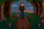 F#&K, I now realize my edit looks faaaar too cosy, with the combination of mushrooms and the sun. Again, at this small size it's hard to do stuff like having a happy background with a creepy frame. The happiness infects everything. Oh well. I do like the creepy grass, at least. Oh, and I changed the shading on the pants a bit, and the nose. Edited by CELS - 09 November 2011 at 3:44pm |
|
|
IP Logged |
|
|
Andrew-M
Commander
Joined: 08 February 2011 Online Status: Offline Posts: 195 |
Posted: 09 November 2011 at 6:10pm |
|
coolsarahkry, thanks i'm glad they look good so far.
Onek, that's a good edit. It's not really what i'm trying to do though. The reason the guy doesn't look like he cares about the monsters is because he doesn't care. The monsters are supposed to be metaphors for people who give him drugs and the forest is supposed to a metaphor for drugs. He's just entering the forest(as in just starting to do drugs) and the monsters(people) are trying to get him to do more. I'm not the best with metaphors so hopefully this makes sense...
I tried making wider pupils:
 I'm not sure if it looks good though.
Also i'm not trying to have a comicish look so I don't think a big head and small body would work. I don't think the background will work either, like CELS said the happiness infects everything.
CELS, that grass looks really good. I'm going to try and make the grass look more like that. Thanks everyone for the help (:
|
|
|
IP Logged |
|
|
coolsarahkry
Midshipman
Joined: 23 June 2020 Online Status: Offline Posts: 90 |
Posted: 10 November 2011 at 3:28pm |
|
You need help with color.
If you want a shade of a color for light, make it a warmer color. If you want a shade for a shadow, move it towards the blue, the colder colors. Also, your colors are way too saturated, and that may be why the forest looks so bright!  Edited by coolsarahkry - 10 November 2011 at 3:29pm |
|
|
IP Logged |
|
|
Andrew-M
Commander
Joined: 08 February 2011 Online Status: Offline Posts: 195 |
Posted: 13 November 2011 at 8:42pm |
|
Thank you for the help coolsarahkry:
 |
|
|
IP Logged |
|
|
Friend
Commander
Joined: 01 April 2015 Online Status: Offline Posts: 710 |
Posted: 13 November 2011 at 9:26pm |
|
yup. Make the forms bizarre. Wiggly trees, Spiky grass, Give him a giant bloated head; whatever you can think of. Colors could definitely add a lot to this, and you don't have to go overboard with them, just make them more interesting and a bit distorted.
Edited by Frost Butt - 13 November 2011 at 9:26pm |
|
|
IP Logged |
|
|
Andrew-M
Commander
Joined: 08 February 2011 Online Status: Offline Posts: 195 |
Posted: 14 November 2011 at 9:42pm |
|
I tried making the colors weirder and changed some other things:
 Do these colors look good?
Also does the grass in the background look better or should I change it back to how it was? Edited by Andrew-M - 14 November 2011 at 9:42pm |
|
|
IP Logged |
|
|
Andrew-M
Commander
Joined: 08 February 2011 Online Status: Offline Posts: 195 |
Posted: 15 November 2011 at 5:04pm |
|
More changes:
 Edit:Should I still change the colors of the jacket and shoes? It might be just me but I think they look good now...
Edit2:Sorry for asking so many questions, I have no idea what i'm doing  Edited by Andrew-M - 16 November 2011 at 1:39am |
|
|
IP Logged |
|
|
mixlplix
Seaman 
Joined: 22 August 2011 Online Status: Offline Posts: 2 |
Posted: 16 November 2011 at 1:38pm |
|
Dude, dont be so hard on yourself. The progress is there.
@onek: HA...  Edited by mixlplix - 16 November 2011 at 1:38pm |
|
|
IP Logged |
|
|
Friend
Commander
Joined: 01 April 2015 Online Status: Offline Posts: 710 |
Posted: 16 November 2011 at 5:25pm |
|
I would definitely change the eyes. see CELS' edit. Your eyes don't read as eyes very well. I'd stick with single pixel pupils at this size
|
|
|
IP Logged |
|
|
Qemist
Commander
Joined: 31 August 2019 Online Status: Offline Posts: 239 |
Posted: 17 November 2011 at 10:53am |
|
I still like Oneks edit so much.. and I used to be a drug user!!
|
|
|
IP Logged |
|
|
Andrew-M
Commander
Joined: 08 February 2011 Online Status: Offline Posts: 195 |
Posted: 17 November 2011 at 3:52pm |
|
mixlplix, i'll try not to be so hard on myself. It's hard though when i'm doing a lot of things wrong... Thanks for the help Frost butt:
 I changed the eyes back to how they were, changed the background, grass, some colors and a couple other things.
Qemist, i've never done drugs before so I don't know what it's like. It's hard knowing who to listen to when one person says something and someone else says something else.
I'll try to make it more like onek's edit and i'll see how it looks.
Edit:The more I look at onek's edit the more I realize that's not what I want to do. I'm really confused right now and I don't know what to do...
Edit2: I'm thinking about not working on this anymore. No matter what I do i'll be disagreeing with people who are much better artists than I am, I feel really bad for that. Whatever I do I lose.  Edited by Andrew-M - 17 November 2011 at 7:34pm |
|
|
IP Logged |
|
|
Andrew-M
Commander
Joined: 08 February 2011 Online Status: Offline Posts: 195 |
Posted: 19 November 2011 at 3:12am |
|
Sorry about earlier, i'm a little sensitive:
 I changed a couple things.
I'm sorry for disagreeing with some of the advice. I try to make things that I like and some of the advice i've been given takes away from what I think this should be. Thank you all for taking the time to help me, I really appreciate it.
|
|
|
IP Logged |
|
| Page of 2 Next >> |
| |
||
Forum Jump |
You cannot post new topics in this forum You cannot reply to topics in this forum You cannot delete your posts in this forum You cannot edit your posts in this forum You cannot create polls in this forum You cannot vote in polls in this forum |
|
