| Active TopicsSearchRegisterLogin |
| WIP (Work In Progress) | |
| |
  |
| Author | Message |
|
Nikonani
Midshipman 
Joined: 08 October 2021 Online Status: Offline Posts: 42 |
  Topic: [WIP] Twily and the Firefly Topic: [WIP] Twily and the FireflyPosted: 18 July 2012 at 8:22am |
|
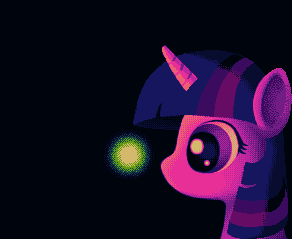
Just a pixel I've been working on lately :)
 Trying to keep the color count pretty low, right now it's at 13 but I have plans to get it back down to 12 or 11 again. Probably not until it gets to a later stage, however. I'm planning on making a background for this as well (with other fireflies and a moonlit sky) to make it a bit more interesting. As for the face, it's looking rather flat I'll admit, and it doesn't quite reflect the light perfectly so I'm still working on that. Also gonna go back and touch up the dithering more. I'm working on it right now but I'm at work and the latest rev is on my laptop, and it can't connect to the place's network so I can only post my last rev I had up online. I guess I can at least start the thread now and then post the latest WIP later today anyways :)
|
|
 IP Logged IP Logged |
|
|
grinningCat
Seaman 
Joined: 30 April 2010 Online Status: Offline Posts: 30 |
Posted: 19 July 2012 at 6:13pm |
|
This is overall great, and my only nitpick is that the back of the head looks a bit flat.
|
|
|
IP Logged |
|
|
Nikonani
Midshipman
Joined: 08 October 2021 Online Status: Offline Posts: 42 |
Posted: 19 July 2012 at 6:34pm |
|
Originally posted by grinningCat
This is overall great, and my only nitpick is that the back of the head looks a bit flat. Thanks, and I'll agree to your nitpick and even admit the same is true about the front of the face :D Since I posted this rev I've gone back and added better reflection from the firefly (which fixes the front of the face) improved the back of the face, added highlights to her hair, etc. Also edited the palette a lot to be more interesting and tight as opposed the to boring hue-shifts and brightness-ramps going on in this one (made the buffer shades act as neutralizers better by having them have less saturation, bigger hue shifts, etc.) I was even trying to reduce it down to CPC colors but couldn't find a unique shade for one or two needed colors even after scrapping it down to 8 colors :P so it's still stuck at 13 non-CPC colors. Should be able to post my update (before I start working on the background for this) by sometime tomorrow! |
|
|
IP Logged |
|
|
Mikebissle
Seaman
Joined: 14 July 2012 Online Status: Offline Posts: 17 |
Posted: 20 July 2012 at 6:37am |
|
Looking good so far--the way the light is reflecting off her hair does not look right to me. It's hard to put into words, so I just made an edit.
  I also tried to do some work on the horn. Right now it looks like a nub. What I've Googled of official art of Twilight Sparkle is somewhat inconsistent-- sometimes her horn looks like a little lump poking out of her head, other times it's longer and pointer. Either way I tried to make it look more conical. It doesn't mesh at all with the rest (dithering is not my friend!), but I hope it helps. I inverted the inside of the ear, but after doing some more referencing of real-life horse ears in profile and 3/4 view, you may have been on the right track after all. Sorry, disregard that change.  Looking forward to seeing what this will look like finished! |
|
|
IP Logged |
|
|
Nikonani
Midshipman
Joined: 08 October 2021 Online Status: Offline Posts: 42 |
Posted: 20 July 2012 at 6:48am |
|
Thanks for the edit! :) Yeah, I think you're definitely right on both accounts -- the lighting looks a lot more correct with your rev, and while the horn you made is rather long and maybe slightly thin, mine was way too dithered (though to match what I've already done I'm going to have to have it somewhat dithered still) and "nub" looking -- I didn't use a reference for what I've done so far, but following your suit and looking at one for the horn does indeed show, while inconsistent with how much it sticks out (well, it is a cartoon show, so the artists probably aren't too strict on something as minor as that :P) it definitely is more pointed than what I have.
Hopefully I'll have an edit included what you suggested and what I've done behind the scenes since posting this tonight -- I'm hoping to put a bullet in this one by the end of the Weekend, which will take lots of work to get the background done by then but I'm really hoping that I do :)
|
|
|
IP Logged |
|
|
Nikonani
Midshipman
Joined: 08 October 2021 Online Status: Offline Posts: 42 |
Posted: 24 July 2012 at 5:08pm |
|
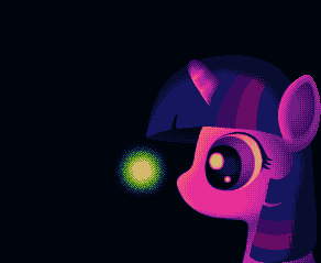
Meh, still playing with a reflection of the light on the hair, but... Meh. Essentially done with Twily herself. The firefly I was gonna change the (hard to see) dark blue surrounding it with the lighter blue on the bright part of her hair -- I tried it out in MS Paint real quick (had no access to Gfx2 earlier) and it works great, but when I try to save/copy the image MSP complete mucks up my colors, so I'll have to do the recolor in grafx2 tomorrow.
After fixing hair and stuff, I'll be onto the background. 
Also, mike, as for the dark "highlights" in her hair you continued into the shadow area -- while it looks good, I thought it was slightly distracting to the viewer when I tried it out. Did try it out however, and it was definitely something work considering, so thanks for that third great part of that edit :) |
|
|
IP Logged |
|
|
Yuran
Commander 
Joined: 10 November 2024 Online Status: Offline Posts: 329 |
Posted: 24 July 2012 at 8:43pm |
|
A drop shadow of the horn?
|
|
|
IP Logged |
|
|
AirStyle
Commander
Joined: 13 November 2017 Online Status: Offline Posts: 376 |
Posted: 24 July 2012 at 8:56pm |
|
Technically, the horn should pop out of the hair at the very top. If this is a true profile of the unicorn, then the horn shouldn't be anywhere else, otherwise it'll look like it's sitting on the forehead at an angle.
|
|
|
IP Logged |
|
|
Blarget2
Seaman
Joined: 18 June 2012 Online Status: Offline Posts: 14 |
Posted: 24 July 2012 at 9:17pm |
|
you obviously have not seen official images of Twilight, Airstyle.
 Edited by Blarget2 - 24 July 2012 at 9:18pm |
|
|
IP Logged |
|
|
AirStyle
Commander
Joined: 13 November 2017 Online Status: Offline Posts: 376 |
Posted: 24 July 2012 at 9:41pm |
|
:| huh....okay then...
|
|
|
IP Logged |
|
|
Nikonani
Midshipman
Joined: 08 October 2021 Online Status: Offline Posts: 42 |
Posted: 25 July 2012 at 6:08am |
|
Originally posted by Blarget2
you obviously have not seen official images of Twilight, Airstyle. ^ this.
While I am stylizing certain parts of Twily's face, the horn's positioning is something I'm trying to keep the same the best I can.
|
|
|
IP Logged |
|
|
tzen
Seaman
Joined: 15 July 2012 Online Status: Offline Posts: 35 |
Posted: 25 July 2012 at 10:04pm |
|
I think maybe the horn should be a tad pointier at the tip. Right now it kind of looks like a... carrot? But not pointy like it was before, it needs to bevel down a bit on the top side.
Can't say I understand the appeal of these ponies, but I think it's a nice take on the official with your own style. |
|
|
IP Logged |
|
| |
||
Forum Jump |
You cannot post new topics in this forum You cannot reply to topics in this forum You cannot delete your posts in this forum You cannot edit your posts in this forum You cannot create polls in this forum You cannot vote in polls in this forum |
|
