| Active TopicsSearchRegisterLogin |
| WIP (Work In Progress) | |
 Topic: Background troubles - C&C are welcome ! Topic: Background troubles - C&C are welcome ! |
  |
| Author | Message |
|
Godjam
Seaman 
Joined: 17 June 2013 Online Status: Offline Posts: 12 |
  Topic: Background troubles - C&C are welcome ! Topic: Background troubles - C&C are welcome !Posted: 17 June 2013 at 2:25am |
|
Hello everybody,
This is my first post here, so let me say I'm glad to be a part of the community :) What's made me come here? I have a little problem that's begin to drive me crazy, maybe you could help me. I've made a game, a small little game, but with (I believe) some funny mechanics. I've made some fine pixel art for it, but not all is good. I've what I've called a "Black Background Trouble". Here is a sample of my problem: 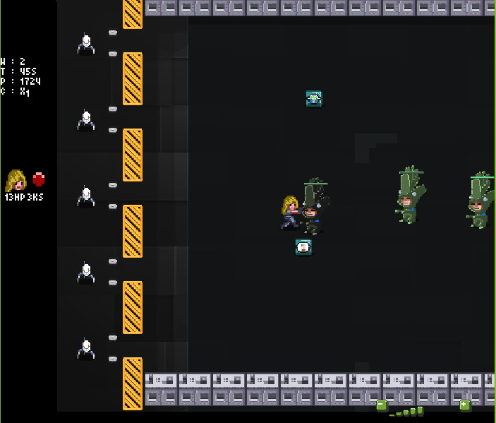
In my view there are three main problems: 1- The dark grey background. 2- The light grey buildings. 3- The black background of the left info panel. Yes, It's ugly! The background is very dark, it is a dark street sample and I believe it is too "poor". I've spent hours to make something bright, with nice bluish shadows and orange highlights, but I've failed, that's why I need you help! So please, give me your comments, feedback and/or ideas in order I solve my problem! Thanks! All this pixels were done using Gimp and ASEprite. [Note : the following is not directly pixel-art related, it's just some precision given on the game.] Here is an animated gif of this game : 
In order to having a better idea of the game, you can read an introduction to the game mechanisms here: http://www.qilineggs.com/2013/06/lonestars-presentation.html. You can also find links, at the end, if you want to play. [end of note] Cheers, Godjam Edited by Godjam - 18 June 2013 at 2:32pm |
|
 IP Logged IP Logged |
|
|
Godjam
Seaman
Joined: 17 June 2013 Online Status: Offline Posts: 12 |
Posted: 17 June 2013 at 3:56am |
|
Hello all,
I've edited the main post in order to make it clearer and show more precisely my problem. Thanks. Godjam. |
|
|
IP Logged |
|
|
Raf
Commander 
Joined: 18 January 2013 Online Status: Offline Posts: 109 |
Posted: 17 June 2013 at 4:29am |
|
You can break up the blackness by adding in lines (like the middle of the road dotted line, or parkinglot lines or such). Sewer lids can help breaking things up a bit as well. To add a dash of colour, you could put stuff like trash bins, letter boxes, barrels, crates, littering trash, lightposts, etc.
|
|
|
IP Logged |
|
|
skaytr
Seaman
Joined: 04 June 2013 Online Status: Offline Posts: 34 |
Posted: 17 June 2013 at 5:39am |
|
I'd like to ask a few questions if that is okay?
It's kind of hard to tell where the game is actually set. In the picture especially, before I read those were buildings I assumed they where mechanical platforms of some sort. - What time period is it set? - What time of day is it set? - What is the angle of perspective? - What is the back story of this game? You don't really need to answer those questions in this forum, but thinking about all of those should help you get started in the right direction. on a strict pixel art level, the buildings I feel are too small compared to your characters. Unless of course you are going for more of an over-world style - in which case you could simplify the environment even more. |
|
|
IP Logged |
|
|
Godjam
Seaman
Joined: 17 June 2013 Online Status: Offline Posts: 12 |
Posted: 17 June 2013 at 9:04am |
|
Hello,
First, thanks for your replies. @Raf: I like the idea of parking lines and sewer lids. Actually there is a middle road line, you can see it on the first image, but yeah it's in dark gray on a darker grey road ^^. Thanks anyway, I keep the ideas. @Skaytr: I think your questions are quite good. The game has only one arena, this road part. The buildings are not platform, but when a boss spawn, it destruct a few buildings, in order to create a new spawn point for enemies. About the time period: in my mind, the heroes are "trapped" into an empty underground town. A kind of huge shelter controlled by the evil Legumens. This being said, I choose a dark background, and it reminds the night, but I believe it's the easy choice. I would prefer something maybe more in the blue tones. About the POV, it's a 3/4 top view à la "Seiken Densetsu" (I'm remarking now the crates don't fit this view) Now the background. The Lonestars are another secret agency that has been sent to stop the imminent Legumens invasion from their base located into New Mexico secret underground base. The Lonestars are the funky guys and the vegetables are the sect that believes in a strange new order where veggies control minds, people and money. 
Last point about the building size. Building are here as area delimiters. They are very small because I don't want them to hide the game arena. |
|
|
IP Logged |
|
|
Raf
Commander
Joined: 18 January 2013 Online Status: Offline Posts: 109 |
Posted: 17 June 2013 at 12:25pm |

Here you go, some ideas for colour schemes (taken from posters like http://www.sffaudio.com/images10/BrokenSeaAudioProductionsEscapeFromNewYork565.jpg, http://www.cvltnation.com/wp-content/uploads/2013/03/Escape_from_New_York_1920x1080.jpg and http://fc01.deviantart.net/fs71/i/2011/196/2/e/escape_from_new_york_by_artmonkey5000-d3tfl2n.jpg) Just look up reference pics like that and use the colour picker to steal colours :P |
|
|
IP Logged |
|
|
Godjam
Seaman
Joined: 17 June 2013 Online Status: Offline Posts: 12 |
Posted: 18 June 2013 at 12:51am |
|
[Deleted, because of multi posting]
Edited by Godjam - 18 June 2013 at 12:52am |
|
|
IP Logged |
|
|
Godjam
Seaman
Joined: 17 June 2013 Online Status: Offline Posts: 12 |
Posted: 18 June 2013 at 12:52am |
|
Hello,
Thanks again for your reply and your interest. The posters you link are really glam, I see the main colors are mostly dark grey and dark blue :/ so I wasn't so far. I like the blue tone you found and apply on the ground. The application is a bit rough, but anyway it's already quite cool ^^. I realise it could be easier for you to give me your advice if I post the original assets. So here they are : Buildings   
The ground 
An hero 
The enemies     
Some items 
  
Expecting it will help to understand my problem. See you. Godjam. Edited by Godjam - 18 June 2013 at 12:53am |
|
|
IP Logged |
|
|
Raf
Commander
Joined: 18 January 2013 Online Status: Offline Posts: 109 |
Posted: 18 June 2013 at 1:37am |
|
I'm not gonna recolour your art for you :P The reason the colouring was rough, was because I did it quickly with the fill tool, and there must've been some artifacting or such in the grey, as it coloured a few pixels and left others out.
Anyways, you now know what colours to use, so you can play around and figure out what you like most ;) |
|
|
IP Logged |
|
|
ultimaodin
Commander
Joined: 04 May 2010 Location: Australia Online Status: Offline Posts: 162 |
Posted: 18 June 2013 at 8:39am |
|
Just because it's a night scene doesn't mean everything needs to be black. Everything still needs to be readable. Here's an edit (colour reduced down to 16 colours for ease):
 |
|
|
The world is but a shadow of emotion, cast in shades of grey.
|
|
|
IP Logged |
|
|
Godjam
Seaman
Joined: 17 June 2013 Online Status: Offline Posts: 12 |
Posted: 18 June 2013 at 2:31pm |
|
Hello,
Nice to see you! @Raf: WHAT? U do not work for others? what the hell?
@UltimaOdin: thanks for your reply, I like the light-up you have done and I totally agree with you on the readability. That's the main reason I left the background grey, actually to focus players attention on the game, not on the background. But the result is a dark grey background. Anyway thank you for your replies. I spend a bit of time to make some pixels and rework the background using your ideas and colors tones. I think about it and I believe the problem is that it's not a "pixel art" background. I also rework crates and buildings, making them more "randomizable". Here is the result: New background 
Buildings   
Example of crates   
And the in-game version: 
(Yes, it's strangely scaled, sorry about that) See you. Godjam. Edited by Godjam - 18 June 2013 at 2:48pm |
|
|
IP Logged |
|
|
Raf
Commander
Joined: 18 January 2013 Online Status: Offline Posts: 109 |
Posted: 18 June 2013 at 2:48pm |
|
Dunno 'bout the strangely scaled. I just love the way it looks now :D Well done!
|
|
|
IP Logged |
|
|
Godjam
Seaman
Joined: 17 June 2013 Online Status: Offline Posts: 12 |
Posted: 18 June 2013 at 2:49pm |
|
Nice! thanks!
|
|
|
IP Logged |
|
|
Godjam
Seaman
Joined: 17 June 2013 Online Status: Offline Posts: 12 |
Posted: 21 June 2013 at 4:08am |
|
Hello all,
I come back here, after a reflexion span, I'm not yet totally satisfied by these pixels. I continue to find this scene much too dark. I don't know, I do not feel this so "fun". Maybe the building are still to grey or the background not enough colored, maybe with some light effect or glow shaders it could be better ? What do you think about it ? Have you any advice (except take a coffee and relax ^^ ) ? Godjam. |
|
|
IP Logged |
|
|
Godjam
Seaman
Joined: 17 June 2013 Online Status: Offline Posts: 12 |
Posted: 05 July 2013 at 2:32am |
|
Hello all,
I back here for the last update of this work. Here is the final result of this wip  : :


As you can see it's most a rework of colours and on the building (you can see it on the top of the 2nd image) Another point : you can find a promo video of this game here : LoneStars PlayStore promo video See ya ! Godjam |
|
|
IP Logged |
|
| |
||
Forum Jump |
You cannot post new topics in this forum You cannot reply to topics in this forum You cannot delete your posts in this forum You cannot edit your posts in this forum You cannot create polls in this forum You cannot vote in polls in this forum |
|
