 | Active TopicsSearchRegisterLogin |
| WIP (Work In Progress) | |
 Pixel Joint Forum : Pixel Art : WIP (Work In Progress) Pixel Joint Forum : Pixel Art : WIP (Work In Progress) |
 Topic: House critique Topic: House critique |
  |
| Author | Message |
|
Paralic
Seaman 
Joined: 08 June 2015 Online Status: Offline Posts: 4 |
   Topic: House critique Topic: House critiquePosted: 28 July 2014 at 5:14pm |
 I'd like some feedback on this please, thank you. |
|
 IP Logged IP Logged |
|
|
jalonso
Admiral 

Joined: 29 November 2022 Online Status: Offline Posts: 13537 |
Posted: 28 July 2014 at 5:31pm |
|
What are you making or trying to get to?
We know its a house ;) |
|
|
|
|
|
IP Logged |
|
|
Paralic
Seaman
Joined: 08 June 2015 Online Status: Offline Posts: 4 |
Posted: 28 July 2014 at 11:21pm |
  Well, its honestly more of a technological wall with a door on it. I'm trying to figure our the best way to render it. I'm particularly interested in someone improving the "house" for me, and then explaining why they changed what they changed. I feel like the larger the piece is as far as pixel art goes especially, the more detail you need for it to look properly, otherwise it looks strange or unrefined. I think that's because of the nature of the clusters of pixels touching together. Can anyone give some insight into this? Edited by Paralic - 28 July 2014 at 11:31pm |
|
|
IP Logged |
|
|
Ego
Midshipman 

Joined: 19 May 2015 Online Status: Offline Posts: 44 |
Posted: 29 July 2014 at 2:37am |
|
I'd be willing to work with you a bit on the idea (and potentially edit) but I have a few potentially leading questions, basically asking some specifics of the piece.
* We have a fairly technological wall with a door on it, okay. Do you just want a kinda future-y technological look, or do you have a specific look in mind? I can see the stitched-together-sheet-metal look you're going for, so I'm guessing that's what you're looking for. * What perspective are you going for? A three-quarter type view with a straight-on perspective from the front? It impacts what you do with the curves. * Is there a context to put this in; to lead right at what I'm really asking, is this a potential game asset/part of a scene? If so, what do you envision for the rest of things? * Is the roof flat? Or is that a placeholder? Alright, I'm done harassing you about the sitch for a moment, so let's talk pixels a bit more specifically. The context can change just about anything depending on the circumstances, but I'll talk about it in an isolated environment running on "technological wall with a door." Light Source: The light source in the piece is inconsistent. The shining on the right and the shadow also curving around the wall imply a top-left lightsource (if the roof is flat, and thus large regions of highlight should be on the roof too, or perhaps an inconsistent light source if the placeholder region is solid. The door itself is a complex space light-wise. The dark cast shadow follows a top-left light source (which is what I suspect most), but the nature of cast shadows is that they do not gradually transition to the light, meaning that it should be bright immediately on the edge of the cast shadow. Since there seems to be a secondary shadow in the top-right of the door, it indicates a top-right light source. The slight curve on the highlights indicates a bit of a top-left light source, but a diffuse light instead of the hard light creating a cast shadow. The sudden change of angle of the shadow's curve to the right of the door implies a sudden angling of the wall after the door, but that doesn't match the smooth curve of the base of the wall. I could keep going a bit more, but that mostly covers it. Visual example:  To step back to high concept, if this is for a situation beyond just a piece (eg it's for a game or mockup) consider what a light source like that does to a whole game. But enough of that, back to just the pixels. Palette: In general, the palette is pretty cool. I like the blueness of the metal (I think?), and the dull orange-y red of the door is a nice counterpoint. I have three things. Let's start with the illustration this time. 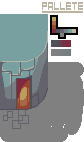 I recommend clicking it to zoom in a bit. 1) Palette size. You currently have 10 colors + transparency. That's not a problem, but if you have a particular conventional color goal in mind, 10+trans is pretty nonstandard. If you're not going for any standard restriction type don't worry about it. 2) Underneath the black-outlined palette map are two pairs of colors dithered between each other. The top one is between the darkest red and the darkest blue. Their problem lies not with their individual colors but with their relative positions in the piece - the red is posited as the darker of the two color based on being a cast shadow, but regardless of order it should be visible which one is actually darker. Their relative closeness to each other makes the outlining around the door hard to interpret. 3) The bottom color comparison is between the middle blue and the grey of the shadow. If you zoom all the way, yeah, they're different colors. If you zoom back to normal, you might be able to tell them apart if you squint. If you look at them in the piece where there are no large connecting spots between the two colors, they might as well be the same color. And so, why not just make them the same color? Shrink the palette a touch. Maybe the final color is a compromise between the two current ones, or maybe you just replace one with the other, or whatever. Form: I already mentioned the curve of the shadows not quite matching the curve of the base/top of the wall. The shadow on the left edge of the image doesn't really make sense regardless of the light source. Maybe it's from something off the the left of the piece edge and the light source is coming from the left, making a cast shadow? Maybe? The biggest thing I want to talk about is the patchwork metalwork making up the wall (or maybe it's very poorly-laid masonry? The blue color and the technological intention makes me think metal). I have two major things about the wall. * Regardless of whether it's metal or stone, it doesn't have much texture. I can see the rim-highlighting you're doing on a couple of the sheets, but it's both not consistent enough (as the sheets don't continue to be defined across the whole wall and not even all the ones that are there get any edge highlighting, just the lightest blue ones), and it's not really enough on its own I don't think. * The sheets/stones themselves don't actually line up! Their edges are staggered from each other both horizontally and vertically, which isn't really how anything is constructed ever. I admit, it gives it a bit of a ramshackle look that's kinda neat, but it's simply baffling how it would actually be built that way. I have a visual example where I put it all together that probably explains that bit better than my words do, but before that I have one more thing. The door is on the curve right now. There's a reason we don't build curved doors for buildings, especially on a curve that significant - they're complex to build and open weird. Having the door itself be straight-on fixes that a bit, plus makes it a touch easier to shade. Here's the edit:  Big things: the door isn't a perfect blend into the building, but I like thinking of it in a game-y context so doors should stand out a bit. That's just my personal interpretation, not necessarily a thing to do. The shadow follows the wall now, and the highlights fade out more gradually around the wall. I went with a bit of a metal-y texture - getting that texture really is a matter of experience for me, figure out a metal texture of your own by looking at metal, at pixel-art-metal, and at your own experimentation. We recently had a Weekly Challenge here about limited-palette robots and I think the entries are still on the front page of the site, that ought to be a good source of people trying out different metal looks. If you have specific questions about something I did, go ahead. Also, with regard to your more theory-based thing there, I'd say that yes, larger pieces often demand a bit more detail. This isn't necessarily true, but because you have more opportunities to introduce detail it often can look empty without it. It brings up more chances for issues of focus: if you put detail work into one area, if he rest isn't as well-detailed it looks either lazy or unfinished, even if all the shapes are right and smooth and good. As long as your level of detail is uniform throughout the piece, you can get as large as your want without issue, but that's pretty rare. Of course, that focus trick (where a bit might have a lot of detail and other areas have less) can be an interesting visual technique if you use it intentionally, but most of the time it's just a lack of uniformity. Hope this helps with the sort of advice you were looking for! |
|
|
IP Logged |
|
|
Paralic
Seaman
Joined: 08 June 2015 Online Status: Offline Posts: 4 |
Posted: 29 July 2014 at 4:37am |
|
This is exactly the type of analysis I was looking for. I want to thank you for taking the time to type all of that out for me. It really does help a-lot, and maybe some other people will read this and learn something too, or even give their own conclusions on it. I'd imagine some of the veteran pixel artists have very strong opinions on certain aspects of pixel art. I thought that overly-defining the light source would be a bad thing because it can sacrifice reusability, depending on how you tile it. I didn't define the lightsource well. (It should follow the cross-contour, as you said to suggest a shape.) I originally went for a rough top-left light source, the newer one is less left and more top if that makes sense. Answers to your questions: *Stitched together sheet-metal look. *The perspective is non-existent. There is only a top portion, that represents things "above the horizon line", and a front face. *Potential game asset. *The roof is supposed to just be flat. Thought I'm curious as to what your design may be if I said it was a placeholder. What would you recommend? What I changed:
------------------------------------------------------------  My new questions:
Edited by Paralic - 29 July 2014 at 2:46pm |
|
|
IP Logged |
|
|
Ego
Midshipman
Joined: 19 May 2015 Online Status: Offline Posts: 44 |
Posted: 29 July 2014 at 11:02am |
|
Great progress!
The new, concretely-defined light source works much better, I definitely can tell where the light is regardless of where I'm looking at on the piece. The more top-based light source is also more manageable for game materials I think. As far as placeholder vs flat roof, if you'd said it was just a placeholder it would have caused some more shadow-casting depending on the exact light source - enough of an angle to cause the cast shadow on the door would have been more than enough for additional stuff up top cast fairly large shadows. I've got another comment about the roof, but it'll come in a bit. The colors work great now, that's really sharp-looking with the general blue look overall with the purple shadow outline. Texture is hard! I'll start off by saying that I like what you've got, but it reads a bit more to me like stone than metal. That's a degree of interpretation, but I think the occasional pocked look tends itself well to stone while the shining look goes well with metal. That's not a rule that the real world runs by, but it's a powerful shorthand that makes it easier for symbolism to work. The shines certainly don't need to be as complex as mine - fewer strokes that are more consistent across the sheets could get the job done easier, but it's still a different method. There's no reason your metal has to be the way I'm saying - I have a particular style of metal personally, and others would probably tell you their own are different. The fairly constant rules of metal in art are that shiny metal has high contrast and is reflective. Since reflective isn't really a reasonable expectation of a game asset, playing with very bright specular shines is your main tool. On texture still, jaggies and texture. Depending on exactly what techniques you use for adding the texture, it can be mitigated or not. Glacing at mine, I have very few jaggies directly - I stuck with 45-degree angles and horizontal/vertical lines and smooth curves (on the door, and curving around the side). I didn't want to rely on dithering's color-blending properties. Outside of mine, jaggies are a tough proposition. As a general rule: they're jarring. If it looks jagged, refine the curve or blunt the cluster with smart anti-aliasing. I personally am really big on smooth curves, so I usually round it out, but even imperfect curves can be smoothed with work. If your jaggies are mild enough to not force the eye's attention, they can be alright, but if they draw attention away from important things it's too much. For me, the solution would be to keep the jaggies on low-contrast. To continue a bit with texture I'm going to look at something else. If you don't know it, Barkley 2 (aka The Magical Realms of Tir na nOg: Escape from Necron 7 - Revenge of Cuchulainn: The Official Game of the Movie - Chapter 2 of the Hoopz Barkley SaGa) is an indie RPG that was Kickstarted about a year and a half ago. It's a cyberpunk game, and your piece's essence kept making me think of it for some reason. All of its pixel art is by Francis Coloumbe, who goes by the name FrankieSmileShow here. Here's a screen I got from Google Images:  https://s3.amazonaws.com/ksr/assets/000/268/066/ac4bb4e58ac45be16539a4265f811916_large.png?1353230293 That's a pretty detail-rich image - Francis is a great artist. Two important things stick out to me. The first is the CRT-like scanlines - subtle, and intrinsically tied to the game, so just ignore them. The other thing is that there's a lot of metal in this image! The door on the right, the car, the poles holding up the basketball hoops, the chains of the hoops, the chain-link fence itself, the shopping car. The common traits I see are in a sudden transition between light and dark when the planes change, a slight implication of edge-highlighting, and a real brightness to the metal shine - it's the brightest thing in the piece after the whites on the character sprites (which are engineered to stand out over the background no matter what). It's a pretty good study of what metal texture can be, and the genre isn't too far off of what you're doing. Barkley is a bit grimier than this piece, but you can still take the ideas. Getting off the texture finally, about my edge highlight that you pointed the green arrow at. One part is yes, to prevent a bit of banding, though it's not a majorly banded thing already. I had a couple motives. First, it fades on along with the shadow of the building - I was going with a fairly left-justified light source. Second, I broke it in places because I personally like the aesthetic of hinting at the curve rather than spelling it out. Third, the curve wasn't perfectly smooth as it was - it's easier to fix curves with implications than it is to use concrete lines, with the gaps acting mildly like anti-aliasing. Lastly, the gaps on the front edge line up with the seams in the metalwork - I didn't have a big reason for that beyond thinking it looked pretty good and feeling like I didn't want a big long thin line like that, just out of taste. So in general, it's a great revision. I have two more notes. 1) Is the door an interact-able thing or set dressing? If you can interact with it, is there any difficulty with it being angled and the player likely being bound in cardinal directions? 2) How heavily do you want this to say "house" as opposed to "wall with door"? Because on top of the texture of the wall, another way to add interest to the wall without dealing in complex shading is to add more detail-y bits. A name or number plaque on the wall (maybe illegible at this distance), a small box for mail, a couple plants in pots around the entrance, examples of the telltale signs that people live there. It's also a way to make the roof interesting - many places with flat roofs use them as additional living space, so the signs that perhaps someone is making use of the roof (a small rooftop garden, a chair they sit in, a couple bottles, the spare junk they don't keep inside, just as examples again) is a way to ad detail to emptyness. Looking back at the Barkley screen, it's how he keeps visual interest, by adding the bis that make it a populated place - holes in the fence, a spare tire, a broken and opened up care, bottles and boxes, etc. There's no NEED to add these things, but having more going on can make the job easier on your texturing work. Keep it up, you've got a good sense working with this. Edited by Ego - 29 July 2014 at 11:04am |
|
|
IP Logged |
|
|
Paralic
Seaman
Joined: 08 June 2015 Online Status: Offline Posts: 4 |
Posted: 31 July 2014 at 11:57am |
 http://i.imgur.com/2B5nGrN.png Answers to your questions: *The door is interactable * Maybe more of an apartment What do you think of how I handled the boxes and the bottle? Edited by Paralic - 31 July 2014 at 12:02pm |
|
|
IP Logged |
|
|
Ego
Midshipman
Joined: 19 May 2015 Online Status: Offline Posts: 44 |
Posted: 31 July 2014 at 2:19pm |
|
I like 'em. Do you intend to do the ground with tiling or having the character exploring large unique screens? The stuff on the ground is easier in the latter and based on this I suspect your might be handling it that way, but I think it's a good thing to consider.
If the door is interactable, consider that the player is likely being controlled digitally (as opposed to analog - meaning with d-pad or arrow keys or WASD). Given the limited directions that allows the player to move, does a character moving straight up into your slightly slanted door cause any weird complications for the animation? That's why I'm suspicious of a door on an angle. If you're confident that it won't cause any weirdness, keep it as-is. The bottles are nice. The one thing I think they're missing is a feeling of connection to the ground. Expanding their shadow a bit where the bottle rests on the ground could give that sense of contact. The boxes are currently quite simple, it might be worth detailing them a bit further. As bases though, the left one is fine, but the right one is a bit out of perspective. Look into using y=2x lines (meaning two pixels in one direction for every one in the other, like 2 horizontal for each 1 vertical shift - we need real terms for these common lines we use...) for the box instead of 45* lines. The boxes too could use a bit of a contact shadow to connect the object to the ground. Gotta say though, it's amazing how just expanding the piece a little has done a lot for its effectiveness. It feels much more solid with the rest of the scene there. Lookin' good man. |
|
|
IP Logged |
|
|
jalonso
Admiral
Joined: 29 November 2022 Online Status: Offline Posts: 13537 |
Posted: 31 July 2014 at 3:50pm |
|
Its looking real nice.
At this stage not really knowing where you are going seems that either the ground or the top plane should have plenty of texture in some way. Probably ground so its weighed down. |
|
|
|
|
|
IP Logged |
|
| |
||
Forum Jump |
You cannot post new topics in this forum You cannot reply to topics in this forum You cannot delete your posts in this forum You cannot edit your posts in this forum You cannot create polls in this forum You cannot vote in polls in this forum |
|
