| Active TopicsSearchRegisterLogin |
| WIP (Work In Progress) | |
| |
  |
| << Prev Page of 15 Next >> |
| Author | Message |
|
jtfjtfjtf
Commander 
Joined: 17 July 2018 Online Status: Offline Posts: 162 |
  Posted: 14 November 2014 at 8:46am Posted: 14 November 2014 at 8:46am |
|
I think you should go back to setting up the shapes for the forms and not get too into detail.
Here's your older body broken into shapes, shaded, and then since you studied anatomy you can see where the anatomy would go. Anatomy is like forms on top of forms. It's 4x, so probably too detailed but it can help spot where the forms are lacking, like your current guy is lacking in obliques making him look flat whether it's shaded or not.  |
|
 IP Logged IP Logged |
|
|
AshCrimson
Commander
Joined: 24 April 2020 Online Status: Offline Posts: 606 |
Posted: 14 November 2014 at 8:57am |
|
Thanks so much for the sketch JTF i appreciate it immensely. Sorry for seeming dumb about this.

|
|
|
IP Logged |
|
|
AshCrimson
Commander
Joined: 24 April 2020 Online Status: Offline Posts: 606 |
Posted: 14 November 2014 at 10:38am |
|
Quick update, tried to break it down into rough shapes like JTF recommended:
 Edit: Update, now with actual arms Edited by AshCrimson - 14 November 2014 at 11:38am |
|
|
IP Logged |
|
|
jtfjtfjtf
Commander
Joined: 17 July 2018 Online Status: Offline Posts: 162 |
Posted: 14 November 2014 at 11:39am |
|
For initially building the character out of shapes, don't go to shading immediately. It's mainly to check proportion and build and make sure everything is right so things can then be built on top of it.
Shapewise, there wasn't too much off with the body I decided to draw over. It was just lacking a little in the side for depth and the groin was glossed over. The leg also felt a little off. |
|
|
IP Logged |
|
|
AshCrimson
Commander
Joined: 24 April 2020 Online Status: Offline Posts: 606 |
Posted: 15 November 2014 at 8:00am |
|
Yeah you're right about the proportions. Checked them versus the 8-head Chart thing in Loomis' book and realised the pelvis/Crotch is too low.
Here's my latest edit:  Raised the pelvis/crotch, redid the left arm, redid both of the upper legs, the head, tried to define the torso and chest. Hopefully the arm and legs look better, also tried to define the groin, not too confident on the result though. Tried not to concentrate on the shading, but more on the overall proportions and shape. A key to the coloured lines (barring the orange ones): Red: Indicating where the shoulders should be. For future reference, i'm using loomis' Figure drawing book and it says shoulders should be 1/3 of the second head line/bar thing. White: Where the rear should be. I think i might need to raise it again. Blue: Where the crotch should be. Yellow: Where the hands should be, if both are resting down by the sides (might have made the arms too long, i'll need to recheck their proportions) |
|
|
IP Logged |
|
|
jtfjtfjtf
Commander
Joined: 17 July 2018 Online Status: Offline Posts: 162 |
Posted: 15 November 2014 at 11:27am |
|
The reason i'm suggesting you forgo shading for now is so you can practice lighting from any angle later.
The 8 head body has easy to find landmarks. The 2nd things listed are around that area as well. -Bottom of Chin -Nipples, bottom of shoulders (how far the pecs extend beyond this depends on build) -Belly Button, bottom of 3rd ab set -Groin (1/2 point of body), wrists -Bottom of knees (1/2 point of bottom half of body) One thing that you should be aware of is the neck, traps, shoulder, collarbone assembly. I made an amended sketch.  The traps and deltoid muscles connect to the collarbones and it's visible on a lot of people. It spans from the top of the shoulder to the sternum. I think getting familiar with ab and oblique placement would also be beneficial. |
|
|
IP Logged |
|
|
AshCrimson
Commander
Joined: 24 April 2020 Online Status: Offline Posts: 606 |
Posted: 17 November 2014 at 4:32am |
|
Thanks again for the drawing. It's true i need to work on and study more anatomy. I'm going to start again from scratch and focus more on the general shape of the body rather than just shading, as i'm probably focusing too much on that.
|
|
|
IP Logged |
|
|
AshCrimson
Commander
Joined: 24 April 2020 Online Status: Offline Posts: 606 |
Posted: 17 November 2014 at 1:46pm |
|
Redid the main body and arms:
 Sorry for the shody arms, not much to work with atm. Hopefully the chest, stomach and shoulders are improved, as well as the crotch. |
|
|
IP Logged |
|
|
AshCrimson
Commander
Joined: 24 April 2020 Online Status: Offline Posts: 606 |
Posted: 19 November 2014 at 6:50am |
|
I'll post some of my smaller stuff when i get the chance, as I've been neglecting to do any of it recently.
|
|
|
IP Logged |
|
|
AshCrimson
Commander
Joined: 24 April 2020 Online Status: Offline Posts: 606 |
Posted: 20 November 2014 at 3:51pm |
|
As i promised, here's some of my smaller sprites:
 In regards to one and two: One is my basic design, without the extra anti-aliasing and pixels that 2 has, but i personally think 2 looks better and makes characters look less lanky/weak, but i am interested in hearing your opinions. I've done most of the stuff in this image in the second style. Trying to focus on readability, stances, legs, arms and making them look less boring. |
|
|
IP Logged |
|
|
PixelSnader
Commander
Not a troll! Joined: 21 May 2026 Online Status: Offline Posts: 3194 |
Posted: 20 November 2014 at 8:29pm |
|
IMO you're thinking too much in contained/individual shapes, separated by clear boundaries (and even lines) and focusing on clean/soft transitions. Humans aren't neat collections of shapes. They're a lot of complex interlocked small shapes (muscle mass), wrapped in a layer of very pliable and soft stuff (fat and skin). Shapes other than those where you can almost touch your bones, will be quite gradual and blobby.
So when you're separating shapes, you should use only a very thin line, or a gradual gradient, if even that. I made an edit: 
And you'll see that in many places, like the pecs and abs I've not really separated bits that much. And things are lighter too. The darkest brown is all but gone, and the second-darkest is less, too. People, in normal lighting scenarios, are not high-contrast objects, because skin is soft, it diffuses light, and it is even sort of translucent. Instead of that separation or smoothing, I used those pixels for actual detail such as the obliques/serrator muscles, or to separate hands and feet a bit into individual fingers/toes. I'm sleepy now and have trouble typing properly so just look at the stuffs more. Ciao. edit: updated the image url Edited by PixelSnader - 27 November 2014 at 1:43pm |
|
|
▄▄█ ▄▄█ ▄█▄ ▄█▄ |
|
|
IP Logged |
|
|
AshCrimson
Commander
Joined: 24 April 2020 Online Status: Offline Posts: 606 |
Posted: 21 November 2014 at 6:13am |
|
Thanks for the edit PixelSnader! Will review it, I'm probably overthinking it/applying things to literally. Apologies for all the frustration this is causing.
|
|
|
IP Logged |
|
|
AshCrimson
Commander
Joined: 24 April 2020 Online Status: Offline Posts: 606 |
Posted: 21 November 2014 at 1:47pm |
|
Quick update:
 Apologies for pretty much copying what you did PixelSnader. I reduced the darker shades after you mentioned skin and how light falls on it. I probably got too carried away with the serratus/obliques. I feel disappointed as i don't think i've improved recently, but thanks for persevering with me. |
|
|
IP Logged |
|
|
AshCrimson
Commander
Joined: 24 April 2020 Online Status: Offline Posts: 606 |
Posted: 23 November 2014 at 3:24pm |
|
Was looking at some of my older stuff and wanted to see if i could try to put what i've learnt into improving it, more for fun than anything else and also because im finding myself with less time to do as much pixel-art as i used to, due to job commitments.
Here's my attempt at improving 3 units from a specific culture/faction/nation:  Originally they were supposed to be inspired by ancient greece, but later decided to dial it down and add some medieval Byzantine (or at least my attempt at) elements to it, eschewing purely bronze armour. |
|
|
IP Logged |
|
|
jtfjtfjtf
Commander
Joined: 17 July 2018 Online Status: Offline Posts: 162 |
Posted: 23 November 2014 at 4:14pm |
|
The new stuff looks a lot less stiff and more natural. I think you're improving a lot.
|
|
|
IP Logged |
|
|
AshCrimson
Commander
Joined: 24 April 2020 Online Status: Offline Posts: 606 |
Posted: 25 November 2014 at 1:20pm |
|
Thanks for the comment! Did some more, tried to avoid repeating the stances and poses but it's inevitable it'll happen. Hopefully the units look different enough to remain easily identifiable:
 |
|
|
IP Logged |
|
|
jtfjtfjtf
Commander
Joined: 17 July 2018 Online Status: Offline Posts: 162 |
Posted: 25 November 2014 at 2:03pm |
|
One thing, when a character bends their knees they should be shorter than a character standing straight.
|
|
|
IP Logged |
|
|
PixelSnader
Commander
Not a troll! Joined: 21 May 2026 Online Status: Offline Posts: 3194 |
Posted: 25 November 2014 at 6:18pm |
|
All your small-res characters have very thin, weird, wobbly limbs, and rather wonky proportions for the torso vs limb length.
You're also still leaning -very- much on anti-aliasing towards a black background. This'll hurt your sprite. Try working on a medium gray, and once in a while use floodfill to compare against very light and dark colors. |
|
|
▄▄█ ▄▄█ ▄█▄ ▄█▄ |
|
|
IP Logged |
|
|
AshCrimson
Commander
Joined: 24 April 2020 Online Status: Offline Posts: 606 |
Posted: 26 November 2014 at 8:58am |
|
Thanks for the feedback both of you!
Are the limbs too long or short? I'm trying to keep them in proportion, but im guessing the small size is throwing me off. I'll also lessen the AA. |
|
|
IP Logged |
|
|
eishiya
Commander
Joined: 04 August 2022 Online Status: Offline Posts: 1109 |
Posted: 26 November 2014 at 10:27am |
|
The arms are too long, the legs are too short. It might just be that the legs' shortness is making the arms look long, so work on those first.
The poses with one leg bent look unnatural and unbalanced, like they've got one leg injured and are dragging it behind them. If you're going for a battle-ready idle post, both legs should be bent about the same. You can suggest that the leg that's more head-on to the viewer (where the bend isn't obvious) by shading the bottom part of the lower half of the leg, since it's facing downwards, away from the light. I really like the colours on these, especially the pink-golden ones on the bottom. Those aren't easy colours to pull off. |
|
|
IP Logged |
|
|
AshCrimson
Commander
Joined: 24 April 2020 Online Status: Offline Posts: 606 |
Posted: 26 November 2014 at 10:34am |
|
Thanks for the comment Eishiya, im going to re-do them, or at least redo the base until i can get it right as well as the proportions.
Just a FYI, im going by Loomis' head-proportion guide: 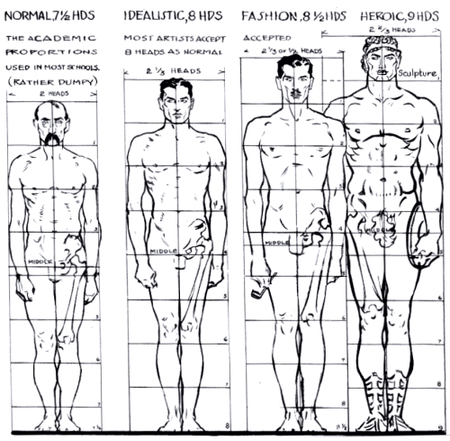 Or at least trying to adhere to it. |
|
|
IP Logged |
|
|
jtfjtfjtf
Commander
Joined: 17 July 2018 Online Status: Offline Posts: 162 |
Posted: 26 November 2014 at 1:31pm |
|
The groin is too low. It seems that you're marking the midpoint of the body at the waist.
I made an edit to show some things  The bent knees one deals with using lighting to show something is receding. The silhouette won't show that his right leg is bent (since it's facing the viewer) so you'll need to use lighting of the form to show that the leg is bending and the shin is under the thigh. Thinking in shapes and lighting those shapes helps with this, even in something small since these aren't stick figures. The standing straight one just shows measurement using the leg. If the the boot is right below the knee you can use it to measure. One thing about small sprites is sometimes people will make the head larger in relation to the body. Your bodies are normal proportions but if you choose a different style you can use other body relations to measure stuff so things still look proportional even with a bigger head (or other exaggerated body parts.) Edited by jtfjtfjtf - 26 November 2014 at 7:51pm |
|
|
IP Logged |
|
|
AshCrimson
Commander
Joined: 24 April 2020 Online Status: Offline Posts: 606 |
Posted: 27 November 2014 at 3:52am |
|
Thanks for the edit JTF!
I like some of the changes you've made in your edit, so i tried to incorporate some of them into three bases:  Main reason for three is because i felt the original one's body size, limb thickness etc made it look too strong or muscular, so made three ones: Heavy = Strong Medium = Average Light = Weak Just give some context and an explanation for my design choices in the past; the reason why the limbs have darker sections, for example the one i put an arrow next to on the light base, is because it helps to remind me of where the important joints (elbow, knees) are. I'm worried that the changes to the legs might make it more difficult if i decide to animate these, so i made another set to the right with these on it, but im curious for your input on this because although i do like my current style, i am always interested in improving it if possible. Apologies for the inconveniance. Edit: Played around with it again and made some changes:  Made the arms less thick. Edited by AshCrimson - 27 November 2014 at 11:21am |
|
|
IP Logged |
|
|
PixelSnader
Commander
Not a troll! Joined: 21 May 2026 Online Status: Offline Posts: 3194 |
Posted: 27 November 2014 at 1:43pm |

Don't skip leg day! Seriously. The legs are the most powerful muscles in your body. While arms are meant to flail around a bit and occasionally grab or hit stuff, legs are meant to keep those arms, the torso attached to it, and the head on top of it all, floating several feet in the air at all times. The legs are the thickest chunkiest muscles in the body. As an example of that, the average calf (lower leg) measures 15 inch. The average bicep (upper arm) measures the same 15 inch. My upper legs are currently... *measures* 21 inch. A bodybuilder would be really proud of such a bicep size (think Schwarzenegger) but as far as legs, well, I've visited the gym maybe a dozen times in my lifetime and currently my 'exercise' consists of walking my dog about 20 minutes a day. So. Legs. Not one pixel wide. 
|
|
|
▄▄█ ▄▄█ ▄█▄ ▄█▄ |
|
|
IP Logged |
|
|
AshCrimson
Commander
Joined: 24 April 2020 Online Status: Offline Posts: 606 |
Posted: 27 November 2014 at 2:24pm |
|
Apologies PixelSnader! Will buff up the legs. My only concern was that it might look disproportionately buff/big.
|
|
|
IP Logged |
|
|
PixelSnader
Commander
Not a troll! Joined: 21 May 2026 Online Status: Offline Posts: 3194 |
Posted: 28 November 2014 at 3:14am |
|
They're a bit thicker in my version than they would be IRL, but you're always going to have that due to the small-scale nature of 30 pixel sprites. You're stylizing the proportions of the head anyway. It's not about it being 100% accurate. It's about it looking realistic enough. Look at the sprites of RA2 for example; smaller sprites, smaller heads, but the same/thicker limbs.
Or something like these: 
Several varieties, but they're all pretty consistent in how the proportions relate to one another. |
|
|
▄▄█ ▄▄█ ▄█▄ ▄█▄ |
|
|
IP Logged |
|
|
StoneStephenT
Commander
Joined: 08 April 2021 Online Status: Offline Posts: 252 |
Posted: 28 November 2014 at 4:21am |
|
Damn, that's a handy little chart to have.
|
|
|
IP Logged |
|
|
AshCrimson
Commander
Joined: 24 April 2020 Online Status: Offline Posts: 606 |
Posted: 29 November 2014 at 2:37pm |
|
I see what you mean Snader, going to play around with changing the size of the head, hopefully it won't look too out of proportion in comparison with the other limbs.
Here's an updated set as well as an attempt to do some basic animations with them (Cloud Strife's fighting stance from ff7 and the other animation is the person/unit assuming said stance):  I still need to get the lighting down and ensure it's consistant, hopefully it's an improvement at least. If i need to lessen the AA or buff the arms, just tell me, or if the lower legs look too bent/need to be straighter, i don't mind changing them. Thanks you guys for helping me as usual! Edited by AshCrimson - 29 November 2014 at 2:38pm |
|
|
IP Logged |
|
|
jtfjtfjtf
Commander
Joined: 17 July 2018 Online Status: Offline Posts: 162 |
Posted: 29 November 2014 at 3:24pm |
|
Some of the joint movement is iffy. If that's the elbow on the blue arm it's way too high. The white leg also appears to be telescoping into itself. One thing that can help is looking at your own movements or another person's in real life. So a mirror or a friend can be very helpful. And then get into those positions.
|
|
|
IP Logged |
|
|
AshCrimson
Commander
Joined: 24 April 2020 Online Status: Offline Posts: 606 |
Posted: 01 December 2014 at 3:57am |
|
Will do so! Thanks again for the help.
In regards to the elbow; that isn't the elbow, but i wasn't sure how to make the arm reach the sword without artificially shortening it and making it inconsistant with the other one. |
|
|
IP Logged |
|
|
jtfjtfjtf
Commander
Joined: 17 July 2018 Online Status: Offline Posts: 162 |
Posted: 01 December 2014 at 5:43am |
|
Don't be afraid of foreshortening
|
|
|
IP Logged |
|
|
AshCrimson
Commander
Joined: 24 April 2020 Online Status: Offline Posts: 606 |
Posted: 04 December 2014 at 11:59am |
|
An attempt at animating:
 Tried to make it smoother, as well as make the arm movements better and look less uh, rubbish. Solely concentrated on animating the arm with the sword in and some minor movements of the torso. Edited by AshCrimson - 04 December 2014 at 12:01pm |
|
|
IP Logged |
|
|
eishiya
Commander
Joined: 04 August 2022 Online Status: Offline Posts: 1109 |
Posted: 04 December 2014 at 12:10pm |
|
Have you tried making the motions yourself, and looking at someone else try them? I think paying attention to how you move through such an attack would tell you far more about what's wrong with your animation than any wall of text. When you do this, don't ignore parts of the body you don't expect to be involved. Every part of the body is likely to be involved. The legs will turn, the free arm will counter-balance or reinforce the motion, etc.
One specific thing I want to point out is that the sword-arm appears to bend in a noodle-like fashion rather than having defined joints. This is especially noticeable when it's raised, it seems to bend upwards right below the elbow, instead of rotating within the shoulder socket. |
|
|
IP Logged |
|
|
AshCrimson
Commander
Joined: 24 April 2020 Online Status: Offline Posts: 606 |
Posted: 04 December 2014 at 12:20pm |
|
Thanks for the comment Eishiya; I don't always have a mirror to practice with, but i do try to keep in mind the rest of my bodies movement, which is a bit difficult sometimes without a large mirror, but your point is still valid, whenever i get the chance, i try to replicate said actions.
Do you think the bending issue could be solved by making the arms thicker, or is it more because of the amount of bends in the arm? I tried to keep the major joint (elbow) consistant, but i was worried if i kept the lower and upper arm completely straight it'd look almost robotic. Edited by AshCrimson - 04 December 2014 at 12:23pm |
|
|
IP Logged |
|
|
eishiya
Commander
Joined: 04 August 2022 Online Status: Offline Posts: 1109 |
Posted: 04 December 2014 at 12:39pm |
|
Evne if you had a mirror, it would be beneficial to feel the pose instead of just looking at it. Looking has its benefits, but it's too easy to focus on the details and specific parts of the body when looking, whereas feeling the pose as you do it makes it easier to understand what's moving and how. Of course, it's best to combine everything at your disposal when it comes to studying.
As for stiff motion - real humans make fluid movements with rigid limbs, and so can animated humans. Curving the actual limbs can make up for low framerates (or for the lack of real motion in still images, e.g. comics), but when you're working with animation, you shouldn't rely on it for the bulk of your fluidity. It should be something you apply at the polishing stage, not a part of your preliminary construction. If it looks stiff at this stage, then most likely you're bending the various joints in an unnatural order, or your motion direction is wrong. Feeling the pose should help with both of those problems. This is an excellent... thing to read on the subject, as well. The general idea presented in those images applies to all the joints in the body, not just the arms. Some animators specifically break this order to make their characters look stiff or otherworldly/creepy. Edit: Forgot to mention! It can help to draw the arms at their full width rather than sticks, but it shouldn't be required. Different animators work in different ways. However, sticks or blobs, the arm should be connected to the shoulder with a socket joint (that is, its end stays fixed and the rest of the arm rotates around that point), not something that bends. Edited by eishiya - 04 December 2014 at 12:49pm |
|
|
IP Logged |
|
|
AshCrimson
Commander
Joined: 24 April 2020 Online Status: Offline Posts: 606 |
Posted: 07 December 2014 at 3:32am |
|
Sorry for the late reply, thanks for the link! Been practising what it teaches and tried to make the arms less noodlely (although i've sometimes had to compromise).
Updated some of my previous unit attempts, some have different variations:  Worried that some might be too "busy". |
|
|
IP Logged |
|
|
AshCrimson
Commander
Joined: 24 April 2020 Online Status: Offline Posts: 606 |
Posted: 08 December 2014 at 11:44am |
|
Tried to change up the positions by doing a reverse view:
 I've probably messed up the lighting/everything apologies. I really wasn't sure what to do in regards to the lighting behind the legs. |
|
|
IP Logged |
|
|
AshCrimson
Commander
Joined: 24 April 2020 Online Status: Offline Posts: 606 |
Posted: 11 December 2014 at 9:44am |
|
Tried to animate an attack from both views:
 Also spear/thrusting version:  I also wanted to see what it'd look like if it had a large shield (that covered up parts of the body and arm). |
|
|
IP Logged |
|
|
AshCrimson
Commander
Joined: 24 April 2020 Online Status: Offline Posts: 606 |
Posted: 13 December 2014 at 2:22pm |
|
Quick update: I added hip movement, changed the position of the sword and the swing, also changed various things as well as the speed of certain frames as well as adding extra frames for more movement:
 |
|
|
IP Logged |
|
|
AshCrimson
Commander
Joined: 24 April 2020 Online Status: Offline Posts: 606 |
Posted: 15 December 2014 at 7:46am |
|
Tried to do a two-handed attack version with a two-handed sword (at some point i need to try an overhead swing to replicate non-bladed weapon attacks):
 As you can see im having a few problems; I suspect the arm movement is pretty bad, but that's just my intuition, i could be wrong. I wanted to make it look like he was returning the sword back to it's original position but im worried it looks like hes' attacking again. I know for it to look in anyway convincing it need's a blur trail during the swing, but even at this stage i think the arc is travels in looks wrong. It could probably do with some more frames just as the blade is traveling downwards in an arc from the shoulder, during the attack, after it rests on the other should and during recovery, but i wanted to get the basic movement down before i started on polishing it. |
|
|
IP Logged |
|
|
AshCrimson
Commander
Joined: 24 April 2020 Online Status: Offline Posts: 606 |
Posted: 20 December 2014 at 4:41am |
|
I'm in the process of reviewing my current small sprites (something i do every so often, just incase there's something that needs changing) and im off the opinion that the knees are in the wrong position.
Now i've consulted Loomis' 8-head proportion chart and i'm sure i'm doing something wrong, because according to the size of the head (not sure whether to include neck or the very top of the head/hair part) the body is over 8 heads, which makes me unsure as to where to position certain parts of the body such as the crotch, knees and hands. Edit: I realise i've been counting it wrong  But it's still sort of relevant, as im sure the proportions are still wrong (at least with the previous and current versions). But it's still sort of relevant, as im sure the proportions are still wrong (at least with the previous and current versions).I know i shouldn't be a slave to the rules, but i also know the head-proportion system is pretty good for artists, so im unsure of what to do. I've also got the problem of trying to keep the sprites under or at least at 32x32 (which fits the tiles i've currently made, i tried going up to 64X64 tile size but that was frankly too big) but without making them look too small or unintentionally dwarf-like or weak. I can't upload my current version of what im working on at the moment, but i will do so as soon as i can for reference. I've had to make the character bases 1-pixel shorter as well, to fit the 32X32 limit, as they were too big. I also want to hear some other people's opinions on whether trying a realistic style at such a size is even possible, let alone practical. I've always liked the sprites in Final Fantasy Tactics, Tactics Advance and Tactics Advance 2, as well as in Tactics Ogre and the knight of lodis. I feel their proportions are odd, resulting in a chibi-like style which i personally find difficult to emulate, although this is less pronouned in the Final Fantasy tactics, which has more detailed, larger sprites, but seem to be closer to chibi style than my attempts, although may be due to the perspective in the game.. Edit: Here's the picture sorry:  Edited by AshCrimson - 20 December 2014 at 11:00am |
|
|
IP Logged |
|
|
MrHai
Commander
Joined: 12 January 2014 Location: Norway Online Status: Offline Posts: 119 |
Posted: 25 December 2014 at 7:35am |
|
I think it's a good point about realism at that size. All 2d art is an abstraction of life, and digital art is a further abstraction. The lower res you go, the more abstract it becomes, and perhaps trying to force a higher level of fidelity than what the medium can comfortably portray isn't worth it.
I've quite enjoyed this whole forum thread, Ash, as you've shown great persistance and a willingness to learn. You have no doubt come a long way. Ever since you started these anatomy studies however, I've been considering chiming in on the propriety of pixel art for learning anatomy. This applies mostly to your bigger pixels and anatomy studies, rather than your small sprites. I've decided against it because I was afraid of raining on your otherwise spectacular parade, as it were, and you were getting such great help from the other forumdwellers. However, as I just responded in another thread about anatomy, outlining some of my thoughts on the matter, I figured I would link to that topic here so you could at least go check it out of your own volition: link here |
|
|
"Work is more fun than fun"
-John Cale |
|
|
IP Logged |
|
|
AshCrimson
Commander
Joined: 24 April 2020 Online Status: Offline Posts: 606 |
Posted: 26 December 2014 at 9:53am |
|
Originally posted by MrHai I think it's a good point about realism at that size. All 2d art is an abstraction of life, and digital art is a further abstraction. The lower res you go, the more abstract it becomes, and perhaps trying to force a higher level of fidelity than what the medium can comfortably portray isn't worth it. I've quite enjoyed this whole forum thread, Ash, as you've shown great persistance and a willingness to learn. You have no doubt come a long way. Ever since you started these anatomy studies however, I've been considering chiming in on the propriety of pixel art for learning anatomy. This applies mostly to your bigger pixels and anatomy studies, rather than your small sprites. I've decided against it because I was afraid of raining on your otherwise spectacular parade, as it were, and you were getting such great help from the other forumdwellers. However, as I just responded in another thread about anatomy, outlining some of my thoughts on the matter, I figured I would link to that topic here so you could at least go check it out of your own volition: link here Thanks for the comment, MrHai. What you've said in the other thread is definitely applicable to me as well. I understand that pencil is probably the best way, but i'm unfortunately pretty bad with the pencil im not as patient with it as i am with pixels. I agree with you about the abstraction and whether it'd be worth going down the realistic route. I'm wondering whether i should reduce the anti-aliasing im using and rely more on pixel clusters? I really like Charlie pl's pieces, especially his GOT Oberyn Martell piece below, which doesn't seem to utilize as much AA as i've done in my previous attempts, and the way he's used the colours to give the impression of a flat service. For example the light section of the chest, with the darker section conveying the stomach, or it does to me at least, is something i'd like to try as well. I am wondering if a similar style could be used with even smaller sprites, such as the ones i'm using? Link to his piece below: http://www.pixeljoint.com/pixelart/88849.htm Also tried to animate an idle motion that transitions into an attack, making it smoother and trying to make the legs look less stupid/wrong. Also played around with the shield and it's perspective.  |
|
|
IP Logged |
|
|
AshCrimson
Commander
Joined: 24 April 2020 Online Status: Offline Posts: 606 |
Posted: 29 December 2014 at 4:47pm |
|
Another attempt at a smoother animation. Changed arms so they're no longer stick thin.
 Sorry if it's jerky, i tried to make it seem less exagerated and also tried to make it a transition between the man standing, to him then going to an idle animation whilst moving his legs/hips. The hand without a sword is supposed to be for a shield but left it out as im focusing more on the limbs at the moment. Edit: it probably needs to be slower too, oh well  Edited by AshCrimson - 29 December 2014 at 4:49pm |
|
|
IP Logged |
|
|
AshCrimson
Commander
Joined: 24 April 2020 Online Status: Offline Posts: 606 |
Posted: 05 January 2015 at 2:00pm |
|
I wanted to try to double the size of the smallest figure like i did before without going too crazy on realism and got this wip:
 Spent a few hours and came i came to the realisation that anatomy will always be a problem for me and that maybe i should stick to the smallest figures im using. Compare to my last attempt: Apologies for the whining, but no matter how much i read up, practice drawing and trying to pixel it, i feel like i just don't "get it" and i feel like an idiot since im constantly running into the same problem. Anyway, I also updated two animations; slashing and stabbing/thrusting (forgot to put weapons however): Slashing:  Stabbing:  I'm hoping they look more natural, fluid and less exaggerated like my previous attempts have been. |
|
|
IP Logged |
|
|
AshCrimson
Commander
Joined: 24 April 2020 Online Status: Offline Posts: 606 |
Posted: 13 January 2015 at 1:57am |
|
Some small updates:
Tried working on and animating a non-humanoid creature:  And finally just a small update on some of the stuff i did before (had to increase the size by x2 for another forum, sorry):  |
|
|
IP Logged |
|
|
PixelSnader
Commander
Not a troll! Joined: 21 May 2026 Online Status: Offline Posts: 3194 |
Posted: 14 January 2015 at 4:59am |
|
Are these animations going to be used realtime or turnbased? Because if it's realtime your animation takes far too long to start. You'd press [attack] and only half a later would blade meet foe.
|
|
|
▄▄█ ▄▄█ ▄█▄ ▄█▄ |
|
|
IP Logged |
|
|
AshCrimson
Commander
Joined: 24 April 2020 Online Status: Offline Posts: 606 |
Posted: 14 January 2015 at 10:33am |
|
It would be turnbased.
|
|
|
IP Logged |
|
|
Limes
Commander
Joined: 15 September 2021 Online Status: Offline Posts: 683 |
Posted: 14 January 2015 at 8:41pm |
|
I couldn't honestly imagine how they'd work real time.
|
|
|
|
|
|
IP Logged |
|
|
AshCrimson
Commander
Joined: 24 April 2020 Online Status: Offline Posts: 606 |
Posted: 15 January 2015 at 6:16am |
|
It would be like the way attacks are handled in shining force, final fantasy tactics etc, if that makes any sense?
I was also thinking of making a slightly bigger version, one for in battle and one for on top of the map, but im still thinking it over. |
|
|
IP Logged |
|
| << Prev Page of 15 Next >> |
| |
||
Forum Jump |
You cannot post new topics in this forum You cannot reply to topics in this forum You cannot delete your posts in this forum You cannot edit your posts in this forum You cannot create polls in this forum You cannot vote in polls in this forum |
|
