| Active TopicsSearchRegisterLogin |
| WIP (Work In Progress) | |
| |
  |
| Author | Message |
|
Varkarrus
Seaman 
Joined: 10 December 2014 Online Status: Offline Posts: 6 |
  Topic: Novice spriter, want Constructive Critici Topic: Novice spriter, want Constructive CriticiPosted: 10 December 2014 at 10:02am |
|
Hey y'all, I'm a novice spriter. I've been spriting for a short while now and I'm definitely better at this than drawing larger drawings (I understand anatomy, but I basically draw everything in ms paint)

So here's a sprite I did recently. I suppose as I do more, I'll post them here as well, but I'd like feedback on them so that I can improve. |
|
 IP Logged IP Logged |
|
|
RebeaLeion
Commander 
Joined: 04 October 2017 Online Status: Offline Posts: 321 |
Posted: 10 December 2014 at 12:05pm |
|
nice, its not bad at all. you could use less saturation and there is quite a lot of color bending. Other than that I m still in doubts so :
Check this out! It ll help you for sure. http://www.pixeljoint.com/forum/forum_posts.asp?TID=11299 http://www.pixeljoint.com/forum/forum_posts.asp?TID=10695 so welcome, I m often looking at those two. Edited by RebeaLeion - 10 December 2014 at 12:10pm |
|
|
IP Logged |
|
|
Varkarrus
Seaman
Joined: 10 December 2014 Online Status: Offline Posts: 6 |
Posted: 10 December 2014 at 12:18pm |

I made some minor changes, including lowering the saturation in most parts. I've already seen both of those tutorials, by the by, wasn't planning on posting this here unless I've already seen those. |
|
|
IP Logged |
|
|
RebeaLeion
Commander
Joined: 04 October 2017 Online Status: Offline Posts: 321 |
Posted: 10 December 2014 at 12:35pm |
|
I removed c. bending there on the last edit and made little different gap in shadow and light. I am not reworking your work or anything this is just sample. Maybe I even messed that face light ... stick with your orig. idea - thats the best.
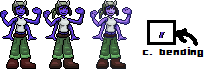
in case you re not sure about color bending I added a sample in image, what I meant. |
|
|
IP Logged |
|
|
Varkarrus
Seaman
Joined: 10 December 2014 Online Status: Offline Posts: 6 |
Posted: 06 January 2015 at 7:45pm |
 
I made two more sprites today, but I'm not too proud of either. I do like how the two pixel outline worked out Edited by Varkarrus - 06 January 2015 at 7:45pm |
|
|
IP Logged |
|
|
RebeaLeion
Commander
Joined: 04 October 2017 Online Status: Offline Posts: 321 |
Posted: 07 January 2015 at 6:04am |
|
I m not fan of 2px outline and it's not very common, not at all. 1px would be better.
|
|
|
IP Logged |
|
|
Varkarrus
Seaman
Joined: 10 December 2014 Online Status: Offline Posts: 6 |
Posted: 07 January 2015 at 7:01am |
|
I got the idea from Binding of Isaac: Rebirth, which has really nice pixel art. Still, I feel like I could improve the shading and color palette a bit (the base colors on the one on the right are taken from a drawing a friend did though, so it'd be the highlights and shadows that I'd change)
|
|
|
IP Logged |
|
|
eishiya
Commander
Joined: 04 August 2022 Online Status: Offline Posts: 1109 |
Posted: 07 January 2015 at 7:22am |
|
Binding of Isaac has a very simple art style made of simple flat shapes with minimal detail. The thick outlines work well there because they flatten the art even more, making it look even simpler. That sort of outline does not work well with more detailed art.
|
|
|
IP Logged |
|
|
Limes
Commander
Joined: 15 September 2021 Online Status: Offline Posts: 683 |
Posted: 07 January 2015 at 10:43pm |
|
I advise you use graphics gale. It is easy to learn and is in all ways better then mspaint.
I have had a problem for the longest time, I tried grafx2 (I was confused and lost) photoshop just has too much worthless tools and I always mess stuff up there because I get so lost. So MSpaint is my go to system it may not have animation transparency or layers but the layout is so nice it is impossible to get lost. As a person who has troubles using anything but paint Graphics Gale is by far the nicest program though I only pixel in library's and at school so I have to use paint. (I have a Mac and I can't find anything I like for it I don't understand how o save my images in Graf) if all else fails use Gimp. Not as user friendly as GG but still a nice pixeler. Your sprite has a nice design, something ide expect I see in a Ratchet and Clank 2D version. The sprite doesn't really pop for me, IDE say not enough contrast or some pillowshading issues. Being a good artist is not just a talent with being able to draw. You must be one with the shapes, you need to see the way they are in your mind, how the light affects it. What might be a 2D image you need to imagine in your mind to be a 3D image you must REALLY understand the shapes. I have always had an easy time with this and I guess it comes natural to me to see shapes when I was little day elementary school I could sketch better than just about anyone in the school. I've always been the best at drawing and very seldom did I practice. My pixel art roots started with me as a grade 4 creating custom emojis. But only in black and white, why? Because where I my have been able to draw tremendously I never truly understood colors, color wheels made no sense. But I have practiced hard and I can understand them now. What I am saying is art I general is a thing anyone can learn but I guess people get scared out of it because there are always people that are just naturally good. (I have gone into a ramble... Damn it) My advice is to always keep a light source in min and always stick to it feel the shapes. (Ugh trying to write on Mobil is a chore) Edited by Limes - 07 January 2015 at 10:45pm |
|
|
|
|
|
IP Logged |
|
|
Varkarrus
Seaman
Joined: 10 December 2014 Online Status: Offline Posts: 6 |
Posted: 08 January 2015 at 7:49am |
|
... You wrote all of that in Mobile? Wow.
I didn't use MS Paint to do this, by the way. I used Paint.Net. I'm not... entirely? sure what you mean with the shapes and stuff, but I do know what you mean about getting a feel for it. I feel like that particular part takes practice more than anything, and over time you just get a knack for it that can't be taught or learned from reading about it. I am trying to keep in mind a light source, so I do stuff like shade under the arms, in the inside of the pants, and stuff, but it's still a little hard to visualize. Really what I think I need to improve on most is shading, and possibly color palette. Edited by Varkarrus - 08 January 2015 at 7:50am |
|
|
IP Logged |
|
|
PixelSnader
Commander
Not a troll! Joined: 21 May 2026 Online Status: Offline Posts: 3194 |
Posted: 09 January 2015 at 11:44pm |
|
I made you two edits. The first one is just cleaning up the pants a wee bit and removing the outlines of the shirt and instead shading it. To show that you don't need to outline things on the inside of the sprite. The second is, well, a complete do-over. I get out of hand sometimes. Anyway, it's supposed to show you that if you drop all the outlines, you can replace them with shading and/or details. You don't even necessarily need an outer outline, and it can still read well on most any background. What Limes means with shapes is the depth/form of whatever you're pixeling. It's about imagining how light will fall. For example, arms and legs are roughly cylindrical shapes, while the head is a sphere. Whatever software you use doesn't really matter. I did this in paint, only used Gimp for the transparency. (I don't like the program, it's clunky, but can't afford photoshop outright, so I'm forcing myself to learn alternatives) What does matter is this; you need to understand what you're working with. And the simpler something is, the better you can understand things. This is why you start sketching with just pencils, and why using MSpaint isn't a bad idea for starters. If you're used to Paint.net, that's fine. Keep using it. |
|
|
▄▄█ ▄▄█ ▄█▄ ▄█▄ |
|
|
IP Logged |
|
| |
||
Forum Jump |
You cannot post new topics in this forum You cannot reply to topics in this forum You cannot delete your posts in this forum You cannot edit your posts in this forum You cannot create polls in this forum You cannot vote in polls in this forum |
|
