| Active TopicsSearchRegisterLogin |
| WIP (Work In Progress) | |
 Topic: Perspective? 3/4 top-view tree trunk Topic: Perspective? 3/4 top-view tree trunk |
  |
| Author | Message |
|
Kich
Midshipman 
Joined: 05 December 2025 Online Status: Offline Posts: 32 |
  Topic: Perspective? 3/4 top-view tree trunk Topic: Perspective? 3/4 top-view tree trunkPosted: 09 August 2015 at 3:16pm |
|
Hey everyone,
I'm having trouble with perspective. How do I make good tree trunks in 3/4 top-view? Look: 
I don't think the tree I made have a trunk like this, but zelda had big ones that actually show just roots: 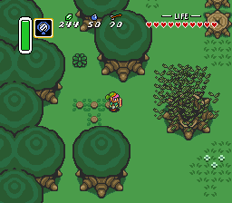 Edited by Lucas Kich - 09 August 2015 at 5:31pm |
|
 IP Logged IP Logged |
|
|
AimlessZealot
Midshipman
Joined: 29 March 2019 Online Status: Offline Posts: 43 |
Posted: 09 August 2015 at 10:24pm |
|
I want to begin by stating : I love your foliage. It's vibrant and has a lot of personality without being so unique that it won't tile well. The color scheme is good (though the limes may need to be muted slightly if you're going to have groups of them) and the fact that it is not symmetrical like your reference images' trees means that flipping it can create randomness and variety.
I wasn't initially sure if there was anything I could contribute since I've never tried this particular problem before, but after studying for a little bit I decided the easiest way to answer would be to take a shot myself. Forgive me for being a little overzealous in the following work... So the first footnote I took from LoZ:L2P was that the perspective is orthagonal. That means no foreshortening like what your attempt does as it thins towards the roots.The next footnote that I took was that the perspective depends on line thickness to help separate "top" and "bottom" objects such as the trunk from the foliage above it. This was my takeaway attempt on finishing the tree you started. 
I kinda went screwy adjusting the top a bit but I realized it was necessary because your original foliage is at the slightly wrong perspective. In the original trees there is a pale green circle at the "top" of the tree. If we assume that the inner circle of your foliage is its top and compare accordingly, we see this: 
In the center is the original, to the left the version with a trunk but no thickening and no adjusted foliage, the right is the thickened/adjusted foliage. The red line gives a nice comparison of top-center. Because yours is pitched too far back, your perspective is technically closer to 2/3rds than 3/4ths. Feel free to use whatever you find useful above however you like. Good luck and great job! |
|
|
IP Logged |
|
|
jalonso
Admiral 
Joined: 29 November 2022 Online Status: Offline Posts: 13537 |
Posted: 11 August 2015 at 2:22pm |
|
If you try to make true to 3/4 then it won't show at all or will look odd.
Its best to go for the optical illusion. Your tree top is great looking. To me, in game art trees I follow this rule. Busy top clean trunk, cleacn top busy trunk. |
|
|
|
|
|
IP Logged |
|
|
Kich
Midshipman
Joined: 05 December 2025 Online Status: Offline Posts: 32 |
Posted: 15 August 2015 at 2:14pm |
|
Hey, thank you both!
I appreciate all your study on this, AimlessZealot :) I quite liked your edits, but I feel aiming a different style than LoZ:L2P (I used the trunk's perspective as example 'cause its perspective seems to make a lot more sense than trees I see on other RPGs). Your reply added a lot, thank you! Indeed jal, :o this is interesting. Thanks for that. I think it's looking better now, I'll keep going with this:  > >    Edited by Lucas Kich - 15 August 2015 at 10:21pm |
|
|
IP Logged |
|
|
AimlessZealot
Midshipman
Joined: 29 March 2019 Online Status: Offline Posts: 43 |
Posted: 16 August 2015 at 10:40am |
|
I like your tree but I would say : your shadow is too busy and lacks the variegation it would need to match what it is shadowing.
Either your shadow represents the broad strokes of the shapes above it and is a single color/opacity so that it symbolizes the shadow of the foliage rather than accurately representing it (like how LoZ and many other games do) OR: Your shadow attempts to account for all of the various details of the shape it is linked to but needs to reflect things like thickness and height differences using shade and opacity. Because you're mixing the two it seems like a uniform, cartoony symbol of something that is much more complicated than the broad-strokes foliage above it. |
|
|
IP Logged |
|
|
jalonso
Admiral
Joined: 29 November 2022 Online Status: Offline Posts: 13537 |
Posted: 17 August 2015 at 2:55pm |
|
Trunk is perfect for this treetop.
Dunno that the ground shadow matches tho :/ |
|
|
|
|
|
IP Logged |
|
|
Kich
Midshipman
Joined: 05 December 2025 Online Status: Offline Posts: 32 |
Posted: 20 August 2015 at 12:05am |
|
I think I got it. Better?
 
|
|
|
IP Logged |
|
|
eishiya
Commander 
Joined: 04 August 2022 Online Status: Offline Posts: 1109 |
Posted: 20 August 2015 at 6:12am |
|
I think you're being too literal with that shadow, trying to get every bit of detail in there, so it doesn't look quite right. A simpler shadow that really emphasises the fact that the tree just has a bunch of very large leaves would be a better match, even if the details don't actually match.
|
|
|
IP Logged |
|
|
Kich
Midshipman
Joined: 05 December 2025 Online Status: Offline Posts: 32 |
Posted: 20 August 2015 at 10:31am |
|
I'm trying, but not reaching this simpler shadow :(
Actually I grew up with this kind of influence so detailed shadows looks quite ok to me today. |
|
|
IP Logged |
|
|
Kich
Midshipman
Joined: 05 December 2025 Online Status: Offline Posts: 32 |
Posted: 20 August 2015 at 11:23pm |
|
I guess I managed to do a simpler shadow :D

(I'm using 48x48 tiles and I intend to make some variations on the grass) Edited by Lucas Kich - 21 August 2015 at 12:44am |
|
|
IP Logged |
|
|
RebeaLeion
Commander
Joined: 04 October 2017 Online Status: Offline Posts: 321 |
Posted: 22 August 2015 at 2:28am |
|
i like your tile so far.
|
|
|
IP Logged |
|
| |
||
Forum Jump |
You cannot post new topics in this forum You cannot reply to topics in this forum You cannot delete your posts in this forum You cannot edit your posts in this forum You cannot create polls in this forum You cannot vote in polls in this forum |
|
