| Active TopicsSearchRegisterLogin |
| WIP (Work In Progress) | |
| |
  |
| << Prev Page of 15 Next >> |
| Author | Message |
|
eishiya
Commander 
Joined: 04 August 2022 Online Status: Offline Posts: 1109 |
  Posted: 26 January 2016 at 8:42am Posted: 26 January 2016 at 8:42am |
|
With their legs together in the side views, they look unbalanced. They're leaning forward but aren't supporting themselves with their feet.
|
|
 IP Logged IP Logged |
|
|
AshCrimson
Commander
Joined: 24 April 2020 Online Status: Offline Posts: 606 |
Posted: 26 January 2016 at 4:49pm |
|
Thanks for the comment Eishiya, i've straightened them up, hopefully they'll still look interesting:
Old:  New:  Static comparison below:  Just a question (to all readers!), am i posting too much? Should i hold off until i have more stuff and dump it in one post, rather than multiple ones? |
|
|
IP Logged |
|
|
eishiya
Commander
Joined: 04 August 2022 Online Status: Offline Posts: 1109 |
Posted: 26 January 2016 at 8:55pm |
|
Looks better! If you're worried about them being stiff, try bending their arms, and not having the arms so far back. The arms being so far back looks off in general - it just doesn't look like a pose anyone would do.
I'd also try making the arms 1px shorter (especially on the shorter two characters), they look a wee long right now. I'm not sure though - it might make them too short. As for posting - post as much as you feel comfortable! Posting updates based on reader suggestions is grand. Posting updates in the absence of replies is fine too, but if you're worried you can always keep it to major updates only. Don't worry about double-posting or anything like that. If there's any "problem" with your posts, it's that they're are focused on non-pixel art things like anatomy, and you haven't done much that needs pixel art-related feedback. And anatomy in pixel art can be hard to critique since it's hard to tell what's an actual problem and what's just a limitation due to the size. That is probably why you're not getting replies. |
|
|
IP Logged |
|
|
jalonso
Admiral 
Joined: 29 November 2022 Online Status: Offline Posts: 13537 |
Posted: 27 January 2016 at 6:00am |
|
Originally posted by AshCrimson
... am i posting too much? Should i hold off until i have more stuff and dump it in one post, rather than multiple ones? NO!!! You have one of the most entertaining, instructional, inspiring and lurkable threads going. I like when you add anything and seeing your progress is great. This may be your quest to improve, learn and develop your skills but its also a thread where others learn and develop too just by following your progress. I sometimes direct newer members to review this thread because your questions, experiments and solutions almost serve as a class or tutorial. Kutgw |
|
|
|
|
|
IP Logged |
|
|
AshCrimson
Commander
Joined: 24 April 2020 Online Status: Offline Posts: 606 |
Posted: 27 January 2016 at 4:21pm |
|
Thanks for the comments guys! Don't worry i will keep on updating/posting as regularly as i can.
I've realised with the new side and back views, i'm going to have to update the characters for readability. I'm debating whether to highlight the arms with black to make them standout. This is currently what i've got:  Still trying to adhere to the 32x32 tiles, im just worried some of the details are hard to read and im also worried about how i'll represent the shield on the front and back view, it probably doesn't even look like a shield without the side views giving context. |
|
|
IP Logged |
|
|
eishiya
Commander
Joined: 04 August 2022 Online Status: Offline Posts: 1109 |
Posted: 27 January 2016 at 7:45pm |
|
Hardly anyone holds their shield perfectly parallel to their side. We should be able to see the flat of the shield (either front or back) from all the angles, and we should never see the shield perfectly head-on. That'll solve your readability problem, as well as make things feel more natural.
I don't think you need to worry too much about making the arms read, since they don't seem important. If you do need to make them readable, consider using shadows to make them stand out - have the arm be lit, and the body that it's seen against be in shadow. I don't think you have room for good outlines at this size, but there's always room for contrasting light against dark colours. In the front and back views, the sides are already shaded anyway, so it wouldn't look weird to have the sides be shaded in the side views. |
|
|
IP Logged |
|
|
AshCrimson
Commander
Joined: 24 April 2020 Online Status: Offline Posts: 606 |
Posted: 29 January 2016 at 5:50am |
|
Tried to do exactly that with the shield(s) Eishiya:
 |
|
|
IP Logged |
|
|
eishiya
Commander
Joined: 04 August 2022 Online Status: Offline Posts: 1109 |
Posted: 29 January 2016 at 9:04am |
|
An improvement, but it feels like they're holding their shields differently in each view. The round shield in particular seems to be turning 90 degrees every frame xP The two triangular shields look good because their shapes help to erase the perspective cues that would "give away" the fact that they're not consistent, but the round and rectangular shields could use some refining. The round shield should appear as an ellipse in all views (not necessarily the SAME ellipse), never as a circle. The rectangular shield looks good from front and back, but seems to be head-on from the sides, it needs a small shape adjustment to show that it's tilted towards the character's front.
|
|
|
IP Logged |
|
|
AshCrimson
Commander
Joined: 24 April 2020 Online Status: Offline Posts: 606 |
Posted: 17 February 2016 at 2:22pm |
|
Thanks for the comment Eishiya, will work that in into my my future edits of shields.
Been toying with the idea of just having attacks done on the overworld, rather than being a seperate mini-screen, so i've had to limit the amount of movement, although im okay with the weapons and certain limbs going out of the 32x32 tile limitation. Here's a few examples of what im getting at, including a New Overhead swing:     Sorry for the glacial updates as well, i wish i had the same amount of time to work on pixel stuff as i did before :/ |
|
|
IP Logged |
|
|
eishiya
Commander
Joined: 04 August 2022 Online Status: Offline Posts: 1109 |
Posted: 17 February 2016 at 2:50pm |
|
I recall recommending ditching the separate screens before, so of course I approve of this xP
One downside to this, though, is the characters appear stacked on top of each other, since you're using square tiles and positioning characters in them as if they're in a top-down view, but the characters are seen from the side. You should probably have the characters overlap in the y-axis to give the scene more depth and avoid this stacking appearance. |
|
|
IP Logged |
|
|
AshCrimson
Commander
Joined: 24 April 2020 Online Status: Offline Posts: 606 |
Posted: 17 February 2016 at 2:57pm |
|
I'm having difficult envisioning what you mean, is there an example you can show me? Sorry for being dense, i want to ensure it's readable.
|
|
|
IP Logged |
|
|
eishiya
Commander
Joined: 04 August 2022 Online Status: Offline Posts: 1109 |
Posted: 17 February 2016 at 3:13pm |
|
Something like this (example not to scale):
 It may damage the readability of individual sprites if they're very skinny or have no distinction between internal detail and external outlines, but it looks less weird to do it like this when you're mixing non-chibi side-view sprites with a top-down environment. The sprite readability can be maintained through good colour/shadow work and distinct external outlines. Alternatively, you could make sprites that are closer to your environment's projection rather than clashing with it. Certain attacks might not read as well then, but others might read better. |
|
|
IP Logged |
|
|
AshCrimson
Commander
Joined: 24 April 2020 Online Status: Offline Posts: 606 |
Posted: 17 February 2016 at 3:55pm |
|
I think i get what you mean, here's a hastily put together piece of my interpretation.
I found it difficult to make characters occlude each other, whilst making the positioning consistant and keeping the tile size to 32x32:  Black lines are to help me plot where i should place the unit. |
|
|
IP Logged |
|
|
eishiya
Commander
Joined: 04 August 2022 Online Status: Offline Posts: 1109 |
Posted: 17 February 2016 at 4:01pm |
|
Generally you would want to avoid placing characters on tile boundaries, since that looks odd. I don't know how much control you have over positioning though.
Is the scale of those tiles going to be like it is in this example? The somewhat-realistic proportions of the sprites look at odds with that scale, and same-screen combat could look even more at odds. Same-screen combat looks best when the environment matches the characters. A scale/style mismatch can still work if the characters are very obviously treated as game pieces on a board rather than as characters in an environment, though. Since I don't know what you're going for, I don't know what advice to give you. My overlap suggestion is made with a "characters in an environment" mindset because your sprite style seems to lean towards that, but your environment tiles suggest "pieces on a board". |
|
|
IP Logged |
|
|
AshCrimson
Commander
Joined: 24 April 2020 Online Status: Offline Posts: 606 |
Posted: 17 February 2016 at 4:13pm |
|
I could go with that theme and maybe make it more overt, by adding some sort of uh, base to the units?
I was originally going with a mixture of Advance Wars/Fire Emblem and Shining force sort of tiles, in regards to the scale, i was hoping to keep it to 32x32 as i worried it would look odd and take up too much space if it was any bigger, but maybe i need to play around with larger tiles like 48x48 or 64x64 although i think the latter would be too big for the current units. I'll be honest, i didn't really give this much thought, i created the stuff then thought it would be cool if they were actually assets one could use so i eventually went down that road. I'll look at some examples in other games and see if i reconcile the two, thanks for the comment btw. |
|
|
IP Logged |
|
|
bluedxca93
Commander
Joined: 27 February 2016 Online Status: Offline Posts: 104 |
Posted: 18 February 2016 at 12:33pm |
|
32x32 is a relatively good size 64x64 maybe too big and to be honest, 48x48 is a good size if you want to draw the things from 32x32 with an slightly lower colour count.
24x24 might even be enough as resolution. it depends on what you want to do. |
|
|
IP Logged |
|
|
AshCrimson
Commander
Joined: 24 April 2020 Online Status: Offline Posts: 606 |
Posted: 18 February 2016 at 1:10pm |
|
Made a quick mock up with the above in mind, adding a base to the unit, sort like models in warhammer and to show what it might look like in hypothetical practice:
 Static version:  Hopefully it avoids the stacking issue and sort of looks more like a piece in some sort of board game. |
|
|
IP Logged |
|
|
AshCrimson
Commander
Joined: 24 April 2020 Online Status: Offline Posts: 606 |
Posted: 21 February 2016 at 9:41am |
|
Bit burnt out from all the (human) character stuff, so trying to diversify and going back to Pokemon:
 Trying to complete this Sudowoodo and Sylveon. I'm sort of halfway Sudowoodo, tried applying some sort of shadow to it, even though it's not shown in the artwork: 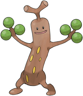 I'm a bit conflicted, in order to get the general shape of the Sylveon i had to downsize a picture by half, put a layer over it and block out the forms and limbs, hence the legs being one colour, hair+face being a different colour etc, but im not this is the proper or even the ethical way of doing this? I guess im asking this; should i try to do it freehand (without the overlay, but still using the image as a reference) or is it considered acceptable to do what i've done so far? I did it in the past with my other pokemon attempts, but it was only for the basic shape, after that i changed it. Hopefully no one thinks less of me because of this, sorry! Edit: Quickly put the colours in for Sylveon, having a few issues trying to make sure it's readable, had to use different white shades to indicate ribbons + actual body and had to use strong colours to seperate certain parts:  |
|
|
IP Logged |
|
|
AshCrimson
Commander
Joined: 24 April 2020 Online Status: Offline Posts: 606 |
Posted: 31 March 2016 at 9:49am |
|
Been busy with stuff lately, haven't done a lot of pixel stuff as i recently have been given a graphics tablet, but here's some attempts at enemies/monsters as well as idle animations for them:
Troll:  Drake:  Updated worm:  Zombie:  |
|
|
IP Logged |
|
|
eishiya
Commander
Joined: 04 August 2022 Online Status: Offline Posts: 1109 |
Posted: 31 March 2016 at 10:39am |
|
I hope it's alright if I reply to your last three posts!:
I like the game piece-like look in your mockup, but the actual board looks like a skateboard. Maybe change it to a rounder base? Also, since they're meant to look like game pieces, maybe their legs shouldn't move relative to the base, at least while moving. While attacking, it shouldn't be a problem if the legs move. I don't know what this community's standards are about tracing to get the proportions, but personally I am against it. Aside from the ethical questionableness, it's also not something you should need to do. Practice your observational skills instead of tracing. Plus, it's okay to be a little wrong - putting your own stylization on things is a big part of doing fan art! Now, for the animations: At first I thought the troll's left arm was getting random holes in it, before I realised it was just behind the leg. That's a cool pose, but it doesn't work well with the spindly limbs. It could work well with thicker limbs. The drake looks like you just put spindly legs on a snake body. The legs do not appear connected to the body, and the front legs even randomly change lengths. Also, it looks odd that the tail's motion seems to come from near the tip - typically, the greatest motion comes from the muscles on/near the torso, even when the tail is prehensile. The worm's looking nice, but maybe its head should bob frontwards and backwards rather than up and down? It seems to have a permanent crease in its neck, surely it would want to unbend it regularly, and be creased like that only at some extreme point in its motion. The zombie's quite readable, but the arms seem to move independently of the torso, and the legs change in length. |
|
|
IP Logged |
|
|
AshCrimson
Commander
Joined: 24 April 2020 Online Status: Offline Posts: 606 |
Posted: 03 April 2016 at 4:09pm |
|
As always i appreciate the comment, critique and advice Eishiya!
Regarding... The Base: I've changed it, making it rounder and added it to the animations below. Tracing: Thank's for your thoughts on this! It dovetails into my recent attempts at learning how to draw. Troll: I'm really wanting to the keep the strange, gangly appearance it has, so i've tried making the arm not go behind it in the idle animation, if it doesn't work i will resort of changing the limb width. Here's what i currently have:  Drake: Changed the legs so they don't bob up and down as much, with this enemy i really wanted to give the impression of a dragon-like creature albeit without any wings. If need be i can re-do the legs. Also made it move less in the animation below:  Worm: Changed it so the head moves back and forwards and made general changes to most of it's frames, also tried to remove the crease:  Zombie: Changed it, hopefully the legs move less, apologies for the rough wip legs, i want to ensure they at least move in a natural manner before i committ to any changes. I've kept the arms, hopefully they won't look as absurd as they did before, now that the legs don't drastically change in length. I've also tried a version with the legs further appart but im unsure if it's appropiate for a zombie enemy: 
|
|
|
IP Logged |
|
|
eishiya
Commander
Joined: 04 August 2022 Online Status: Offline Posts: 1109 |
Posted: 04 April 2016 at 8:33am |
|
The new base looks much better. The AA on the farside doesn't seem appropriate though, and it likely to be misread as part of the sprites.
I didn't realize there were outlines on the characters! The outlines help quite a bit! The new zombie animation is less interesting but it's more readable and makes more anatomical sense. However, in the interest of... well, interest, I'm sure you'd be willing to sacrifice some anatomy so I hope you can find a way to make the weird pose readable! Have you tried putting outlines on the zombie's leg when it's on front of the arm? It might break out of the style a little but it could help it read better by adding some artificial thickness to the leg. The drake's legs look better but it still reads like a snake with a deformed spine and limbs sewn on to the surface. Look at animal skeletons, look at how the limbs attach to the spine, and look at how muscle fills those areas out to allow the limbs to move. Your creature is lacking any indication of that. It just doesn't look like a believable creature. I think the worm's looking better, but that much head movement is probably unnecessary - it looks like it's moving, but you no longer need movement animations. It also still looks creased. Worms don't have skeletons, but still, imagine if it had a spine in there, how it would have to be bent. Fat forms have their flesh preventing them from bending too much. With worms and snakes, you generally want smooth curves with no creases (think S shape, not Z shape). They can crease, but should only do so when a lot of force is applied to them, which will help you a lot in those animations. By having them crease all the time, you're missing out not only on believability, but also on opportunities to make other animations (such as them being hit in combat) feel more forceful. Also, this crease issue is also present in the drake's neck. The zombie's legs being closer together looks better. You still have the legs changing length, just less. Legs cannot change length. The only way that a character's height can change from the legs is if the legs change position. Also, with the outline visible, I noticed the zombie's arms are coming out of its shoulders unnaturally, it looks like they have an extra bend in them right below the shoulders. Since you've changed the perspective from side-view to 3/4, shouldn't the perspective on these sprites change as well? Their legs are all still shown aligned to the same horizontal line, as if we're seeing them from the side. It didn't occur to me before, but seeing these in context now, they look out of place relative to the backgrounds and base. |
|
|
IP Logged |
|
|
AshCrimson
Commander
Joined: 24 April 2020 Online Status: Offline Posts: 606 |
Posted: 04 April 2016 at 11:43am |
|
Thanks yet again for the critique and advice Eishiya! I feel my stuff improving because of your comments. I'll adress the issues again and post them when im done.
Sorry for the stupid mistakes! I sometimes have difficulty visualing the problems you point out, but i will never intentionally ignore any advice, regardless of who gives it. Edit: Quick attempt to re-do the whelp that later turned into a bigger edit of it (alongside previous verions for comparison):  Probably made things worse :/ but i based the new one on looking at a komodo dragon, which is what i was originally trying to go for i guess Also i'm not sure how i'll deal with the shift in perspective beyond totally redoing it :/ |
|
|
IP Logged |
|
|
Vilmore
Midshipman 
Joined: 06 January 2017 Online Status: Offline Posts: 23 |
Posted: 04 April 2016 at 4:23pm |
|
zomg!!! I love your topic AshCrimson!
I love the type of game you are making, I love that you are already keeping it up for 2 years. Keep going man! |
|
|
IP Logged |
|
|
AshCrimson
Commander
Joined: 24 April 2020 Online Status: Offline Posts: 606 |
Posted: 04 April 2016 at 5:43pm |
|
Thanks for the comment vilmore! I'm unfortunately not making any game atm (I cannot code and lack a coder willing to work for free on such a project sadly).
Quick worm update:  Probably messed it up but i won't to try something different, with the head at least. Made the body more S-like and reduced the back and forwards movement of the neck. |
|
|
IP Logged |
|
|
jalonso
Admiral
Joined: 29 November 2022 Online Status: Offline Posts: 13537 |
Posted: 04 April 2016 at 6:05pm |
|
Originally posted by AshCrimson
...I cannot code and lack a coder willing to work for free on such a project sadly... You are not alone. My Medici is all dusty :( Updates are nice. The zombie is the hardest to read because without a label I would never have guessed it was a zombie. Since I have not yet said so in 2016...your thread and you are awesome 
|
|
|
|
|
|
IP Logged |
|
|
Vilmore
Midshipman
Joined: 06 January 2017 Online Status: Offline Posts: 23 |
Posted: 05 April 2016 at 4:08am |
|
Originally posted by AshCrimson
Thanks for the comment vilmore! I'm unfortunately not making any game atm (I cannot code and lack a coder willing to work for free on such a project sadly) Oh man, that makes my heart bleed 
Seeing your art come alive is a 1000 times more gratifying that a making a gif. I feel so bad for you, working on all this without a game. There must be solutions! I would almost want to teach you... Would you give your art to programmers students?? or other programmers out there who can't find an artist willing to work for free?? There must be like minded programmers out there who would want to be your buddy, I'm sure. Just a note of warning, making an actual game is hard, much harder than just making an art mockup. But also a lot of fun. |
|
|
IP Logged |
|
|
eishiya
Commander
Joined: 04 August 2022 Online Status: Offline Posts: 1109 |
Posted: 05 April 2016 at 8:35am |
|
If you have trouble visualising something I said, please tell me. I don't mind doing a sketch or a quick pixel-over to illustrate what I mean.
The drake still has the issue of the legs not attaching in a sensible way, they're coming out of the bottom. Have them come out at the sides, work with that. Also, have the width of the limb be different at different points, limbs aren't pencils xP I know you're going for a noodle-limb look, but I believe stylization should come second to readability. Here's a pixel-over:  I made the limbs come out at the side rather than the bottom (really it just amounted to removing some of your shading), and I fattened them up a little bit. While I was at it, I removed a bit of jagginess on the neck, and made the tail follow the spine more instead of rapidly changing direction (which looks painful). I also changed the positions of the feet to match the perspective a little more, I'll go into that later. The head on the new worm looks great, but you made its bending problem worse.  I unbent the worm a bit. It's fine, even good, to have some frames like yours where has a very tense-looking, zig-zagged bend like you have in your animation. It looks more dynamic and tense when the body is bent sharply, and that's great for animations! The problem I'm trying to get at is that you have that look in all of your frames, which just makes the worm look like it's permanently bent and cannot unbend. tl;dr have some frames in the animation where the worm is curving rather than sharply bending, it'll make the sharply-bent frames look better. Also, remember, worms don't have joints. They can bend anywhere on their body. You can push the wormy slithery look by making the bends/curves of the form change their positions relative to the worm in various animations. In other words, with worms, inconsistency can be a good thing. If you're doing the sharp bending just to save space, you can make them work better by having the form slither through those bands instead of keeping them in a fixed position on the worm's body. As for the perspective change, just moving the far feet up and over a little can go a long way! The drake pixel-over I did provides an example. It took almost no work. You can take it to a different level by shifting all the far limbs up a pixel or two and cleaning up the results. It'll be tougher with your larger sprites (the humanoids), but if you keep it subtle and go for a compromise rather than an actually matching perspective, it shouldn't be a ridiculous amount of work. The drake paintover doesn't completely match the perspective, but it feels much more "correct" than leaving the feet all planted on the same imaginary line. I'm sad to hear there's no game to go with these! I hope you'll find someone who wants to make this game. Or I should just kidnap you and make you do the character art for my game xP |
|
|
IP Logged |
|
|
AshCrimson
Commander
Joined: 24 April 2020 Online Status: Offline Posts: 606 |
Posted: 05 April 2016 at 3:32pm |
|
Thank you all for the comments, i really appreciate them!
I probably wouldn't mind people using my stuff, but im not sure why when there's better stuff out there, for free! A really quick whelp edit, thickened limbs as Eishiya advised, changed perspective slightly and hopefully made them look like they're attached to the actual body.  Will work on the worm next. Edit: Quick attempt, want to see if it's going in the right direction:  |
|
|
IP Logged |
|
|
eishiya
Commander
Joined: 04 August 2022 Online Status: Offline Posts: 1109 |
Posted: 05 April 2016 at 6:33pm |
|
Definitely heading in a good direction with both of these! The belly on the drake could use some softening, all the shadow-pixels lining up making it look boxy. The tail animation's looking much more natural.
|
|
|
IP Logged |
|
|
rocifier
Midshipman
Joined: 28 March 2016 Online Status: Offline Posts: 26 |
Posted: 06 April 2016 at 1:18am |
|
Hmm, I think the brown priest looked better before the edit. His form especially chest is reading better, you can tell the coat is tightened below the pecs. But on edit 2 its just kinda undefined and looks like awkward man boobs.
|
|
|
IP Logged |
|
|
Vilmore
Midshipman
Joined: 06 January 2017 Online Status: Offline Posts: 23 |
Posted: 06 April 2016 at 7:19am |
|
Originally posted by AshCrimson
Thank you all for the comments, i really appreciate them!I probably wouldn't mind people using my stuff, but im not sure why when there's better stuff out there, for free! There is not that much good free stuff out there. I hear lots of coder (and coder students) complain they dont find art for their game. And for example on open game art there is not that much good stuff, just a few sets. I dont really know where else to look? Actually I find a lot of stuff online pretty bad 
With the collection that you are building, you could make some programmers very happy. |
|
|
IP Logged |
|
|
AshCrimson
Commander
Joined: 24 April 2020 Online Status: Offline Posts: 606 |
Posted: 06 April 2016 at 12:28pm |
|
I guess i'd be okay with people uh using my stuff? Not sure how i'd feel if the games that resulted from it were on sale for money though.
|
|
|
IP Logged |
|
|
AshCrimson
Commander
Joined: 24 April 2020 Online Status: Offline Posts: 606 |
Posted: 08 April 2016 at 1:30pm |
|
Quick update on both:
  Smaller changes on the worm, sorry. |
|
|
IP Logged |
|
|
eishiya
Commander
Joined: 04 August 2022 Online Status: Offline Posts: 1109 |
Posted: 08 April 2016 at 3:48pm |
|
The worm's animation makes it look very cute.
The drake's legs are changing in length instead of bending/shifting. It's okay to distort the skeleton for more extreme, stylised motion, but for minor motion, it'll look more natural if you keep the bones in mind and avoid breaking them. |
|
|
IP Logged |
|
|
AshCrimson
Commander
Joined: 24 April 2020 Online Status: Offline Posts: 606 |
Posted: 27 April 2016 at 1:20pm |
|
Thanks for the advice, did this;
 Hopefully that rectifies the problem somewhat. I played a bit of advance wars (Ds version) and remembered why i loved it's graphic style (16x16), so tried to crib a bit from it:  Plus tried animating at the same tile size as Advance war's units on the map:  Sorry btw, i know i'm always getting distracted and doing stuff and never really finishing it. I mean, my excuse is that im not working on anything specific anyway so... |
|
|
IP Logged |
|
|
AshCrimson
Commander
Joined: 24 April 2020 Online Status: Offline Posts: 606 |
Posted: 22 May 2016 at 3:55pm |
|
A quick attempt at a larger, more detailed version of one of the units, hopefully it's anatomy isn't totally rubbish, i tried to get the calves to look better but...
 |
|
|
IP Logged |
|
|
AshCrimson
Commander
Joined: 24 April 2020 Online Status: Offline Posts: 606 |
Posted: 01 June 2016 at 4:18am |
|
Another, quick attempt:
 Still trying to get the proportions and general size of the legs and arms down. I'm also kind of struggling to get the knees and elbows down, making them look distinct. A question; am i using/doing too much AA? Sorry for the lack of noticeable updates; been practising and experimenting with larger characters, colour and other stuff. When i did the smallist mock up, i was told i should use differing, softer/pastel colours to make the units pop out more, so tried doing it with the normal map tiles. Two versions: Normal colours, second is the softer/pastel colours. Units have normal colours in both versions. I'm hoping they stand out more, whilst the colours for the background don't distract/dominate but still look relatively pretty.  For reference, here's the new colours next to the old ones for comparison:  Most drastic change is the green. |
|
|
IP Logged |
|
|
AshCrimson
Commander
Joined: 24 April 2020 Online Status: Offline Posts: 606 |
Posted: 07 June 2016 at 4:20am |
|
Tried fixing some of the issues with the standing large base:
 |
|
|
IP Logged |
|
|
MrHai
Commander
Joined: 12 January 2014 Location: Norway Online Status: Offline Posts: 119 |
Posted: 08 June 2016 at 5:58am |
|
I think the new map colors look great!
Your figures are looking a bit hunched over. Maybe you want this shaggy-style of posture, but I made a quick edit to illustrate how to straighten their backs a little. All I did was move the shoulders down a couple of pixels, and move the head 1 pixel to the left. 
|
|
|
"Work is more fun than fun"
-John Cale |
|
|
IP Logged |
|
|
AshCrimson
Commander
Joined: 24 April 2020 Online Status: Offline Posts: 606 |
Posted: 09 June 2016 at 1:27pm |
|
Originally posted by MrHai I think the new map colors look great! Your figures are looking a bit hunched over. Maybe you want this shaggy-style of posture, but I made a quick edit to illustrate how to straighten their backs a little. All I did was move the shoulders down a couple of pixels, and move the head 1 pixel to the left. Thanks for the edit and tip, MrHai! Also appreciate the comment about the map colours. Made a quick edit with your words in mind, also tried to fix the anatomy of the left leg, with two versions:  Also changed the arms slightly. |
|
|
IP Logged |
|
|
AshCrimson
Commander
Joined: 24 April 2020 Online Status: Offline Posts: 606 |
Posted: 15 June 2016 at 12:32pm |
 Tried my hand at the beach daily pixel thing Wanted to go back to basics and make a really simplistic, small scene, although it's probably a bit too simple. I really like Miami Hotline's simplistic style, although i disagree with the colour choice and some of the fuzziness, so im thinking of taking a look at how they deal with objects and putting my own twist on it. Struggled with the chair and the perspective, hopefully it reads as one. |
|
|
IP Logged |
|
|
AshCrimson
Commander
Joined: 24 April 2020 Online Status: Offline Posts: 606 |
Posted: 22 June 2016 at 4:23am |
|
So i've been pouring over FF Tactics Advance sprites, trying to understand the pixel placement and why it works, I've been re-coloured the sprites, copied the outline and tried to place the pixels myself, but i must be missing something because i can't make head or tails over it.
I'm not sure how gauche it is to recolour or to use pre-existing sprites as a base, but i've tried to at least put my own spin on it (ignoring the head for the time people, first one is the original, ffta sprite):  So i'm wondering; is it mainly Anti-aliasing? Specifically the placement of the pixels and clusters, that makes ffta sprites so good? Sorry if this is a dumb question, I've become obsessed with avoiding banding, to the point of avoiding doing sprites like this. |
|
|
IP Logged |
|
|
eishiya
Commander
Joined: 04 August 2022 Online Status: Offline Posts: 1109 |
Posted: 22 June 2016 at 7:24am |
|
FFTA sprites have a fair bit of detail, which does require AA just to be able to read well. More than AA though, it's the lack of outlines within objects. This frees up pixels for more detail and more interesting shadows. In your edit, you have introduced outlines that probably should not be there, such as around the abdomen. You've also taken the pants hemline to be an outline. That dark area is there to provide clearer separation of the two objects (pants and shoes) but should not be there in a naked sprite.
Also, you can do banding without AA xP |
|
|
IP Logged |
|
|
AshCrimson
Commander
Joined: 24 April 2020 Online Status: Offline Posts: 606 |
Posted: 22 June 2016 at 8:40am |
|
Originally posted by eishiya FFTA sprites have a fair bit of detail, which does require AA just to be able to read well. More than AA though, it's the lack of outlines within objects. This frees up pixels for more detail and more interesting shadows. In your edit, you have introduced outlines that probably should not be there, such as around the abdomen. You've also taken the pants hemline to be an outline. That dark area is there to provide clearer separation of the two objects (pants and shoes) but should not be there in a naked sprite. Also, you can do banding without AA xP Thanks for the advice Eishiya! Do you mean something like this?:  (Last one is my attempt at making an actual character, with clothes). Edit: Slight update, tried to vary the bases and make a fully headed one and an example of a finished unit (and the original sprite from ff tactics advance):  Sorry for the incremental changes, just trying to understand learn more about this sort of style |
|
|
IP Logged |
|
|
eishiya
Commander
Joined: 04 August 2022 Online Status: Offline Posts: 1109 |
Posted: 22 June 2016 at 12:31pm |
|
Kind of like that, yeah! There's some anatomy booboos, but they wouldn't matter for the clothed sprite.
I doubt the FFTA artists (or most artists working with the SD style) actually think about what's going on underneath the sprites' clothing. At that size, and with such modified anatomy, it's more important to make sure the sprite's overall appearance reads, even if it means distorting the anatomy further. I'd go as far as saying it might be a bad idea to try to understand the style in terms of anatomy. It's important to understand anatomy in general for any style, but not so that you can draw a naked person in it, rather so that you can draw the final sprite and then know whether it looks good or not. Ditto for clothing, perspective etc - they don't need to depict things accurately, but it helps to know what's wrong when something is wrong. For example, the skirt on your character looks weird because when seen from above, most skirts would appear convex, whereas yours looks concave. |
|
|
IP Logged |
|
|
AshCrimson
Commander
Joined: 24 April 2020 Online Status: Offline Posts: 606 |
Posted: 23 June 2016 at 8:20am |
|
Thanks for the comment Eishiya, edited the skirt and did 3 more, hopefully they look different enough from each other:
 Right now im trying to see what i should do with flat spaces. I'm not happy with the first two (dude with the white hat and brown skinned guy), but im not sure what i can do to make them look non-crap atm. Any suggestions? Should i re-do them from scratch? |
|
|
IP Logged |
|
|
zodiac
Midshipman
Joined: 19 June 2016 Online Status: Offline Posts: 29 |
Posted: 23 June 2016 at 7:16pm |
|
FFT uses chibi sprites, meaning the heads need to be bigger. That's why the hat is huge in the ref pic. On the first two, at least give them a bit of brow line, which you did on the third.
The other thing is perspective: you're not quite tilting the characters' clothes enough. Especially on the second guy, the huge belt guard is facing directly at us, which in perspective looks like it's now on his left side (our right). Ditto with the third/fourth guys' kilts - the belts are right, but the lower hem curves the wrong way (cover at least the leg pixel directly below the belt). The shoulders, meanwhile, would get more light. Don't necessarily need to raise them, but at least raise the highlight line. If you raised the rest of the head by one to do this it would look better - you can also put a shine on baldy's head for visual interest. |
|
|
IP Logged |
|
|
AshCrimson
Commander
Joined: 24 April 2020 Online Status: Offline Posts: 606 |
Posted: 28 June 2016 at 1:25pm |
|
Thanks for the critique and advice Zodiac! Tried applying your words to the bases.
Animated comparison:  Still comparison:  Lightened some of the colours, increased the size of the heads as you advised, tried changing the direction of the belt guard on the bald dude, changed the shoulder's slightly, raised the right hem line by a pixel and changed some other small things. |
|
|
IP Logged |
|
|
AshCrimson
Commander
Joined: 24 April 2020 Online Status: Offline Posts: 606 |
Posted: 02 July 2016 at 1:15pm |
|
Tried a walking animation and an attack animation:
  Used the original animations from the game as a reference, tried my own hand at it, using the base when i got stuck (hardest was the walk animation) and then added more frames if needed to make it smoother. Did the walk animation first, so it needs to be updated, but i wanted to show what i've learnt so far. I feel like im cheating using someone elses sprites to learn but i've found it useful so far so im conflicted |
|
|
IP Logged |
|
| << Prev Page of 15 Next >> |
| |
||
Forum Jump |
You cannot post new topics in this forum You cannot reply to topics in this forum You cannot delete your posts in this forum You cannot edit your posts in this forum You cannot create polls in this forum You cannot vote in polls in this forum |
|
