| Active TopicsSearchRegisterLogin |
| Resources and Support | |
 Topic: 32 color bright fantasy palette, seeking comments Topic: 32 color bright fantasy palette, seeking comments |
  |
| Author | Message |
|
Lendrick
Midshipman 
Joined: 12 October 2008 Online Status: Offline Posts: 71 |
  Topic: 32 color bright fantasy palette, seeking comments Topic: 32 color bright fantasy palette, seeking commentsPosted: 08 May 2014 at 3:37pm |
|
So one of the frequent problems I run into on OpenGameArt is that, while we have a lot of pixel art, we frequently run into issues of consistency. Given a general lack of consistent palettes for particular types of games, it can be difficult sometimes to find pixel art to use together in a game that doesn't clash.
We've had some luck lately with the Arne and Dawnbringer palettes (which I'm a huge fan of), but those are both intended to be fairly universal, as opposed to catering toward specific types of games. As such, I've been thinking about trying to put together a few 32 color palettes that are geared toward specific artistic styles rather than universality. The first one I'm working on is a bright fantasy palette that's geared toward the look of the first Secret of Mana game, or the Chrono Trigger overworld. I'm looking for comments on what I have so far:  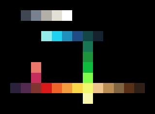  You can play around with this palette in my gradient tool at this link: http://static.opengameart.org/gradientifier-dev/rainbow2.html So, why not DB32? For the effect I'm looking for, I find that it lacks some of the really saturated midtones. I realize that having more muted colors makes DB32 more versatile; what I'm aiming for here is to give up some of that versatility in favor of something more stylized. This palette is in fact deliberately weak in terms of muted colors (particularly midtones), and also in terms of brownish-greens that you might see in games that are going more for a sense of realism. Specific stuff I was considering when I made the palette:
Current issues? I've got two very close off-whites, one of which I think I can probably get rid of, and replace with some other color (maybe a rust color or something). As for other issues (apart from the aforementioned deliberate weaknesses), I have no idea, which is why I'm posting here. :) Plans for other palettes right now include something more appropriate for realistic or post-apocalyptic games, and also perhaps something dark and moody along the lines of the Speedball II palette. Edited by Lendrick - 08 May 2014 at 3:41pm |
|
|
http://opengameart.org
Free, legal art for Open Source game projects. |
|
 IP Logged IP Logged |
|
|
Lendrick
Midshipman
Joined: 12 October 2008 Online Status: Offline Posts: 71 |
Posted: 09 May 2014 at 1:23pm |
|
Based on some feedback from Surt, I've updated the palette a bit. I also merged a couple similar colors and added a bit more variety.
  |
|
|
http://opengameart.org
Free, legal art for Open Source game projects. |
|
|
IP Logged |
|
|
Hapiel
Rear Admiral 
Joined: 30 June 2023 Online Status: Offline Posts: 3266 |
Posted: 09 May 2014 at 5:45pm |
|
Test it out by remapping some artworks that you like, and show them here! That should help with critique too!
The current palette contains 2 times the same dark brown, so it is only 34 colors. Also I think the red and your dark pink are super close to each other, especially on my second screen (it is hard to make palettes if you have multiple screens >.<) I made a couple of quick remaps for you. To me most of them look way too bright, and the dark colors too saturated. I hope this can be fixed and still fit your style idea! All images below have your palette              |
|
|
IP Logged |
|
|
Lendrick
Midshipman
Joined: 12 October 2008 Online Status: Offline Posts: 71 |
Posted: 09 May 2014 at 8:52pm |
|
Thanks :)
Bright and saturated is what I'm aiming for. Since this palette is in part inspired by Chrono Trigger, I did a remap of a scene from the overworld:  I see what you mean about the red and the dark pink.. I may sacrifice the dark pink color for another green midtone (it's clear from the screenshot that another green is needed, because those bright spots are a bit too bright). Or, I might just darken the bright green a shade or two and make that dark purple color a bit bluer to differentiate it from the red and see what happens there. Regardless, the CT screenshot here is a bit closer to my intent for how the colors would be used (lighter greens for grass, darker greens for trees, mid and dark blues for ocean). |
|
|
http://opengameart.org
Free, legal art for Open Source game projects. |
|
|
IP Logged |
|
|
Lendrick
Midshipman
Joined: 12 October 2008 Online Status: Offline Posts: 71 |
Posted: 09 May 2014 at 9:41pm |
|
Here, changed things up a bit.
   I think the above images do fairly well at demonstrating the look that I'm aiming for with this palette. Hopefully the color choices make a bit more sense this way. Edited by Lendrick - 09 May 2014 at 10:10pm |
|
|
http://opengameart.org
Free, legal art for Open Source game projects. |
|
|
IP Logged |
|
|
Lendrick
Midshipman
Joined: 12 October 2008 Online Status: Offline Posts: 71 |
Posted: 09 May 2014 at 10:26pm |
|
Just for kicks, I desaturated the entire palette slightly. Even for the look I'm aiming for, the saturation was over the top. The images below are a bit closer to the originals.
   Edited by Lendrick - 09 May 2014 at 10:27pm |
|
|
http://opengameart.org
Free, legal art for Open Source game projects. |
|
|
IP Logged |
|
|
DawnBringer
Commander 
Joined: 11 August 2024 Online Status: Offline Posts: 568 |
Posted: 10 May 2014 at 4:32am |
|
Good work guys, you identified some redundancies and replaced them with the missing pink/magentas. However there's still clumping in the bright-yellow and dark registers (why no proper yellow?). The red(s) need some attention too, as it's close to the brown but far from the orange. Also note that there's accidentally some menu-colors included in the last analysis.
In general I wonder if these close ramps of green and blue is enough for a nice varied grass/water world. Perhaps more green-yellow and more blue ramps with a set of interpolating cyans would be more powerful, and better suited for the aesthetics of "Mana"-like games. 
|
|
|
IP Logged |
|
|
Lendrick
Midshipman
Joined: 12 October 2008 Online Status: Offline Posts: 71 |
Posted: 10 May 2014 at 7:32am |
|
Greets!
I've poked and prodded at the palette a bit more (right now there's a duplicate color in there, but it was easier to leave it in for the moment while I test things). I added a couple shades of cyan in there, merged a dark brown with a dark purple, merged some bright yellows and made them more yellow, and made the green slightly more yellow as well. I    Thoughts? Edited by Lendrick - 10 May 2014 at 7:39am |
|
|
http://opengameart.org
Free, legal art for Open Source game projects. |
|
|
IP Logged |
|
|
DawnBringer
Commander
Joined: 11 August 2024 Online Status: Offline Posts: 568 |
Posted: 10 May 2014 at 8:27am |
|
Your two darkest colors are almost identical [20,20,20] & [24,29,33]. The yellow is still too pale and similar to the "sand" color. The "skin" and bright-purple are quite close and could be optimzed. The gap between the two darkest greens is too big. The brown / red need some attention; try drawing some trees...there's one very saturated red-brown, an orange and two beige colors to choose from. Options are limited and a bit wonky right now.
|
|
|
IP Logged |
|
|
Lendrick
Midshipman
Joined: 12 October 2008 Online Status: Offline Posts: 71 |
Posted: 10 May 2014 at 10:17am |
|
Okay, so I removed one of the darks and made the other one slightly darker. I saturated the yellow as much as I could without it looking weird, narrowed the gap between the darkest greens, desaturated the brown, brightened the red slightly, added another dark blue-green, made the pink color a bit more blue to separate it a bit from the skin color, and I think that's about it.
I think I might need to saturate the brown midtones a bit more, but I'm not sure.    Edited by Lendrick - 10 May 2014 at 10:20am |
|
|
http://opengameart.org
Free, legal art for Open Source game projects. |
|
|
IP Logged |
|
|
DawnBringer
Commander
Joined: 11 August 2024 Online Status: Offline Posts: 568 |
Posted: 11 May 2014 at 6:30am |
|
Hm, think you changed the wrong green (but it was still an improvement, so don't undo it :) ).
Right now your middle greens are clumped together a bit. It can be a great help to study the brightness plots (just under the rightside hue-brightness diagram), to get a good sense of how ramps are spaced, and where possible interpolators are located. 
The brightest green and blue/cyan are very close, maybe darken that green just a wee bit? Edited by DawnBringer - 11 May 2014 at 6:34am |
|
|
IP Logged |
|
|
Lendrick
Midshipman
Joined: 12 October 2008 Online Status: Offline Posts: 71 |
Posted: 11 May 2014 at 7:57am |
|
So when I palette-matched the images this time, it took a lot mess manual adjusting of colors to make them look good. I think that's pretty telling.
   Edited by Lendrick - 11 May 2014 at 8:18am |
|
|
http://opengameart.org
Free, legal art for Open Source game projects. |
|
|
IP Logged |
|
|
Lendrick
Midshipman
Joined: 12 October 2008 Online Status: Offline Posts: 71 |
Posted: 11 May 2014 at 10:51am |
|
Small change here: I sacrificed the lightest cyan color for a darker cyan midtone that I think will be more useful for both foliage and water:
  The SOM image isn't affected by this change. |
|
|
http://opengameart.org
Free, legal art for Open Source game projects. |
|
|
IP Logged |
|
|
Lendrick
Midshipman
Joined: 12 October 2008 Online Status: Offline Posts: 71 |
Posted: 12 May 2014 at 1:38pm |
|
So in practice I'm finding that off-whites aren't really very useful. I was able to remove the very light beige and replace it with another skin/earth tone that IMO fixes an issue with the brown ramp, which required a color that was too orange.
 Note that the light beige color I replaced wasn't being used in my example images, so the only thing that changed was the analysis (although if I redid the mapping in the examples, they'd probably look a little better). |
|
|
http://opengameart.org
Free, legal art for Open Source game projects. |
|
|
IP Logged |
|
|
Volrak_Rutra
Midshipman
Joined: 26 September 2014 Online Status: Offline Posts: 63 |
Posted: 19 October 2014 at 10:21pm |
|
how do you guys make these colour space diagrams?
|
|
|
IP Logged |
|
|
4red
Seaman 
Joined: 04 September 2020 Online Status: Offline Posts: 8 |
Posted: 20 October 2014 at 1:22am |
|
They use the dawnbringer's tools for grafx2, its the best way to see if your limited palette is "correct".
In my opinion it's very hard to create a universal 32 color palette. Cannot be done. It will look good in some games and not good in other games. You need more sets of palettes, one for rpg's, one for action games and one with realistic colors for paintings, for the latter see Fool's gallery for correct colors for realistic paintings. |
|
|
IP Logged |
|
|
Volrak_Rutra
Midshipman
Joined: 26 September 2014 Online Status: Offline Posts: 63 |
Posted: 20 October 2014 at 6:06am |
|
Originally posted by 4red They use the dawnbringer's tools for grafx2, its the best way to see if your limited palette is "correct". where can I get my hands on those tools? are those some kind of Grafx2 scripts? |
|
|
IP Logged |
|
|
DawnBringer
Commander
Joined: 11 August 2024 Online Status: Offline Posts: 568 |
Posted: 20 October 2014 at 7:01am |
|
@Volrak: Yes, Grafx2 scripts. There's links on my gallery page. (I'm also working on an update with several new features for the analysis script)
Edited by DawnBringer - 20 October 2014 at 7:03am |
|
|
IP Logged |
|
|
Volrak_Rutra
Midshipman
Joined: 26 September 2014 Online Status: Offline Posts: 63 |
Posted: 21 October 2014 at 4:16pm |
|
Thanks! I even figured out how to run them! Is there any sort of documentation on how to write one of those? This kind of functionality extension is definitely a powerful tool to be able to tap into. Are there any pointers you can share on how to write them?
|
|
|
IP Logged |
|
|
DawnBringer
Commander
Joined: 11 August 2024 Online Status: Offline Posts: 568 |
Posted: 21 October 2014 at 5:05pm |
|
Check the Brushfactory Page for instructions.
|
|
|
IP Logged |
|
|
Antraxis
Seaman
Joined: 09 August 2005 Online Status: Offline Posts: 3 |
Posted: 14 January 2016 at 4:15am |
|
Hello, I picked 36 colors from Finecolour Markers
Based on Your palette. 
Here are the marker numbers: 0 2 10 26 41 44 50 86 96 107 119 121 136 140 152 156 163 167 179 184 191 205 206 212 228 229 234 244 246 255 262 269 272 273 274 283 |
|
|
IP Logged |
|
|
yrizoud
Commander
Joined: 03 May 2021 Location: France Online Status: Offline Posts: 343 |
Posted: 14 January 2016 at 6:39am |
|
I expect the colors will appear differently as markers on paper, rather than screen pixel colors. But I'd be curious to see the result, so don't hesitate to share/link what you draw with it.
|
|
|
IP Logged |
|
|
Antraxis
Seaman
Joined: 09 August 2005 Online Status: Offline Posts: 3 |
Posted: 16 January 2016 at 12:32am |
|
@yrizoud numbered colors on the left side are the actual colors based on scanned drawing (you can still see paper facture on them). I will post ( if won't forget ) a test color chart made with this markers when they arrive, be patient for a few days until the shipping arrives.
|
|
|
IP Logged |
|
|
Antraxis
Seaman
Joined: 09 August 2005 Online Status: Offline Posts: 3 |
Posted: 22 October 2016 at 8:20am |
|
Hello guys, a bit late but here it is. I bought all the markers listed in my previous post and some colouring examples ( based on Doodle Invasion book ).
By they way, somebody knows how to align this images side by side? 


|
|
|
IP Logged |
|
| |
||
Forum Jump |
You cannot post new topics in this forum You cannot reply to topics in this forum You cannot delete your posts in this forum You cannot edit your posts in this forum You cannot create polls in this forum You cannot vote in polls in this forum |
|
