| Active TopicsSearchRegisterLogin |
| WIP (Work In Progress) | |
| |
  |
| Author | Message |
|
Krysis
Midshipman 
Joined: 01 May 2006 Location: Bulgaria Online Status: Offline Posts: 87 |
  Topic: WIP Unnamed Santa Game Mockup Topic: WIP Unnamed Santa Game MockupPosted: 20 October 2006 at 12:39pm |
|
Im working on this little thing and I need some critic.
Simple game: Pick up all the gifts and avoid the polar bears before the time runs out.
|
|
 IP Logged IP Logged |
|
|
Pixel_Outlaw
Commander 
Joined: 01 September 2005 Online Status: Offline Posts: 3829 |
Posted: 20 October 2006 at 1:05pm |
|
It's looking really nice, you might want to try the light blue from your palette a the snow details though.
Edited by Pixel_Outlaw - 20 October 2006 at 1:05pm |
|

|
|
|
IP Logged |
|
|
Scruffs
Midshipman
Joined: 13 September 2005 Location: United States Online Status: Offline Posts: 79 |
Posted: 20 October 2006 at 1:13pm |
|
yea i agree. The mockup is very nice, but the colour choices are rather bland.
heres what i would do:
 Edited by Scruffs - 20 October 2006 at 1:18pm |
|
|
IP Logged |
|
|
Pixel_Outlaw
Commander
Joined: 01 September 2005 Online Status: Offline Posts: 3829 |
Posted: 20 October 2006 at 1:28pm |
|
I guess gray is just a lonely color. :( It makes me hurt in side like a little teddy with a bandage tied on his paw...
|
|
|
|
|
|
IP Logged |
|
|
Centrefuge
Midshipman
Joined: 02 September 2005 Location: United States Online Status: Offline Posts: 58 |
Posted: 20 October 2006 at 2:27pm |
|
I must be in the minority that prefers the first one and other images that are duller... That's a neat looking game. I'd play that addictively. Is it for a cell phone?
|
|
 Someday I'll take over the world, just not today... Someday I'll take over the world, just not today...
|
|
|
IP Logged |
|
|
Bisque
Commander
Joined: 11 April 2005 Online Status: Offline Posts: 149 |
Posted: 23 October 2006 at 1:40am |
|
Scruffs I think your colour changes are a bit too much in the opposite
direction. The saturation is hurting my eyes just a bit haha xD;
I think this would be an awesomely cute game to play. Simple but fun :). I do have some crits though, and I hope you dont mind, but I made an edit of it to display what I'm going to talk about. 1. General Palettes On first glance I can see 3 possible problems with the palettes you're using, and how you're using them. a) Saturation is your friend! But remember not to hug it too tightly sometimes xD. Most of the colours you're using seem to be pretty low in saturation and almost dull looking. However there are a few random colours in there that are actually TOO saturated..especially in comparison to everything else. An example of this would be the main red being used for santas clothing. It is almost pink looking and is so deeply saturated that is has made its dull outline basically irelevant. In most cases I try to actually make the outline a little more saturated than the colour it is surounding :). b) Hue shifting can be fun ;D. When creating a palette remember that it doesnt have to be comprised of just a lighter and darker version of the same colour. Use the hue slider a bit sometimes too. This helps add depth and contrast in some instances. If it helps you, maybe try finding any random photo and comparing the shadowy parts to the highlighted ones of the same object. You may be surprised to see that a highlight that may be ..say..almost peach in colour, could have a deep purple shadow! c)Contrast Please. My eyes are begging, ^^;! A lot of the lil sprites/objects have little to no contrast between them and the background behind them. This makes it extremely hard to focus on them. Remember to give foreground objects a contrasting outline to the background. ----- 2. Aii the trees. Hmm, well this MAY just be personal opinion, but I think your trees could do with some work :). They're good, but I think they could look even better. Right now there just seems to be too much going on within such a tiny space. The snow looks extremely random aaand I do believe I spy some pillow shading down there at the bottom of them. Maybe try some snow 'rings' to go along with the cartoony look of the Santa and bears? 3. There are a few other minor changes I made, but I think they are pretty explanitory if you compare the images :) 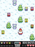
|
|
|
Poor Alice is dead. They cut off her head. But we'll be okay, didn't need her either way.
|
|
|
IP Logged |
|
| |
||
Forum Jump |
You cannot post new topics in this forum You cannot reply to topics in this forum You cannot delete your posts in this forum You cannot edit your posts in this forum You cannot create polls in this forum You cannot vote in polls in this forum |
|

