| Active TopicsSearchRegisterLogin |
| WIP (Work In Progress) | |
| |
  |
| Author | Message |
|
Indigo
Commander 
Joined: 20 April 2016 Online Status: Offline Posts: 174 |
  Topic: *grunt* Topic: *grunt*Posted: 06 November 2006 at 11:10am |
|
I focused on the following major areas; anatomy, texturing, and colour unification. 12 colours + trans. 5 of those colours, surprisingly enough are used in both the green and brown colour ramps. A lot of time was spent on the colours for this, and special thanks to Ptoing for critiquing it heavily in that area.
new: 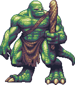 old:  and just for kicks, I combined some of my early wips with along with my new edits to create a nifty animated progress gif:  thanks to all those who helped me so far. my goal was to create a piece that showed what my current abilities are with pixelling. Its kind of funny because the old version of this represented my max abilities 3 years ago. C+C is highly appreciated for this. Help me meet my goal. :) -Dan |
|
 IP Logged IP Logged |
|
|
scottfro
Midshipman 
Joined: 10 October 2006 Online Status: Offline Posts: 61 |
Posted: 06 November 2006 at 11:14am |
|
update looks awesome! maybe some dings in the club to give it a little more character?
|
|
|
IP Logged |
|
|
Blueberry_pie
Rear Admiral 
Joined: 24 July 2015 Online Status: Offline Posts: 2176 |
Posted: 06 November 2006 at 12:15pm |
|
Wow. The first one was excellent but this is even better. Awesome awesome work. No crits from me :)
|
|
|
IP Logged |
|
|
Souly
Commander
Joined: 13 December 2020 Online Status: Offline Posts: 2451 |
Posted: 06 November 2006 at 12:28pm |
|
Awesome.
I like the new right hand much more now then the old one. As does the added rips on the sash, and the new tail. This looks great, excellent details and lighting. Nothing to nit pick here, it's all well done. |
|

I am the jesus of PJ. |
|
|
IP Logged |
|
|
Monkey 'o Doom
Commander
Joined: 24 September 2005 Online Status: Offline Posts: 2994 |
Posted: 06 November 2006 at 1:10pm |
|
I loved the old version, and the new one is even better, but in the new version, I think the knees could use some improvement. The left (his right) knee is very bolcky and looks less organic than the rest of the piece. Maybe angle the bottom of that knee or something to break the square look? Great work here though.
|
|

RPG is numberwang. |
|
|
IP Logged |
|
|
EyeCraft
Commander
Joined: 07 July 2005 Location: Australia Online Status: Offline Posts: 425 |
Posted: 06 November 2006 at 8:12pm |
|
Holy crap! This is pure pixel mastery! I'll just say that this piece is worthy of worship, but in hope of helping you push it even further I'm going to try to crit it...god damn those colours are nice...ahem, ok here I go...
I think his right arm and head could be more scaly. His left foot's toenails could use a tiny bit of tidying...just a little bit of AA in a couple of places... umm... The shading on his right bicep could use a little bit more mid-tone I think The highlight on the bottom right of the loin cloth could use a little AA The shading on his jaw seems a little bit blocky in the shadow areas The shading of his left, er, ankle? is a little blocky Hope I've been of assistance. But jesus, this is just brilliant...  |
|
|
IP Logged |
|
|
Psychotic_Carp
Commander
Joined: 02 April 2005 Online Status: Offline Posts: 1008 |
Posted: 06 November 2006 at 8:18pm |
|
I liked the older club better!
|
|
 got game? got game?
|
|
|
IP Logged |
|
|
EyeCraft
Commander
Joined: 07 July 2005 Location: Australia Online Status: Offline Posts: 425 |
Posted: 06 November 2006 at 10:16pm |
|
Originally posted by Psychotic_Carp I liked the older club better! :O No way! |
|
|
IP Logged |
|
|
neota
Commander
Joined: 27 November 2018 Online Status: Offline Posts: 158 |
Posted: 07 November 2006 at 2:01am |
|
A massive improvement! I'm impressed!
There are two things that you might improve: *the club looks somewhat blobby in its shading. If you sharpened some of the lines, that might also help with: *the strap looks like it's attached to the club. Consider making the area that goes over his shoulder darker. That might require some reworking elsewhere. I think it would make the sprite read a lot better. |
|
|
absolutely.
|
|
|
IP Logged |
|
| |
||
Forum Jump |
You cannot post new topics in this forum You cannot reply to topics in this forum You cannot delete your posts in this forum You cannot edit your posts in this forum You cannot create polls in this forum You cannot vote in polls in this forum |
|
